In today's fast-paced digital marketing landscape, having the ability to visualize and analyze data in real-time is paramount for success. Marketing teams often find themselves overwhelmed with data from various sources, making it challenging to derive actionable insights. This is where analytics dashboard software comes into play. These powerful tools aggregate data from multiple channels, providing a cohesive view that helps marketers make informed decisions swiftly. With the right analytics dashboard, you can track campaign performance, understand customer behavior, and optimize strategies—all in real-time.
By the end of this article, you'll gain insights into what analytics dashboard software is, its importance in marketing, and a curated list of top tools that can elevate your data management process. Let's dive into the top 7 analytics dashboard software tools that can help you visualize your marketing performance effectively.
1. Cometly
Best for: Comprehensive analytics and performance tracking.
Cometly is an advanced marketing analytics platform designed to provide real-time insights for data-driven decision-making.
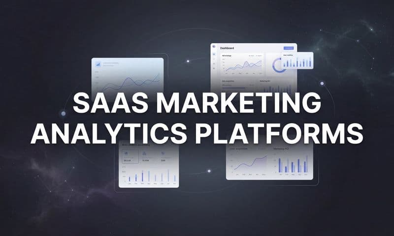
 Top 7 Analytics Dashboard Software To Enhance Your Marketing Insights
Overview & Background: Cometly specializes in multi-touch attribution, enabling marketing teams to track the performance of their campaigns across various channels. Its robust features allow users to visualize customer journeys and analyze the impact of different marketing efforts. As businesses increasingly rely on data for decision-making, Cometly positions itself as a valuable asset for organizations aiming to optimize their marketing strategies.
Key Features:
1. Real-Time Reporting: Cometly provides up-to-the-minute insights, allowing teams to pivot strategies quickly based on current data.
2. Attribution Tracking: This feature enables users to understand the influence of each touchpoint on customer conversion, leading to more effective marketing campaigns.
3. Customizable Dashboards: Users can tailor their dashboards to reflect specific KPIs that matter most to their marketing objectives.
4. Integration Capabilities: Cometly seamlessly integrates with various marketing tools, enhancing data coherence and usability.
5. User-Friendly Interface: The platform is designed to be intuitive, making it easy for users to navigate and extract valuable insights.
How It Works: Cometly aggregates data from multiple sources, providing a comprehensive view of marketing performance. Users can customize their dashboards to display the metrics that are most relevant to their strategies, facilitating real-time decision-making.
Pricing & Plans: Cometly offers tiered pricing plans, catering to businesses of various sizes and needs, ensuring that users get the best value for their investment.
Why It’s Great for Marketing Professionals: Cometly empowers marketing teams with the insights needed to optimize campaigns effectively. By providing clarity on customer interactions, it allows organizations to allocate resources more efficiently and drive better results.
2. Tableau
Best for: Data visualization and customizable reporting.
Tableau is renowned for its powerful data visualization capabilities, helping users transform raw data into actionable insights.
 7 Top Alternatives To Marketing Analytics Software To Enhance Your Insights
Overview & Background: With a strong focus on visual analytics, Tableau allows users to create interactive and shareable dashboards. It is widely adopted across various industries for its ability to handle large datasets and provide real-time analytics.
Key Features:
1. Robust Data Blending: Users can combine data from multiple sources, providing a holistic view of performance.
2. Interactive Dashboards: Tableau’s dashboards are highly interactive, enabling users to drill down into data for deeper insights.
3. Mobile Accessibility: The platform is designed to be mobile-friendly, allowing users to access analytics on the go.
4. Collaboration Tools: Teams can easily share dashboards and reports, enhancing collaboration and communication.
5. Extensive Template Library: Tableau offers a variety of pre-built templates to help users get started quickly.
How It Works: Users can connect Tableau to various data sources, including spreadsheets and databases, to visualize and analyze their data effectively. Its drag-and-drop interface simplifies the process of creating dashboards.
Pricing & Plans: Tableau offers a subscription-based pricing model, with various tiers tailored to meet the needs of different organizations.
Why It’s Great for Data Analysts: Tableau’s powerful visualization capabilities make it an excellent choice for data analysts who need to present data in an engaging and understandable way.
3. Google Data Studio
Best for: Free data visualization and reporting.
Google Data Studio provides a user-friendly platform for creating interactive reports and dashboards without any cost.
 Discover 10 Top Sisense Alternatives To Enhance Your Data Analytics
Overview & Background: As part of Google’s suite of tools, Data Studio integrates seamlessly with other Google services, making it a popular choice for businesses already using Google’s ecosystem.
Key Features:
1. Free to Use: Google Data Studio is completely free, making it accessible for businesses of all sizes.
2. Easy Integration: It connects effortlessly with Google Analytics, Google Ads, and other Google services.
3. Collaborative Features: Multiple users can work on reports simultaneously, enhancing teamwork and productivity.
4. Extensive Templates: Users can choose from a variety of templates to kickstart their reporting efforts.
5. Customizable Reports: Data Studio allows users to create highly customizable reports tailored to their specific needs.
How It Works: Users can connect their data from various sources, including Google Sheets and Google Analytics, to create visual reports that are easy to share and embed.
Pricing & Plans: Google Data Studio is free, offering excellent value for startups and small businesses looking to get started with analytics.
Why It’s Great for Small Businesses: Its cost-effectiveness and integration with other Google tools make it ideal for small businesses venturing into data analytics.
4. Microsoft Power BI
Best for: Comprehensive business intelligence solutions.
Microsoft Power BI integrates seamlessly with Microsoft products to deliver comprehensive business intelligence solutions.
 Discover 7 Top Tableau Alternatives To Enhance Your Data Visualization
Overview & Background: Power BI is designed to help organizations analyze data and share insights across the organization. It is particularly beneficial for businesses already using Microsoft products.
Key Features:
1. Advanced Analytics: Power BI offers advanced analytics capabilities, including AI-driven insights and forecasting.
2. Data Modeling: Users can create complex data models to analyze relationships between different datasets.
3. Interactive Dashboards: The platform enables users to create interactive dashboards that update in real-time.
4. Secure Sharing: Power BI features robust sharing options, ensuring that sensitive data remains protected.
5. Integration with Microsoft Products: Seamless integration with Office 365 and other Microsoft tools enhances its utility.
How It Works: Users can import data from various sources and create visual reports that can be easily shared across the organization.
Pricing & Plans: Power BI offers a free version and various subscription plans, making it accessible for businesses of all sizes.
Why It’s Great for Companies Using Microsoft: Its seamless integration with Microsoft products makes it the preferred choice for organizations already within the Microsoft ecosystem.
5. Domo
Best for: Real-time business intelligence and analytics.
Domo excels in delivering real-time data insights, enabling organizations to make informed decisions quickly.
 Top 7 Analytics Dashboard Software To Enhance Your Marketing Insights
Overview & Background: Domo’s platform is designed to connect data across the enterprise, providing a unified view that helps businesses optimize their operations.
Key Features:
1. Real-Time Data Connectivity: Domo connects with multiple data sources, providing real-time insights for agile decision-making.
2. Collaborative Features: The platform fosters collaboration by allowing teams to share insights and dashboards easily.
3. Customizable Dashboards: Users can create dashboards tailored to their specific needs, enhancing data engagement.
4. AI-Driven Insights: Domo leverages AI to provide predictive analytics and insights based on historical data.
5. User-Friendly Interface: The intuitive design ensures that users can navigate and utilize the platform easily.
How It Works: Domo aggregates data from various sources, allowing users to customize their dashboards and reports based on real-time information.
Pricing & Plans: Domo offers tiered pricing based on the number of users and data sources, providing flexibility for organizations of different sizes.
Why It’s Great for Enterprises: Its focus on real-time data connectivity makes it ideal for enterprises needing extensive data integration and analysis.
6. Qlik Sense
Best for: Interactive dashboards and business intelligence.
Qlik Sense is known for its associative data model, which allows users to explore data in an interactive manner.
 Top 7 Analytics Dashboard Software To Enhance Your Marketing Insights
Overview & Background: Qlik Sense empowers users with self-service analytics, enabling them to create their own dashboards without reliance on IT.
Key Features:
1. Associative Data Model: This feature allows users to explore data freely without being restricted by predefined queries.
2. Self-Service Analytics: Users can create their dashboards and reports, promoting data independence.
3. Collaboration Tools: Qlik Sense supports collaborative features, allowing teams to share insights effectively.
4. AI Integration: The platform incorporates AI to enhance data exploration and insights.
5. Responsive Design: Qlik Sense is designed to work well on various devices, including mobile.
How It Works: Users can connect to multiple data sources and leverage the associative model to explore data dynamically, uncovering insights that may not be immediately apparent.
Pricing & Plans: Qlik Sense offers a subscription-based model, with different tiers based on the features and capabilities required.
Why It’s Great for Data Analysts: Its self-service capabilities and associative model make it an excellent choice for data analysts seeking to explore and visualize data independently.
7. Sisense
Best for: Embedded analytics and data integration.
Sisense specializes in embedding analytics into applications, making it a powerful tool for organizations looking to integrate data into their workflows.
 Top 7 Analytics Dashboard Software To Enhance Your Marketing Insights
Overview & Background: Sisense is designed to simplify complex data integration and visualization, allowing organizations to embed analytics into their existing applications.
Key Features:
1. Embedded Analytics: Sisense allows users to embed analytics into their applications, providing seamless access to data insights.
2. Powerful Data Modeling: Users can work with large datasets and create complex data models effortlessly.
3. AI-Driven Insights: The platform offers AI capabilities to enhance data analysis and provide predictive insights.
4. Customizable Dashboards: Users can create dashboards tailored to their specific business needs.
5. Scalability: Sisense is designed to scale with the organization, accommodating growing data needs.
How It Works: Sisense aggregates and analyzes data from various sources, providing users with the tools to embed analytics into their applications and workflows.
Pricing & Plans: Sisense offers tiered pricing based on deployment options, ensuring flexibility for organizations of different sizes.
Why It’s Great for Organizations Needing Robust Data Solutions: Sisense’s focus on embedding analytics makes it an ideal choice for organizations looking to enhance their data integration capabilities.
Putting It All Together
Choosing the right analytics dashboard software can make a significant difference in how effectively your marketing team operates. Each tool discussed offers unique features and benefits that cater to different business needs. Cometly excels in real-time tracking, Tableau provides powerful visualization, Google Data Studio is cost-effective for beginners, and Microsoft Power BI integrates seamlessly with existing Microsoft tools.
Before making a decision, consider your specific business needs, budget constraints, and the scalability of the tool. The right analytics dashboard can empower you to gain insights, optimize performance, and ultimately drive better marketing outcomes.
Ready to transform your marketing analytics? Get your free demo today and see how Cometly can enhance your data management capabilities!