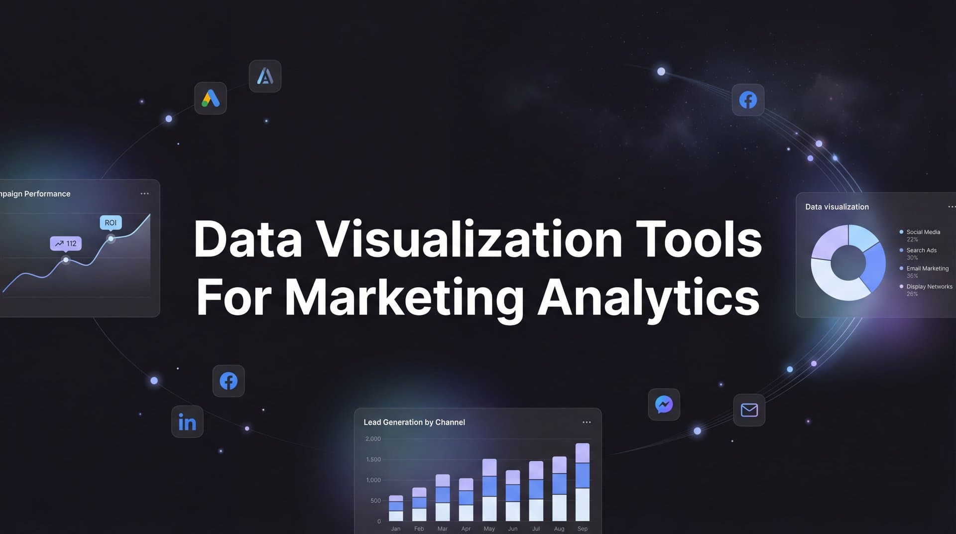
Marketing teams today are drowning in data from dozens of platforms—Meta Ads, Google Analytics, CRM systems, email campaigns, and more. But raw numbers in spreadsheets don't reveal which campaigns are actually driving revenue or where your budget is being wasted. Data visualization tools transform that chaos into clear, actionable insights that help you spot trends, identify winning campaigns, and communicate results to stakeholders with confidence.
The right visualization tool does more than make pretty charts. It connects your attribution data, tracks customer journeys across touchpoints, and helps you make faster, smarter decisions about where to invest your marketing budget. Whether you need real-time ad performance dashboards, multi-touch attribution views, or executive reports that actually get read, choosing the right platform matters.
We've evaluated the leading data visualization tools for marketing analytics teams, considering factors like ease of use, integration capabilities, real-time data handling, marketing-specific features, and pricing. Here are the top tools that can turn your marketing data into competitive advantage.
1. Cometly
Best for: Marketing teams needing attribution-focused visualization with AI-powered optimization recommendations
Cometly is a marketing attribution and analytics platform built specifically for understanding which ads and channels actually drive revenue across the entire customer journey.
 9 Best Data Visualization Tools for Marketing Analytics in 2026
Where This Tool Shines
Unlike general-purpose visualization tools, Cometly is purpose-built for marketing attribution. It captures every touchpoint—from initial ad clicks to CRM events—and visualizes the complete customer journey in a way that reveals what's truly driving conversions. The AI-powered recommendations layer analyzes your attribution data to identify high-performing ads and campaigns, then suggests where to scale with confidence.
The platform excels at solving the core challenge marketing teams face: connecting spend to revenue across multiple platforms. With server-side tracking and conversion sync capabilities, Cometly provides more accurate data than pixel-based tracking alone, then feeds enriched conversion events back to ad platforms like Meta and Google to improve their AI targeting and optimization.
Key Features
AI Attribution Visualization: Compare multiple attribution models side-by-side with AI-generated insights about which campaigns deserve more budget.
Real-Time Cross-Platform Dashboards: Monitor ad performance across Meta, Google, TikTok, LinkedIn, and more in unified views that update in real time.
Customer Journey Mapping: Visualize every touchpoint from first click to conversion, revealing the true path customers take before buying.
Server-Side Tracking: Capture accurate conversion data that bypasses iOS limitations and ad blockers for reliable attribution visualization.
Conversion Sync Reporting: See how enriched conversion data flows back to ad platforms, improving their algorithm performance and your ROI.
Best For
Cometly is ideal for growth-focused marketing teams and agencies running paid campaigns across multiple platforms who need to understand true attribution and optimize budget allocation. If you're spending significant money on ads and want to know exactly which touchpoints drive revenue—not just last-click conversions—this platform delivers the clarity you need.
Pricing
Custom pricing based on ad spend volume. Demo available to explore the platform and discuss specific needs for your marketing operation.
2. Tableau
Best for: Enterprise marketing teams requiring sophisticated analysis and custom visualizations of complex data sets
Tableau is the industry-leading business intelligence platform known for powerful visualization capabilities and deep analytical features.
 11 Best Big Data Tools for Marketing Analytics in 2026
Where This Tool Shines
Tableau handles complexity better than almost any other visualization tool. When you need to blend data from your CRM, ad platforms, web analytics, and sales systems into sophisticated custom visualizations, Tableau delivers. The drag-and-drop interface makes it surprisingly approachable despite its power, letting marketers build custom dashboards without writing code.
The platform's calculated field capabilities let you create custom marketing metrics—like customer acquisition cost by channel or lifetime value cohort analysis—that go far beyond what standard reporting tools offer. For teams with data analysts or technical marketers, Tableau becomes an incredibly flexible canvas for answering complex questions about marketing performance.
Key Features
Advanced Calculated Fields: Build custom marketing metrics using formulas that combine data from multiple sources in sophisticated ways.
Data Blending: Connect and merge data from CRM, ad platforms, analytics tools, and databases without complex ETL processes.
Interactive Dashboards: Create visualizations where users can drill down, filter, and explore data without building new reports.
Tableau Public: Share insights publicly or embed interactive visualizations on websites for stakeholder communication.
Mobile Optimization: Access and interact with dashboards on mobile devices with touch-optimized interfaces.
Best For
Tableau works best for mid-to-large marketing organizations with technical resources who need deep analytical capabilities and custom visualization flexibility. If you have complex data sources and sophisticated questions about marketing performance, the investment in Tableau pays off through insights you can't get elsewhere.
Pricing
Starts at $75 per user per month for Tableau Creator (full authoring capabilities). Viewer licenses available at lower price points for stakeholders who only need to view dashboards.
3. Looker Studio
Best for: Budget-conscious teams heavily invested in Google's marketing ecosystem
Looker Studio is Google's free visualization tool with native connections to Google Ads, Analytics, Search Console, and hundreds of other data sources.
 9 Best Data Visualization Tools for Marketing Analytics in 2026
Where This Tool Shines
The price is unbeatable—completely free with a Google account. For marketing teams running Google Ads and using Google Analytics, Looker Studio provides seamless integration that requires minimal setup. You can build professional-looking marketing dashboards in minutes using pre-built templates, then customize them to match your specific reporting needs.
The community connector marketplace expands Looker Studio far beyond Google's ecosystem, with connectors for Meta Ads, LinkedIn, Shopify, HubSpot, and hundreds of other platforms. Real-time collaboration features let multiple team members work on reports simultaneously, making it easy to iterate on dashboard designs with stakeholders.
Key Features
Native Google Integrations: Connect Google Ads, Analytics, Search Console, and YouTube with zero configuration required.
Community Connectors: Access hundreds of third-party connectors for non-Google marketing platforms and data sources.
Template Gallery: Start with pre-built marketing report templates and customize them for your specific needs.
Real-Time Collaboration: Multiple users can edit reports simultaneously with comment threads and version history.
Embedded Reporting: Share reports via link or embed interactive dashboards in websites and internal tools.
Best For
Looker Studio is perfect for small-to-medium marketing teams on tight budgets who primarily use Google's marketing platforms. If you're just starting with data visualization or need to create client reports quickly without software costs, this is your best entry point.
Pricing
Completely free for standard use. Enterprise features available through Looker (Google Cloud's paid BI platform) for organizations needing advanced governance and support.
4. Power BI
Best for: Marketing teams embedded in Microsoft ecosystems seeking enterprise-grade analytics at accessible pricing
Power BI is Microsoft's business analytics platform offering strong integration with Microsoft 365 and competitive pricing for powerful features.
 9 Best Data Visualization Tools for Marketing Analytics in 2026
Where This Tool Shines
Power BI delivers enterprise-level capabilities at a fraction of Tableau's cost. For marketing teams already using Microsoft 365, SharePoint, or Dynamics CRM, the integration is seamless. You can embed Power BI reports directly into Teams channels, making it effortless to share marketing performance updates where your team already collaborates.
The DAX formula language lets you create sophisticated custom metrics, while the natural language Q&A feature allows non-technical stakeholders to ask questions like "What was our cost per lead last month?" and get instant visualizations. Power Automate integration enables automated workflows—like sending weekly performance reports to your inbox or triggering alerts when campaigns hit specific thresholds.
Key Features
DAX Formulas: Create complex calculated metrics for marketing analysis using Microsoft's powerful formula language.
Natural Language Q&A: Ask questions about your data in plain English and get automatic visualizations as answers.
Microsoft 365 Integration: Embed reports in Teams, SharePoint, and PowerPoint for seamless stakeholder communication.
Paginated Reports: Generate detailed, print-ready marketing reports with precise formatting control.
Power Automate Workflows: Trigger automated actions based on data thresholds or schedule report distribution.
Best For
Power BI excels for marketing teams in Microsoft-centric organizations who need enterprise features without enterprise pricing. If your company uses Office 365 and you want sophisticated analytics that integrate with existing workflows, Power BI offers exceptional value.
Pricing
Free desktop version for individual use. Power BI Pro at $10 per user per month for sharing and collaboration. Premium capacity starts at $4,995 per month for large organizations.
5. Databox
Best for: Marketing teams wanting pre-built templates and mobile-optimized dashboards with minimal setup time
Databox is a marketing-focused dashboard platform with over 100 native integrations and templates designed specifically for common marketing use cases.
 9 Best Data Visualization Tools for Marketing Analytics in 2026
Where This Tool Shines
Databox gets you from zero to working dashboard faster than almost any other tool. The pre-built templates for common marketing scenarios—like "Facebook Ads Performance" or "SEO Traffic Overview"—mean you can connect your accounts and have professional dashboards running in under 10 minutes. The mobile app with push notifications keeps you informed about campaign performance even when you're away from your desk.
The TV dashboard mode transforms any screen into a live marketing performance display for your office, creating visibility and accountability across the team. Benchmark groups let you compare your metrics against industry averages, providing context for whether your performance is truly competitive or needs improvement.
Key Features
Pre-Built Templates: Start with ready-made dashboards for Google Ads, Meta, SEO, email marketing, and dozens of other use cases.
Goal Tracking: Set targets for key metrics and receive automated alerts when you're trending off track.
TV Dashboard Mode: Display live performance metrics on office screens to keep teams aligned and motivated.
Benchmark Groups: Compare your marketing metrics against industry standards to understand competitive positioning.
Mobile App: Monitor performance and receive push notifications about important metric changes on iOS or Android.
Best For
Databox is ideal for marketing teams who value speed and simplicity over deep customization. If you need dashboards up and running quickly without technical setup, and you want mobile access to performance data, Databox delivers exactly what you need without unnecessary complexity.
Pricing
Free tier includes 3 data sources and 10 users. Paid plans start at $47 per month for additional sources and features. Professional plans at $135 per month add advanced capabilities.
6. Klipfolio
Best for: Marketing agencies and teams needing real-time dashboards with white-label client reporting capabilities
Klipfolio is a real-time dashboard platform designed for agencies and marketing teams requiring custom metric tracking and client-facing reports.
 9 Best Agency Client Reporting Dashboards in 2026
Where This Tool Shines
Klipfolio's real-time data refresh capabilities mean your dashboards always show current performance—critical when you're actively managing campaigns and need to react quickly to changes. The custom metric formulas let you define exactly how you want to calculate and display performance, going beyond what pre-built connectors offer.
For agencies, the white-label client dashboard feature is invaluable. You can brand reports with your logo and colors, then give clients secure access to view their campaign performance without seeing your other clients' data. PowerMetrics, their metric catalog management system, helps larger teams standardize how marketing metrics are defined and calculated across all dashboards.
Key Features
Real-Time Data Refresh: Dashboards update continuously as new data flows in, showing current performance without manual refreshes.
Custom Metric Formulas: Define exactly how metrics should be calculated using flexible formula builders.
White-Label Dashboards: Brand client-facing reports with your agency's logo and colors for professional presentation.
PowerMetrics: Create a centralized catalog of standardized metrics that ensures consistency across all dashboards.
Automated Distribution: Schedule dashboard snapshots to be sent via Slack or email at regular intervals.
Best For
Klipfolio works best for marketing agencies managing multiple client accounts or in-house teams with complex, custom reporting requirements. If you need real-time visibility and the flexibility to define metrics your own way, Klipfolio provides the control you need.
Pricing
Starts at $90 per month for team plans with 5 users and 10 data sources. Professional and enterprise tiers available for larger operations requiring more data sources and users.
7. Whatagraph
Best for: Agencies needing automated cross-channel reports with visual storytelling and white-label branding
Whatagraph is a marketing reporting platform focused on automated report generation and delivery with professional visual design.
Where This Tool Shines
Whatagraph excels at taking the manual work out of client reporting. Once you set up a report template, the platform automatically pulls fresh data, generates updated visualizations, and delivers polished reports to clients on your schedule—weekly, monthly, or whatever cadence you choose. The visual storytelling approach presents data in narrative format that's easier for non-technical stakeholders to understand than raw dashboards.
The smart data blending feature automatically combines metrics from different platforms—like matching Facebook ad spend with Google Analytics conversions—to create unified performance views. For agencies juggling dozens of client reports, this automation saves hours every week while maintaining professional presentation quality.
Key Features
Automated Report Scheduling: Set up reports once, then have them automatically generated and delivered on your chosen schedule.
Cross-Channel Visualization: Combine data from multiple marketing platforms into unified performance views without manual data work.
White-Label Branding: Customize reports with your agency's logo, colors, and branding for professional client presentation.
Smart Data Blending: Automatically match and merge related metrics from different platforms for accurate cross-channel analysis.
Pre-Designed Templates: Start with professionally designed report layouts for common marketing scenarios and customize as needed.
Best For
Whatagraph is perfect for marketing agencies that send regular performance reports to multiple clients and want to automate the process without sacrificing professional quality. If you're spending significant time each month building reports manually, the automation pays for itself quickly.
Pricing
Starts at $199 per month for 10 data sources and 3 users. Professional plans at $299 per month add more sources and users. Custom enterprise pricing available for larger agencies.
8. Supermetrics
Best for: Teams needing a data pipeline to pull marketing data into their preferred visualization platform
Supermetrics is a marketing data pipeline tool that connects over 100 marketing platforms to destinations like Google Sheets, Looker Studio, Excel, and data warehouses.
Where This Tool Shines
Supermetrics isn't a visualization tool itself—it's the bridge that gets your marketing data where you need it. If you love working in Google Sheets or Excel, Supermetrics pulls data from Meta Ads, Google Ads, LinkedIn, TikTok, and dozens of other platforms directly into your spreadsheets with automated refresh schedules. This approach gives you ultimate flexibility to analyze and visualize data using tools you already know.
For teams using Looker Studio, Tableau, or Power BI, Supermetrics acts as the connector layer that brings all your marketing data into one place. The query manager lets you customize exactly which metrics and dimensions you pull, giving you control over your data structure without writing API code.
Key Features
100+ Marketing Connectors: Pull data from virtually every major marketing platform including Meta, Google, LinkedIn, TikTok, and more.
Multiple Destinations: Send data to Google Sheets, Excel, Looker Studio, Tableau, Power BI, BigQuery, Snowflake, and other platforms.
Automated Refresh: Schedule data pulls to run automatically so your reports always show current information.
Custom Queries: Define exactly which metrics, dimensions, and date ranges you want to pull from each platform.
Template Library: Start with pre-built query templates for common marketing reporting scenarios.
Best For
Supermetrics is ideal for marketing teams who already have a preferred visualization tool but struggle with getting data from multiple marketing platforms into it. If you're comfortable with spreadsheets or BI tools and just need reliable data pipelines, Supermetrics solves that problem elegantly.
Pricing
Starts at $39 per month per connector for basic use. Core plans at $99 per month add more features and higher data limits. Enterprise pricing available for data warehouse destinations and unlimited queries.
9. Domo
Best for: Enterprise marketing operations requiring real-time data processing and embedded analytics at scale
Domo is an enterprise business intelligence platform with real-time data processing capabilities and embedded analytics for large marketing organizations.
Where This Tool Shines
Domo operates at enterprise scale in ways smaller tools can't match. The real-time data pipeline processing handles massive data volumes without performance degradation, making it suitable for marketing organizations managing hundreds of campaigns across global markets. Magic ETL provides a visual interface for complex data transformations—joining CRM data with ad platform metrics and web analytics without writing SQL.
The embedded analytics capabilities let you build white-label marketing performance portals for clients or internal stakeholders, with the entire Domo platform running behind your branded interface. AI-powered insights automatically surface anomalies and trends in your data, alerting you to performance changes before you manually spot them in dashboards.
Key Features
Real-Time Processing: Handle massive data volumes with instant updates across all dashboards and reports without performance lag.
Magic ETL: Transform and combine data from multiple sources using visual workflows instead of complex SQL queries.
Embedded Analytics: Build branded client portals or internal tools with Domo's visualization engine running behind your interface.
AI Insights: Automatically detect anomalies, trends, and opportunities in your marketing data with machine learning.
Enterprise Governance: Control data access, audit usage, and manage permissions at scale across large organizations.
Best For
Domo is built for large marketing organizations and enterprises with complex data requirements, substantial budgets, and needs for embedded analytics or white-label solutions. If you're managing marketing operations at scale across multiple regions or business units, Domo provides the infrastructure to support that complexity.
Pricing
Custom enterprise pricing based on data volume, number of users, and specific feature requirements. Implementation typically involves professional services engagement for setup and training.
Making the Right Choice
The best data visualization tool for your marketing team depends on your specific needs, technical resources, and budget. If attribution and understanding the complete customer journey is your priority, Cometly delivers purpose-built visualization with AI recommendations that help you optimize spend across channels. For teams heavily invested in Google's ecosystem on a tight budget, Looker Studio provides impressive capabilities at zero cost.
Enterprise marketing operations with complex data requirements will find Tableau's analytical depth or Domo's real-time processing capabilities worth the investment. Marketing agencies juggling multiple client reports should look at Whatagraph or Klipfolio for automated, white-label reporting that saves hours every week.
Consider your primary use case: Are you trying to understand attribution and optimize ad spend? Start with Cometly. Need to blend data from dozens of sources into custom analysis? Tableau or Power BI will serve you well. Want pre-built dashboards running in minutes? Databox gets you there fastest. Already comfortable with spreadsheets? Supermetrics plus Google Sheets might be your perfect combination.
The right tool transforms marketing data from overwhelming to actionable, helping you spot opportunities, cut waste, and communicate results with confidence. Choose based on where you need clarity most, and your visualization tool becomes one of your most valuable marketing assets.
Ready to elevate your marketing game with precision and confidence? Discover how Cometly's AI-driven recommendations can transform your ad strategy—Get your free demo today and start capturing every touchpoint to maximize your conversions.