Optimizing your landing pages is all about refining the copy, design, and user experience to get more people to take action. It’s a mix of art and science. You need a clear value proposition, a design that feels effortless, and a call-to-action that's impossible to ignore. Everything should guide visitors toward one specific goal.
Why Landing Page Optimization Matters More Than Ever
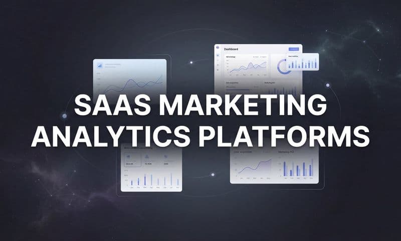
 How to Optimize Landing Pages That Actually Convert
This diagram might look simple, but it shows you everything you need to know. Your landing page is the moment of truth where your marketing budget either delivers a return or vanishes. Every single click from an ad, email, or social post leads right here, making it the final boss of your campaign’s effectiveness.
The Real Cost of Neglecting Optimization
An unoptimized page doesn't just fall flat; it actively burns through your budget.
Picture this: two businesses each drop $5,000 on ads to send 1,000 visitors to their page. One uses a generic, unfocused page that converts at 1%. The other has a finely tuned page that pulls in a 6% conversion rate.
The first company gets 10 leads. The second gets 60. That’s a 6x return on the exact same ad spend.
This is the power of what I call 'conversion momentum'—that invisible force that smoothly carries a user from curiosity to action. A great page builds it up, while a bad page slams on the brakes. With the average landing page conversion rate sitting at only 6.6%, most businesses are leaving a ton of money on the table.
Shifting From Task to Strategy
Optimizing landing pages isn't just another item on your marketing checklist. It’s a core strategy for maximizing your return on investment (ROI). A solid landing page experience directly shapes how people see your brand and whether they trust you enough to move forward.
Your landing page isn't just a digital brochure; it's your most dedicated salesperson, working 24/7 to turn prospects into customers. Treat its development with the same strategic importance.
To help you get started, here’s a quick breakdown of the core areas we'll be focusing on.
Core Pillars of Landing Page Optimization
Pillar | Key Focus | Impact on Conversions |
|---|---|---|
Design & UX | Creating a clean, intuitive, and mobile-friendly layout. | A frictionless experience reduces bounce rates and guides users toward the CTA. |
Copywriting | Crafting a compelling headline, clear value prop, and persuasive body copy. | Strong copy connects with user pain points and builds trust, making the offer irresistible. |
Forms | Designing short, simple, and easy-to-complete forms. | Reducing form friction is one of the fastest ways to increase lead submissions. |
Calls-to-Action | Using clear, benefit-driven, and visually prominent CTAs. | A powerful CTA tells users exactly what to do next and why they should do it. |
Testing | Continuously running A/B tests on headlines, copy, images, and layouts. | Data-driven testing eliminates guesswork and ensures consistent performance improvements. |
Each of these pillars works together to create a high-performing page that turns clicks into customers.
Ultimately, every single element on your page should serve one conversion goal. If you really want to dig into the mechanics of why this matters, check out these powerful Conversion Rate Optimization tips that deliver real results. By focusing on constant improvement, you’ll turn your static pages into dynamic conversion machines.
Writing Compelling Copy That Drives Action
 How to Optimize Landing Pages That Actually Convert
A great design might convince a visitor to stick around for a few seconds, but it's your words that get them to convert. Your copy is the engine of the landing page. It's what explains your value, builds trust, and ultimately persuades someone to take that final, crucial step.
Without the right message, even the most beautiful page is dead in the water. The goal isn't just to describe your offer; it's to make the visitor feel completely understood. Your copy needs to connect with their problems, their goals, and their gut feelings.
Crafting a Magnetic Headline and Subheading
Let's be real: your headline is the first—and often the only—thing people read. It has one job: grab their attention and make them curious enough to keep scrolling. A great headline is brutally clear, concise, and all about the benefit. It has to answer the visitor's unspoken question: "What's in it for me?"
For example, a generic headline like "Advanced Project Management Software" is a total snoozefest. It's forgettable.
A much stronger version? "Finish Projects on Time and Under Budget, Every Time." See the difference? That one speaks directly to a core pain point.
The subheading is your headline's trusted sidekick. It quickly expands on the headline's promise, adding a bit more context and reinforcing the main benefit.
- Headline: Stop Losing Leads in Your Funnel
- Subheading: Cometly’s attribution platform shows you exactly which ads are driving sales, so you can double down on what works and cut the waste.
This one-two punch works because it identifies a problem and immediately dangles a clear, desirable solution.
Building an Irresistible Value Proposition
Your value proposition is the heart of your message. It's a straightforward statement that explains the tangible results a customer gets from using your product. This is where you have to stop listing features and start selling outcomes.
So many companies get this wrong. They just list a bunch of features, hoping you'll connect the dots yourself.
Feature-focused (weak): Our software has real-time analytics, server-side tracking, and multi-touch attribution.
Benefit-focused (strong): Get crystal-clear data on every ad, campaign, and email. See your entire customer journey in one place and finally prove your marketing ROI.
To nail your value proposition, you need to answer a few key questions:
- What problem does my product really solve? Be specific. Don't just say "improves marketing"; say "eliminates wasted ad spend."
- What are the specific benefits of using it? Think in terms of outcomes like "increased revenue," "more qualified leads," or "saved time."
- Why should they choose us over the other guy? This is where you highlight what makes you unique. Is your solution easier to use? More accurate? Better integrated?
Answering these questions forces you to frame your offer in a way that truly resonates with what your audience actually wants.
Leveraging Social Proof and Trust Signals
No matter how persuasive you think your copy is, people will always trust their peers more. That's why social proof is a non-negotiable part of any high-converting landing page. It's a powerful shortcut to building credibility and calming the nerves of a potential customer.
Strategically weave these elements into your page to back up your claims:
- Direct Testimonials: Use quotes from happy customers that highlight specific, juicy results. Don't settle for "Great product!" Go for "We increased our ROAS by 3x in the first month using Cometly."
- Case Studies: Briefly summarize a customer success story. For a SaaS product, this could be a short paragraph detailing the challenge, solution, and the amazing outcome.
- Trust Badges & Logos: If you've worked with well-known companies, show off their logos. It's an instant credibility booster.
This proof needs to support the copy around it. If you're talking about pricing or ROI, stick a testimonial about saving money right next to it. That kind of contextual placement makes your claims feel much more believable.
Writing Calls to Action That Convert
Your Call to Action (CTA) is the grand finale. It's the final instruction, and it needs to be clear, compelling, and push for action. Generic CTAs like "Submit" or "Click Here" are absolute conversion killers because they're vague and offer zero value.
The best CTAs are benefit-driven and use strong action verbs. They set crystal-clear expectations for what happens next.
Weak CTAStrong CTAWhy It WorksSubmitGet Your Free Demo"Demo" sets a clear expectation and "Free" removes risk.DownloadSend My Free Guide"My" creates a sense of ownership for the user.Sign UpStart My 14-Day Free TrialSpecifies the trial length and reinforces it’s free.
For those looking to automate and refine their messaging even further, exploring how AI can help generate high-performing ad and landing page copy is a smart move. You can learn more about how to leverage AI for your ad copy to get faster results. The key is to make clicking the button feel like the obvious, logical next step in solving the visitor's problem.
Designing for Trust and a Frictionless Experience
Your landing page design is a lot like a great referee—you only notice it when it’s doing a bad job. The best designs are practically invisible. They effortlessly guide visitors toward your conversion goal without ever making them feel pushed or manipulated. This is how you create a frictionless experience that builds subconscious trust and makes it easy for them to say ‘yes’.
It all boils down to directing the user’s eye. A visitor should land on your page and instantly know where to look and what to do next. This isn’t magic; it’s just a smart strategy built on a solid visual hierarchy.
Using Visual Hierarchy to Guide Attention
Think of your landing page as a guided tour. As the guide, you decide which sights are the most important. Visual hierarchy is how you tell visitors, "Look here first, then look over here, and definitely click this button."
You can pull this off with a few simple design principles:
- Size: Your most important elements, like the main headline and the call-to-action button, should be bigger than everything else on the page.
- Color and Contrast: A bright, high-contrast CTA button practically screams to be clicked. It needs to pop against the page’s background and other elements.
- Whitespace: Don't cram your page full of text and images. Giving elements room to breathe makes the page feel less overwhelming and naturally draws attention to your key components, like the form.
Imagine a page where the CTA button is the same dull gray as the body text—it just gets lost. Now picture that same page with a vibrant orange button on a clean white background. Your eye is drawn to it instantly. That's effective hierarchy at work.
The Psychology of Design Elements
Every single design choice you make sends a message. Color, for example, has a huge psychological impact. Blue often conveys trust and security (think of all the banks and tech companies that use it), while green is associated with growth and success. The key is to pick a color palette that aligns with your brand and the action you want users to take.
Images and videos are just as critical. They can't just be decoration; they have to reinforce your core message. If you’re selling software that saves people time, show a visual of a relaxed, efficient team—not a generic stock photo of a laptop.
A professional, clean aesthetic does more than just look good—it’s an instant trust signal. An outdated or cluttered design can make visitors question your credibility before they’ve even read a single word of your copy.
A well-designed page feels professional and reassures visitors that they're in a safe place. This is a fundamental part of optimizing the entire customer journey for better results.
Building a Flawless Mobile-First Experience
Let’s get one thing straight: your landing page will be viewed on a mobile device. Designing for a desktop and just hoping it "works" on a phone is a recipe for failure. You have to adopt a mobile-first mindset from the very beginning.
This means designing for thumbs, not a mouse. Buttons need to be large and easy to tap. Forms should be simple, with fields that don't require endless pinching and zooming. And your text absolutely has to be large enough to be easily readable on a small screen.
Businesses that nail this see incredible results. In fact, companies with truly optimized landing pages can achieve conversion rates as high as 55%—a massive leap from the typical 2-5% many campaigns struggle with. This huge improvement is often directly tied to a superior mobile experience and lightning-fast loading speeds. You can discover more insights about ad conversion rates on Analytify.io.
Essential Trust Signals That Reassure Visitors
Beyond the overall look and feel, specific elements can instantly boost your credibility. Think of these trust signals as a final layer of reassurance, calming any last-minute anxieties a visitor might have before converting.
Make sure you include these on your page:
- Security Badges: If you process payments or handle sensitive data, display SSL certificates or security logos (like Norton or McAfee) prominently.
- Privacy Policy Link: A clearly visible link to your privacy policy shows you're transparent and respect user data. This is usually placed in the footer, often near the form.
- Contact Information: Providing a physical address, phone number, or email address makes your business feel real and accountable.
- Social Proof: As we've covered, logos of well-known clients, customer testimonials, and star ratings provide that crucial third-party validation that you deliver on your promises.
By combining a clean, mobile-first design with clear visual cues and undeniable trust signals, you create an environment where converting feels like the most natural thing in the world to do. You remove the friction and pave a smooth, clear path directly to your call to action.
Optimizing Your Forms and Calls to Action
 How to Optimize Landing Pages That Actually Convert
After all the work you’ve put into crafting killer copy and a beautiful design, it all comes down to this. The form and the call-to-action (CTA) button are the final gatekeepers standing between you and a new lead. This is where the conversion actually happens.
Get them right, and you’ll see a serious lift in performance. Get them wrong, and you’ll create a frustrating bottleneck that kills your momentum before it ever gets started.
The key is to make this last step feel helpful and effortless, not like a demanding interrogation. Every single element, from the number of fields in your form to the text on your CTA button, has to be designed to reduce friction and build confidence.
Rethinking the Landing Page Form
The age-old debate around forms is always about length. How many fields are too many? The truth is, there’s no magic number. It all depends on the value of your offer and where the user is in their journey.
Asking for a phone number and company size for a simple newsletter signup? That's overkill, and you'll see your signups tank. But requesting that same information for a high-value, personalized demo with a sales expert is perfectly reasonable. The goal is to create a fair value exchange: only ask for what you absolutely need for that specific conversion.
Don't let your form feel like an interrogation. Treat it as the start of a helpful conversation. Each field should have a clear purpose that serves both you and the user.
To make the process even smoother, you can borrow a few modern tricks:
- Multi-Step Forms: For longer forms, break them into smaller, digestible chunks. Asking for contact info on step one and company details on step two feels way less intimidating than one giant form.
- Inline Validation: Give people real-time feedback as they fill out the form. A little green checkmark next to a valid email is so much better than a big red error message after they’ve already hit "submit."
- Helpful Error Messages: Ditch the generic "Invalid field." Use clear messages like "Please enter a valid email address" to remove the guesswork and frustration.
By designing smarter, more intuitive forms, you can slash your abandonment rates. If you want to build truly engaging lead capture experiences, our guide on creating smart and interactive web forms has advanced strategies you can use right away.
Crafting a Call to Action That Demands a Click
Your CTA button is the trigger. It’s the final push that makes the conversion happen. It needs to be visually prominent, crystal clear, and compelling. While color and size are important for grabbing attention, the words you use—the microcopy—are what really drive the action.
Generic, low-value words like "Submit," "Download," or "Click Here" are conversion killers. They’re uninspired and do nothing to communicate the benefit to the user. A powerful CTA, on the other hand, reinforces your value proposition and sets clear expectations.
Here’s how to level up your CTA microcopy:
- Use Strong Action Verbs: Start with a verb that commands action, like Get, Start, Build, or Join.
- Reinforce the Benefit: Remind the user what's in it for them. Instead of just "Download," try "Get My Free Ebook."
- Create Urgency or Ownership: Phrases like "Start My Free Trial" or "Claim Your Spot" use personal pronouns and imply immediacy.
Let’s look at a real-world scenario. Imagine a SaaS company offering a free tool to help businesses plan their marketing budget.
Weak CTA | Strong CTA | Why It Works Better |
|---|---|---|
Submit | Get Your Free Growth Plan | "Submit" is passive and vague. "Get Your Free Growth Plan" is benefit-driven, action-oriented, and clearly states the valuable outcome. |
Download Now | Build My Marketing Budget | "Download Now" is generic. "Build My Marketing Budget" is specific, personal, and focuses on the job the user wants to accomplish. |
The difference is subtle but profound. A great CTA doesn't just ask for a click; it promises a solution, making it the obvious and logical final step. By perfecting these final elements, you ensure all the effort you've put into your landing page actually pays off.
Using Data to Continuously Improve Performance
Publishing your landing page isn’t the finish line; it’s the starting line. True optimization is an ongoing process fueled by data, not guesswork. It’s about systematically testing your assumptions to see what actually resonates with your audience and drives them to act.
This is how you stop wondering why people aren't converting and start making informed decisions that consistently lift your results.
At the heart of this process is A/B testing, sometimes called split testing. It’s a simple concept: you compare two versions of a page (Version A and Version B) to see which one performs better. By changing just one thing at a time—like the headline, the call-to-action button, or the main image—you can pinpoint exactly what’s influencing user behavior.
This image shows a basic visual of how A/B testing works, with traffic split evenly between two different page versions to find a winner.
 How to Optimize Landing Pages That Actually Convert
You send half your traffic to the original page and half to the new version. Then, you measure which one gets more conversions. Simple, right? But the magic is in the details.
Forming a Solid Hypothesis
Every great A/B test begins with a strong hypothesis. A hypothesis isn’t just a random guess; it’s an educated prediction based on what you already know about your audience and their behavior.
It should always follow a clear structure: "If I change [X], then [Y] will happen, because [Z]."
For example, a weak idea is, "Let's test a new headline." A much stronger hypothesis would be: "If we change the headline from feature-focused to benefit-focused, then form submissions will increase because visitors will better understand the immediate value."
This framework forces you to think critically about why you’re running the test in the first place, which leads to much more meaningful insights—whether you win or lose.
Choosing the Right Elements to Test
It’s tempting to start with small tweaks like changing a button color from blue to green. While those tests can make a difference, your biggest wins will almost always come from testing the high-impact elements that have a major influence on a visitor's decision-making process.
Think about testing these components first:
- Your Main Headline and Value Proposition: This is the first thing people see. Does framing your core benefit in a different way grab more attention?
- Your Call to Action (CTA): Test the button copy ("Get Your Free Demo" vs. "Start My Trial"), its color, and even its placement on the page.
- Hero Image or Video: Does a video of your product in action outperform a static image? Does a picture of a real person build more trust than a generic graphic?
- Form Length and Fields: Will removing one or two non-essential fields significantly reduce the number of people who abandon your form?
Here's a quick look at some ideas you can start with.
A/B Testing Ideas for Your Landing Page
Element to Test | Why It Matters | Metric to Watch |
|---|---|---|
Headline | It's the first impression. A clear, benefit-driven headline can dramatically increase engagement. | Bounce Rate, Time on Page, Conversions |
Call to Action (CTA) | The text, color, and placement of your CTA directly impact whether a user takes the desired action. | Click-Through Rate (CTR), Conversion Rate |
Hero Image / Video | Visuals set the tone and can explain your offer faster than text. The right visual can build immediate trust. | Engagement Rate, Conversion Rate |
Social Proof | Testimonials, case studies, or logos can reduce anxiety and build credibility with new visitors. | Scroll Depth, Conversion Rate |
Form Length | Every extra field adds friction. Shorter forms often lead to higher completion rates. | Form Abandonment Rate, Conversions |
Ultimately, what you test depends on your specific goals, but always start with the elements that have the biggest potential to move the needle.
The goal of A/B testing isn't just to find a "winner." It's to learn more about your audience with every experiment. Even a failed test provides valuable data on what doesn't work.
Reaching Statistical Significance
One of the most common mistakes I see people make is ending a test too early. You might see one version pull ahead after a couple of days and be tempted to declare a winner. But without reaching statistical significance, that result could just be random chance.
Statistical significance is the probability that your result isn't a fluke. Most testing tools aim for a 95% confidence level, meaning you can be 95% sure that the outcome is repeatable. To get there, you need enough visitors and conversions for the data to be reliable. Always let your tests run until your platform tells you the results are significant.
Going Beyond A/B Testing with Qualitative Data
While A/B tests tell you what is happening, they don't always explain why. To get the full picture, you need to layer in qualitative data—the kind that reveals user behavior and friction points. Understanding these behaviors is a key part of turning raw numbers into actionable data for your marketing strategy.
Here are a few tools that provide invaluable context:
- Heatmaps: These create a visual map of where users click, tap, and scroll. A heatmap might show you that people are trying to click on a non-clickable element, which is a clear sign of a design flaw.
- Session Recordings: Watch anonymized recordings of real user sessions. You can see exactly where they get stuck, hesitate, or rage-click in frustration, giving you crystal-clear insights into user experience issues.
- Form Analytics: This tool shows you which specific form fields cause the most drop-offs. If 60% of users abandon your form on the "Phone Number" field, that's a signal to either make it optional or remove it entirely.
By combining the quantitative data from A/B tests with the qualitative insights from these user behavior tools, you can build a complete picture of your landing page's performance. This data-driven approach turns optimization from a guessing game into a repeatable process for growth.
Got Landing Page Questions? We’ve Got Answers.
Even the sharpest marketers run into questions when they're deep in an optimization project. It's totally normal. Getting these common hurdles sorted out can give you the clarity and confidence to push forward.
Let's dive into some of the most frequent questions I hear and give you some straight, actionable answers.
How Long Should My Landing Page Be?
There's no magic word count. The honest answer is always: "as long as it needs to be."
What really matters is the complexity of your offer and how much convincing someone needs before they'll take action.
Think about it this way: for a simple, low-risk ask like signing up for a newsletter, a short, punchy page is perfect. The value is clear, the commitment is tiny, and you don't need to write a novel to get the point across.
But if you're asking someone to schedule a demo for a pricey piece of software, you're going to need more runway. A longer page gives you the space to build a rock-solid case, tackle objections head-on, explain detailed features, and pile on the social proof.
Here's the core principle: your page must be long enough to dismantle a visitor's skepticism and build enough trust to get them to convert. Cut the fluff, but never cut the essential info that helps you make your case.
Does My Landing Page Need SEO?
This one's simple: it depends entirely on where you're getting your traffic.
If your landing page is built exclusively for paid ad campaigns—think Google Ads or Meta ads—then on-page SEO isn't a priority. Your traffic is coming from a direct link you paid for, not from someone Googling a keyword.
On the other hand, if you want that page to show up in organic search results and pull in free, steady traffic over time, then landing page SEO is absolutely critical. This means you'll need to focus on:
- Keyword Research: Pinpointing the exact search term your ideal customer is using.
- On-Page Optimization: Weaving that keyword into your page title, headings, and body copy in a natural way.
- User Experience Signals: Making sure your page loads lightning-fast and looks great on mobile.
You have to decide the page's job upfront. A dedicated PPC page can be a pure, unfiltered conversion machine. An organic page has to do double duty, balancing conversion goals with SEO best practices.
How Often Should I A/B Test My Page?
You should be testing as often as your traffic volume allows. The biggest roadblock for A/B testing is simply not having enough visitors to get a clear winner in a reasonable amount of time.
If you have a high-traffic page getting thousands of visitors a day, you could probably run a new test every single week. But for a lower-traffic page, a single test might need to run for a month or even longer to gather enough data to be confident in the results.
A good rule of thumb is to always be testing something. As soon as one test wraps up, have the next one ready to go. This builds a culture of continuous improvement, ensuring your page is always getting smarter based on real user behavior, not just your team's assumptions.
At the end of the day, optimizing landing pages is all about building and maintaining momentum. Get these fundamental questions answered for your specific situation, and you'll be in a much better position to make smart, data-backed decisions that drive real growth.
Ready to stop guessing which ads are actually driving sales? Cometly provides crystal-clear attribution, showing you the complete customer journey from first click to final conversion. See exactly how Cometly can boost your ROI.