You've just spent three hours pulling data from Google Ads, Meta, LinkedIn, and your analytics platform. Your spreadsheet has 47 tabs. The numbers look different depending on which platform you check. And when you finally present to stakeholders, the first question is: "So... should we increase the budget or not?"
This scenario plays out in marketing teams everywhere. The problem isn't a lack of data—it's that raw numbers without context create confusion instead of clarity.
The right PPC reporting template transforms this chaos into strategic advantage. It's not just about organizing metrics into neat columns. It's about answering three critical questions every stakeholder needs addressed: What happened in our campaigns? Why did those results occur? What should we do next?
Effective PPC reporting bridges the gap between advertising activity and business outcomes. When your CFO asks about marketing ROI, when your CEO questions channel effectiveness, when your team debates budget allocation—your reporting template should provide immediate, confident answers.
The challenge is that different situations demand different reporting approaches. An executive reviewing quarterly performance needs vastly different information than a campaign manager optimizing daily ad spend. A creative team analyzing ad performance requires different insights than a finance team tracking budget pacing.
This guide walks through seven specialized PPC reporting templates, each designed for specific strategic needs. From high-level executive summaries to granular creative analysis, you'll discover frameworks that turn disconnected platform data into cohesive narratives that drive smarter marketing decisions.
1. The Executive Summary Dashboard Template
The Challenge It Solves
Executives and senior stakeholders don't have time to wade through hundreds of rows of campaign data. They need to understand business impact in under two minutes. When your CEO asks "How's our advertising performing?" mid-hallway, you need a single-page answer that connects ad spend directly to revenue and growth metrics.
Most PPC reports fail at this level because they lead with platform-specific jargon—impressions, CTR, quality scores—rather than business outcomes. Executives care about customer acquisition costs, return on ad spend, and whether marketing is contributing to company goals.
The Strategy Explained
The Executive Summary Dashboard condenses your entire PPC performance into six key visual blocks that tell a complete story without requiring any advertising expertise to interpret. Think of it as translating complex advertising data into the language of business outcomes.
Start with a prominent metric card section displaying your core campaign performance metrics: Total Ad Spend, Total Revenue Generated, Overall ROAS, and Cost Per Acquisition. These four numbers immediately answer the fundamental question every executive asks: is our advertising profitable and efficient?
Next, add a simple month-over-month or quarter-over-quarter comparison showing percentage changes. A single green arrow displaying "+23% revenue" or a red arrow indicating "+15% CPA" provides instant context about performance trends. This comparison element eliminates the need for stakeholders to remember previous numbers or ask follow-up questions about trajectory.
Include one clean visualization, typically a dual-axis chart showing ad spend and revenue over time. This visual instantly reveals whether increased spending correlates with revenue growth or if efficiency is declining. When stakeholders can see the relationship between investment and returns at a glance, budget conversations become significantly more productive.
Finish with a brief "Key Insights" section limited to three bullet points maximum. Each insight should connect a metric to a business implication rather than reporting platform statistics in isolation. For example, stating that LinkedIn campaigns drove 40% higher customer lifetime value than other channels communicates strategic value, whereas simply noting that LinkedIn CTR increased by 2.3% leaves executives wondering what that actually means for the business.
Implementation Steps
1. Create a single-page layout with clear visual hierarchy—most important metrics in the top left where eyes naturally land first.
2. Design metric cards with large numbers and minimal text—the number should be readable from six feet away.
3. Add conditional formatting that automatically highlights metrics outside acceptable ranges (red for concerning trends, green for positive movement).
4. Include a "Last Updated" timestamp and reporting period prominently at the top so stakeholders know data freshness.
5. Create a consistent template structure you use every reporting period—familiarity helps executives spot changes faster.
Pro Tips
Always lead with revenue metrics rather than vanity metrics like impressions or reach. Frame everything in business language: "customer acquisition" instead of "conversions," "revenue per dollar spent" instead of "ROAS." Test your dashboard by showing it to someone outside marketing—if they can't understand it in 60 seconds, simplify further.
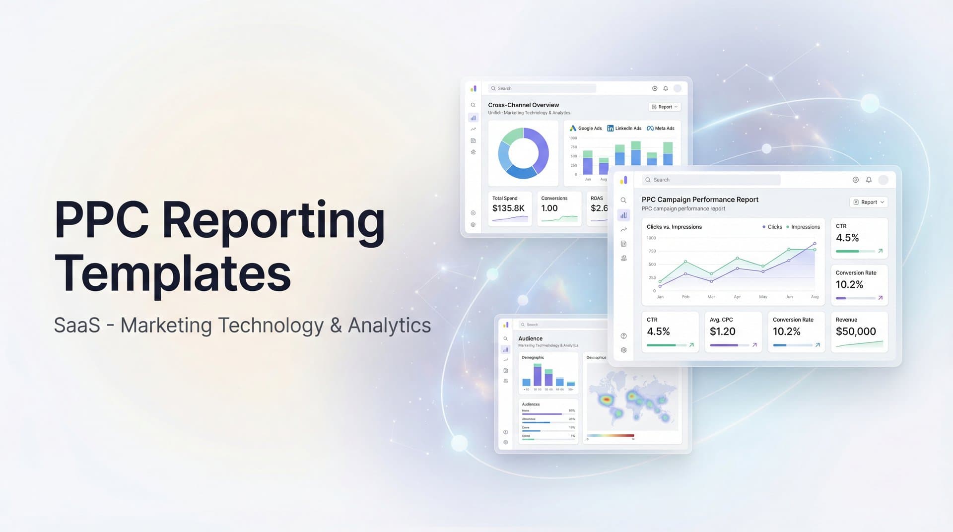
2. The Cross-Platform Performance Comparison Template
The Challenge It Solves
Running campaigns across Google Ads, Meta, LinkedIn, TikTok, and other platforms creates a fragmented performance picture. Each platform uses different terminology, tracks metrics differently, and presents data in its own format. Google calls them "conversions" while Meta calls them "purchases." LinkedIn measures "leads" while TikTok focuses on "complete registrations."
This inconsistency makes it nearly impossible to answer fundamental questions: Which platform delivers the best return? Where should we allocate additional budget? Which channel drives the highest quality customers?
The Strategy Explained
The Cross-Platform Performance Comparison Template establishes a standardized framework that normalizes metrics across all advertising channels, making true apples-to-apples comparisons possible for the first time.
Build your template with a consistent column structure featuring these standardized metrics: Platform Name, Total Spend, Impressions, Clicks, Click-Through Rate, Cost Per Click, Conversions, Cost Per Conversion, Revenue Generated, and Return on Ad Spend. This approach ensures every platform gets evaluated using identical criteria, eliminating the guesswork that often plagues multi-channel analysis.
The most critical element is defining what counts as a "conversion" consistently across all platforms. If you're tracking purchases, verify that every platform reports actual completed purchases, not just add-to-cart actions or link clicks. Achieving this level of accuracy often requires implementing conversion tracking custom configurations rather than relying on each platform's default settings, which can vary significantly in what they measure.
Enhance your template with calculated fields that reveal efficiency differences between channels. Revenue Per Click exposes which platforms attract higher-intent traffic that's more likely to convert. Conversion Rate identifies which channels demonstrate the strongest audience alignment with your offer. Cost Per Acquisition expressed as a percentage of customer lifetime value uncovers long-term profitability by channel, helping you understand true value beyond surface-level metrics.
Rather than declaring a single "winner," include a ranking system that scores each performance marketing platform across multiple dimensions: volume, efficiency, and quality. This nuanced approach to attribution and measurement reveals strategic insights that single-metric comparisons miss. For example, a platform might rank first in volume but third in efficiency, clarifying its role as a top-of-funnel awareness driver rather than a direct response channel.
Implementation Steps
1. Map each platform's native metrics to your standardized metric definitions—document what counts as a conversion on each platform.
2. Create a master spreadsheet or dashboard with one row per platform and standardized columns that remain consistent across all reporting periods.
3. Pull data from each platform's reporting API or export function, then transform it to match your standard format before populating the template.
4. Add conditional formatting to highlight best and worst performers in each metric category—use color coding to make patterns immediately visible.
5. Include a notes column for context about platform-specific factors affecting performance (seasonal promotions, creative tests, audience expansion).
Pro Tips
Don't just compare platforms in isolation—analyze how they work together. Often, LinkedIn drives initial awareness that leads to Google search conversions. Use your cross-platform template to identify these patterns by tracking conversion paths. Consider creating separate comparison tables for different campaign objectives—lead generation campaigns shouldn't be judged by the same criteria as direct response sales campaigns.
3. The Campaign-Level Deep Dive Template
The Challenge It Solves
Account-level summaries hide critical performance variations between individual campaigns. Your overall ROAS might look healthy at 4:1, but that average masks the reality that three campaigns are crushing it at 8:1 while five others are losing money at 1.5:1.
Without campaign-level visibility, you can't identify which specific strategies are working, which audiences respond best, or where to cut budget versus scale investment. You end up making decisions based on averages that don't represent any actual campaign's performance.
The Strategy Explained
The Campaign-Level Deep Dive Template breaks down performance by individual campaign, revealing the specific strategies, audiences, and approaches driving your best and worst results.
Structure your template with campaigns grouped by objective—separate sections for brand awareness campaigns, lead generation campaigns, and direct sales campaigns. Each objective requires different success metrics. Brand campaigns should be evaluated on reach and engagement efficiency, while sales campaigns must demonstrate clear revenue return.
For each campaign, track: Campaign Name, Objective, Daily Budget, Total Spend, Primary Metric (varies by objective), Cost Per Result, and a performance rating (exceeding target, meeting target, below target, or needs immediate attention).
Add a "Days Active" column to avoid unfairly judging campaigns that just launched against mature campaigns with months of optimization. Include "Last Optimization Date" to identify campaigns that might be stale and need fresh creative or audience adjustments.
Create a separate insights section that identifies patterns across high-performing campaigns. If your three best campaigns all target similar audiences or use video creative, that's actionable intelligence for future campaign development.
Implementation Steps
1. Export campaign-level data from each advertising platform with all relevant performance metrics for your reporting period.
2. Create separate worksheet tabs or dashboard sections for each campaign objective category—this prevents comparing campaigns with fundamentally different goals.
3. Calculate performance against target for each campaign—if your target lead cost is $50 and a campaign delivers at $35, mark it as exceeding target by 30%.
4. Sort campaigns within each objective category by performance score, putting your best and worst performers at the top for immediate visibility.
5. Add action recommendations for underperforming campaigns—specific next steps like "test new creative," "expand audience," or "reduce budget by 50%."
Pro Tips
Don't just focus on underperformers—your top campaigns deserve equal attention. Analyze what makes them successful so you can replicate those elements. Look for campaigns that perform well on one metric but poorly on another (high clicks but low conversions might indicate messaging mismatch). Consider creating a "campaign health score" that combines multiple metrics into a single 1-10 rating for easier prioritization.
4. The Creative Performance Analysis Template
The Challenge It Solves
You're running 30 different ad variations across your campaigns. Some feature product images, others show customer testimonials. Some use short copy, others tell detailed stories. Results vary wildly, but without systematic analysis, you can't identify which creative elements actually drive performance.
Most marketers look at individual ad performance in isolation—"Ad #47 has a 2.3% CTR"—without understanding whether it's the headline, the image, the call-to-action, or the audience targeting that makes it work. This makes it nearly impossible to create consistently effective creative.
The Strategy Explained
The Creative Performance Analysis Template systematically categorizes your ads by creative elements, revealing which specific components correlate with strong performance across your entire creative library.
Start by creating a master inventory of all active ads with standardized tagging for creative elements. Tag each ad across multiple dimensions: Image Type (product shot, lifestyle, testimonial, illustration), Video Length (if applicable), Headline Approach (benefit-focused, question-based, urgency-driven), Primary Color Scheme, Call-to-Action Type, and Copy Length (short, medium, long).
Build a performance table that shows average metrics for each creative element category. For example, show that testimonial-based ads average 3.8% CTR while product-only shots average 2.1% CTR. Calculate that benefit-focused headlines drive 34% lower cost per conversion than question-based headlines.
Include a creative lifecycle analysis showing how ad performance changes over time. Many ads start strong but experience creative fatigue after 14-21 days of exposure to the same audience. Tracking this pattern helps you plan creative refresh schedules.
Add a top performers showcase highlighting your 5-10 best ads with annotations explaining what makes them effective. Include the actual creative or a link to view it, along with performance metrics and notes about audience and placement context.
Implementation Steps
1. Create a standardized creative tagging system with 5-8 key dimensions you'll track consistently across all ads.
2. Build a creative inventory spreadsheet listing every active ad with its tags, performance metrics, and launch date.
3. Use pivot tables or dashboard filters to calculate average performance by each creative element category—this reveals which elements correlate with success.
4. Track performance trends over time by comparing week 1, week 2, week 3, and week 4+ performance for each ad to identify creative fatigue patterns.
5. Create a creative brief template for your design team based on your performance insights—specify proven elements to include in future ads.
Pro Tips
Remember that correlation isn't causation—testimonial ads might perform better because you're showing them to warmer audiences, not because testimonials are inherently superior. Test creative elements systematically by changing one variable at a time. Build a creative performance database over time so you can reference past learnings when planning new campaigns. Share this analysis with your creative team regularly—designers and copywriters need data-driven feedback to improve.
5. The Audience Segment Breakdown Template
The Challenge It Solves
Not all customers are created equal. Your campaigns might be reaching thousands of people, but without audience segmentation, you can't tell whether you're attracting high-value customers or bargain hunters who'll never buy again.
Platform-level reporting shows aggregate performance across all audiences, hiding critical differences between segments. Your retargeting audiences might convert at 8% while cold prospecting converts at 0.5%. Your enterprise audience might have 3x higher lifetime value than small business customers. Without this visibility, you're flying blind on audience strategy.
The Strategy Explained
The Audience Segment Breakdown Template maps your entire advertising funnel by audience type, revealing which segments drive the most valuable customer relationships from first impression through revenue generation.
Organize your template around the customer journey stages: Top of Funnel (cold audiences, lookalikes, broad interest targeting), Middle of Funnel (engaged audiences, content consumers, email subscribers), and Bottom of Funnel (retargeting, cart abandoners, past customers).
For each audience segment, track full-funnel metrics: Impressions and Reach (awareness), Click-Through Rate and Engagement Rate (interest), Conversion Rate and Cost Per Conversion (action), Average Order Value and Customer Lifetime Value (value), and Return on Ad Spend (overall efficiency).
The most valuable insight comes from comparing efficiency at different funnel stages. Cold audiences should be evaluated primarily on cost-per-click and engagement quality, not immediate conversion rates. Bottom-funnel retargeting should be judged on conversion rate and revenue generation. Using the same success criteria across all segments leads to poor strategic decisions.
Include a customer quality analysis that goes beyond conversion rates. Track metrics like repeat purchase rate, average order value, and 90-day customer lifetime value by acquisition audience. This reveals which audiences attract customers worth investing more to acquire.
Implementation Steps
1. Create a comprehensive audience inventory listing every targeting segment you're currently running across all platforms.
2. Categorize each audience by funnel stage and audience type—use consistent naming conventions so you can aggregate similar audiences.
3. Pull performance data for each audience segment, ensuring you're tracking metrics appropriate to that funnel stage.
4. Connect advertising data to your CRM or analytics platform to track post-conversion metrics like customer lifetime value by acquisition audience.
5. Calculate a "customer quality score" for each audience that combines conversion efficiency with long-term customer value metrics.
Pro Tips
Pay special attention to audience overlap—if someone sees ads from both your cold prospecting campaign and your retargeting campaign, which one gets credit for the conversion? Understanding overlap helps you avoid double-counting and reveals true incremental impact. Consider creating custom audiences based on engagement quality rather than just website visits—someone who watched 75% of your video is more valuable than someone who bounced after 5 seconds. Test expanding your best-performing audiences gradually while monitoring whether performance holds at scale.
6. The Budget Pacing and Forecast Template
The Challenge It Solves
It's the 23rd of the month and you suddenly realize you've spent 95% of your monthly budget with a week still remaining. Or worse, you're at 60% spend with only three days left and your boss is asking why you're not hitting targets.
Budget pacing problems create cascading issues. Overspending early means pausing campaigns mid-month, losing momentum and wasting the optimization learning your campaigns built up. Underspending means missed opportunities and difficult conversations about why marketing didn't deploy allocated resources effectively.
The Strategy Explained
The Budget Pacing and Forecast Template provides daily visibility into spend velocity, immediately flagging when you're tracking ahead or behind target so you can make proactive adjustments rather than reactive crisis management.
Build your template around a daily tracking structure that shows: Total Monthly Budget, Days Elapsed in Month, Days Remaining, Actual Spend to Date, Target Spend to Date (based on even daily pacing), Variance from Target (dollars and percentage), Current Daily Average Spend, and Projected Month-End Spend (based on current pace).
Add visual indicators that immediately show pacing status. A simple stoplight system works well—green when you're within 5% of target pacing, yellow when you're 5-15% off pace, red when variance exceeds 15%. This allows you to spot problems at a glance without analyzing numbers.
Include a forecast model that projects month-end performance based on current trends. If you're spending $800 daily and have 12 days remaining, your projected month-end spend is current spend plus $9,600. Compare this projection to your budget to see if adjustments are needed.
Create a separate section tracking performance metrics alongside spend—knowing you're on pace for budget doesn't matter if your cost per acquisition is 40% above target. Include projected end-of-month metrics like total conversions, average CPA, and estimated revenue based on current performance trends.
Implementation Steps
1. Set up a daily data pull from your advertising platforms that automatically updates your pacing template each morning.
2. Calculate your target daily spend by dividing monthly budget by number of days in the month—this becomes your baseline for comparison.
3. Build formulas that automatically calculate variance from target and project month-end spend based on current daily average.
4. Add conditional formatting that highlights concerning variances in red and favorable performance in green for quick visual scanning.
5. Create a simple action plan tied to variance thresholds—if you're 10% over pace, increase bids by X% or pause lowest-performing campaigns.
Pro Tips
Don't just track total account spend—break down pacing by campaign or channel so you can identify which specific areas are over or under pacing. Consider that even daily pacing isn't always optimal—weekends might naturally spend less than weekdays for B2B campaigns. Adjust your target pacing to account for these patterns. Build in a small buffer (5-10% of budget) for end-of-month optimization opportunities rather than planning to spend exactly 100% of budget.
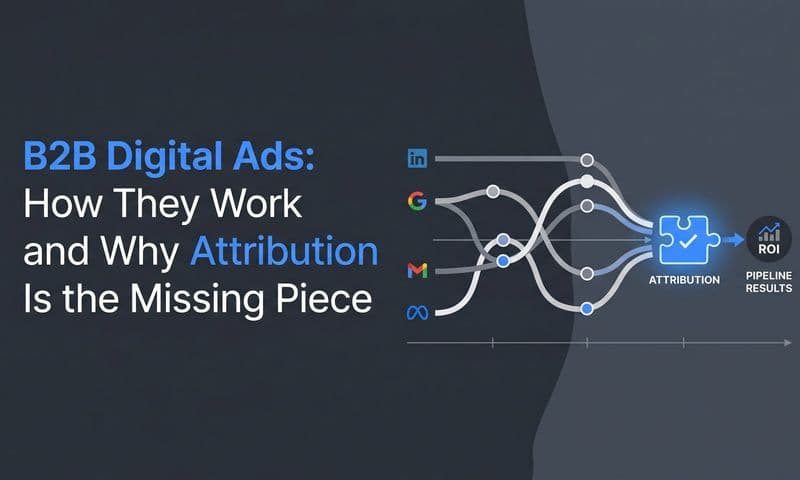
7. The Attribution and Customer Journey Template
The Challenge It Solves
Your Google Ads dashboard shows 100 conversions. Your Meta Ads Manager shows 85 conversions. Your analytics platform reports 120 conversions. Which number is right? More importantly, which marketing touchpoints actually deserve credit for driving those conversions?
Single-touch attribution models give all credit to either the first or last touchpoint, ignoring the reality that most customers interact with multiple ads across several platforms before converting. This leads to systematic undervaluation of awareness and consideration-stage marketing, and overvaluation of last-click channels like branded search.
The Strategy Explained
The Attribution and Customer Journey Template maps the complete path customers take from first awareness through conversion, distributing credit across all meaningful touchpoints to reveal the true contribution of each marketing channel.
Start with a conversion path analysis that shows common sequences customers follow. You might discover that 40% of customers first see a Facebook ad, then click a Google search ad, then return via email before converting. Another 25% might see LinkedIn ads, visit directly, then convert through a retargeting ad. Understanding these patterns reveals how channels work together rather than in isolation.
Create an attribution comparison table showing how different models allocate credit. Display the same conversion data under multiple models: Last Click (all credit to final touchpoint), First Click (all credit to initial touchpoint), Linear (equal credit to all touchpoints), Time Decay (more credit to recent touchpoints), and Position-Based (extra credit to first and last touchpoints, remaining credit distributed to middle touches).
Include a touchpoint value analysis that calculates the average number of touchpoints before conversion, the typical time from first touch to conversion, and which channels most frequently appear in converting paths versus non-converting paths.
Add a channel synergy matrix showing which channel combinations drive the highest conversion rates and customer values. This reveals strategic partnerships—for example, customers who interact with both content marketing and paid search might convert at 3x the rate of those who only see paid search.
Implementation Steps
1. Implement cross-platform tracking that can follow individual users across multiple touchpoints—this typically requires a unified tracking system beyond native platform pixels.
2. Create a customer journey database that logs every advertising touchpoint for each user along with timestamps and channel information.
3. Build path analysis reports that identify the most common sequences of touchpoints leading to conversions.
4. Calculate conversion credit under multiple attribution models so you can compare how different approaches change your understanding of channel value.
5. Generate a recommended attribution model based on your actual customer journey patterns—if most conversions happen within 24 hours of first touch, time decay makes sense; if journeys span weeks, position-based might be better.
Pro Tips
Remember that attribution models are frameworks for understanding value, not absolute truth. No model perfectly captures reality, but comparing multiple models reveals insights single-model reporting misses. Pay attention to assisted conversions—channels that rarely get last-click credit but frequently appear earlier in converting paths are probably more valuable than last-click data suggests. Consider that different products or customer segments might have fundamentally different journey patterns requiring different attribution approaches.
Putting It All Together
The most sophisticated reporting template in the world is worthless if your team doesn't use it consistently. The key is matching template complexity to actual reporting needs rather than building elaborate systems that gather dust.
Start with foundations. Every marketing team needs the Executive Summary Dashboard for stakeholder communication and the Cross-Platform Performance Comparison for basic channel management. These two templates alone will transform your reporting from scattered platform exports to coherent performance narratives.
Add specialized templates as your reporting matures. Once you're comfortable with platform comparison, layer in the Campaign-Level Deep Dive to identify optimization opportunities. When creative becomes a bottleneck, implement the Creative Performance Analysis. As your audience strategy grows more sophisticated, add the Audience Segment Breakdown.
Think about reporting cadence strategically. Weekly reports need the Budget Pacing and Forecast Template to catch problems before they become crises. Monthly reports benefit from the Executive Summary and Cross-Platform Comparison to show progress against goals. Quarterly reviews are the right time for Campaign Deep Dives, Creative Analysis, and Attribution reviews that inform strategic planning.
The pattern that separates effective reporting from data dumps is this: every template should answer specific questions that drive specific decisions. If a report doesn't lead to action, it's consuming time without creating value.
Here's the reality that makes all these templates exponentially more valuable: they're only as good as the data feeding them. When your tracking is fragmented, when platform-reported conversions don't match reality, when you can't connect ad clicks to actual revenue—even the most elegant template shows unreliable information.
This is where accurate attribution becomes the foundation of meaningful reporting. When you can track the complete customer journey across platforms, when you know which touchpoints actually drive revenue, when your data reflects reality rather than platform estimates—suddenly every template transforms from interesting analysis into strategic intelligence.
Ready to elevate your marketing game with precision and confidence? Discover how Cometly's AI-driven recommendations can transform your ad strategy—Get your free demo today and start capturing every touchpoint to maximize your conversions.