In digital marketing, traffic is just the beginning; conversion is where value is created. Many marketers focus on driving more visitors to their site, but the real leverage lies in improving the performance of the traffic you already have. This is the core of Conversion Rate Optimization (CRO), the systematic process of increasing the percentage of website visitors who take a desired action, be it a purchase, a signup, or a form submission.
This isn't about guesswork or following trends; it's a data-centric discipline that transforms user behavior insights into measurable revenue growth. To truly understand the power of these tips, it's essential to grasp the fundamental concept of Conversion Rate Optimization. Mastering this practice is non-negotiable for sustainable success, whether you're scaling a SaaS platform, running an e-commerce store, or managing client campaigns at an agency. A higher conversion rate means a lower customer acquisition cost and a greater return on every marketing dollar spent.
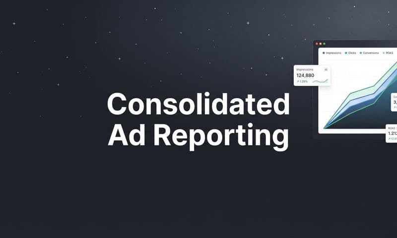
In this comprehensive guide, we'll break down proven conversion rate optimization tips that go beyond generic advice. We will provide actionable, hypothesis-driven strategies you can implement immediately. You'll learn how to refine everything from A/B testing and landing page UX to checkout forms and trust signals. We will also touch on leveraging powerful analytics with platforms like Cometly to ensure every optimization effort is backed by accurate, multi-touch attribution data. Get ready to turn your website into a high-performance conversion engine.
1. A/B Testing (Split Testing)
A/B testing, also known as split testing, is a foundational method in conversion rate optimization (CRO) that eliminates guesswork from the decision-making process. It works by creating two versions of a single element, the "A" version (control) and the "B" version (variation), and showing them to two similarly sized audience segments. By measuring which version drives more conversions, you gain statistical proof of what works best for your audience.
 10 Data-Driven Conversion Rate Optimization Tips for 2025
This data-driven approach allows marketers in SaaS, e-commerce, and agencies to make incremental improvements that compound into significant gains. For example, Netflix famously tests everything from button colors to personalized content thumbnails, while HubSpot’s classic red vs. green button test demonstrated that color choice can have a measurable impact on user actions.
How to Implement A/B Testing Effectively
To get reliable results, your testing process must be structured and methodical. Vague tests lead to ambiguous outcomes, undermining your CRO efforts.
- Test One Variable at a Time: To attribute a change in performance directly to your test, isolate a single element. Test a headline, a call-to-action (CTA) button, an image, or a form field, but not all at once.
- Ensure Statistical Significance: Use a sample size calculator to determine how many visitors you need for your results to be statistically significant, typically aiming for a 95% confidence level.
- Run for a Full Business Cycle: Let your test run for at least one to two full weeks to account for fluctuations in user behavior on different days. Ending a test prematurely can lead to false conclusions.
- Document Everything: Maintain a centralized log of all your tests, including the hypothesis, variant details, results, and key takeaways. This repository prevents you from repeating tests and helps build institutional knowledge.
Key Insight: A/B testing is not about finding a single "perfect" solution. It is about fostering a continuous cycle of hypothesizing, testing, and learning to steadily improve performance over time.
For marketers looking to maximize their ROI and test multiple ad variations simultaneously, adopting a more advanced methodology is crucial. You can learn more about implementing an accelerated testing strategy on cometly.com to get faster, more reliable insights from your campaigns.
2. Clear Value Proposition
A clear value proposition is the cornerstone of high-converting landing pages. It is a concise statement that immediately answers a visitor's most important question: "What's in it for me?" It clearly articulates the unique benefits of your product or service, explains the problem it solves, and distinguishes you from competitors. When positioned prominently, it helps visitors instantly understand if your offering aligns with their needs, reducing bounce rates and encouraging further exploration.
An effective value proposition cuts through the noise and connects with your audience's core motivations. For instance, Slack’s "Be less busy" focuses on a universal pain point, while Grammarly’s "AI-powered writing assistance" clearly states what it does and for whom. These statements are powerful conversion rate optimization tips because they build immediate relevance and trust with the user.
How to Craft a Compelling Value Proposition
A weak or confusing value proposition forces users to work too hard, causing them to leave. To create one that converts, you must prioritize clarity, relevance, and differentiation.
- Focus on Outcomes, Not Features: Customers buy solutions, not just tools. Instead of listing technical specifications, emphasize the tangible benefits and positive outcomes they will experience. For example, instead of "50GB of cloud storage," try "Never lose another important file again."
- Be Specific and Quantifiable: Whenever possible, use data to make your claims more believable and impactful. A value proposition like "Increase your sales by up to 25%" is far more compelling than a generic "Sell more."
- Ensure Prominent Placement: Your primary value proposition should be the first thing visitors see, typically in the hero section of your homepage or landing page. Use a strong visual hierarchy with a clear headline and sub-headline to grab attention.
- Test for Clarity: Show your value proposition to people from your target audience and ask them to explain what your company does. If they can’t articulate it simply and correctly, it needs refinement.
Key Insight: Your value proposition is not a slogan or a tagline. It's a strategic promise that sets clear expectations and provides a compelling reason for a visitor to choose you over anyone else. It's the most critical element for turning a visitor into a customer.
3. Optimized Landing Pages
A dedicated landing page is a standalone web page created specifically for a marketing or advertising campaign. Unlike your homepage, which has multiple goals and navigation paths, a landing page is designed with a single focus or goal, known as a call-to-action (CTA). This singular focus is one of the most effective conversion rate optimization tips because it eliminates distractions and guides visitors toward the exact action you want them to take.
 10 Data-Driven Conversion Rate Optimization Tips for 2025
This strategy is a cornerstone for companies like Unbounce and Leadpages, whose clients report significantly higher conversion rates by directing campaign traffic to focused pages. For example, a SaaS company running a PPC ad for a "Free Ebook" should send users to a page where the only action is to download that ebook, not to their general blog or homepage. This alignment between ad promise and page experience is critical for success.
How to Build High-Converting Landing Pages
An effective landing page is more than just a page with a form; it's a carefully crafted experience designed to persuade and convert. Mismatched messaging or poor design can cause visitors to bounce immediately.
- Match Ad Copy to Headline: The headline on your landing page should directly reflect the messaging in the ad that brought the visitor there. This creates a seamless user experience and confirms they are in the right place.
- Remove Main Navigation: Eliminate all site navigation and other distracting links. The goal is to keep the user focused on the offer and prevent them from clicking away before converting.
- One Primary CTA: Feature a single, clear call-to-action. Make the CTA button stand out with a contrasting color and compelling, action-oriented text like "Get Your Free Demo" instead of "Submit."
- Leverage Social Proof: Include customer testimonials, case study results, or logos of well-known clients to build trust and credibility with new visitors.
- Optimize for Speed: A slow-loading page is a major conversion killer. Aim for a load time under three seconds, as even a one-second delay can cause a significant drop in conversions.
Key Insight: The power of a landing page comes from its simplicity and focus. By removing all non-essential elements, you create the most direct path from a visitor's click to a desired conversion.
For a deeper dive into improving your landing page and overall user journey, you can explore some easy ways to improve your conversion rate. Discover more actionable tips at Cometly’s guide to boosting conversions.
4. Simplify Forms and Reduce Friction
Forms are the final gateways to conversion, yet they are often major friction points that cause users to abandon the process. Simplifying forms by removing unnecessary fields, clarifying instructions, and minimizing the cognitive load required to complete them is a high-impact conversion rate optimization tip. Every field you ask a user to fill represents a small cost in time and effort, and these costs add up quickly, leading to significant drop-off rates.
This principle is about making the data submission process as seamless and effortless as possible. By reducing the number of required fields, you lower the barrier to entry, making it more likely that users will complete the desired action. For example, Conversion Rate Experts famously demonstrated that a shorter form could outperform a longer one by a massive margin, while Unbounce saw a 120% increase in conversions by reducing their form from 10 fields to just three.
How to Implement Form Simplification Effectively
A streamlined form feels less like an interrogation and more like a simple, logical step. The goal is to collect only the essential information needed to move the user to the next stage of the funnel.
- Remove All Non-Essential Fields: Conduct a field audit and ask yourself, "Is this information absolutely necessary right now?" Eliminate every optional field and any required field that doesn't serve an immediate purpose.
- Use Progressive Profiling: Instead of asking for everything upfront, collect data over time. A lead generation form might only ask for an email, while subsequent interactions can gather more details like company name or role.
- Implement Smart Defaults and Autofill: Make the process easier by pre-filling known information and enabling browser autofill capabilities. Use mobile-friendly inputs like numerical keyboards for phone numbers or date pickers for scheduling.
- Optimize Layout and Design: Use a single-column layout, clearly label each field, and provide inline validation to give users instant feedback. Ensure the CTA button is prominent and clearly states the value of submitting the form.
Key Insight: Treat every form field as a potential point of failure. The less you ask of your users, the more likely they are to give you what you truly need: the conversion.
To take this a step further, consider moving beyond static fields. You can learn more about building high-converting, dynamic experiences by implementing smart, interactive web forms on cometly.com to engage users more effectively.
5. Compelling Call-to-Action (CTA) Buttons
A call-to-action (CTA) button is arguably the most critical element on any landing page or ad, serving as the gateway to conversion. It’s the final instruction you give to your visitor, and its effectiveness hinges on a powerful combination of design, copy, and placement. A well-crafted CTA removes friction and motivates users to take the desired action, directly impacting click-through rates and overall conversion performance.
 10 Data-Driven Conversion Rate Optimization Tips for 2025
This is a core principle in conversion rate optimization tips because even minor tweaks can yield major results. For instance, Netflix's "Join Free for a Month" is far more compelling than a generic "Sign Up" because it clearly communicates value and eliminates risk. Similarly, extensive testing by pioneers like Conversion Rate Experts has shown that changing button copy from passive to active can lift conversions by over 50%.
How to Implement Compelling CTA Buttons
To transform your CTA from a simple button into a powerful conversion tool, you must be deliberate and user-centric in your approach. Psychology, clarity, and visual appeal all play a vital role.
- Use Action-Oriented and First-Person Copy: Instead of "Submit," try an action verb that completes the sentence "I want to..." For example, use "Get My Free Trial" or "Claim My Discount." This first-person perspective creates a sense of ownership and personal relevance for the user.
- Create Visual Contrast: Your CTA should stand out from the rest of the page. Use a bold, contrasting color that draws the eye but still aligns with your brand palette. Make the button large enough to be easily tappable on all devices without overwhelming the design.
- Communicate Clear Value: The button copy should explicitly state what the user gets by clicking. Ambiguous CTAs like "Click Here" or "Continue" are less effective than specific, benefit-driven ones like "Download Your Free Ebook" or "Start Your 14-Day Trial."
- Test Placement and Directional Cues: Position your CTA in a logical spot where the user’s gaze naturally falls after reading your value proposition, such as above the fold or at the end of a compelling section. Consider using subtle visual cues like arrows to guide attention directly to the button.
Key Insight: A great CTA isn’t just a button; it's the culmination of your value proposition. It should answer the user's question, "What's in it for me?" with compelling clarity and make the next step feel irresistible.
6. Social Proof and Testimonials
Social proof is a psychological principle where people assume the actions of others reflect correct behavior in a given situation. In CRO, this means leveraging testimonials, reviews, and user counts to build trust and reduce purchase anxiety. When a potential customer sees that others have already purchased from you and had a positive experience, it validates their decision-making process and makes them feel more confident converting.
This powerful conversion rate optimization tip works because it taps into our natural tendency to trust peers over brands. For SaaS and e-commerce businesses, displaying evidence of a happy customer base can be the deciding factor for hesitant visitors. For example, Amazon’s star ratings and customer reviews are central to its user experience, while B2B sites like G2 and Capterra build their entire business model on verified user feedback.
How to Implement Social Proof Effectively
Simply adding a random testimonial is not enough; your social proof must be authentic, specific, and strategically placed to have a real impact.
- Be Specific and Authentic: Vague praise like "Great product!" is less effective than a detailed testimonial that highlights a specific problem and how your solution fixed it. Always use real names and photos (with permission) to boost credibility.
- Use Quantitative Data: Incorporate hard numbers whenever possible. A case study showing a customer "increased revenue by 40%" is far more compelling than one that says they "saw great results."
- Place Strategically: Position social proof near key decision-making points, such as next to a call-to-action button, on a pricing page, or within the checkout process.
- Diversify Your Proof: Use a mix of formats, including written testimonials, star ratings, case studies, video interviews, and logos of well-known clients. This appeals to different visitor preferences and strengthens your overall credibility.
Key Insight: The most powerful social proof directly addresses a prospect's primary pain points or objections. Collect testimonials by asking customers how your product solved a specific challenge they were facing before they signed up.
7. Mobile Optimization and Responsive Design
With mobile devices now accounting for over half of all web traffic, a seamless mobile experience is no longer optional; it's a critical component of any successful conversion strategy. Mobile optimization goes beyond simple responsive design, which just adapts a desktop site to a smaller screen. It requires a mobile-first mindset that addresses the unique context, needs, and friction points of users on the go.
This data-driven approach is essential for any business, as mobile users often have shorter attention spans and less patience for slow-loading pages or complex navigation. For instance, Shopify has invested heavily in optimizing its mobile checkout process, recognizing that a significant portion of e-commerce conversions happen on smartphones. Similarly, Google’s mobile-first indexing policy directly ties your mobile site’s performance to your search engine ranking, making it a non-negotiable priority.
How to Implement Mobile Optimization Effectively
To capture and convert mobile traffic, you must design for the user’s specific environment. Simply shrinking desktop elements is a common mistake that leads to high bounce rates and lost revenue.
- Prioritize Speed Above All Else: Mobile users expect pages to load almost instantly. Compress images, minimize code, and leverage browser caching to reduce load times. Consider implementing Accelerated Mobile Pages (AMP) for content-heavy landing pages.
- Simplify Navigation and Forms: Design a thumb-friendly interface with large tap targets for buttons and links. Reduce the number of form fields to the absolute minimum and use mobile-friendly input types (like number pads for phone numbers).
- Test on Actual Devices: Browser emulators are useful, but they don't replicate real-world conditions like varying network speeds or different device processing powers. Test your site on a range of popular iOS and Android devices to identify true performance issues.
- Design for the Mobile Context: Leverage mobile-specific features like one-tap checkout with Apple Pay or Google Pay, click-to-call buttons, and geolocation to create a more convenient experience. For a deeper dive into ensuring your site performs flawlessly on all devices, consider this comprehensive mobile website optimization guide.
Key Insight: True mobile optimization isn't just about making your site look good on a small screen. It's about fundamentally rethinking the user journey to remove friction and cater to the specific behaviors and expectations of a mobile audience.
8. Page Speed Optimization
Page speed is no longer a technical nicety; it is a fundamental conversion factor that directly impacts your bottom line. Slow-loading pages frustrate users, increase bounce rates, and harm search engine rankings. Studies consistently show that even a one-second delay can cause a significant drop in conversions, as modern consumers expect near-instantaneous digital experiences, especially on mobile devices.
This focus on performance is why companies like Amazon calculated that a one-second slowdown could cost them $1.6 billion in sales annually. Optimizing your site's speed provides a better user experience, which in turn leads to higher engagement, better brand perception, and ultimately, more revenue. It's a critical element in any comprehensive conversion rate optimization strategy.
How to Implement Page Speed Optimization
Improving your website’s performance involves a systematic approach to identifying and eliminating bottlenecks. Start by analyzing your site with tools like Google PageSpeed Insights or GTmetrix to get a baseline score and specific recommendations.
- Optimize Images: Compress and resize images without sacrificing quality. They are often the largest files on a page. Use modern formats like WebP and implement lazy loading for images that appear below the fold.
- Enable Caching and Compression: Use browser caching so repeat visitors can load your site faster. Enable GZIP compression on your server to reduce the size of your CSS, HTML, and JavaScript files.
- Minimize Code and Scripts: Reduce the number of HTTP requests your site makes by minifying CSS, JavaScript, and HTML. Remove any unnecessary third-party scripts or plugins that slow down loading.
- Use a Content Delivery Network (CDN): A CDN stores copies of your site in multiple geographic locations, serving content from the nearest server to the user, which dramatically reduces latency for a global audience.
- Monitor Core Web Vitals: Keep a close eye on Google's Core Web Vitals (LCP, FID, CLS) as they are direct measures of user experience and impact both SEO and conversion rates.
Key Insight: Page speed is a user experience issue first and a technical issue second. Every millisecond you shave off your load time reduces friction in the customer journey and makes a conversion more likely.
Continuously improving performance requires ongoing vigilance. You can explore how top marketers use a landing page monitoring system from cometly.com to track speed and other critical metrics that affect conversions.
9. Scarcity and Urgency Elements
Scarcity and urgency are powerful psychological triggers that compel users to act now rather than later. By signaling that an opportunity is limited in time or quantity, you tap into the fear of missing out (FOMO) and reduce decision-making friction. When used ethically, these tactics can dramatically boost conversion rates by creating a compelling reason for immediate commitment.
This data-driven principle is a cornerstone of conversion rate optimization tips for a reason: it works. E-commerce giant Booking.com famously uses scarcity with messages like, "Only 2 rooms left at this price!" while Shopify stores leverage countdown timers for flash sales. These elements create a sense of value and exclusivity, motivating potential customers to complete their purchase before the opportunity disappears.
How to Implement Scarcity and Urgency Effectively
To avoid appearing manipulative or creating a negative user experience, these tactics must be implemented with authenticity and precision. The goal is to provide a helpful nudge, not to pressure or deceive your audience.
- Use Authentic Scarcity: Base your claims on real-world limitations. If you say "only 5 left in stock," it must be true. False scarcity erodes trust and can damage your brand's reputation in the long run.
- Implement Countdown Timers Strategically: Use timers for genuine limited-time offers, such as flash sales, early-bird pricing, or next-day shipping cutoffs. Ensure the timer is visible but not intrusive, and make the deadline clear.
- Combine with Social Proof: Amplify the effect by pairing urgency with social proof. Displaying "20 people have this in their cart" alongside "Low in stock" creates a powerful combination of high demand and limited availability.
- Be Transparent and Clear: Clearly state the terms of the offer. If a discount ends at midnight, specify the time zone. Transparency prevents customer frustration and builds confidence in your offer.
Key Insight: Scarcity and urgency are most effective when they highlight the genuine value of acting quickly. They should answer the user's question, "Why should I buy this now?" by presenting a clear and credible benefit that will soon be unavailable.
10. Personalization and Segmentation
Personalization and segmentation move beyond a one-size-fits-all approach by tailoring the user experience to individual visitor characteristics and behaviors. Segmentation divides your audience into distinct groups based on shared traits, while personalization uses that data to deliver relevant content, offers, and interactions. This strategy dramatically boosts engagement and conversions by making users feel understood.
This method is a core driver of success for industry giants. Amazon generates a significant portion of its revenue from its recommendation engine, while Netflix’s personalized content suggestions keep users engaged and subscribed. By showing the right message to the right person at the right time, you create a more efficient and satisfying customer journey, making it a powerful tool in your conversion rate optimization tips arsenal.
How to Implement Personalization and Segmentation Effectively
Effective implementation requires a clear strategy built on reliable data. Start small and expand your efforts as you gather more insights into what resonates with different audience segments.
- Start with Basic Segmentation: Begin by grouping users based on readily available data like traffic source, geographic location, device type, or new vs. returning visitors. Even this simple level of targeting can yield significant improvements.
- Leverage Behavioral Data: Track user actions such as pages visited, products viewed, time on site, and items added to a cart. Use this information to trigger dynamic content, personalized offers, or targeted pop-ups.
- Implement Dynamic Content: Test variations of headlines, calls-to-action (CTAs), and hero images that change based on the user segment. For example, show a different value proposition to a visitor from a paid ad campaign versus one from organic search.
- Create Buyer Journey Personalization: Map content and offers to different stages of the funnel. A first-time visitor might see an introductory offer, while a repeat customer could be shown loyalty rewards or complementary products.
Key Insight: The goal of personalization is not just to show different content, but to create a more relevant and seamless experience that guides each user segment toward conversion with less friction.
Building a robust personalization strategy relies heavily on collecting and activating visitor data. You can develop a more powerful approach by exploring how to build a first-party data strategy on cometly.com to fuel your segmentation and targeting efforts.
10 CRO Tips Comparison
Strategy | Implementation Complexity | Resources / Tech | Expected Outcomes | Ideal Use Cases | Key Advantages |
|---|---|---|---|---|---|
A/B Testing (Split Testing) | Medium, requires experimental setup and analysis | A/B platform, analytics, sufficient traffic, analyst time | Statistically validated lifts, typical 2–30 percent, results in weeks | Landing pages, CTA or copy changes, pricing experiments | Removes guesswork, measurable, repeatable improvements |
Clear Value Proposition | Medium to High, needs research and messaging skill | Customer research, copywriter, stakeholder alignment | Improves relevance, 10–25 percent potential conversion gain | Homepages, hero sections, new product launches | Reduces visitor friction, attracts qualified traffic |
Optimized Landing Pages | Low to Medium, standard design and dev work | Landing page builder or dev, targeted copy, tracking | 30–100 percent higher conversions vs homepage | Paid campaigns, lead gen, webinars, product offers | Focused user journey, easy to test and iterate |
Simplify Forms and Reduce Friction | Low, minor UX and dev changes | Frontend dev, form validation, optional backend for profiling | 20–50 percent higher completion depending on baseline | Signups, lead capture, checkout flows | Higher completion rates, improved UX and mobile friendliness |
Compelling CTA Buttons | Low, quick copy and design iterations | Design, copy testing tool, small frontend changes | 20–90 percent CTR or conversion improvements possible | CTAs across pages, trial or signup, checkout | Low cost, fast impact, easy to A/B test |
Social Proof and Testimonials | Low to Medium, content collection and placement | Customer quotes, review widgets, compliance review | 20–50 percent uplift when credible and relevant | New visitors, high trust purchases, B2B SaaS pages | Builds credibility and reduces perceived risk |
Mobile Optimization and Responsive Design | Medium to High, design and extensive testing | Responsive design work, QA across devices, performance tuning | 30–100 percent lift from mobile users, SEO and UX gains | Sites with majority mobile traffic, e-commerce, apps | Essential for mobile users, improves retention and SEO |
Page Speed Optimization | Medium, technical work and infra changes | Dev or infra expertise, CDN, performance tools | 7–70 percent conversion impact depending on current speed | High traffic sites, e-commerce, mobile heavy pages | Direct revenue and SEO impact, reduces bounce rates |
Scarcity and Urgency Elements | Low, simple to implement but must be honest | Minor dev, inventory or deadline logic, design | 5–50 percent immediate uplift if authentic | E-commerce flash sales, events, limited offers | Drives immediate action, easy short term boost |
Personalization and Segmentation | Medium to High, data and orchestration required | CDP or marketing automation, analytics, consent management | 10–50 percent uplift depending on sophistication | Product recommendations, targeted campaigns, VIP flows | Increases relevance and AOV, better ROI on marketing spend |
Putting Your Optimization Plan into Action
You have now explored a comprehensive suite of conversion rate optimization tips, each designed to systematically enhance your marketing performance. From the foundational principles of hypothesis-driven A/B testing and crafting a clear value proposition to the tactical execution of simplifying forms and deploying compelling social proof, this guide provides a robust framework. We've covered the critical need for mobile-first design, the non-negotiable impact of page speed, and the psychological power of scarcity and personalization.
However, knowledge without action is just potential. The true challenge, and the greatest opportunity, lies in transforming these individual tips into a cohesive, ongoing optimization strategy. The difference between companies that see incremental improvements and those that achieve exponential growth is not just in what they test, but in how they measure, learn, and iterate. This is where the process becomes a powerful, self-sustaining growth engine rather than a series of disconnected experiments.
From Disconnected Tactics to a Unified Strategy
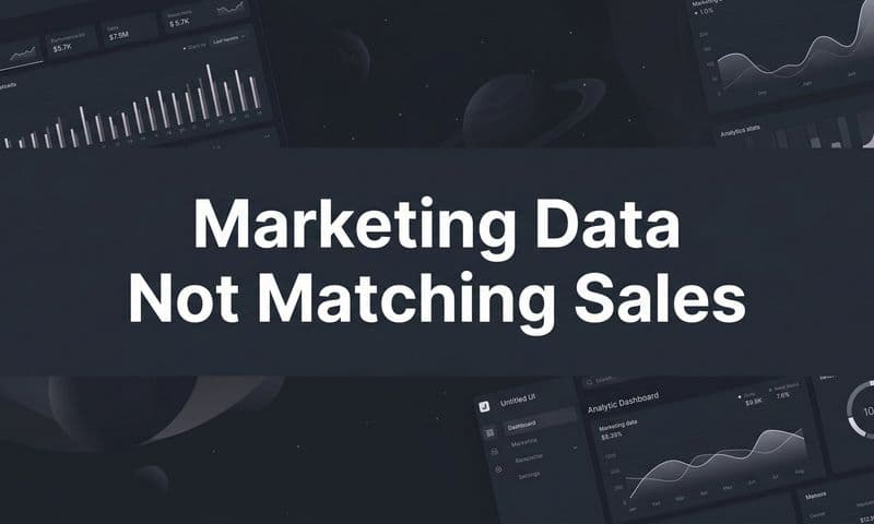
The core theme connecting all of these conversion rate optimization tips is the necessity of a data-driven mindset. You cannot optimize what you cannot accurately measure. Simply looking at last-click attribution in your ad platforms gives you a dangerously incomplete picture, leading you to potentially cut winning campaigns or scale losing ones.
Consider the interplay between the strategies discussed:
- Ad-to-Landing Page Alignment: How do you know if your personalized landing page for a specific ad segment is truly driving higher-quality leads or just more clicks? You need to track the user journey from the initial ad impression all the way through to the final sale.
- Funnel and Checkout Optimization: A change to your checkout form might decrease initial form submissions but lead to a higher overall order value from more qualified buyers. Without a system that connects every touchpoint, you might mistakenly label this test a failure.
- Multi-Channel Impact: Your top-of-funnel content on social media might not get the final click, but it plays a crucial role in introducing your brand. Accurate attribution ensures these vital introductory touchpoints get the credit they deserve, preventing you from mistakenly pausing effective awareness campaigns.
This is why the foundation of any successful CRO program isn't just the testing tool; it's the measurement and attribution platform. It’s the source of truth that validates your hypotheses, reveals the true customer journey, and provides the confidence needed to make bold, strategic decisions. Without it, you are essentially navigating without a compass, relying on gut feelings and siloed data points.
Your Actionable Roadmap to Higher Conversions
Embarking on a CRO journey can feel overwhelming, but progress is built on consistent, focused effort. Instead of trying to implement all ten tips at once, prioritize based on where you can make the most significant impact with the least amount of effort.
Start by creating a simple, structured plan:
- Establish Your Baseline: Use a reliable analytics platform to understand your current conversion rates across key funnels. Document everything so you have a clear starting point.
- Identify the Biggest Leaks: Where are you losing the most potential customers? Is it on a specific landing page, during the form submission process, or at the checkout stage? Focus your initial efforts here.
- Formulate a Hypothesis: Based on the data, create a clear hypothesis. For example: "By replacing the generic 'Submit' CTA with 'Get My Free Demo,' we will increase form completions by 15% because it clarifies the immediate value."
- Test and Measure: Run your A/B test with a tool that provides accurate, real-time data on how the change impacts not just clicks, but actual revenue.
- Analyze and Iterate: Whether your hypothesis was proven right or wrong, you've learned something valuable. Document the results and use that insight to inform your next test.
This continuous loop of hypothesizing, testing, and learning is the heartbeat of effective conversion rate optimization. Each cycle makes your marketing smarter, more efficient, and more profitable. By adopting this iterative process, you move beyond random tweaks and begin building a scalable system for sustainable growth. The journey to mastering conversion rate optimization is a marathon, not a sprint, and it's paved with data.
Stop guessing which marketing efforts are driving real revenue. Cometly provides the clear, accurate, multi-touch attribution you need to validate your CRO tests and confidently scale what works. See the complete customer journey from first click to final sale and make data-driven decisions that grow your bottom line.