A data analytic dashboard is your business's command center. It’s a visual interface that pulls together all your key metrics in real time, transforming raw, messy data into charts and graphs you can actually understand. In short, it gives you a complete picture of your business's health at a glance.
Imagine trying to fly an airplane with hundreds of loose dials scattered all over the cockpit. You’d have no idea what your altitude, speed, or direction was. It would be total chaos.
That’s exactly what running a business feels like without a data analytic dashboard. You have data coming from everywhere—sales figures, marketing performance, website traffic, customer support tickets—but no unified way to see what it all means together.
A dashboard acts as your business cockpit. It takes all those critical dials and arranges them into one clear, visual, and interactive display. Instead of drowning in spreadsheets, you get an intuitive story told through visuals, turning confusing data into something you can make sense of in seconds.
The real point of a data analytic dashboard is to shift from just collecting data to actually making smart decisions with it. It instantly flags what’s working and what isn’t, letting you be proactive instead of constantly putting out fires.
This centralized view helps you spot emerging trends, catch potential issues before they become disasters, and jump on opportunities the moment they appear.
Here’s an example of what a clean, effective dashboard looks like inside Cometly, pulling together key advertising metrics into one simple view.
You can immediately see how campaigns are performing without having to dig through a dozen different reports. That’s the power of clarity.
Implementing a dashboard offers immediate, tangible advantages that ripple across the entire organization. It moves data from being a background asset to a central driver of strategy.
Here’s a quick summary of the business impact:
Ultimately, a dashboard fosters a data-driven culture where decisions are backed by evidence, not just intuition.
As businesses generate more data than ever, the demand for these tools is exploding. The global business analytics market hit roughly $96.6 billion in 2024 and is expected to nearly double to almost $196.5 billion by 2033. This surge is fueled by the simple need for tools that can make sense of all this digital noise. For more on this trend, you can explore the market growth insights on imarcgroup.com.
A well-designed dashboard doesn’t just throw numbers at you; it provides context. It helps answer critical questions for everyone on your team:
By turning raw information into a clear story, a dashboard makes sure everyone is working from the same version of the truth. This alignment is the first step in turning insights into powerful strategies. For a deeper look at making your data useful, check out our guide on creating actionable data.
At the end of the day, a dashboard’s value isn’t in the data it holds, but in the confident decisions it helps you make.
A truly powerful data dashboard is more than just a collection of pretty charts on a screen. Think of it less like a photo album and more like a car's dashboard; every gauge has a specific function, and they all have to work together perfectly to tell you how fast you're going, if you have enough fuel, and if the engine is healthy. When engineered correctly, these building blocks turn a passive report into an active, decision-making tool.
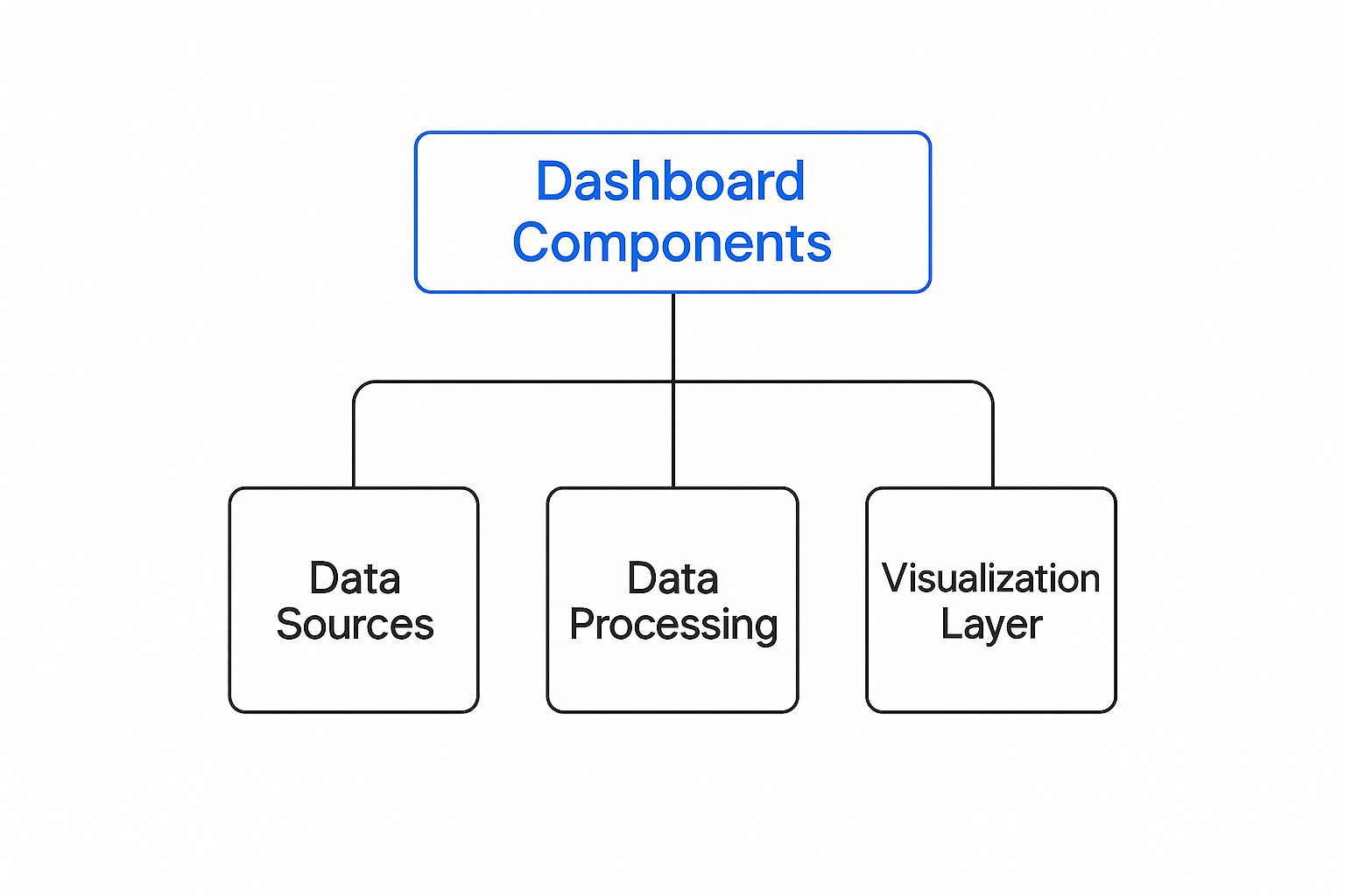
The entire structure relies on a few core elements working in harmony. You start with raw information at the base, which then gets processed and finally presented through a visualization layer that tells a clear, compelling story.
This infographic breaks down the fundamental architecture of an analytic dashboard.

This hierarchy shows how reliable data sources are the foundation. From there, processing and visualization layers build on top to create meaningful insights.
Before you even think about charts or colors, you have to define your Key Performance Indicators (KPIs). These are the vital signs of your business—the specific, measurable metrics telling you if you're on track to hit your goals. A dashboard without clear KPIs is like a GPS without a destination; it's active, but it isn’t going anywhere useful.
Your KPIs should be directly tied to your most important business goals. For an e-commerce store, this might be Customer Acquisition Cost (CAC) and Average Order Value (AOV). For a SaaS company, it could be Monthly Recurring Revenue (MRR) and Customer Churn Rate.
A common mistake is tracking way too many metrics. A great dashboard focuses on a handful of truly critical KPIs, pushing vanity metrics and secondary data to other reports. This focus ensures the most important information always commands attention.
Once you know what you want to measure, the next step is deciding how to display it. The whole point of data visualization is to make complex information instantly understandable. The type of chart you choose can either clarify your data’s story or completely confuse it.
Here’s a simple guide to matching the visualization to the insight:
The right chart turns a boring list of numbers into a clear, compelling narrative.
The accuracy of your entire dashboard hinges on the quality of its foundation: the data sources. For a dashboard to be trustworthy, it must pull from a single, unified source of truth. When data is fragmented across different platforms—one report from Google Analytics, another from your ad platform, and a third from your CRM—you end up with conflicting numbers and an incomplete picture.
This is why a central data warehouse or a robust integration platform is non-negotiable. It ensures every single metric on your dashboard is consistent and reliable. To learn more about bringing your information together, check out our guide to marketing data integration.
Finally, the best dashboards aren't static. They are interactive tools that invite curiosity and empower users to explore the data for themselves. You want people to ask questions and find their own answers.
Key interactive elements include:
This interactivity transforms users from passive viewers into active analysts, fostering a culture where anyone can dig into the data. It’s the final piece that makes a dashboard an indispensable part of daily operations.
The line between a data analytic dashboard that gets used every day and one that just gathers digital dust often comes down to one thing: design. An effective dashboard isn't just about showing data; it's about telling a story with it—one that's instantly understandable and leads to action. Good design turns a wall of numbers into a clear narrative, guiding your eye to what matters most.
This need for clarity is exactly why well-designed dashboards are in such high demand. The global real-time dashboard market was already worth around $12 billion in 2023 and is on track to hit $32 billion by 2032. This isn't just hype; it's driven by a real need for tools that help people make smart, data-backed decisions on the fly. You can find more details on the growth of the real-time dashboard market on dataintelo.com.
Adopting a "less is more" mindset is the first step. The goal is to avoid the classic trap of information overload, where a cluttered screen paralyzes the user instead of empowering them.
Before you even think about creating a chart, you have to answer two simple but critical questions: Who is this for, and what's its main job? A dashboard for a CEO who needs a high-level view of financial health will look completely different from one for a marketing manager digging into ad campaign performance.
Defining this focus early on prevents the dashboard from becoming a cluttered mess where nothing stands out. It ensures every single element on the screen has a specific, valuable purpose.
A single dashboard can't be everything to everyone. Trying to make it one is a surefire way to build something confusing and, ultimately, useless.
Once you know the purpose, you can start designing a visual hierarchy that naturally pulls the user’s attention to the most important information first. Think of it like a newspaper—headlines grab your attention, and subheadings guide you deeper. Your dashboard should do the same using size, color, and placement.
Put your most critical KPIs—the "headline" numbers—at the top left, which is where the eye naturally goes first. Supporting charts and more granular data should flow below or to the right, creating a logical path from a high-level summary to the nitty-gritty details.
A well-structured data analytic dashboard tells a story in layers. A user should be able to grasp the main takeaway in five seconds, understand the context in thirty seconds, and explore the underlying details in five minutes if they choose to.

Clarity comes from keeping things simple and consistent. A clean, organized layout reduces cognitive load, making it much easier for users to process information quickly and accurately. This is where a few practical design rules can make a massive difference.
Here are a few actionable tips to put into practice:
By focusing on these user-centric design principles, you can create a data analytic dashboard that’s not just informative but truly intuitive. To learn more, check out our guide on creating powerful data visualization dashboards.
Understanding the theory behind a great data analytic dashboard is one thing, but actually building one is where the magic happens. Let’s shift from concepts to practice and build your first marketing performance dashboard right inside Cometly.
This walkthrough will take you through it step-by-step. The goal is simple: create a command center that gives you a real-time, unified view of your marketing efforts, so you can optimize with total confidence.
The bedrock of any dashboard is clean, centralized data. One of the biggest headaches for marketers is trying to piece together reports from a dozen different places—Facebook Ads, Google Ads, TikTok, Shopify, you name it. Each platform has its own story to tell. Cometly brings all those stories together into a single source of truth.
Connecting your accounts is the first and most important step. Cometly’s one-click integrations make this dead simple, no coding or complex API work needed.
Once you’re connected, Cometly starts syncing everything automatically. Ad spend, clicks, sales revenue, customer data—it all flows into one place, eliminating frustrating discrepancies and giving your dashboard a solid foundation.
With all your data piped into Cometly, it’s time for the fun part: deciding what to track. Think of widgets as the gauges in your cockpit, with each one displaying a specific Key Performance Indicator (KPI). Cometly’s drag-and-drop interface makes adding and arranging these widgets feel intuitive and easy.
Start with the metrics that matter most to your business goals. For most, that means:
For each KPI, you’ll add a widget. You might use a "Single Value" widget to show your overall ROAS as a big, bold number you can’t miss. A "Line Chart" is perfect for tracking CPA over the last 30 days to spot trends, while a "Bar Chart" can give you a quick side-by-side comparison of different ad campaigns.
This screenshot from Cometly shows just how clean the interface is for building out a custom dashboard to track your most important metrics.

You can see how different data points, from ad spend to conversion value, are organized for quick, at-a-glance analysis.
How you organize your dashboard is just as critical as the data itself. A well-designed data analytic dashboard uses visual hierarchy to tell a story, guiding the viewer’s eye from the big picture down to the finer details.
A best practice is to place your most important, "north star" metrics at the top of the dashboard. This could be your overall ROAS or total revenue. This ensures that anyone viewing the dashboard can get the main takeaway in five seconds or less.
Use the drag-and-drop canvas to create a logical flow:
A static dashboard is a report. An interactive one is a tool. Cometly lets you add dynamic filters that empower you and your team to slice and dice the data to uncover deeper insights. This turns your dashboard into an exploratory powerhouse.
You can add global filters that apply to the entire dashboard. Some of the most useful ones include:
These filters allow anyone on your team to answer their own questions without needing to bug an analyst for a custom report. A marketing manager can instantly check how a new campaign is performing in its first week.
For a closer look at these capabilities, you can explore more of Cometly's analytics features.
By following these steps, you can turn a mess of disconnected data points into a cohesive, actionable dashboard that helps you make smarter marketing decisions, faster.

Once you’ve nailed the basics, your dashboard is ready to evolve. It can go from a simple reporting tool to a serious strategic weapon. This is where you stop just looking at what happened and start digging into why it happened—and what’s likely to happen next.
This is the stuff that separates the good dashboards from the truly great ones. It’s a huge shift, and the market reflects it. The global data analytics sector, valued at around $64.75 billion in 2025, is expected to explode to over $658 billion by 2034. That growth is all about software that enables this kind of deep, real-time analysis. You can check out the full data analytics market research on precedenceresearch.com to see the trend for yourself.
Moving from standard reporting to advanced analytics is how you truly become a data-driven organization.
Think of predictive analytics as giving your dashboard a crystal ball. It uses historical data to build models that can forecast future trends, so you can stop reacting to the past and start preparing for what’s coming. This flips your entire strategy from reactive to proactive.
Imagine a dashboard that doesn't just show you last month's sales figures. Instead, it projects next quarter’s revenue based on your current ad spend, seasonal patterns, and market trends. That kind of foresight helps you put your resources in the right place, manage inventory better, and set goals you can actually hit.
A dashboard equipped with predictive analytics transforms from a rear-view mirror into a forward-looking GPS. It doesn't just tell you where you've been; it helps you navigate the road ahead with confidence.
With these models in place, you can finally answer the big questions, like "Which of our customers are most likely to churn next month?" or "What kind of return should we expect from our holiday ad campaigns?" To see how this works in a marketing context, take a look at our guide on predictive analytics in marketing.
Not all data is created equal. Some numbers are just noise, while others are signals you can’t afford to miss. Anomaly detection sets up your dashboard to automatically flag any unusual spikes or dips in performance that fall outside the norm. It’s like an early-warning system for your business.
It could catch a sudden drop in your website's conversion rate, alerting you to a broken payment gateway. Or it might spot an unexpected surge in traffic from a new referral source, revealing a piece of content that just went viral. Without automated detection, these critical insights are way too easy to miss in the day-to-day flood of data.
This technique is a game-changer because it allows for:
A dashboard that is only focused on what happened in the past is useful, but one that can look ahead and spot irregularities is where the real power lies. Before we move on, let's compare these two approaches.
A look at standard reporting versus advanced analytical capabilities within a dashboard.
The takeaway is simple: while standard reporting tells you the score, advanced analytics helps you write the playbook for the next game.
Finally, some of the most powerful insights don't come from looking at your entire audience as one big blob. They come from slicing your data into smaller, meaningful groups. Cohort analysis and user segmentation let you track the behavior of specific customer groups over time.
A cohort is just a group of users who share a common trait, like signing up in the same month or making their first purchase during a holiday sale. By analyzing these groups separately, you can uncover long-term trends in customer loyalty and lifetime value.
For instance, you can answer questions like, "Do customers we acquired during our Black Friday sale stick around longer than the ones we got in January?" This level of detail turns your dashboard from a simple reporting interface into an indispensable tool for making strategic decisions, revealing the deep-seated patterns that truly drive your business forward.
A great data analytics dashboard is so much more than a reporting tool. Think of it as the catalyst for building a truly data-driven culture. We’ve walked through everything from the core concepts to flawless execution, seeing firsthand how a dashboard can turn raw numbers into a clear, compelling story. Its real purpose? To bring clarity, spark collaboration, and empower fast, confident decision-making across your entire organization.
The most important mental shift is to see your dashboard not as the end of the analysis process, but as the starting point for strategic conversations.
Every chart and metric on your dashboard should either inspire a question or validate a strategy. It’s the bridge between knowing what happened and deciding what to do next. Once you have your dashboard up and running, it becomes an essential tool for tracking your most important performance indicators and helping you effectively measure marketing ROI, turning abstract data into real-world insights. This is the continuous feedback loop that fuels sustainable growth and innovation.
Your dashboard isn't just a reflection of past performance. It's your command center for shaping the future, giving your team the power to act decisively and intelligently.
Transforming your data into your most valuable strategic asset is closer than you think. With a powerful platform like Cometly, you can start building the dashboards that don't just give you answers, but lead you to ask smarter, more impactful questions.
Even after getting a handle on data analytic dashboards, a few common questions always seem to come up. Let's clear up the lingering details so you can move forward with confidence.
It’s simple when you think about it this way: a report is a photograph, while a dashboard is a live video feed.
A report is a static snapshot of data from a specific period. It’s perfect for a deep dive into past performance, like a quarterly financial summary. You create it, you analyze it, and then it’s done—a record of what already happened.
A dashboard, on the other hand, is completely dynamic and interactive. It updates in near real-time to show you what’s happening right now. The whole point is to monitor ongoing performance at a glance, letting you spot trends as they emerge and react quickly.
The key distinction boils down to purpose. Reports are for periodic, in-depth analysis of the past. A data analytic dashboard is for continuous, real-time monitoring of the present.
There’s no magic number here. The right update frequency comes down to the speed of your business and the decisions you’re making.
Here’s a simple way to think about it:
The rule of thumb is to update your data at the same pace you make decisions with it. Anything else is just noise.
Building a great dashboard is as much about avoiding common traps as it is about adding cool features. Knowing the pitfalls from the start will save you a ton of headaches and ensure your dashboard is actually useful.
Here are the top mistakes people make:
Steer clear of these, and you’ll build a tool for clarity, not confusion.
Ready to build a dashboard that avoids these mistakes and delivers real-time clarity? See how Cometly makes it easy to connect your data and build powerful, intuitive dashboards in minutes. Explore Cometly's features today.