Trying to make sense of a spreadsheet full of raw numbers is like trying to find your way through a new city without a map. You know the information is in there somewhere, but it's impossible to see the bigger picture. This is where data visualization dashboards come in. They act as your map, transforming overwhelming datasets into clear, intuitive visuals that tell a story and guide your business decisions.
Dashboards give you a consolidated, at-a-glance view of your organization's health, making even the most complex information easy to digest.
Turning Raw Data Into Actionable Insights
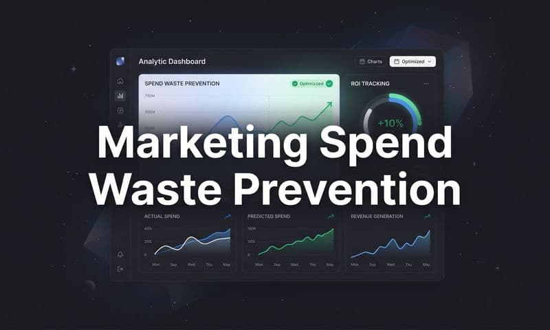
 Build Better Data Visualization Dashboards
Think about the dashboard in your car. It doesn’t bog you down with every single mechanical detail of the engine. Instead, it shows only the most critical information—your speed, fuel level, and engine status—so you can drive safely and get where you need to go. A business dashboard works on the exact same principle, filtering out all the noise to highlight the metrics that actually matter.
This shift from just collecting raw data to visual storytelling is what allows teams to make smarter, faster decisions. Instead of getting lost in endless rows and columns, anyone can instantly spot trends, identify opportunities, and solve problems before they spiral out of control. It’s about turning numbers into a narrative that everyone in the organization can understand and act on.
The Power of Visual Context
Dashboards are powerful because they work for everyone, from an executive tracking high-level KPIs to a marketing specialist digging into campaign performance. They create a common visual language that aligns teams and breaks down the silos that often pop up between departments. When everyone is looking at the same clear picture, collaboration becomes a lot more effective.
This visual approach is proven to speed up comprehension and lead to better decisions. In fact, around 64% of businesses say data visualization tools have significantly improved their decision-making, which is a big reason why so many are investing in them.
A great dashboard doesn't just show you data; it answers critical business questions. It tells you where you are, where you’ve been, and where you're headed.
From Information Overload to Clarity
The whole point of a dashboard is to make complex datasets digestible. Instead of spending hours pulling reports together manually, a well-designed dashboard automates the entire process. This frees up your team's time for what really matters: analysis and strategy.
This is the key to turning raw numbers into something genuinely useful. If you want to dig deeper into this, our guide on creating https://www.cometly.com/post/actionable-data offers practical strategies to make sure your metrics are actually driving results.
Ultimately, data visualization dashboards are the bridge connecting your data to your strategy. They give your organization the clarity it needs to navigate a complex market, empowering you to act with confidence and precision. This is how data stops being just a resource and becomes a real competitive advantage.
Why Effective Dashboards Drive Business Growth
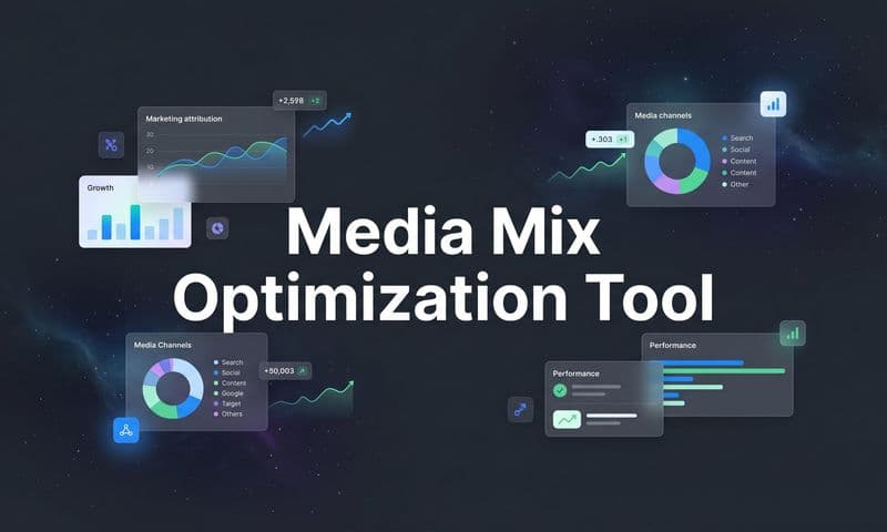
 Build Better Data Visualization Dashboards
Simply having data isn't enough. The real value comes from turning that data into decisive action, and that's where effective data visualization dashboards shine. They stop being just a reporting tool and become a powerful engine for business growth, connecting teams directly to the metrics that actually matter.
Think about a retail manager who spots a sudden dip in regional sales on a live dashboard. Instead of waiting for a weekly report, they can adjust inventory and launch a targeted promotion right now to fix the problem. That ability to react in real time is a massive competitive advantage.
This is exactly why the global real-time dashboard market, valued at $12 billion in 2023, is expected to explode to $32 billion by 2032. As businesses lean more heavily on instant insights, this growth makes one thing clear: dashboards are essential to modern strategy.
Fostering a Data-Literate Culture
One of the biggest impacts of a great dashboard is its ability to smash data silos. When critical information is locked away in different departmental spreadsheets, it leads to confusion and misalignment. Dashboards democratize data, creating a single source of truth everyone can see and understand.
This accessibility helps build a data-literate culture where every team member is empowered to make informed decisions. A customer support lead can spot a surge in tickets about a specific bug and instantly ping the product team, stopping a minor glitch from becoming a major meltdown.
Dashboards align the entire organization around measurable outcomes. They stop teams from operating in isolation and get everyone pulling in the same direction, guided by the same set of facts.
Enhancing Operational Efficiency
Manual data collection and report building are massive time sinks. Dashboards automate the whole process, freeing up hours your team can spend on analysis and strategy instead of just compiling numbers.
This efficiency boost translates directly into better performance and quicker reactions to market shifts. A few examples:
- Marketing Teams: Can watch campaign performance across every channel, moving budget from underperforming ads to top performers in minutes, not days.
- Operations Teams: Can track supply chain logistics in real time, identifying bottlenecks and rerouting shipments to avoid expensive delays.
- Sales Leaders: Can see their pipeline health at a glance, forecast revenue more accurately, and pinpoint which reps need coaching.
These operational improvements aren't just small wins; they compound over time to create a more agile and resilient organization. To make the most of this, it's crucial to select from the best marketing analytics tools for success that offer robust dashboarding features.
Ultimately, effective dashboards do more than just show you information. They provide clarity, drive alignment, and enable the proactive, data-driven decisions that are essential for sustained business growth.
Choosing the Right Dashboard for Your Goals
Not all data visualization dashboards are created equal. Choosing the right one is like picking the right tool for a specific job—you wouldn't use a microscope to gaze at the stars, and you wouldn't use a telescope to examine a single cell.
Each tool has a purpose. Matching the dashboard type to your business goal is absolutely essential for turning data into meaningful action.
Just as a mechanic has a toolbox full of different instruments for different tasks, your data strategy should include a variety of dashboards. Each one should be designed for a specific audience and objective. This ensures everyone, from the C-suite to the frontline teams, gets the exact insights they need without distracting noise.
The infographic below shows how different dashboard goals, like real-time monitoring and trend analysis, form a kind of business intelligence hierarchy.
 Build Better Data Visualization Dashboards
This visual hierarchy shows how an effective data strategy builds from foundational, real-time monitoring up to complex trend analysis and integration, with each layer serving a distinct purpose.
Strategic Dashboards for the Big Picture
Think of a strategic dashboard as a telescope pointed at the future. It’s designed for the C-suite and executive leadership, offering a high-level, panoramic view of the organization's health against its long-term goals.
These dashboards don't get bogged down in daily fluctuations. Instead, they focus on key performance indicators (KPIs) that track progress over months, quarters, and years.
Common metrics on a strategic dashboard include:
- Monthly Recurring Revenue (MRR): Tracks the predictable revenue stream, crucial for subscription-based businesses.
- Customer Lifetime Value (CLV): Measures the total revenue a business can expect from a single customer account.
- Market Share Growth: Shows the company's performance relative to its competitors over time.
This type of dashboard is all about providing a quick, easily digestible summary that informs major strategic decisions. It answers the big questions: Are we on track to meet our annual targets? Are we growing faster than the market?
Analytical Dashboards for Deep Dives
If strategic dashboards are telescopes, then analytical dashboards are powerful microscopes. Built for data analysts, business intelligence specialists, and marketing strategists, these tools are designed for exploration and discovery.
They are rich with data and packed with interactive features like filters, drill-downs, and segmentation capabilities.
The purpose of an analytical dashboard isn't just to display data but to empower users to ask complex questions and uncover the "why" behind the numbers. It’s a sandbox for data exploration.
An analyst might use this dashboard to investigate a sudden drop in customer retention by slicing data by region, customer segment, and product line to pinpoint the root cause. This is the workbench where deep insights are forged from raw information. A great example is a well-structured marketing analytics dashboard, which allows for in-depth analysis of campaign performance.
Operational Dashboards for Real-Time Action
Finally, an operational dashboard acts like a live news feed, delivering up-to-the-minute information to the teams on the ground who need it most. These dashboards are critical for monitoring day-to-day activities and ensuring everything is running smoothly.
The focus here is on immediate action and spotting problems as they happen.
Build Better Data Visualization Dashboards
Typical users include sales teams tracking daily quotas, customer support monitoring ticket queues, or warehouse managers watching inventory levels. The data has to be fresh, often updating every few minutes. By providing a real-time pulse on business activities, operational dashboards empower teams to be proactive, efficient, and responsive to immediate challenges.
Principles of High-Impact Dashboard Design
A great data visualization dashboard has as much to do with human psychology as it does with technology. It's not enough to just throw data on a screen; the goal is to present it in a way that feels intuitive, sparks insight, and drives someone to take action.
Without smart design, even the most powerful data becomes confusing noise. At best, it gets ignored. At worst, it leads people to the wrong conclusions.
The golden rule? Clarity over clutter. A high-impact dashboard guides your eye to the most important information, tells a clear story, and makes the key takeaways obvious in seconds. This isn’t about cramming every metric you can find onto a single screen. It's about curating the right data to answer specific questions for a specific audience.
Know Your Audience and Their Questions
Before you even think about picking a chart type or a color scheme, you have to answer one critical question: who is this for?
An executive needs a high-level, strategic view of KPIs like revenue growth and market share. A marketing manager, on the other hand, needs granular, real-time data on campaign performance and ad spend. Designing a dashboard without a clear audience in mind is like giving someone a map without knowing their destination—it might be accurate, but it’s not helpful.
Always start by defining the user and the primary questions they need the dashboard to answer.
- For Executives: Focus on trends and progress toward goals. Stick to simple visuals like scorecards and line charts showing performance over months or quarters.
- For Analysts: Build in interactivity. They need the ability to dig deeper with filters, drill-downs, and more complex charts that allow for data exploration.
- For Operations Teams: Prioritize real-time data. Use gauges, alerts, and simple status indicators to monitor what’s happening right now.
Choose the Right Visualization for the Job
Every type of chart tells a different story. Picking the wrong one is a surefire way to mislead your audience. A line chart is perfect for showing a trend over time, but it’s a terrible choice for comparing distinct categories.
A well-chosen chart clarifies data instantly. A poorly chosen one creates confusion and forces the user to work harder to understand the message.
Here’s a quick guide to matching the chart to your data’s story:
- Comparisons: Use bar charts or column charts to compare values across different categories, like sales performance by region.
- Trends Over Time: Use line charts or area charts to show how a metric changes over a continuous period, such as website traffic over a year.
- Part-to-Whole Relationships: Use pie charts or donut charts to show the composition of a whole, like the percentage of traffic from different marketing channels. Use these sparingly—they get hard to read with more than a few categories.
- Distribution: Use histograms to understand the frequency and distribution of a dataset, such as the spread of customer order values.
For a deeper look into this, our guide on data visualization for marketing provides more specific examples of how to apply these principles.
Create a Clean Layout to Avoid Overload
The human brain can only process so much information at once. A cluttered dashboard with too many colors, charts, and numbers creates cognitive overload, making it impossible to focus on what matters.
Effective design uses a clean layout and visual hierarchy to guide the user's attention. Place the most critical information—the high-level KPIs—in the top-left corner, since that's where most readers’ eyes go first. Group related metrics together and use plenty of white space to create visual separation between different sections. This creates a logical flow that tells a story instead of just throwing random facts at the user.
To help you stay on track, we've put together a quick reference table of essential do's and don'ts for effective dashboard design.
Dashboard Design Do's and Don'ts
Principle | Do (Best Practice) | Don't (Common Mistake) |
|---|---|---|
Clarity | Use clear, concise labels and titles for every chart and metric. | Using technical jargon or acronyms without an explanation. |
Color | Use a limited, consistent color palette. Use color strategically to highlight key data points or alerts. | Using too many bright, clashing colors (the "rainbow effect") that distract and have no meaning. |
Layout | Organize information in a logical grid with ample white space. Place the most important KPIs at the top. | Cramming as many visualizations as possible onto a single screen, creating a cluttered and overwhelming interface. |
Context | Provide context by including comparison periods (e.g., vs. last month) or targets. | Displaying numbers in isolation without giving the user a benchmark to gauge performance. |
Keeping these principles in mind will help ensure your dashboard isn't just a collection of charts, but a powerful tool for making smarter, faster decisions.
Dashboards in Action for Marketing Attribution
 Build Better Data Visualization Dashboards
Theory is one thing, but the real magic of a data visualization dashboard happens when it solves a messy, high-stakes business problem. For marketers, one of the biggest puzzles is attribution: figuring out which channels, campaigns, and ads actually deserve credit for a conversion.
Without a clear view, marketing spend feels like a gamble. You might be pouring money into a flashy social media campaign that looks good on paper, while a quiet, unassuming blog post is secretly doing the heavy lifting of turning leads into customers. An attribution dashboard cuts through that fog. It's like a truth serum for your marketing efforts.
It works by pulling in data from every customer touchpoint—social media clicks, PPC ads, email opens, organic search visits, you name it—and mapping out the entire customer journey in one place. This unified view is the first step to understanding how your channels work together to get results.
Visualizing Different Attribution Models
Once all your data is in one spot, the dashboard can bring different attribution models to life. Each model tells a slightly different story about your customer’s path to purchase, and seeing them side-by-side gives you a much richer understanding of your marketing ecosystem.
Imagine your dashboard has a simple dropdown menu to switch between models:
- First-Touch Attribution: This model gives 100% of the credit to the very first interaction a customer had with your brand. A dashboard would likely show a bar chart where channels like SEO and content marketing are the heroes, showing you what’s best at generating that initial spark of awareness.
- Last-Touch Attribution: The complete opposite, this model gives all the credit to the final touchpoint before someone converted. Your dashboard’s visuals would instantly shift, probably highlighting channels like PPC search ads or direct email promos that are great at closing the deal.
- Multi-Touch Attribution: This is where dashboards really flex their muscles. A multi-touch model, like a linear or U-shaped one, spreads the credit across multiple touchpoints. The dashboard could use something like a Sankey diagram to visually trace customer paths, showing how a user first found you through a blog post, later saw a retargeting ad, and finally converted after an email.
By visualizing these models, you stop asking "Which channel is best?" and start asking "Which channel is best at each stage of the journey?" That shift is everything for building a sophisticated marketing strategy.
From Insight to Optimized Spend
This newfound clarity leads directly to smarter, more confident budget decisions. A well-designed attribution dashboard doesn’t just show you data; it tells you what to do next.
Here’s a real-world example. A marketer looks at their dashboard and sees that their LinkedIn ads have a huge first-touch conversion value but a tiny last-touch value. At the same time, their Google Ads for branded keywords have a massive last-touch value but almost zero first-touch credit.
Without a dashboard, they might mistakenly slash the LinkedIn budget because it doesn’t look like it’s "closing." But the visualization makes it obvious: LinkedIn is filling the top of the funnel with great leads, and Google Ads are there to capture that demand later on. The right move isn’t to cut one for the other, but to fund both properly so they can do their specific jobs.
This level of analysis is crucial for connecting your marketing actions directly to sales. To dig deeper into this, our guide on closed-loop marketing explains exactly how to bridge that gap between your marketing data and actual revenue. By connecting every touchpoint, you can prove ROI with total clarity.
Ultimately, a marketing attribution dashboard turns a chaotic mess of data points into a clear strategic roadmap. It lets marketers stop guessing, optimize their spend with surgical precision, and confidently show the direct impact of their work on the bottom line. This is a perfect example of how data visualization dashboards turn information into a competitive advantage.
What's Next for Data Visualization Dashboards
Today’s data visualization dashboards are impressive, but their evolution is just getting started. We’re watching them transform from static reports of past events into intelligent, proactive partners in analysis. The future isn’t just about showing what happened; it’s about predicting what will happen next—and even recommending the smartest move.
This leap forward is being fueled by artificial intelligence (AI) and machine learning (ML). These technologies are embedding predictive analytics right into the dashboard experience. Imagine a dashboard that doesn't just chart your past sales but forecasts next quarter's revenue with stunning accuracy, automatically flagging potential shortfalls and pointing you toward the most promising growth opportunities.
The Rise of Conversational Analytics
Another huge shift is the move toward more natural, human-like ways of interacting with data. Thanks to Natural Language Processing (NLP), users will soon be able to just ask their dashboards questions in plain English. Instead of messing with complex filters, you could just type, "Show me our top-performing ad campaigns in the Southeast region last month," and get an instant, beautiful visualization.
This "conversational analytics" approach is tearing down the technical walls between people and their data. Suddenly, deep insights are available to everyone in the company, not just the trained analysts. It turns the dashboard from a rigid tool into a dynamic collaborator.
The next generation of dashboards won't wait for you to find insights. They'll bring the most critical insights directly to you, complete with context and recommendations for what to do about them.
This evolution is part of a much bigger trend. The global data visualization market is on track to grow at a compound annual growth rate of about 9.4% from 2025 to 2034. While North America is the current leader, the fastest growth is expected in the Asia Pacific region, driven by rising internet use and ML advancements. You can discover more insights about the global data visualization market and its future trends.
Real-Time Data and Mobile-First Design
Finally, the need for speed is completely reshaping how dashboards are built. As business moves faster, real-time data streams are becoming non-negotiable. Dashboards are increasingly plugging into live data sources to give you an up-to-the-second view of performance, enabling decisions to be made in the moment.
This demand for immediacy is also driving a push toward mobile-first design. Big decisions don't just happen at a desk anymore. The dashboards of tomorrow are being built to deliver a seamless, intuitive experience on any device, ensuring critical insights are always just a tap away. These trends are what will keep dashboards indispensable for navigating market changes and staying ahead of the competition.
Have Questions? Let's Clear a Few Things Up.
Even after you get the hang of data visualization dashboards, a few practical questions always seem to pop up. Let's tackle some of the most common ones I hear so you can feel confident building or using dashboards for your business.
What's the Real Difference Between a Dashboard and a Report?
The biggest difference boils down to purpose and timing. A report is typically a static, detailed snapshot of something that already happened, like a monthly sales summary. It’s designed for a deep-dive review and is almost always backward-looking.
A dashboard, on the other hand, is a living, breathing tool. It gives you a dynamic, at-a-glance view of your most important Key Performance Indicators (KPIs) in real-time. You build a dashboard for continuous monitoring and quick answers, letting you drill down into the data to see what’s happening right now.
Think of it this way: a report is like a photograph of a past event. A dashboard is the live video feed of what's happening in your business at this very moment.
Which Tools Are Best for Creating Dashboards?
The "best" tool really depends on what you need to do and how technical your team is. If you're dealing with complex data and need serious visualization power, the industry leaders are Tableau, Microsoft Power BI, and Google Looker Studio.
But you don't always need a cannon to kill a mosquito. For more focused use cases, other platforms are fantastic:
- Grafana is a favorite for monitoring technical systems and infrastructure.
- Klipfolio and Databox are incredibly user-friendly and great for building business dashboards quickly.
- Don't forget that many of your existing tools—like your CRM or marketing automation software—often have robust built-in dashboarding features perfectly tailored to their own data.
How Do I Choose the Right Metrics for My Dashboard?
This is the most critical question of all. Get this wrong, and the whole dashboard is useless.
Always, always start with your business goal. Ask yourself, "What decision is this dashboard supposed to help someone make?" Every single metric you choose should directly help answer that question.
Focus on actionable KPIs that track real progress, not vanity metrics that just look good on a slide. For example, instead of only tracking website traffic, you should be tracking the conversion rate of that traffic. One tells you you're busy; the other tells you you're effective.
Most importantly, talk to the people who will actually be using the dashboard. Involve them in picking the metrics. When you collaborate, you ensure the final product gives them exactly what they need to do their jobs better and make smarter, data-driven decisions.
Ready to stop guessing and start seeing exactly what drives your revenue? Cometly provides the ultimate marketing attribution dashboard, unifying all your data into one clear view. Track every touchpoint, optimize your ad spend with confidence, and prove your ROI. Get started with Cometly today and turn your data into your biggest competitive advantage.