Why Your Marketing Team Needs Data Visualization Now
Picture this: you walk into a high-stakes meeting, armed with spreadsheets packed with numbers. You know your latest campaign was a massive success, but as you present, you see eyes glazing over. The rows and columns of raw data, which represent hours of work and big wins, just aren't connecting. This scenario is exactly why data visualization for marketing is no longer a "nice-to-have" but an absolute must. It’s the bridge between complex information and confident, data-backed decisions.
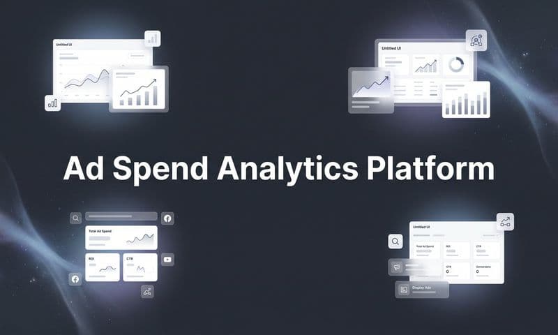
 Data Visualization for Marketing: Boost Your Campaign Success
From Numbers to Narratives
Traditional reports are like giving someone a box of furniture parts with a dense instruction manual. All the pieces are there, but the effort required to see the final product is huge. Data visualization, on the other hand, presents a fully assembled piece of furniture. It transforms numbers into a story the human brain is built to understand in an instant. This isn't just a figure of speech; it's based on how we think. Our brains process visuals 60,000 times faster than plain text.
This mental shortcut is a game-changer for marketers. When you show a color-coded map illustrating campaign engagement by region instead of a table of city names and click-through rates, your audience doesn't just see data; they see opportunity. They can immediately spot where to ramp up efforts and where to pull back, all without getting lost in the raw numbers. To learn more about the foundation of this process, you can explore our guide on data analytics for marketing. This change from passive reporting to active insight is key to staying nimble in marketing today.
The Power of Visual Persuasion
The effect of visuals goes beyond simple understanding; it drives action and shapes perception. Visuals are especially important in marketing because about 90% of the information our brain takes in is visual, making it a powerful channel for communication. This is why adding visuals like videos to marketing emails can lead to a 200–300% jump in click-through rates (CTR), showing just how effective visual content is at capturing attention. You can explore more findings on visual data's impact to see its wide-ranging uses. When you translate abstract metrics like ROI into clear charts, you’re not just reporting; you’re persuading.
This persuasive ability offers real advantages for your team:
- Securing Bigger Budgets: A clear, engaging visual story of a campaign's success is much more likely to convince executives to increase your funding than a dense spreadsheet.
- Gaining Executive Buy-In: Visualizations make it simple for leadership to understand the "so what" behind your data, building trust and agreement on strategic plans.
- Uncovering Hidden Opportunities: By plotting data visually, your team can notice trends, connections, and outliers that competitors, stuck in their spreadsheets, are likely to miss.
In short, bringing data visualization into your workflow is about giving your team the power to show its value more effectively, make smarter decisions faster, and ultimately, achieve better results for the business.
Navigating the Marketing Data Visualization Landscape
The world of marketing data visualization is bustling with a wide variety of tools and techniques. This boom is a direct result of marketing data becoming more complex. The global market for these tools was valued at around $9.22 billion in 2022 and is projected to grow substantially, showing just how urgently businesses need to make sense of their information. If you're curious about this trend, you can read more about modern data visualization trends. For marketing teams, this wealth of options can make it tough to tell the difference between what looks good and what actually works.
Actionable Insights vs. Professional Polish
The main challenge isn't just making pretty charts; it's about creating visuals that drive action. A common trap is to produce dashboards that look slick and professional but offer no clear next steps.
Imagine the difference between a beautiful, high-resolution satellite image of a city and a simple, clear subway map. The satellite photo is technically impressive, but the subway map is what actually helps you get where you're going. Effective data visualization for marketing should work like that subway map, guiding your team from an observation to a decision.
Many visualizations fall flat because they don't answer a specific business question. For instance, a pie chart showing your website's traffic sources is interesting, but a funnel chart highlighting the drop-off rate at each stage of the customer journey is actionable. The first chart says, "Here's where people come from." The second one yells, "We are losing 40% of potential customers right after they add an item to their cart—we need to fix this!" The goal is to design visuals with a clear purpose, focusing on metrics that lead to real improvements.
Static Reports vs. Interactive Dashboards
Another key decision is choosing between static and interactive visuals. It's a common myth that interactive dashboards are always better. The right choice depends entirely on who will be looking at it and what you want them to do.
- Static Reports: These are fixed visuals, like a PDF or an image of a chart. They are perfect for telling a specific, unchanging story. A quarterly performance review for executives, for example, should be a static report. It presents a curated story, focusing on key wins and insights without the risk of stakeholders getting lost in a sea of filters. They are great for creating a single, authoritative version of the truth.
- Interactive Dashboards: These let users dig into the data themselves by applying filters, changing dates, or drilling down into specifics. They are perfect for campaign managers and analysts who need to investigate performance, spot trends, and answer questions on the fly. An interactive dashboard could let a media buyer compare ad performance across different platforms, demographics, and creatives in real time, allowing for quick adjustments.
The mistake is using one when the other is needed. Sending an interactive dashboard to a busy executive often means it gets ignored, while giving a static report to an analyst can hold them back from uncovering deeper insights.
Beyond Basic Charting
As marketing leans more heavily on data, the need for specialized tools that do more than create simple charts is growing. Basic tools might be fine for a bar graph of website visits, but they can't handle the details of modern marketing.
Comprehensive platforms are built to tackle complex challenges by integrating data from many sources into one unified view. They can visualize things like:
- Complex Attribution Modeling: Showing how different touchpoints—from a social media ad to an email newsletter—contribute to a final sale.
- Customer Journey Mapping: Visually plotting the various paths customers take before they decide to buy.
- Social Media Sentiment Analysis: Turning unstructured text from social media into clear trend lines that show how people feel about your brand.
These advanced features turn data from a rearview mirror into a forward-looking guide, revealing practical insights that basic tools simply can't find.
Essential Visualization Types Every Marketer Should Master
Choosing the right visualization isn't just about making data look pretty; it's about telling the truth. The wrong chart can actively mislead you, hiding important insights or creating false impressions that hurt your credibility. Think of it like a carpenter's toolkit—you wouldn't use a sledgehammer to drive a nail. A marketer needs a set of specific charts, each designed for a particular kind of data story.
Mastering these foundational charts is a key part of effective data visualization for marketing.
 Data Visualization for Marketing: Boost Your Campaign Success
The infographic shows a clear trade-off: as you move from free, simple tools to advanced enterprise platforms, the cost and complexity go up, but so do the specialized features for deep marketing analysis.
To help you choose the right chart for the job, we've put together a table comparing the most common visualization types. It breaks down what each one is best for and the kind of marketing insights it can reveal.
Visualization TypeBest Use CaseMarketing InsightsComplexity LevelLine GraphTracking metrics over a continuous period (time).Shows trends, momentum, and patterns. Perfect for website traffic over a year or follower growth.LowBar ChartComparing values across distinct categories.Compares performance of different ad campaigns, social channels, or content categories.LowPie ChartShowing parts of a whole (composition).Displays the percentage breakdown of a single metric, like traffic sources or budget allocation.LowScatter PlotIdentifying the relationship between two different variables.Reveals correlations. Does ad spend correlate with conversions? Does time on page affect bounce rate?MediumHeat MapVisualizing user engagement on a webpage or image.Shows where users click, scroll, and hover, highlighting hot and cold spots on a landing page.MediumFunnel VisualizationTracking user progression through a multi-step process.Pinpoints drop-off points and bottlenecks in conversion funnels, like a checkout or signup flow.High
This table serves as a quick reference guide. As you can see, simple charts are great for straightforward comparisons, while more advanced types are needed to uncover complex relationships and behavioral patterns in your data.
Foundational Charts for Every Campaign
Let's start with the basics. These are the workhorses of marketing analytics, and knowing when to use each is the first step to clear reporting.
- Line Graphs: Your go-to for tracking performance over time. Think of a line graph as a story with a clear beginning, middle, and end. It’s perfect for showing website traffic trends month-over-month or tracking social media follower growth. Its power lies in showing momentum and revealing patterns over continuous periods.
- Bar Charts: Ideal for comparing distinct categories. If a line graph shows a continuous journey, a bar chart provides a snapshot comparison. Use it to compare conversion rates across different ad campaigns or see which blog categories generate the most leads. A key rule: Bar charts are best at showing "how much," while line graphs are best at showing "how it changed."
- Pie Charts: Use with extreme caution. Pie charts are meant to show parts of a whole, like the percentage breakdown of traffic sources. However, people are notoriously bad at comparing angles. If you have more than three or four slices, a simple bar chart is almost always clearer and more honest.
Advanced Visuals for Deeper Insights
Once you've mastered the basics, you can move on to visualizations that uncover more complex relationships in your data. These are the tools that separate surface-level reporting from strategic analysis.
- Scatter Plots: The best tool for revealing correlations. A scatter plot helps you see if two different variables are related. For example, you could plot ad spend against conversion volume to see if there's a connection. If the dots cluster into a clear line or curve, you've found a relationship worth investigating.
- Heat Maps: Perfect for understanding user behavior. A heat map overlays color on a webpage or graphic to show where users click, move their mouse, or spend the most time. It’s like getting thermal vision of user attention, instantly revealing which buttons are being ignored and which headlines are drawing the eye.
- Funnel Visualizations: Essential for optimizing conversions. A funnel chart illustrates the progressive drop-off of users at each stage of a process, like a checkout or signup flow. It immediately highlights bottlenecks. Seeing that 80% of users drop off after adding an item to their cart is a powerful, actionable insight that a simple table of numbers would hide.
Choosing Tools That Actually Work for Marketing Teams
Selecting the right platform for data visualization for marketing can feel like navigating a crowded marketplace where every vendor promises a perfect solution. The key isn't finding the most expensive or feature-packed tool, but the one that aligns with your team's specific needs, skills, and goals. A tool that's perfect for a social media manager tracking engagement might be useless for an analyst focused on multi-touch attribution.
Think of it like choosing a vehicle. A sports car is fast and impressive, but it’s the wrong choice for a family of five needing to haul groceries. Similarly, a high-powered, complex BI platform might be overkill for a small team that just needs clear, reliable campaign reports. The goal is to find a tool your team will actually adopt and use daily, not one that gathers digital dust after the initial excitement fades.
Key Factors for Evaluating Marketing Visualization Tools
When comparing options, move beyond the flashy sales demos and focus on the practical realities of using the software. A thorough evaluation framework helps you cut through the hype and see which tools are genuinely built for marketing challenges.
Here are the critical areas to assess:
- Integration Capabilities: A tool is only as good as the data it can access. Check for seamless, native integrations with your core marketing stack: your CRM (like Salesforce), ad platforms (Google Ads, Meta), e-commerce platforms (Shopify), and analytics services. The easier it is to connect data sources, the more comprehensive your visuals will be.
- Ease of Use and Learning Curve: How quickly can a non-technical team member build a meaningful report? A steep learning curve often leads to poor adoption. Look for platforms with intuitive, drag-and-drop interfaces that empower your entire team, not just data specialists.
- Scalability and Performance: Will the tool grow with you? Ensure it can handle increasing data volumes from new campaigns and channels without slowing down or crashing. This is crucial for growing businesses that expect their marketing activities to expand.
- Specialization for Marketing: Generic business intelligence (BI) tools are powerful but often lack marketing-specific features. Specialized platforms often include pre-built templates for common marketing reports, understand marketing-specific metrics, and are designed to answer questions about ROI and campaign performance directly.
Just as this visual clarifies complex demographic data, your chosen tool should simplify your marketing metrics, turning them into clear insights.
To help you compare your options, we've put together a table of popular tools used by marketing teams. This gives you a quick look at what each platform does best, who it's for, and how it connects with the rest of your marketing technology.
ToolBest ForKey FeaturesIntegration OptionsPricing RangeCometlyPerformance marketers and agencies needing accurate attribution and ROI clarity.Real-time, ad-level attribution; Server-side tracking (CAPI); AI-powered analytics chat; Custom dashboards.Native integrations with Meta Ads, Google Ads, TikTok Ads, Shopify, CRMs like HubSpot, Salesforce, Close.$$ - $$$Looker StudioTeams needing a free, flexible BI tool that integrates deeply with the Google ecosystem.Customizable reports and dashboards; Wide range of data connectors; Collaboration features.Google Analytics, Google Ads, Google Sheets, BigQuery, plus third-party connectors (e.g., Supermetrics).FreeTableauData analysts and enterprises requiring deep, complex data analysis and interactive visualizations.Powerful data exploration; Advanced analytics capabilities; Strong enterprise-level features.Connects to hundreds of data sources including databases, spreadsheets, and cloud apps.$$$ - $$$$WhatagraphMarketing agencies needing automated, white-labeled client reporting and performance monitoring.Pre-built templates for marketing reports; Automated report scheduling; Cross-channel data aggregation.Integrates with over 50 marketing platforms like Google Analytics, Meta Ads, LinkedIn Ads, and SEMrush.$$ - $$$Microsoft Power BIOrganizations heavily invested in the Microsoft ecosystem (Excel, Azure) needing business analytics.Strong integration with Excel; AI-powered insights; Robust data modeling and preparation.Deep integration with Microsoft products; Connectors for various third-party services.$ - $$
This comparison highlights that the "best" tool really depends on your core objective. For deep, accurate ad attribution, a specialized tool like Cometly is designed for the job. For general, free-form reporting, Looker Studio is a strong starting point.
The Role of Specialized Tools in Your Strategy
While all-in-one platforms are tempting, sometimes the best strategy involves integrating a specialized tool that excels at one critical function. For instance, accurate attribution data is the foundation of trustworthy visualizations. Without it, you’re just creating pretty charts based on flawed information.
This is where a tool like Cometly becomes essential. It’s not just another dashboard builder; it provides the reliable, unified attribution data that makes your visuals more accurate and actionable. By feeding clean, server-side tracked data into your primary visualization platform, you ensure that the insights you present are based on a true picture of performance.
To get started with building a reliable source of truth, check out our guide on creating a marketing KPI dashboard. Ultimately, the best toolset often combines a strong visualization platform with a dedicated attribution solution to ensure both clarity and accuracy.
Building Marketing Dashboards That Drive Real Action
A marketing dashboard packed with colorful but disconnected charts is like a car's dashboard showing the temperature of each tire but not your speed. It's a lot of data without a clear, actionable point. The purpose of data visualization for marketing isn't just to show numbers; it's to build tools that change behavior and lead to smarter, faster decisions. A great dashboard doesn't just report what happened—it guides what should happen next.
The secret is to understand the psychology of your audience. How you arrange metrics, the colors you pick, and the story you tell with the layout all affect how your team will read and react to the data. To build effective dashboards, you must start by understanding key marketing metrics and benchmarks. This foundation makes sure you're tracking what actually moves the needle for the business.
Choosing the Right Dashboard for the Job
One of the most common reasons dashboards fail to inspire action is a mismatch between the type of dashboard and its user. Not all dashboards serve the same purpose, and using the wrong one is a recipe for confusion and inaction. The two main types are operational and strategic.
- Operational Dashboards: These are for your front-line team—the campaign managers and marketing specialists. Think of this as the cockpit of a race car, delivering real-time data for quick adjustments. It should display granular, frequently updated metrics like ad spend, click-through rates (CTR), and conversion rates for specific campaigns. The goal is to spot and fix problems or jump on opportunities as they unfold.
- Strategic Dashboards: These are built for the C-suite and executive leadership. This is more like the mission control overview, showing high-level progress toward major business goals. It focuses on big-picture metrics that connect marketing to revenue, such as Customer Acquisition Cost (CAC), Customer Lifetime Value (LTV), and overall marketing ROI. These are reviewed less often (weekly or monthly) and are meant to inform long-term strategy, not daily tactics.
Showing a tactical, operational dashboard to an executive is overwhelming; giving a high-level strategic one to a campaign manager isn't useful. Matching the dashboard to the audience is the first step toward making data actionable.
Designing for Different Stakeholders
Beyond the operational-strategic split, smart dashboard design requires thinking about the specific needs of each user. Every chart and number should answer a question that person has.
Stakeholder RoleKey QuestionsEssential MetricsVisualization FocusPPC ManagerWhich ads are performing best right now? Where is my budget being wasted?Cost Per Click (CPC), Return on Ad Spend (ROAS), Conversion Rate per Ad.Trend lines, comparison bar charts, and detailed data tables.Content MarketerWhich blog posts are driving leads? What topics resonate most?Leads per Post, Time on Page, Organic Traffic, Keyword Rankings.Funnel visualizations, tables sorted by performance, topic cluster maps.CMO/ExecutiveIs our marketing budget generating a positive return? How is marketing contributing to revenue?Overall Marketing ROI, CAC to LTV Ratio, Pipeline Value.Big-number KPIs, high-level trend graphs, goal-oriented gauge charts.
By tailoring the information to the user, you turn a passive data display into an active decision-making tool. This approach ensures every team member sees the information most relevant to their role, empowering them to take ownership of their results. You can find more inspiration by exploring these excellent marketing dashboard examples that show how to apply these principles.
Advanced Data Storytelling That Wins Budgets
Great data visualization for marketing does more than just show off metrics; it turns numbers into stories that prove your team's value and secure future funding. Getting stakeholders to greenlight bigger budgets isn't about throwing more data at them. It's about telling a better story with the data you already have. This means going beyond basic charts to create visual narratives that lead your audience to a clear, actionable conclusion.
Crafting a Compelling Visual Narrative
A powerful data story follows a classic structure: a beginning, a middle, and an end. You start by setting the scene (the business challenge or opportunity), build tension by revealing key insights through your data, and finish with a clear resolution or a call to action. It’s the difference between saying, "Our click-through rate was 2%," and showing a visual journey that explains, "We saw a dip in engagement, so we A/B tested a new creative. This led to a 45% lift in conversions and opened up a whole new profitable audience for us."
One of the most powerful methods for this is progressive disclosure. Instead of hitting your audience with a complicated dashboard all at once, you reveal information layer by layer. Begin with the high-level result, then drill down into the specific factors that contributed to it. This approach builds understanding step-by-step, making your findings easier to follow and much more convincing.
Techniques That Resonate with Decision-Makers
To make your story truly memorable, you need visuals designed for impact. A simple before-and-after comparison is a fantastic way to highlight marketing's contribution. By visually contrasting metrics like Customer Acquisition Cost (CAC) before and after a new strategy, you make the improvement impossible to ignore. Animated charts are another great tool, allowing you to show a campaign's growth over time and build a sense of momentum that static images just can't match.
Consider these high-impact approaches:
- Before-and-After Comparisons: Use side-by-side bar charts to display a clear performance increase from a specific marketing push.
- Animated Trend Lines: Animate a line graph to dynamically show how a key metric like ROAS climbed throughout a campaign.
- Interactive Elements: Give stakeholders the ability to filter data themselves. This creates a sense of discovery and gives them ownership over the insights.
Adapting Your Story for the Audience
The most effective marketing leaders know that a one-size-fits-all story rarely works. The narrative you share with your data-focused analysts should look very different from the one you present to your big-picture executives.
AudienceStorytelling FocusKey VisualsData AnalystsA deep dive into why something happened, exploring correlations and details.Scatter plots, detailed funnel visualizations, and data tables.Marketing ManagersFocus on campaign performance and opportunities for optimization.ROAS trend lines, conversion rate funnels, creative performance comparisons.Executives/CFOConnect marketing actions directly to business goals like revenue and ROI.High-level KPI gauges, CAC vs. LTV charts, overall marketing ROI visuals.
Ultimately, a convincing data story must be built on a foundation of accurate information. To truly prove cause and effect, you need a reliable data source. Understanding the differences between various marketing attribution models ensures the story you're telling is not only persuasive but also credible. By mastering these storytelling techniques, you can turn every performance review into a strategic conversation about future opportunities and growth.
Integration Strategies That Actually Work
The most powerful examples of marketing data visualization don’t come from a single source; they emerge when you connect information from multiple platforms into one cohesive picture. Think of it like assembling a puzzle. Each piece—your social media analytics, ad platform data, website behavior, and CRM entries—is valuable on its own. But only when pieced together does the full image of the customer journey become clear.
This integration process, however, is where many teams get stuck. It’s not just about connecting tools; it’s about making sure they speak the same language.
Overcoming Common Integration Hurdles
Connecting your marketing stack often reveals frustrating inconsistencies. One tool might label a "conversion" differently than another, or your email platform might update data hourly while your ad analytics update daily. These mismatches create unreliable dashboards and erode trust in your reporting.
To avoid this, teams need a plan to maintain data quality as they connect more sources. This involves:
- Standardizing Naming Conventions: Agree on a single, consistent naming system for campaigns, sources, and events across all platforms.
- Validating Data Automatically: Set up checks that automatically flag discrepancies before they contaminate your dashboards. For instance, if a lead appears in your CRM without a corresponding website session, an alert can trigger a review.
- Aligning Update Frequencies: Make sure your integrated dashboards clearly state the refresh rate of each data source to prevent misinterpretations based on mismatched timelines.
By creating a unified view, you can trace a customer's path from a social media ad, through a blog post, to an email signup, and finally to a purchase. This complete view is something isolated data sources can never provide.
The screenshot below shows a dashboard that brings together different marketing metrics into a single, clean interface.
This unified view makes it easy to see performance at a glance, connecting ad spend directly to results without switching between multiple tabs.
The Foundation of Trustworthy Visuals
Ultimately, your visualizations are only as trustworthy as the data feeding them. Inaccurate or incomplete data can lead to beautifully designed charts that point your team in the wrong direction. This is especially true for attribution, where knowing which touchpoints actually drove a conversion is critical. For example, connecting sales funnel data with website analytics requires careful setup, as detailed in guides on integrating tools like ClickFunnels with Google Analytics.
This is why specialized attribution tools are so important. They provide the clean, accurate, and unified data foundation that makes your visualizations reliable. A platform like Cometly is built to solve this exact problem, using server-side tracking to ensure every conversion is correctly attributed. By feeding this reliable data into your dashboards, you transform your visuals from simple reports into powerful, decision-driving assets.
Ready to build visualizations on a foundation of truly accurate data? Discover how Cometly can unify your marketing attribution and provide the clarity you need to grow with confidence.