8 Actionable Marketing Dashboard Examples to Drive Growth
In marketing, what you can’t measure, you can’t improve. Yet, many teams drown in a sea of disjointed data, struggling to connect their activities to tangible business outcomes. A well-designed marketing dashboard is the solution, transforming raw data into a clear, actionable command center for your entire strategy. It visualizes performance, reveals trends, and empowers you to make data-driven decisions that optimize return on investment (ROI). Without a centralized view, you're essentially flying blind, guessing which channels are working and which are draining your budget.
This article moves beyond generic templates to provide a detailed breakdown of high-performing marketing dashboard examples from industry-leading platforms. We will dissect each one, focusing on the strategic purpose behind its layout and metric selection. You won't just see what these dashboards look like; you'll understand why they are structured the way they are and how to replicate their success. For each example, we will analyze the key performance indicators (KPIs) presented, their data sources, and the specific use cases they are best suited for, from SaaS lead generation to e-commerce ad spend optimization.
To build a truly effective dashboard, you must first understand which numbers actually matter for your goals. For instance, to ensure your marketing dashboards are effective, it's vital to identify the key social media metrics to track for effective performance measurement. This guide equips you with the tactical insights and replicable frameworks needed to build a dashboard that not only reports on past performance but also guides future strategy, ensuring every marketing dollar is spent with precision and purpose. Let's dive into the examples.
1. Cometly Marketing Dashboards
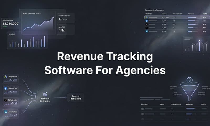
Cometly serves as a real-time command center for marketers who need absolute clarity into what’s driving leads, pipeline, and revenue. Unlike traditional analytics platforms that rely on delayed or fragmented data, Cometly unifies ad, website, and CRM activity into a single, actionable view. This makes it possible to see — in one place — which ads and marketing channels actually generate qualified leads and closed revenue, not just clicks and impressions.
What sets Cometly apart is its precision in connecting marketing spend directly to ROI. Every conversion, form submission, and deal is attributed back to the exact source, campaign, and even the specific ad that initiated the journey. Companies using Cometly consistently report sharper decision-making, faster optimization cycles, and increased confidence in their marketing investments. For example, B2B SaaS teams have used Cometly to uncover wasted ad spend and reallocate budgets toward campaigns that drive bottom-line growth — sometimes cutting CAC by over 30% within the first quarter of implementation.
 8 Marketing Dashboard Examples to Track in 2025
Key Metrics and Strategic Insights
Cometly tracks every stage of the marketing funnel, from awareness through conversion, providing visibility across all paid and organic touchpoints. Core metrics include ad-level ROAS, lead conversion rate, pipeline value, revenue by source, and multi-touch attribution paths. These data points help marketing and sales teams align on what’s truly influencing revenue — not just engagement.
Below is a visualization representing how Cometly surfaces three key performance indicators that tell the full story of campaign health:
Revenue by Source, Cost per Qualified Lead, and Ad ROAS.
This kind of clarity reveals immediate opportunities for optimization. For instance, if a campaign drives a high lead volume but low revenue, Cometly helps identify whether the issue lies in lead quality, targeting, or conversion funnel inefficiencies. Instead of guessing, marketers gain the insight to act decisively.
Actionable Takeaways
To maximize the value of Cometly’s Marketing Dashboard, consider these proven strategies:
- Segment Dashboards by Objective: Create dashboards for paid ads, funnel performance, and attribution modeling to tailor insights for each team or initiative.
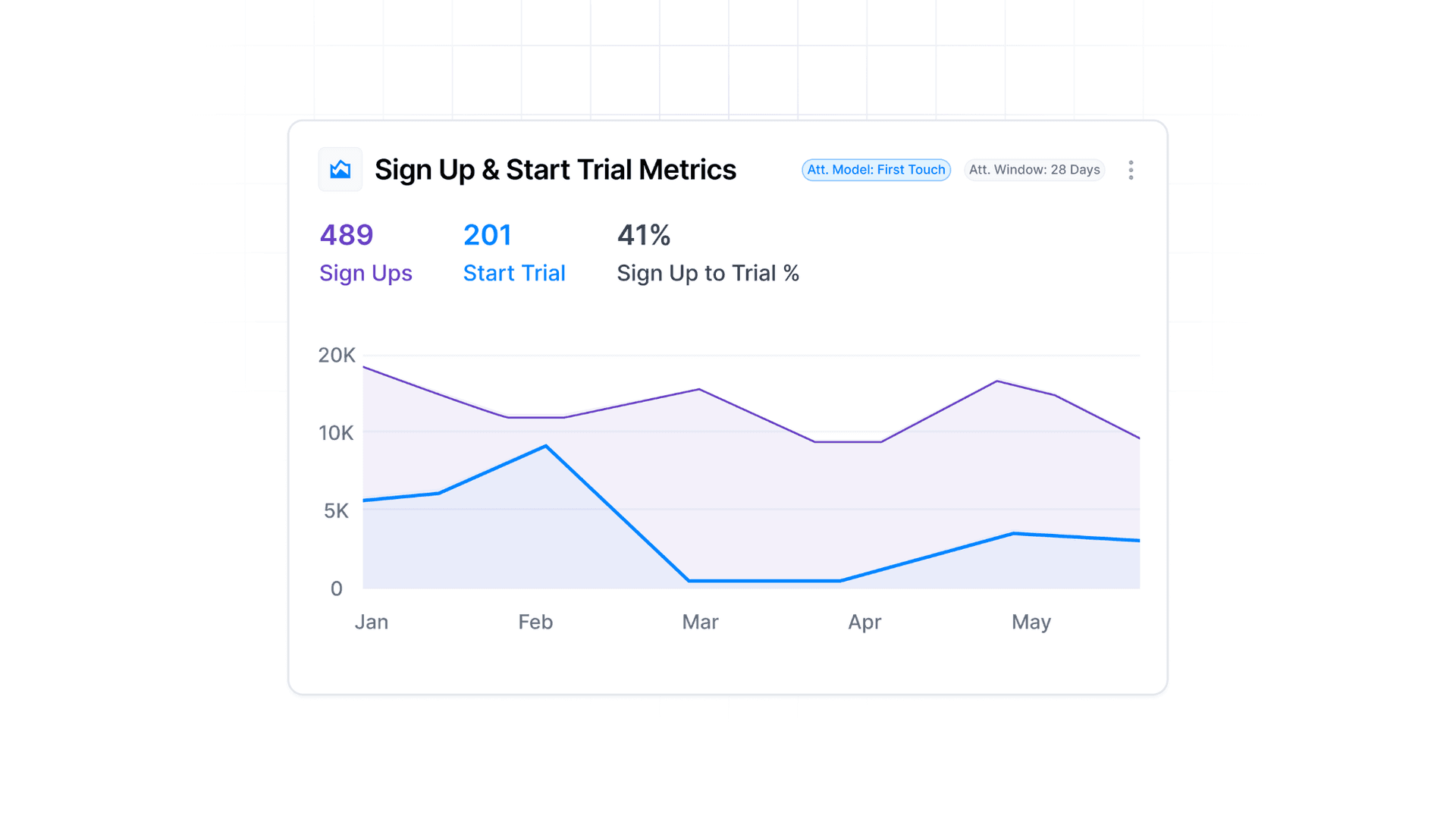
- Use Multi-Touch Attribution Models: Evaluate performance beyond last-click attribution. Cometly’s models (First-Touch, Linear, Time-Decay, U-Shaped, etc.) show how different interactions contribute to the final conversion.
- Track Full-Funnel ROI: Integrate your CRM or payment processor to track every dollar from initial click to closed revenue — essential for proving marketing’s direct financial impact.
- Monitor Ad-Level Insights: Dive into granular creative performance across platforms. Cometly lets you identify which specific ad images, headlines, or campaigns drive the most conversions in real time.
- Automate Conversion Syncing: Use Cometly’s server-side tracking and Conversion API to send verified conversions back to ad platforms, improving optimization and reducing data loss.
Understanding Attribution Models in Cometly
At the heart of Cometly’s value is its powerful attribution-modeling engine, which allows marketers to understand exactly how different touchpoints influence conversions. Rather than relying solely on a last-click view, Cometly empowers users to choose from—and compare—models such as First Touch, Last Touch, Last Non-Direct Touch, Linear, Linear Paid, U-Shaped, and also use Source Specific logic. Each model provides a different lens into the buyer journey, helping teams uncover which campaigns create awareness, which nurture leads, and which ultimately drive purchases.
Here’s how they break down:
- First Touch: Credits 100% to the first click in the journey.
Example: Day 1: Google Ad → Day 2: Email → Day 3: Facebook Ad → Day 4: Organic → Conversion → Google Ad gets full credit. - Last Touch: Credits 100% to the last click before conversion.
Example: Same journey above → Organic gets 100% credit. - Last Non-Direct Touch: Credits the last non-direct click before conversion, disregarding direct site visits.
Example: If the last touch was “Direct” then credit goes to the previous non-direct touch. - Linear: Distributes credit equally across all touchpoints in the journey.
Example: Four clicks before conversion → each gets 25%. - Linear Paid: Distributes credit equally across all paid sources only, excluding organic or email.
Example: Two paid ads and two non-paid touches → only paid ads each receive 50% credit. - U-Shaped: Gives 40% credit each to the first and last touch, and the remaining 20% is distributed equally among the middle touches.
Example: Four touchpoints → first and last each get 40%, middle two share 20% (10% each). - Source-Specific (First or Last Touch – Source Specific): Filters the journey to touches from selected sources (e.g., Facebook Ads, Google Ads, Email) and then applies First Touch or Last Touch logic only to those filtered touchpoints.
Example Journey: Facebook Ad → Google Ad → Email → Organic → Facebook Ad → Google Ad → Purchase.
If using Last Touch – Source Specific and you select “Facebook Ads”, credit goes to that last Facebook Ad.
Attribution Windows
Equally important is the attribution window, which defines the time period in which an interaction is eligible for credit. With Cometly you can choose windows such as 1, 7, 14, 30, 60, 90 days or Lifetime (LTV).
- Short windows (1 day or 7 days) are ideal for fast-turnaround conversions (e.g., e-commerce).
- Moderate windows (14 day or 30 day) suit cases where prospects take a bit of time.
- Longer windows (60 day, 90 day or Lifetime) fit high-touch B2B or long sales cycle offerings.
Choosing the right window ensures you’re attributing credit only within a timeframe relevant to your business context.
By combining the attribution model (how credit is distributed) with the attribution window (when the credit applies), Cometly gives you a flexible, nuanced view of how marketing efforts drive results—and helps you make smarter budget allocations and campaign optimizations.
Cometly Ads Manager
The Cometly Ads Manager is where data meets action. It’s a unified workspace that brings together performance metrics from every ad platform — Meta, Google, TikTok, LinkedIn, and more — and enriches them with real revenue and attribution data captured by Cometly. Instead of relying on the inconsistent numbers inside each ad account, marketers see one accurate, real-time view of what’s actually working across all paid channels.
 8 Marketing Dashboard Examples to Track in 2025
Unlike native ad dashboards that only report platform-side conversions, Cometly’s Ads Manager blends ad spend, lead data, and revenue attribution into a single source of truth. You can instantly see which campaigns, ad sets, and individual ads are producing true ROI — not just clicks or impressions — enabling smarter decisions and faster optimization.
Real-Time, Revenue-Connected Reporting
Cometly’s Ads Manager updates in real time, allowing you to make confident decisions with verified conversion data. Each ad is tied directly to tracked sales, subscriptions, or form submissions, so every number you see reflects actual business results — not modeled data.
Whether you’re comparing campaigns across multiple ad platforms or analyzing performance within a single account, Cometly automatically normalizes metrics, so your ROAS, CAC, and revenue per ad are measured consistently. This gives teams the confidence to shift budgets toward the highest-performing ads and cut wasted spend immediately.
Ad-Level Attribution and Creative Insights
Attribution doesn’t stop at the campaign level — Cometly drills down to the individual ad level, showing exactly which creative, headline, and copy variations are driving conversions. Each ad is analyzed within the selected attribution model, revealing whether top performers tend to initiate, assist, or close conversions in your funnel.
This level of insight transforms how teams approach creative testing and scaling. Instead of guessing what worked, marketers can double down on proven creative frameworks that consistently produce revenue. For performance-driven advertisers, this makes Cometly’s Ads Manager an indispensable creative intelligence tool.
Cross-Platform Optimization and Decision Making
Managing multiple ad platforms usually means jumping between dashboards and spreadsheets, but Cometly eliminates that friction. You can view blended results across Meta Ads, Google Ads, TikTok Ads, and LinkedIn Ads all in one interface — making it easy to compare platform efficiency, identify new growth opportunities, and see the impact of spend shifts in real time.
Because Cometly tracks every ad click through its server-side tracking and Conversion API integrations, it bypasses browser restrictions, ensuring data accuracy even when cookies are blocked. That means you’re always seeing the most complete picture of your marketing performance.
Actionable Takeaways
To fully leverage the power of Cometly’s Ads Manager:
- Analyze beyond platform-reported data: Use Cometly’s revenue-based metrics to verify what’s truly working.
- Drill into ad-level insights: Identify the best-performing creative assets by tracking conversions, not just engagement.
- Switch attribution models dynamically: Instantly see how performance changes under First Touch, Linear, or U-Shaped models.
- Monitor spend efficiency: Compare ROAS, CAC, and pipeline revenue across all active channels in one clean interface.
- Sync verified conversions back to ad platforms: Improve optimization accuracy by feeding high-quality event data directly to Meta, Google, and others.
The Cometly Ads Manager isn’t just a reporting tool — it’s the control center for every modern performance marketer. By pairing real-time data with attribution precision, Cometly empowers teams to see what drives revenue, stop what doesn’t, and scale what works with absolute confidence.
For businesses investing heavily in paid media or multichannel campaigns, Cometly isn’t just a dashboard — it’s the nerve center of your marketing intelligence. By consolidating every data source and automating attribution, Cometly enables teams to operate with unmatched accuracy and confidence, ensuring every marketing dollar is accounted for and optimized for growth.
Get Started With Cometly Today
2. Google Analytics 4 Marketing Dashboard
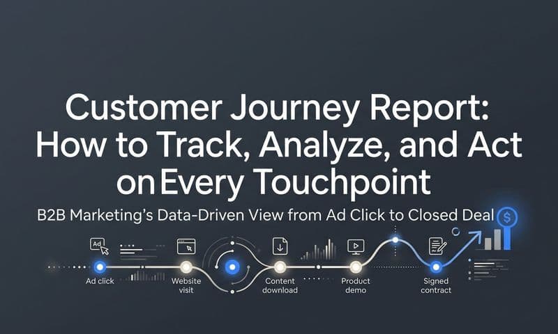
The Google Analytics 4 (GA4) Marketing Dashboard marks a significant paradigm shift from its predecessor, Universal Analytics. It is designed as an event-based, cross-platform analytics hub, offering a unified view of user journeys across websites and mobile apps. Unlike traditional session-based models, GA4 focuses on individual user interactions, providing deeper, more granular insights into behavior. This makes it an essential tool for marketers aiming to understand the complete customer lifecycle in today's multi-device world.
The true strength of this dashboard is its predictive capabilities and privacy-centric design. For example, Spotify leverages GA4's cross-platform tracking to understand how users engage with music and podcasts across its web player and mobile applications, creating a seamless user experience. Similarly, Airbnb uses GA4's enhanced ecommerce features to meticulously track its booking funnel, identifying drop-off points and optimizing paths to increase conversions. These examples underscore its role not just as an analytics platform, but as a strategic tool for growth and user experience enhancement.
Key Metrics and Strategic Insights
GA4 moves beyond traditional metrics like bounce rate to focus on engagement and user-centric data. Key metrics now include Engaged sessions, Engagement rate, User stickiness (DAU/MAU), and Conversions. The platform's powerful "Explorations" feature allows marketers to conduct advanced analysis, such as funnel exploration, path analysis, and cohort analysis, directly within the interface. This helps reveal how users navigate toward conversion and where they encounter friction.
Monitoring these metrics allows for a more nuanced understanding of user intent. For instance, a high engagement rate coupled with low conversions on a specific landing page might indicate that the content is valuable but the call-to-action is ineffective.
Actionable Takeaways
To harness the full potential of GA4 as one of the most powerful marketing dashboard examples, consider these replicable strategies:
- Implement Custom Event Tracking: Go beyond default events. Set up custom events for key interactions unique to your business, such as "demo_request_submitted" or "newsletter_signup," to measure what truly matters.
- Leverage the Explorations Hub: Don't just rely on standard reports. Use Funnel exploration to visualize the steps users take to complete a conversion and identify where they drop off. Path exploration can reveal unexpected user journeys that lead to conversions.
- Build Custom Audiences: Create highly specific audiences based on user behavior (e.g., "users who viewed a product but didn't add to cart" or "users who watched 75% of a video"). Use these audiences for targeted remarketing campaigns in Google Ads.
- Activate Google Signals: Turn on Google Signals to get enhanced cross-device reporting and access demographic and interest data, providing a richer profile of your user base for better personalization.
For businesses evaluating their analytics stack, understanding the landscape of available tools is key. If you're exploring different platforms, you can learn more about various Google Analytics alternatives to find the best fit for your specific needs.
3. Salesforce Marketing Cloud Dashboard
The Salesforce Marketing Cloud Dashboard is an enterprise-grade command center designed for orchestrating complex, multi-channel marketing campaigns at scale. It excels at providing a unified view of the customer across disparate touchpoints like email, mobile, social, and advertising. Unlike more siloed platforms, this dashboard integrates powerful automation with AI-driven analytics, allowing large organizations to manage sophisticated customer journeys and personalization efforts from a single, cohesive interface. This makes it a core component for businesses focused on building deep, long-term customer relationships.
The true strength of this dashboard lies in its ability to connect every marketing interaction to a unified customer profile, enabling highly personalized experiences. For example, American Express utilizes Marketing Cloud to deliver tailored offers across various channels, which has boosted customer engagement by 40%. Similarly, T-Mobile leveraged its Journey Builder tool to design seamless onboarding experiences, while Unilever uses the embedded Einstein AI to optimize campaign timing and content, ensuring maximum impact. These cases demonstrate its value as a strategic engine for customer lifecycle management, not just a reporting tool.
Key Metrics and Strategic Insights
Salesforce Marketing Cloud focuses on metrics that reflect deep customer engagement and journey progression. Key metrics include Email Engagement Rate (opens, clicks, conversions), Customer Lifetime Value (CLV), Campaign ROI by Channel, and Journey Completion Rates. By monitoring these, marketers can understand how different channels work together to influence customer behavior and identify opportunities to enhance the overall customer experience.
The platform’s AI, Einstein, provides predictive insights, such as recommending the optimal send time for an email or identifying audiences most likely to engage. This transforms the dashboard from a rearview mirror into a forward-looking guide for campaign strategy.
Actionable Takeaways
To effectively harness the power of this comprehensive dashboard, consider these proven strategies:
- Map Existing Journeys First: Before building new campaigns, use Journey Builder to map your current customer processes. This helps identify existing friction points and opportunities for immediate improvement.
- Integrate with Salesforce CRM: A crucial step is to connect Marketing Cloud with your Salesforce CRM. This creates a 360-degree customer view, enabling sales and marketing teams to work from a single source of truth.
- Leverage Einstein AI: Don't ignore the AI recommendations. Actively use Einstein's insights for send time optimization, engagement scoring, and content personalization to improve campaign performance.
- Start with a Pilot Program: The platform is vast. Begin with a focused pilot program, such as an abandoned cart journey or a welcome series, to learn the tools and demonstrate value before a full-scale rollout.
For organizations managing complex campaigns, understanding how each touchpoint contributes to a conversion is vital. Exploring various marketing attribution tools can provide context on how platforms like Salesforce help solve this challenge.
4. Facebook Ads Manager Dashboard
The Facebook Ads Manager dashboard is a powerhouse for social media advertisers, providing a granular view of campaign performance across Facebook, Instagram, Messenger, and the Audience Network. Unlike broader marketing dashboards, its strength lies in its specialized focus on paid social advertising. It offers an unparalleled depth of data on audience behavior, ad creative performance, and conversion tracking, making it an essential tool for any brand investing in Meta's advertising ecosystem. Its interface is designed for direct action, allowing marketers to launch, manage, and optimize campaigns within the same environment where they analyze results.
This dashboard’s value is proven by the countless direct-to-consumer brands that have scaled on the platform. For instance, Glossier famously leveraged its detailed targeting capabilities to find niche beauty enthusiasts, which fueled their 600% year-over-year growth. Similarly, Casper used Facebook's lookalike audiences to expand beyond its initial customer base, resulting in a 35% sales increase. These examples underscore its role not just as a reporting interface, but as a growth engine for e-commerce and performance marketing.
Key Metrics and Strategic Insights
The Facebook Ads Manager excels at tracking metrics critical for optimizing ad spend and campaign effectiveness. Key metrics include Cost Per Result (CPR), Return on Ad Spend (ROAS), Click-Through Rate (CTR), and Conversion Rate. By closely monitoring these, advertisers can quickly identify winning ad creative, pinpoint underperforming audiences, and reallocate budget to maximize ROI. The platform's ability to segment data by placement, demographics, and device provides deep strategic insights into user behavior.
This detailed breakdown allows for precise, data-backed decisions. A low CTR might signal creative fatigue, while a high CPR could indicate targeting issues or a disconnect between the ad and the landing page. By analyzing these metrics together, marketers can build a comprehensive picture of campaign health and pinpoint exact areas for improvement, a crucial element in creating high-performing marketing dashboard examples.
Actionable Takeaways
To extract maximum value from the Facebook Ads Manager dashboard, implement these replicable strategies:
- Install the Meta Pixel: Ensure the Meta Pixel is correctly installed on your website for comprehensive conversion tracking. This allows you to measure actions like purchases, leads, and add-to-carts directly attributed to your ads.
- Leverage Automated Rules: Set up automated rules to manage your campaigns efficiently. You can create rules to automatically pause low-performing ads, increase budgets on successful ad sets, or adjust bids based on performance thresholds.
- Test and Iterate Constantly: Use the A/B testing feature to systematically test different ad creative, headlines, audiences, and placements. This data-driven approach is key to discovering what resonates most with your target market.
- Regularly Audit Audiences: Don't let your audience segments become stale. Regularly review the performance of your saved audiences, custom audiences, and lookalike audiences, refreshing or refining them based on recent conversion data.
For marketers weighing their options across different social platforms, understanding the nuances between them is vital. You can get a better sense of where this platform stands by exploring a comprehensive comparison of Facebook Ads Manager and its competitors.
5. Tableau Marketing Analytics Dashboard
The Tableau Marketing Analytics Dashboard serves as a powerful business intelligence tool that transforms raw, complex marketing data into interactive and visual stories. Its strength lies in its ability to connect disparate data sources, from advertising platforms and CRMs to spreadsheets and cloud databases, and consolidate them into a single, dynamic view. Unlike many platform-specific dashboards, Tableau offers unparalleled flexibility, enabling marketers to build completely custom visualizations that answer nuanced business questions beyond standard reporting. This makes it an essential asset for teams needing to dive deep into performance analytics and communicate insights effectively across an organization.
The real impact of this dashboard is seen in its application by major enterprises. For instance, Lenovo uses Tableau to monitor global marketing campaign performance across 160 countries, dramatically improving their visibility into ROI. Similarly, Charles Schwab developed interactive dashboards to analyze customer acquisition costs and lifetime value across various channels, while Schneider Electric leveraged it for sophisticated marketing attribution analysis, leading to a 20% improvement in campaign efficiency. These examples demonstrate Tableau's capacity to move beyond simple metric tracking to become a core driver of strategic decision-making.
 8 Marketing Dashboard Examples to Track in 2025
Key Metrics and Strategic Insights
Tableau excels at visualizing complex relationships between different marketing metrics. Key metrics frequently tracked include Return on Ad Spend (ROAS) by channel, Customer Lifetime Value (CLV), multi-touch attribution models, and funnel conversion rates segmented by audience demographics or behaviors. By visualizing these interconnected data points, marketers can uncover hidden trends, such as which specific channel combinations yield the highest-value customers or how seasonality impacts campaign performance across regions.
The platform empowers users to move from "what happened" to "why it happened." For example, a dashboard could layer website traffic data over campaign spend and sales conversions, immediately highlighting whether a spike in ad spend translated into actual revenue. This level of granular analysis is critical for optimizing budgets and proving marketing’s contribution to the bottom line. For those looking to explore this further, you can find a wealth of information in this guide to creating a marketing analytics dashboard.
Actionable Takeaways
To effectively deploy a Tableau dashboard for marketing analytics, consider these proven strategies:
- Start with a Question: Instead of trying to visualize all your data at once, begin with a specific business question, like "Which of our content assets generates the most qualified leads?" This focused approach ensures your dashboard provides clear answers.
- Automate Data Connections: Use Tableau’s native connectors (e.g., for Google Analytics, Salesforce, or SQL databases) to create live, automated data feeds. This eliminates manual reporting and ensures your insights are always based on the latest information.
- Create Interactive Filters: Build dashboards with user-driven filters for date ranges, channels, campaigns, or regions. This allows stakeholders to self-serve and explore the data that is most relevant to their roles, making the dashboard a more valuable and widely used resource.
- Use Consistent Visual Language: Implement a standardized color scheme and formatting style across all your dashboards. This creates a cohesive and professional look, making it easier for users to interpret the data quickly and accurately.
6. Mailchimp Marketing Dashboard
The Mailchimp Marketing Dashboard serves as a powerful nerve center for email-centric marketing strategies, especially for small and medium-sized businesses. It provides a clear, digestible view of audience growth, campaign engagement, and automation performance. Far more than a simple email reporting tool, it integrates audience management and multi-channel campaign data, allowing marketers to see how their efforts translate into tangible subscriber interactions. This makes it an essential platform for businesses aiming to build and nurture a loyal audience through targeted communication.
The real strength of the Mailchimp dashboard is its ability to directly link email activities to audience behavior and, for e-commerce brands, revenue. For example, Chubbies Shorts uses Mailchimp's robust e-commerce integrations to track exactly how much revenue is generated from specific email campaigns, proving direct ROI. Similarly, The Penny Hoarder utilizes its automation features to build sophisticated nurture sequences that guide subscribers through their content ecosystem, significantly boosting long-term engagement. These cases show its value as a tool for driving both engagement and commercial success.
Key Metrics and Strategic Insights
Mailchimp’s dashboard excels at tracking metrics crucial for email marketing health and audience development. Key metrics include Open Rate, Click-Through Rate (CTR), List Growth Rate, and Unsubscribe Rate. For e-commerce users, Revenue per Campaign and Conversion Rate from emails are paramount. By monitoring these, marketers can quickly assess campaign effectiveness, understand audience preferences, and refine their content strategy.
A core function is visualizing audience segmentation. A typical report might compare the performance of different audience segments, such as new subscribers versus loyal customers, to reveal which groups are most engaged. This allows for more precise targeting and personalization in future campaigns, moving beyond a one-size-fits-all approach.
Actionable Takeaways
To transform your Mailchimp dashboard from a reporting tool into a growth engine, implement these replicable strategies:
- Master Segmentation with Tags: Use tags to create dynamic segments based on subscriber behavior, interests, or purchase history. Send highly targeted campaigns to these segments to dramatically increase relevance and engagement.
- Leverage A/B Testing: Don't just guess what works. Systematically test different subject lines, send times, and content formats. Use the dashboard's A/B testing reports to make data-backed decisions that improve performance over time.
- Build Smart Automation Workflows: Set up automated welcome series for new subscribers, re-engagement campaigns for inactive contacts, and post-purchase follow-ups. These automated touchpoints nurture your audience and drive action without manual effort.
- Monitor Industry Benchmarks: Mailchimp provides benchmark data for your industry. Regularly compare your open and click rates against these benchmarks to gauge your relative performance and identify areas for improvement.
For businesses looking to optimize their email and audience-building efforts, exploring the full suite of tools offered by Mailchimp is a critical step. Understanding its advanced features unlocks deeper insights and more effective marketing automation.
7. Adobe Marketing Cloud (Adobe Experience Cloud) Dashboard
The Adobe Experience Cloud dashboard serves as an enterprise-grade command center for managing the entire customer experience. It moves beyond traditional marketing analytics to offer a deeply integrated suite of tools including Adobe Analytics, Target, and Campaign. This platform is designed for large organizations that need to orchestrate complex, multi-channel customer journeys in real-time. Unlike more siloed solutions, it provides a unified customer profile, enabling sophisticated cross-channel attribution and personalization at a massive scale. This makes it an essential tool for enterprises focused on delivering cohesive, data-driven experiences across every touchpoint.
The true strength of the Adobe dashboard is its ability to connect vast datasets to tangible business outcomes through advanced analytics and personalization. For instance, Coca-Cola leverages the platform to deliver hyper-personalized digital experiences, which has resulted in a 45% uplift in engagement. Similarly, The Home Depot uses Adobe Analytics to bridge the gap between its online and in-store channels, optimizing its omnichannel strategy and boosting online-to-store conversions. These marketing dashboard examples demonstrate its power not just for reporting, but as a strategic engine for customer experience transformation.
Key Metrics and Strategic Insights
Adobe Experience Cloud excels at providing a 360-degree view of the customer, focusing on long-term value and experience optimization. Key metrics often include Customer Lifetime Value (CLV), Path to Conversion across multiple channels, Audience Segment Performance, and Real-Time Personalization Impact. By tracking these complex metrics, marketers can understand intricate customer behaviors and optimize journeys for maximum engagement and revenue.
For example, a dashboard could visualize how different audience segments interact with personalized content variations. By monitoring metrics like Uplift in Conversion Rate and Time on Page for targeted experiences versus a control group, teams can quantify the direct ROI of their personalization efforts. This level of detail allows for continuous refinement of targeting rules and content strategy, ensuring marketing messages resonate effectively with each specific user group.
Actionable Takeaways
To effectively deploy this comprehensive platform, consider these replicable strategies:
- Adopt a Phased Implementation: Don't try to boil the ocean. Start by implementing one core solution, like Adobe Analytics, to build a solid data foundation before layering on other tools like Adobe Target or Campaign.
- Invest in Training and Change Management: This is a powerful but complex ecosystem. Ensure your teams receive thorough training and establish clear processes to foster adoption and maximize the platform's value.
- Prioritize Data Governance: Garbage in, garbage out. From the very beginning, establish strict data quality standards and governance protocols to ensure the insights you derive are accurate and reliable.
- Build a Center of Excellence (CoE): Create a dedicated internal team or CoE responsible for platform mastery, best practices, and driving ongoing optimization. This group can serve as a resource for the entire marketing organization.
For businesses looking to master enterprise-level customer experience management, exploring the full capabilities of the Adobe Experience Cloud is a critical step. Its integrated nature provides a holistic framework for understanding and personalizing every stage of the customer journey.
8. Power BI Marketing Dashboard
Microsoft's Power BI stands as a titan in the business intelligence space, offering marketing teams a robust platform to forge highly interactive and deeply analytical dashboards. It excels at aggregating disparate data sources, from social media analytics and Google Ads to internal CRMs and spreadsheets, into a unified, dynamic visualization. Unlike more rigid, platform-specific dashboards, Power BI provides unparalleled flexibility, allowing marketers to drill down into the most granular details of their campaign performance. This makes it an essential tool for organizations that require custom analytics and cross-channel performance measurement.
The platform's strength lies in its ability to transform raw data into clear, strategic narratives. For example, Heathrow Airport utilizes Power BI to monitor marketing campaign effectiveness across various channels, helping them optimize passenger experience initiatives in real-time. Similarly, the Miami Heat leverages it to dissect fan engagement data, leading to improved marketing ROI for season ticket promotions. These cases demonstrate how Power BI moves beyond simple reporting to become a core driver of strategic decision-making and budget optimization.
Key Metrics and Strategic Insights
A Power BI marketing dashboard is a powerhouse for tracking a diverse set of metrics tailored to specific business goals. Common metrics include Return on Ad Spend (ROAS), Cost Per Lead (CPL) by campaign, Customer Lifetime Value (CLV), and channel-specific engagement rates. By visualizing these KPIs together, marketers can identify correlations that might otherwise go unnoticed, such as how a spike in social media engagement impacts lead quality from paid search.
The true strategic value emerges when you analyze performance across the entire marketing mix. You can build visuals that directly compare the ROAS from your email campaigns against your paid social efforts, allowing for agile budget reallocation. This comprehensive view helps teams move from channel-specific tactics to a holistic, data-informed marketing strategy, ensuring every dollar is spent for maximum impact.
Actionable Takeaways
To harness the full capabilities of Power BI for your marketing analytics, implement these replicable strategies:
- Master Power Query: Use the Power Query Editor to clean, transform, and shape your raw data before it even hits the dashboard. This ensures data integrity and makes your visualizations more reliable and easier to build.
- Create Template Dashboards: For agencies or departments managing multiple brands or campaigns, build a template file (.pbit). This standardizes reporting, saves significant setup time, and ensures consistency across all analyses.
- Leverage the Q&A Feature: Enable the natural language query feature to allow team members to ask questions directly to the data (e.g., "show me top 10 keywords by conversions last month"). This democratizes data access and fosters faster insights.
- Set Up Automated Refreshes: Schedule automatic data refreshes to ensure your dashboard always displays the most current information. This eliminates manual updates and provides stakeholders with real-time performance views.
For those looking to build their own advanced reporting system, understanding the specifics of implementation is key. You can explore a detailed guide to creating a Power BI Marketing Dashboard to see how these elements come together in a practical application.
Marketing Dashboard Features Comparison
Marketing Dashboard | Implementation Complexity 🔄 | Resource Requirements ⚡ | Expected Outcomes 📊 | Ideal Use Cases 💡 | Key Advantages ⭐ |
|---|---|---|---|---|---|
Cometly Marketing Dashboard | Moderate; intuitive setup with guided tracking implementation | Medium; requires connecting ad platforms and CRM for full visibility | Real-time clarity into which ads and channels drive leads, pipeline, and revenue | Businesses running paid media campaigns who want precise attribution and ROI tracking | Real-time ad-level insights, multi-touch attribution models, CRM and payment integration, server-side tracking |
Google Analytics 4 Marketing Dashboard | High; requires technical setup and learning | Low; free platform | Deep user behavior insights with advanced ML predictions | Businesses of all sizes needing cross-platform analytics | Free, machine learning insights, strong Google integration |
Salesforce Marketing Cloud Dashboard | Very high; complex setup requiring expert resources | High; expensive enterprise solution | AI-powered predictive analytics and multi-channel campaigns | Large enterprises with complex marketing automation | Scalable, advanced AI, strong CRM integration |
Facebook Ads Manager Dashboard | Moderate; interface can be overwhelming | Low to medium; cost varies with ad spend | Effective social media campaign management and optimization | Businesses focusing on social media advertising | Massive reach, detailed targeting, real-time optimization |
Tableau Marketing Analytics Dashboard | High; requires advanced data and visualization skills | High; costly licensing and setup | Interactive visual insights driving strategic decisions | Data-driven orgs needing complex marketing data visualization | Powerful visualization, multi-source integration, flexibility |
Mailchimp Marketing Dashboard | Low; beginner-friendly interface | Low to medium; pricing scales with list size | Improved email marketing engagement and audience growth | SMBs focused on email marketing and audience development | User-friendly, strong deliverability, free tier available |
Adobe Marketing Cloud Dashboard | Very high; complex, technical implementation | Very high; expensive enterprise tool | Sophisticated cross-channel personalization and analytics | Large enterprises needing customer experience management | Comprehensive suite, advanced AI, robust data governance |
Power BI Marketing Dashboard | Moderate; learning curve for advanced features | Medium; cost-effective BI tool | Cost-effective, integrated marketing analytics dashboard | Microsoft-centric orgs seeking BI with multi-data source access | Cost-effective, Microsoft integration, user-friendly |
From Data Points to Strategic Decisions: Building Your Ultimate Marketing Dashboard
Throughout this deep dive into high-performing marketing dashboard examples, a clear, unifying theme has emerged: a dashboard is not merely a collection of charts and numbers. It is a strategic command center, a narrative of your marketing performance, and the catalyst for informed, agile decision-making. We've journeyed through the robust, all-in-one ecosystems of HubSpot and Salesforce, the granular web and app insights of Google Analytics 4, and the specialized ad performance views of Facebook Ads Manager. Each example, from the visual storytelling power of Tableau and Power BI to the campaign-specific focus of Mailchimp, underscores a critical principle. The best dashboards are purpose-built, user-centric, and ruthlessly focused on the metrics that matter.
Generic, one-size-fits-all templates are the enemy of clarity. As we analyzed, the most effective dashboards are tailored to specific roles and objectives. A CMO’s dashboard, focusing on high-level metrics like Customer Acquisition Cost (CAC), Marketing ROI, and Customer Lifetime Value (LTV), will look fundamentally different from a PPC specialist's dashboard, which must drill down into Click-Through Rate (CTR), Cost Per Click (CPC), and conversion rates by ad creative. This customization is not a luxury; it is a necessity for transforming raw data into actionable intelligence.
Key Takeaways for Actionable Dashboard Design
So, what are the most critical, replicable strategies you should take away from these examples?
- Define Your "Why" Before Your "What": Before connecting a single data source, answer this question: "What specific decisions will this dashboard empower us to make?" This north star will guide every choice, from metric selection to layout design, preventing the creation of a "data graveyard" filled with vanity metrics.
- Prioritize the Metric Hierarchy: Structure your dashboard logically. Start with top-level Key Performance Indicators (KPIs) that represent your ultimate goals (e.g., Revenue, MQLs). Then, support them with diagnostic metrics that explain performance (e.g., Traffic Sources, Conversion Rates). Finally, include operational metrics for day-to-day management (e.g., Ad Spend, Email Open Rates). This creates a clear visual flow from outcome to cause.
- Embrace Segmentation for Deeper Insights: The true power of a dashboard is unlocked through segmentation. Don't just look at overall conversion rates; analyze conversion rates by channel, campaign, demographic, and device. The marketing dashboard examples from platforms like Google Analytics and Tableau excel at this, revealing hidden opportunities and underperforming segments that a high-level view would miss.
- Blend Data Sources for a Holistic View: Your customer's journey doesn't happen in a silo, and neither should your data. The most advanced dashboards combine data from your CRM (like Salesforce), your ad platforms (like Facebook Ads), and your web analytics (like Google Analytics) to create a single source of truth. This is how you connect ad spend directly to revenue and calculate a true, blended CAC.
Your Next Steps: From Inspiration to Implementation
Reading about powerful marketing dashboard examples is the first step. Now, it's time to build your own engine for growth. Start small. Don't try to build a massive, all-encompassing enterprise dashboard overnight. Instead, pick one critical area of your marketing, like lead generation or paid ad performance, and build a focused dashboard for it.
Use the principles we've discussed. Identify the key questions for that marketing function, select the 3-5 essential KPIs that answer them, and choose a tool that fits your technical comfort level and budget. Sketch out the layout on paper first, applying the visual hierarchy principles. This iterative, focused approach ensures you create a tool that is immediately valuable and avoids the overwhelm of a complex, data-heavy project. Mastering the art and science of the marketing dashboard is a force multiplier for your entire organization, enabling you to optimize spend, accelerate growth, and consistently prove the value of your marketing efforts with undeniable data.
If you’re running paid ads and need a dashboard that provides crystal-clear attribution and ties every dollar directly to sales, native platform dashboards often fall short. Cometly is specifically designed for performance marketers and e-commerce brands to eliminate data guesswork, providing a single source of truth for your ad performance and customer journey. See how it can unify your analytics and give you the clarity you need to scale profitably.