Ever stared at a spreadsheet packed with campaign metrics? It can feel like trying to navigate a new city without a map—just a sea of numbers and labels. Data visualization marketing is how you turn that raw data into clear, insightful graphics like charts and dashboards, giving you the turn-by-turn directions you need to make smarter decisions.
From Data Overload to Strategic Clarity
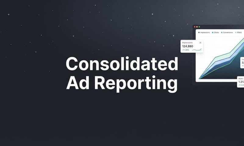
 Mastering Data Visualization Marketing Campaigns
Most marketers are swimming in data. You have endless streams of information coming from your analytics platforms, ad networks, and CRM, but pulling real conclusions from rows and columns of text is slow and clunky. This is exactly where data visualization marketing changes the game.
It’s not just about making pretty charts. It's a fundamental shift in how you see performance. Instead of manually cross-referencing numbers, you can instantly spot patterns, identify outliers, and understand the complex relationships hidden in your data.
Think of it this way: raw data is like a pile of unassembled puzzle pieces. Data visualization is the finished picture on the box lid—it gives you the context and clarity to see how every single piece fits together to tell the full story.
This approach turns abstract metrics into tangible insights, making it far easier to communicate findings to your team and stakeholders in a way that actually sticks.
Why Visuals Are Essential for Modern Marketers
The move toward visual data isn't just a trend; it's a strategic necessity. Marketers are quickly realizing that raw numbers alone aren't enough to make timely, informed decisions.
A simple line graph in a PPC report might show a drop in website traffic, but it won't tell you why. Visualization tools, on the other hand, can immediately highlight which campaigns or keywords were responsible, turning an alarming trend into an actionable fix.
This process is what gets you to strategic clarity, moving you beyond just reacting to problems. By embracing data visualization marketing, you can:
- Accelerate comprehension: Quickly grasp complex performance data without getting lost in spreadsheets.
- Improve decision-making: Identify trends and outliers faster, leading to more confident and accurate strategic moves.
- Enhance communication: Clearly present campaign results and ROI to team members and leadership in a format they can actually digest.
To see how top teams are leveraging immediate insights, check out these real-time data visualization examples that showcase the power of turning live data into strategic assets. Ultimately, this practice equips you to navigate your marketing landscape with the precision of a GPS, guiding you straight to your goals.
Why Your Brain Loves Visual Marketing Data
 Mastering Data Visualization Marketing Campaigns
The reason data visualization marketing works so well isn't just a matter of preference; it’s rooted in our biology. Our brains are hardwired for visual processing, making them incredibly efficient pattern-recognition machines that have evolved over millennia to interpret the world through sight.
Think about trying to understand campaign performance by staring at a dense spreadsheet. It’s like reading a book one word at a time, slowly trying to piece together the plot. A well-designed chart, on the other hand, is like seeing the entire story in a single, powerful image. You instantly grasp the narrative—the key characters (metrics), the conflicts (performance issues), and the resolution (the outcome).
This isn't an exaggeration. It’s just how we’re built. Our brains give immense priority to visual information, dedicating massive resources to processing it quickly and efficiently.
The Science of Seeing Insights
The neurological basis for this is staggering. An incredible 50% of the cerebral cortex is dedicated to processing visual input, allowing us to recognize an entire image in as little as 13 milliseconds. Compare that to text, where visuals are processed up to 60,000 times faster. These biological realities explain why data visualizations accelerate comprehension and strategic action.
This incredible speed is why a dashboard can communicate what a thousand-row spreadsheet can't. It bypasses the slow, linear process of reading and taps directly into our brain's high-speed visual-processing capabilities. This means you can spot a downward trend in ROAS or an outlier in your CPA without ever having to hunt for the numbers.
For marketers, this biological shortcut is a huge advantage. It lets you communicate complex findings to stakeholders who don't have time to wade through raw data. Instead of explaining a trend, you can show it, leading to faster alignment and more confident decision-making across the board.
Turning Data Into a Universal Language
Visual data transcends expertise and serves as a universal language. A rising line on a graph means growth. A shrinking slice of a pie chart signals a decline. These are concepts anyone can understand at a glance, regardless of their analytical background.
This shared understanding fosters better collaboration. When a marketing team can look at the same dashboard and see the same story, discussions shift from trying to interpret the data to deciding what to do about it. Data visualization marketing breaks down communication barriers and gets everyone on the same page, faster.
Visuals don't just present data; they make it accessible. By translating complex numbers into intuitive charts and graphs, you democratize insights and empower your entire team to contribute to strategic conversations.
This accessibility is critical for building a truly data-driven culture. It’s not about turning everyone into a data scientist; it’s about giving everyone the tools to understand performance clearly. To deepen your understanding, you can explore our detailed guide on data visualization for marketing, which covers practical applications for turning numbers into actionable insights.
Ultimately, by aligning your reporting with how the human brain naturally works, you create a more efficient and impactful marketing operation. You move from slow, manual analysis to rapid, intuitive understanding—giving your team the clarity it needs to act decisively and drive measurable results.
Crafting Visuals That Actually Drive Decisions
Knowing your brain loves visuals is one thing; creating graphics that actually lead to smarter marketing decisions is another. Data visualization marketing isn't about decorating a report—it's about building a clear, honest, and compelling argument with your data. The goal is to inform, not just to impress.
This means moving beyond default chart settings and thinking critically about the story you want to tell. A well-crafted visual should guide your audience to a conclusion without ambiguity. It strips away the noise and highlights the essential insight, making complex information instantly accessible.
The first step is always choosing the right type of visualization for the job. You wouldn't use a hammer to turn a screw, and you shouldn't use a pie chart to show a trend over time. Each chart type has a specific job to do.
Choosing the Right Chart for Your Story
The chart you pick is the foundation of clear communication. Your choice should line up directly with the main question you're trying to answer. Are you comparing performance between channels? Showing a trend over time? Illustrating the parts of a whole? Getting this right is the most critical first step.
The right chart prevents misinterpretation and ensures your core message lands immediately. Here's a quick guide to help you choose the best visualization for your marketing data.
Choosing the Right Chart for Your Marketing Data
Goal | Recommended Chart Type | Marketing Use Case |
|---|---|---|
Comparing values across categories | Bar or Column Chart | Comparing ad spend per platform or conversion rates by campaign. Our eyes are great at comparing lengths, making this super intuitive. |
Showing trends over time | Line Chart | Tracking website traffic, lead growth, or ROAS over days, weeks, or months. Perfect for showing momentum and identifying patterns. |
Illustrating proportions of a whole | Pie or Donut Chart (use sparingly) | Showing a traffic source breakdown (e.g., Organic vs. Paid vs. Direct). Best for five or fewer categories to avoid clutter. |
Showing relationships between variables | Scatter Plot | Revealing correlations, like the relationship between ad spend and the number of conversions. |
Making the right choice here is half the battle, setting you up to present your data with clarity and impact from the get-go.
Simplify to Amplify Your Message
Once you've picked the right chart, the next step is to simplify ruthlessly. The most common mistake in data visualization is clutter. Unnecessary labels, distracting gridlines, loud colors, and 3D effects all detract from the main point.
Your visualization is not a path to express cleverness via complexity; it's a tool for clarity. The objective is to get to an insight efficiently, with the end goal of influencing a meaningful business action.
Think like a minimalist. Remove every single element that doesn't add to the viewer's understanding. This practice, known as decluttering, makes your data the star of the show. A clean visual is not only easier to read but also appears more professional and trustworthy. To get this right, exploring essential data visualization best practices can give you a deeper playbook for creating impactful charts.
This infographic shows a simple decision tree for selecting KPIs based on your primary campaign goal.
 Mastering Data Visualization Marketing Campaigns
The visual clearly maps objectives like 'Brand Awareness' directly to a relevant metric like 'Impressions,' simplifying the strategic planning process.
Weave a Compelling Data Narrative
Finally, the most powerful visualizations tell a story. Your data doesn't exist in a vacuum; it represents real customer actions, campaign results, and business outcomes. To craft a narrative, you need to provide context.
Instead of a generic title like "Monthly Website Traffic," try something more descriptive: "Website Traffic Grew 30% After Launching New SEO Initiative." This frames the data and immediately tells your audience what they should be looking for.
You can also use annotations to highlight specific data points—like a sudden spike in traffic or a dip in conversions—and briefly explain what caused it. This narrative layer transforms a static chart into a dynamic story that guides stakeholders toward a specific conclusion. For marketers, connecting these visual stories back to financial results is where marketing attribution comes in, providing the framework to assign value to each touchpoint in your narrative.
Master these principles, and you'll create visuals that don't just display data—they drive decisions and prove marketing’s value.
Turning Past Performance Into Predictive Insights
 Mastering Data Visualization Marketing Campaigns
Great data visualization marketing does more than just tell you what happened last quarter. Its real power kicks in when you stop using your dashboards as rearview mirrors and start treating them like a windshield, showing you what’s coming up ahead. This is the leap from descriptive to predictive analytics.
Instead of just charting past results, you start to visualize future possibilities. Your marketing data transforms from a simple record of events into a strategic foresight tool, giving you a serious edge in predicting market shifts and customer needs.
It’s the difference between knowing you hit your sales goal and knowing which actions are most likely to help you exceed it next month.
From Reporting to Forecasting
The key to making this shift is to build predictive models directly into your visual dashboards. Think about a standard line chart showing your customer acquisition cost (CAC) over the last six months. It’s useful, sure, but it’s reactive.
Now, imagine that same chart with a dotted line extending into the future, projecting your CAC based on your planned ad spend. That’s a visualized regression model, and it completely changes the conversation. Suddenly, you're not just reviewing performance; you're stress-testing your strategy before you spend a single dollar.
Predictive visualization isn't about having a crystal ball. It's about using historical data to run simulations, so you can make proactive, evidence-based decisions instead of reactive guesses. It helps you answer "what if" questions with a high degree of confidence.
This approach is becoming the new standard in modern marketing. Across the industry, we're seeing a huge rise in predictive analytics baked into advanced data visualization tools. These systems use historical customer data—like demographics and transaction history—to forecast what people will do next.
Visualizing Future Customer Segments
Another powerful application is using cluster analysis to find emerging customer segments. A traditional dashboard might show you your current audience breakdown. A predictive dashboard, on the other hand, can visualize potential new groups of customers before they become mainstream.
For example, a visualization might show a small but rapidly growing cluster of users who buy a specific combination of products. This visual cue can tip you off to a new cross-selling opportunity or a niche market worth targeting with a dedicated campaign. By seeing these patterns emerge visually, you can act on them faster than competitors who are still digging through spreadsheets.
This is what it means to turn data into a competitive advantage. You can effectively forecast things like:
- Budget Impact: Visualize how increasing or decreasing spend on certain channels will likely affect lead generation and sales.
- Customer Churn: Spot at-risk customer segments with visual red flags, allowing you to launch retention campaigns before it’s too late.
- Campaign Success: Project the potential ROI of a new campaign based on how similar initiatives performed in the past.
By embracing this forward-looking approach, you elevate your data visualization marketing from a simple reporting function to a core part of your strategic planning engine. To learn more about how to put these concepts into action, check out our complete guide on predictive analytics in marketing.
Visualizing Your Marketing Attribution Data
This is where the rubber meets the road. All the theory and best practices come alive when you see them working inside a real tool. Data visualization marketing stops being an abstract idea and becomes the process you use every day to make better decisions. With a marketing attribution platform, you can finally turn that tangled mess of customer journey data into clean, actionable insights that tell you exactly what’s working.
Think about a typical multi-channel campaign. You've got ads running on Facebook, a blog pulling in organic traffic, and an email newsletter doing the hard work of nurturing leads. Without a visual way to connect the dots, figuring out which touchpoints actually lead to a sale is a massive headache. You're left guessing where to put your budget to get the best return.
An attribution platform like Cometly is your command center. It pulls all that scattered data into one place and serves it up in visual dashboards that tell a story, closing the gap between raw numbers and smart actions.
From Touchpoints to Clear Pathways
First things first, you need to see the entire customer journey laid out visually. Instead of staring at a spreadsheet filled with random interactions, you get a map showing how people move from their first touchpoint to the final purchase. This instantly shows you the most common paths your customers take and reveals which channels are the heavy hitters at different stages of the funnel.
For example, a dashboard might reveal that a customer's journey often starts with a Facebook ad, moves on to a blog post, and finally converts after they get an email. Seeing it laid out like that makes the synergy between your channels impossible to ignore. You immediately get that all three touchpoints matter, not just the last one.
Attribution dashboards turn a tangled web of interactions into a clear, linear story. They help you see how different channels work together, so you can stop thinking in silos and start optimizing the entire customer experience.
By visualizing these pathways, you can start making smarter, more holistic decisions. You might realize those top-of-funnel ads are way more valuable than you thought, or that one specific blog post is a secret weapon for converting leads.
Visualizing Different Attribution Models
One of the most powerful things you can do with visual attribution is flip between different models on the fly. With a single click, you can switch your view from a last-touch model (which gives 100% of the credit to the final click) to a multi-touch model that spreads the credit out across the entire journey. For a deeper dive, our guide on attribution modeling breaks down how these different lenses can completely change your view of channel performance.
When you visualize these models, their impact becomes crystal clear:
- First-Touch: A bar chart might light up your organic search and social media channels, showing their strength in bringing new people into your world.
- Last-Touch: The same chart might suddenly shift, giving all the credit to your email marketing and branded search ads, highlighting their power in closing deals.
- Linear or U-Shaped: You’ll likely see a much more balanced visual, proving that multiple channels played a part in sealing the deal.
This visual back-and-forth gives you a much truer sense of ROI. You can pinpoint your best "openers" and your best "closers," which helps you fund each stage of the funnel with confidence.
The screenshot below from a Cometly dashboard gives you a clean, at-a-glance view of key metrics like ad spend, revenue, and ROAS.
This kind of layout lets you spot trends and make data-backed decisions in seconds, without ever having to get lost in a spreadsheet.
Presenting Compelling ROI to Stakeholders
Let’s be honest, trying to communicate your results with a dense report full of numbers is painful for everyone. Data visualization makes this infinitely easier. Instead of a spreadsheet, you can walk stakeholders through a simple, powerful dashboard. A clean chart showing a steady climb in ROI or a visual breakdown of your most profitable channels is far more persuasive.
This kind of visual proof builds trust and shows the value of your marketing in a language anyone can understand. It changes your role from just a campaign manager to a strategic partner who can clearly prove the financial impact of your work.
Even with perfect data, a poorly designed visual can completely tank your message. Good data visualization marketing is all about building trust and clarity, but a few common slip-ups can destroy both in seconds. These mistakes don't just make charts confusing—they can actively mislead your audience.
The good news? These traps are easy to sidestep once you know what to look for. By ditching deceptive tactics and choosing clarity over cleverness, you can create visuals that are both honest and insightful. This keeps your data-driven arguments grounded in credibility.
The goal of a visualization is not to express cleverness through complexity. The objective is to get to an insight efficiently, with the end goal of influencing a meaningful business action.
Think of your chart as a promise to present the data fairly. Breaking that promise with a misleading visual is the fastest way to lose the trust you've worked so hard to build.
Distorting the Truth with Misleading Axes
One of the oldest and sneakiest tricks in the book is messing with a chart's Y-axis. This usually means not starting the axis at zero, which makes tiny differences look like massive, dramatic shifts.
For example, a bar chart showing a tiny 5% bump in conversion rates can be manipulated to look like a groundbreaking achievement if the Y-axis starts near the lowest data point instead of at zero. It creates a narrative that just isn't true.
The Fix: Always, always start your Y-axis at zero for bar charts and line graphs that show magnitude. If you absolutely have to truncate an axis for readability, make it painfully obvious to the viewer with a clear visual break or a note. When it comes to data, transparency is everything.
Confusing Correlation with Causation
This is another huge one. It's tempting to show two trend lines moving together and declare that one caused the other, but without more proof, it's intellectually dishonest. Just because your social media ad spend went up at the same time as your website traffic doesn't mean the ads caused the traffic. A million other factors could be at play.
It's an easy shortcut for trying to prove ROI, but your credibility will take a major hit when someone inevitably calls you out on it.
Here are a few other common visualization mistakes to watch out for:
- Overly Complex Charts: Trying to cram way too much information into a single visual. A cluttered chart is a useless chart. If the data is complex, break it down into multiple, simpler charts.
- Poor Color Choices: Using colors that are hard to tell apart or that don't mean anything intuitively. Stick to a simple, clean color palette that guides the eye instead of distracting it.
- Inconsistent Scales: Using different scales for similar items in the same visual. This makes it impossible for your audience to make accurate comparisons.
By steering clear of these common blunders, you can turn a potentially confusing or deceptive chart into one that's honest, powerful, and effective. For a deeper dive into creating clear visuals, check out our complete guide on marketing data visualization for more practical tips and examples.
Frequently Asked Questions
Even with a solid strategy, getting started with data visualization marketing can bring up a few questions. Let's tackle some of the common hurdles marketers run into, from picking the right tools to proving the value of your shiny new dashboards.
What’s the Best Data Visualization Tool to Start With?
Honestly, the best tool is usually the one you already have and feel comfortable with. You don't need a complicated, expensive platform to get started.
A fantastic free option is Google Looker Studio (what used to be called Data Studio). It connects right into Google Analytics and Google Ads, making it a no-brainer for web and performance marketers.
Once you get the hang of it and your needs get more complex, you can look at more powerful platforms like Tableau or Microsoft Power BI. But remember, the goal is clarity, not complexity. Start simple and build momentum.
How Do I Avoid Overwhelming My Audience with Too Much Data?
This is a big one. The key is to tell one clear story with each visual you create. Before you even think about building a chart, ask yourself this one question: "What's the single most important thing I want my audience to take away from this?"
Answering that question forces you to be ruthless. Instead of jamming every metric you can find onto a single screen, create separate, focused visuals that answer specific business questions. Don't be afraid of white space, use a limited color palette, and get rid of anything that doesn't add value, like extra gridlines or borders.
A great visualization doesn't show you everything—it shows you what's important. The point isn't to present a wall of data, but to surface the critical insights that actually help you make better marketing decisions.
How Can I Justify the Investment in Visualization Tools to Leadership?
You've got to frame the conversation around two things they care about: efficiency and ROI. Make it clear that data visualization marketing isn't just another line item expense; it's an investment in making smarter, faster decisions.
Start by calculating how many hours your team currently burns manually pulling reports from a dozen different sources. Then, show them how a centralized, visual dashboard reclaims that time. The best way to do this is with a simple "before and after." Show them a messy, confusing spreadsheet next to a clean dashboard that instantly highlights channel performance and ROI.
When they see how visual data leads directly to smarter budget allocation and better campaign results, the investment will feel like a no-brainer.
Stop guessing and start seeing exactly what drives your revenue. With Cometly, you can visualize your entire customer journey, attribute sales to the right channels, and make data-driven decisions with confidence. Get started with Cometly today!