Digital marketing reporting is how you collect, analyze, and present data from your marketing channels to figure out what’s actually working. It’s not about drowning in spreadsheets; it’s about turning raw numbers into smart decisions that tell you where to put your money for the best results.
Why Digital marketing reporting Matters
Think of your marketing like a ship trying to reach a destination—more revenue, better leads, or just getting your name out there. Without reporting, you're sailing completely blind. You might be moving, but you have no idea if you're going in the right direction, how fast you're getting there, or if you're about to hit an iceberg.
Reporting is your compass and your map, all rolled into one. It gives you a clear, data-backed view of your performance, turning your efforts into results you can actually see and measure.
Transforming Data Into Decisions
A good report does more than just spit out facts; it tells a story. It helps you understand the "why" behind the numbers. For instance, a report might show that your website traffic is up by 20%. That's nice, but a great report digs deeper.
It connects that traffic spike to a specific blog post that blew up on LinkedIn, showing you exactly what kind of content your audience loves. That insight is gold. It tells you to create more content on that topic or maybe put a little more ad spend behind your LinkedIn posts. Without that report, you'd never make the connection.
A report is only as good as the action it inspires. The ultimate goal is not just to present data but to use it as a catalyst for strategic change, optimizing campaigns in real time and reallocating resources to the channels delivering the highest return.
Proving Value and Securing Buy-In
Reporting is also your best tool for showing stakeholders, clients, or the C-suite that what you're doing is actually making money. It’s how you connect your day-to-day marketing activities to the company's bottom line. When you can clearly show how your social media campaign led to a 15% increase in qualified leads and a bump in sales, you're not just justifying your budget—you're building trust.
This means tracking the right numbers across the entire customer journey. You can check out our guide on the essential digital marketing performance metrics to see which ones really move the needle. By telling a clear story backed by solid data, you prove that marketing isn't just a cost center; it's a powerful engine for growth. And that’s how you get the buy-in you need to scale what's working.
Choosing Your Core Metrics and KPIs
Jumping into digital marketing reporting without a clear set of metrics is like sailing without a compass. You’re adrift in a sea of data—clicks, impressions, likes, shares—but have no idea if you're actually getting closer to shore. To make your reports mean something, you first need to understand the difference between a simple metric and a true Key Performance Indicator (KPI).
A metric is just a number. It’s a data point. Your website got 10,000 visitors last month? That’s a metric. It's interesting, but it doesn't tell the whole story.
A KPI, on the other hand, is a metric that’s tied directly to a business goal. It’s a measure of performance that tells you whether you're winning or losing. While website visitors (the metric) is nice to know, the visitor-to-lead conversion rate (the KPI) tells you how effectively that traffic is actually growing your business.
The goal isn't just to collect data; it's to track the numbers that signal real business health.
Aligning Metrics with Your Marketing Funnel
The best way to choose your KPIs is to map them to the customer journey, often pictured as a marketing funnel. Different metrics matter at different stages because your goals change as a potential customer moves from first hearing about you to becoming a loyal fan. A huge mistake I see all the time is marketers chasing the wrong metric at the wrong stage.
Think of it this way:
- Awareness Stage: The goal here is simple: get on people's radar. You want to know how many eyeballs you’re reaching.
- Engagement Stage: Once people know you exist, you need to pull them in. These metrics measure how they’re interacting with your content.
- Conversion Stage: This is where the magic happens. You’re turning interested folks into paying customers or qualified leads. These KPIs are all about action.
- Retention Stage: Getting a new customer is great, but keeping them is where the real profit is. These metrics track loyalty and repeat business.
Organizing your KPIs this way tells a clear story of how your marketing is guiding people from one stage to the next.
Key KPIs For Each Funnel Stage
To get even more specific, let's look at the KPIs that are most valuable at each step. An e-commerce brand and a B2B SaaS company will—and should—track entirely different numbers because their goals are worlds apart.
For an E-commerce Brand:
- Awareness: Social Media Impressions, Ad Reach
- Engagement: Product Page Views, Add-to-Cart Rate
- Conversion: Conversion Rate, Average Order Value (AOV)
- Retention: Customer Lifetime Value (CLV), Repeat Purchase Rate
For a B2B SaaS Company:
- Awareness: Organic Search Traffic, Blog Subscribers
- Engagement: Webinar Registrations, Gated Content Downloads
- Conversion: Demo Requests, Free Trial Sign-ups
- Retention: Churn Rate, Net Promoter Score (NPS)
The right KPI isn't just a number; it's a reflection of a strategic business goal. A high 'add-to-cart' rate means nothing if the 'checkout completion rate' is low. Context is everything.
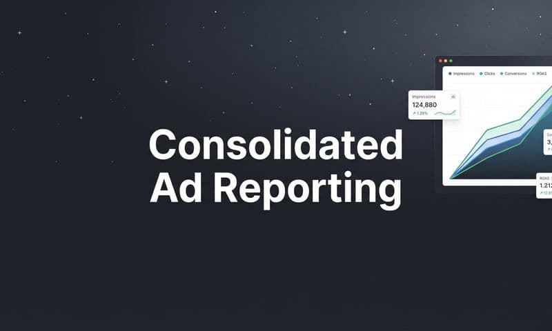
This dashboard gives you an idea of how to bring these metrics together for an at-a-glance view of performance.
 Guide to Digital Marketing Reporting
When your data is organized visually like this, you can spot trends in seconds and see which numbers are driving your overall success.
To make this even clearer, here is a table that breaks down the most important metrics to track at each stage of the funnel.
Key Marketing Metrics By Funnel Stage
A breakdown of essential metrics and KPIs to track at different stages of the customer journey, from initial awareness to final conversion.
Funnel Stage | Primary Goal | Example KPIs | What It Tells You |
|---|---|---|---|
Awareness (Top of Funnel) | Introduce your brand to a new audience and generate reach. | Impressions, Reach, Website Traffic, Social Media Followers | How many people are seeing your brand and content for the first time. |
Engagement (Middle of Funnel) | Capture interest and encourage interaction with your brand. | Click-Through Rate (CTR), Time on Page, Bounce Rate, Email Open Rate | How effectively your content is holding the audience's attention. |
Conversion (Bottom of Funnel) | Drive specific, valuable actions that lead to business growth. | Conversion Rate, Cost Per Acquisition (CPA), Return on Ad Spend (ROAS) | Whether your marketing efforts are successfully turning prospects into customers. |
Retention & Loyalty | Nurture existing customers to encourage repeat business and advocacy. | Customer Lifetime Value (CLV), Churn Rate, Repeat Purchase Rate | How good you are at keeping customers happy and coming back for more. |
Tracking metrics across the entire funnel ensures you don’t have any blind spots. It creates a complete picture of your marketing performance, from the first touch to the final sale and beyond.
Connecting Metrics to Business Outcomes
At the end of the day, every KPI you track should tie back to a bigger business objective, whether that’s growing revenue, cutting costs, or making customers happier. This is where truly understanding your data becomes a superpower.
To put this in perspective, the global digital ad industry is expected to hit an incredible $1.16 trillion by 2030. Within that massive market, data shows that SEO, websites, and blogs made up 16% of the channels delivering the highest ROI. This proves that tracking metrics like organic traffic and keyword rankings isn’t just a marketing task—it’s a core business activity that directly fuels your bottom line.
Of course, to really connect your marketing efforts to revenue, you need solid tracking in place. Figuring out how different touchpoints lead to a final sale is tough but absolutely essential. For a much deeper look at this, check out our complete guide to marketing attribution.
By choosing the right KPIs and linking them to real-world outcomes, your digital marketing reports stop being a boring list of numbers and become a strategic roadmap for growth.
How to Build an Effective Marketing Report
Collecting data is one thing. Turning that mountain of numbers into a clear, compelling story that actually drives action? That's the real challenge.
An effective report doesn't just list metrics. It crafts a narrative. It explains what happened, highlights new opportunities, and gives clear direction for what to do next. A report that just dumps data on someone is just noise. A report that tells a story is a powerful business tool.
This all starts with knowing your audience. An executive just needs the high-level ROI summary, but a channel manager needs to see the granular campaign performance. The structure, the content, even the visuals have to be tailored to who’s reading it.
Start with a Powerful Executive Summary
Before you even think about charts and graphs, write a concise executive summary. This is easily the most important part of your entire report, especially for busy stakeholders who might not read anything else.
Think of it as the trailer for your movie—it needs to hit all the main plot points and key takeaways in just a few sentences.
Your summary should nail three core questions:
- What were our main goals? Briefly remind everyone what you were trying to accomplish.
- Did we achieve them? Give a clear, top-line answer on how you performed against your KPIs.
- What are the key takeaways and next steps? Highlight the biggest wins, the toughest challenges, and what you recommend doing about them.
This section sets the stage and makes sure even the busiest person walks away knowing exactly how marketing is performing and why it matters.
Structure Your Report for Clarity
A well-structured report guides the reader logically from a broad overview down to the nitty-gritty details. After the executive summary, organize your content in a way that builds understanding, rather than causing overwhelm.
A great flow looks something like this:
- Overall Performance Dashboard: Start with a visual snapshot of your most important KPIs. Use charts and scorecards to show trends at a glance, like month-over-month lead growth or overall ROAS.
- Channel-Specific Breakdowns: Dedicate a section to each major channel—Paid Social, SEO, Email Marketing, etc. This is where you can dig into the metrics and performance for each one.
- Key Wins and Learnings: This is crucial. Highlight what went exceptionally well and, just as importantly, what didn't. Talk about that successful A/B test or the ad campaign that flopped, and explain what you learned from it.
- Action Plan and Recommendations: End with a clear, forward-looking plan. Based on everything you just showed, what should the team start, stop, or continue doing?
This structure ensures your report isn’t just a look back at the past, but a strategic guide for what comes next. Detailed documentation is a cornerstone of success, which is why we've put together a comprehensive guide on marketing campaign tracking to help you keep everything organized.
"Data is just the raw material. The real value comes from the insights you extract and the story you tell. A great report doesn't just show what happened; it explains why it happened and what you're going to do about it."
Visualize Data to Tell a Better Story
Let's be honest, humans are visual creatures. We process images 60,000 times faster than text, which is why charts and graphs are non-negotiable in a good report. They turn dense spreadsheets into simple visuals that make trends and patterns pop.
But you have to choose the right tool for the job:
- Line charts are perfect for showing trends over time, like website traffic or lead growth.
- Bar charts are great for comparing categories, like the performance of different ad campaigns.
- Pie charts work well for showing composition, like the percentage of traffic coming from organic vs. paid.
Always label your axes clearly, use a legend if needed, and add notes to point out significant events, like a campaign launch or a Google algorithm update. A well-designed visual provides context and makes your key points impossible to miss.
When you focus on the narrative, structure, and visualization, you build reports that people actually read—and more importantly, act on.
Finding The Right Reporting and Automation Tools
Let's be honest: manually pulling data from a dozen different platforms every week is a surefire way to burn out. It’s tedious, prone to errors, and steals hours that you should be spending on strategy and analysis. This is exactly where modern digital marketing reporting tools step in. They do the grunt work for you, connecting all your data sources into a single, cohesive view.
Choosing the right tool is a lot like picking the right vehicle for a road trip. A sleek sports car is perfect for a quick spin, but it's completely useless if you're planning a cross-country camping trip that requires off-road capability. The best reporting tool for you depends entirely on your team’s size, budget, and what you’re trying to achieve. The goal isn't just to collect data, but to find a solution that helps you understand it faster.
 Guide to Digital Marketing Reporting
The Main Categories Of Reporting Tools
The market for reporting software is massive, but most tools fall into one of three buckets. Each one serves a different purpose, and it’s common for businesses to use a combination of them to get the full picture.
- All-in-One Platforms: Think of these as the Swiss Army knives of the marketing world. Tools like HubSpot or Marketo bundle everything—CRM, email marketing, social media management, and robust reporting—into one package. They're great for getting a unified view of the entire customer journey, from the first click to the final sale.
- Data Visualization and Dashboard Tools: Platforms like Looker Studio (formerly Google Data Studio), Tableau, and Power BI are masters of bringing data together and making it look good. They use connectors to pull information from hundreds of sources—Google Ads, Facebook, your CRM—and turn it all into beautiful, interactive dashboards that make complex data easy to digest.
- Specialized Channel Analytics Tools: These tools go deep on a single channel. We’re talking about tools like SEMrush or Ahrefs for SEO, or Sprout Social for social media analytics. They provide granular data and competitive insights that broader platforms often miss. For example, integrating a specialized tool like Amazon Attribution is crucial if you need to track how your off-platform ads are performing.
The best reporting stack isn't about having the most tools; it's about having the right tools that work together. Your goal should be to create a seamless flow of data that powers clear, actionable insights without unnecessary complexity.
A huge part of this is understanding how different touchpoints contribute to a conversion. To get a better handle on this, you can check out our detailed guide: https://www.cometly.com/post/guide-to-multi-touch-attribution. This will help you see how different tools fit into the bigger picture of tracking customer journeys.
To help you decide, let's break down the main types of reporting tools and what they're best suited for.
Comparison Of Digital Marketing Reporting Tool Types
Tool Category | Primary Function | Examples | Best For |
|---|---|---|---|
All-in-One Platforms | Combines multiple marketing functions (CRM, email, social) with reporting. | HubSpot, Marketo | Businesses looking for a single, integrated system to manage the entire customer lifecycle. |
Data Visualization Tools | Aggregates and visualizes data from various sources into custom dashboards. | Looker Studio, Tableau | Teams that need to blend data from many different platforms for comprehensive analysis. |
Specialized Analytics Tools | Provides deep, channel-specific insights and competitive analysis. | SEMrush, Ahrefs, Sprout Social | Marketers who need granular data and advanced features for a specific channel like SEO or social media. |
Ultimately, the right choice depends on where you need the most clarity. An all-in-one might be great for overall journey mapping, but you'll likely still need a specialized tool to dig into the nitty-gritty of your SEO performance.
The Growing Role Of AI In Reporting
The next wave of reporting is already here, and it's powered by AI. Artificial intelligence is quickly shifting from a buzzword to an essential feature in modern reporting tools, changing how we interact with our data. It’s no longer just about automating data collection; it’s about automating the discovery of insights.
AI-driven features can now:
- Surface Critical Insights: Automatically scan thousands of data points to pinpoint significant trends, like a sudden drop in conversion rate for a key demographic, without you having to look for it.
- Flag Performance Anomalies: Send you an alert in real-time when a campaign starts overspending or an ad's performance unexpectedly tanks.
- Generate Report Summaries: Use natural language to write concise, human-readable summaries of your performance data, saving you hours of manual analysis and writing.
This isn’t just a niche trend—it’s backed by serious investment. One recent report found that 71% of marketers plan to invest at least $10 million in AI over the next three years, and 83% of CMOs are optimistic about its impact. This shows how central AI is becoming to how we measure performance.
By embracing these tools, you can move from just reporting on what happened in the past to proactively shaping what happens next.
Using Advanced Reporting Strategies
 Guide to Digital Marketing Reporting
Once you've nailed the basics, it's time to graduate from simple performance tracking. Welcome to the world of advanced digital marketing reporting. This is where you stop just describing what happened and start explaining why it happened—and even predicting what will happen next.
Advanced strategies help you connect the dots, turning scattered data points into a clear story about your customer's journey. These aren't just for massive companies, either. Any business willing to dig a little deeper can gain a serious strategic edge, making smarter budget decisions and unlocking growth that surface-level reports would have missed entirely.
Demystifying Cross-Channel Attribution
One of the biggest headaches in marketing is figuring out which touchpoints actually deserve credit for a conversion. A customer might see a Facebook ad, click a Google search result, and then open an email before finally buying something. So, who gets the credit?
Cross-channel attribution models are the frameworks that help you answer that question.
Simpler models give all the credit to a single event:
- First-Touch Attribution: The very first channel a customer interacts with gets 100% of the credit. This is great for understanding which channels are driving initial awareness.
- Last-Touch Attribution: The final channel a customer touches before converting gets 100% of the credit. It’s easy to track but often overvalues bottom-of-the-funnel tactics while ignoring everything that came before.
But the real customer journey is rarely that simple. That's where more sophisticated models come in. Multi-touch attribution spreads the credit across multiple touchpoints, giving you a much more balanced view of what’s actually working.
This lets you appreciate the teamwork between your channels, helping you build a more effective demand generation engine. You can dive deeper into this topic by exploring our guide on https://www.cometly.com/post/mastering-demand-generation.
Moving from single-touch to multi-touch attribution is like switching from a single spotlight to full stage lighting. You suddenly see every actor's contribution to the final performance, not just the one who delivered the final line.
Unlocking Long-Term Value with Cohort Analysis
While most reports focus on short-term wins like monthly conversions, cohort analysis zooms out to give you a long-term view of customer behavior. This technique groups users based on a shared trait—usually when they signed up or made their first purchase—and tracks their actions over time.
For example, you could compare the retention rate of customers you acquired in January versus those who came on board in March. If the March group sticks around longer, you can dig into what you were doing differently that month. This insight is pure gold for subscription businesses or e-commerce stores that rely on repeat purchases.
Cohort analysis helps you answer critical questions like:
- How long does it take for a new customer to become profitable?
- Which acquisition channels bring in the most loyal, high-value customers?
- Did our new onboarding process actually improve customer retention?
By understanding this long-term value, you can justify investing in channels that might have a higher upfront cost but deliver more loyal customers down the road.
Looking Forward with Predictive Analytics
The final frontier of reporting is moving from reactive to proactive. Predictive analytics uses your historical data, statistical algorithms, and machine learning to forecast what’s likely to happen next. Instead of just reporting on last month's churn rate, predictive models can flag which customers are at risk of churning right now, so you can step in and save them.
This forward-looking approach turns your reporting from a history lesson into a strategic weapon. It helps you forecast campaign performance, predict customer lifetime value, and put your budget where it will deliver the best future returns.
Considering there are now roughly 5.56 billion internet users worldwide, the ability to predict behavior across such a massive audience is a game-changer. You can find more details on this in the Digital 2025 Global Overview Report. This enormous user base, primarily on mobile, creates an incredibly rich dataset for building powerful predictive models.
How to Present Reports That Drive Action
Look, a brilliant digital marketing report is completely useless if it just sits in an inbox, unread and ignored. The final, and most critical, step is turning all that data into a story that actually inspires people to do something. This isn't just about showing numbers on a slide; it's about communication, influence, and transforming yourself from a data reporter into a trusted strategic advisor.
The real key is to present your findings in a way that resonates with everyone in the room—especially the non-marketers. They don’t care about click-through rates or impression shares. What they care about is revenue, growth, and solving real business problems. Your job is to connect your marketing data directly to those high-level goals.
Frame Your Narrative Around Business Goals
Before you even open your presentation, you need to know your audience's priorities. A CEO wants to see the return on investment (ROI). A sales manager wants to know about lead quality. You have to tailor your story to answer their biggest questions right from the start.
Instead of saying, "Our cost per click decreased by 15%," try reframing it. Flip it to this: "We made our advertising 15% more efficient, which allowed us to generate 200 additional high-quality leads for the sales team without increasing our budget." See the difference? The second version connects a marketing metric directly to a tangible business outcome.
The What, So What, Now What Framework
The most effective presentations I've ever seen follow a simple but powerful structure. It’s a framework that moves your audience from data to decision-making, ensuring every point you make has a clear purpose.
- The What: Start with the key data point. "Our organic search traffic increased by 30% this quarter." This is the objective fact.
- The So What: Explain why this fact actually matters. "This is significant because these visitors are highly engaged, spending twice as long on our site as visitors from other channels." This adds the crucial context.
- The Now What: Propose a clear, actionable next step. "Based on this, we recommend doubling down on our content strategy and allocating more resources to SEO to capture even more of this high-intent audience."
This framework turns a dry data point into a compelling argument for a specific action. It’s how you get heads nodding in agreement.
A presentation that ends with data is a failure. A presentation that ends with a clear, data-backed recommendation for what to do next is a success. Your goal is to leave the room with agreement and a mandate for action.
When you present your digital marketing reporting, you are not just sharing information—you are guiding the company's strategy. By focusing on the 'so what' and tying every metric back to the bottom line, you show the immense value marketing brings to the table. This approach secures buy-in, builds trust, and positions you as an essential driver of business growth. Your reports stop being a review of the past and become the roadmap for a more profitable future.
Frequently Asked Questions
How Often Should I Create Marketing Reports?
There’s no one-size-fits-all answer here—it really boils down to who’s reading the report and what they need to know.
For the folks in the trenches, like your campaign managers, daily or weekly reports are often best. They need to see tactical metrics like ad spend and click-through rates to make quick adjustments.
Your management team, on the other hand, probably doesn't need that daily firehose of data. A monthly report gives them a broader look at performance against key KPIs. For executive leadership, a quarterly report is usually perfect. They're focused on the big picture: high-level ROI, market trends, and overall strategic progress.
What Is the Biggest Reporting Mistake?
The most common trap marketers fall into is focusing on "vanity metrics." These are the numbers that look impressive on the surface—like page views or a spike in social media likes—but don't actually connect to business outcomes.
A report packed with flashy but irrelevant numbers is just noise. It doesn't prove value or help guide strategy.
Always, always anchor your reports to the KPIs that directly impact the bottom line. Think conversion rates, customer acquisition cost (CAC), and, of course, return on investment (ROI).
How Do I Start if My Data Is Scattered?
It's a classic problem: your data lives in a dozen different places. Start by identifying your most critical sources. For most, this will be Google Analytics, your CRM, and your main social media ad platforms.
Once you know where your data is, the next step is to bring it all together with a data dashboard tool.
These tools act as a central hub, using connectors to automatically pull data from all your scattered sources into one unified dashboard. This means you can finally stop the tedious cycle of manually exporting and importing spreadsheets and start visualizing your cross-channel performance in one place.
Ready to stop guessing and start seeing exactly what drives your revenue? Cometly is the marketing attribution platform that unifies all your data into one clear view, showing you which campaigns, ads, and channels deliver real results. Eliminate wasted spend and scale with confidence. Get started with Cometly today.