You're staring at five browser tabs. Meta Ads Manager shows 47 conversions. Google Ads claims 52. LinkedIn reports 18. Your CRM says 61 deals closed this month. And your spreadsheet? It's telling you absolutely nothing about which campaigns actually drove revenue.
This is the daily reality for marketing teams running multi-platform campaigns. You're collecting mountains of data from every touchpoint, but when your CEO asks "what's working?", you're stuck piecing together conflicting reports like a detective with half the clues missing.
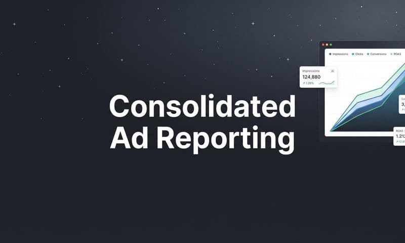
An attribution data visualization tool solves this exact problem. It connects all your tracking data across platforms, applies attribution logic to assign proper credit, and transforms the chaos into clear visual insights you can actually use. Instead of drowning in spreadsheets, you see customer journeys mapped out, channel performance compared side by side, and conversion paths that reveal exactly how prospects become customers.
Turning Raw Attribution Data Into Visual Clarity
An attribution data visualization tool does something deceptively simple: it takes the messy tracking data scattered across your marketing stack and turns it into charts, graphs, and dashboards that make sense at a glance.
Think about what raw attribution data actually looks like. It's timestamps showing when someone clicked an ad. UTM parameters tracking which campaign they came from. Conversion events recording when they filled out a form or made a purchase. Cookie IDs attempting to connect multiple sessions from the same person. CRM entries showing when a deal closed weeks after the first touchpoint.
This data exists, but it's fragmented. Meta tracks its clicks. Google tracks its clicks. Your website analytics tracks sessions. Your CRM tracks deals. None of them talk to each other naturally, and none of them show you the complete picture of how a customer actually moved from stranger to buyer.
Visualization tools connect these data sources through integrations and APIs. They pull in ad click data from Meta and Google, website session data from your analytics platform, form submissions from your website, and deal data from your CRM. Then they match these events to individual users, building a unified timeline of every touchpoint in the customer journey. Understanding how to leverage first-party data tracking tools becomes essential for building this complete picture.
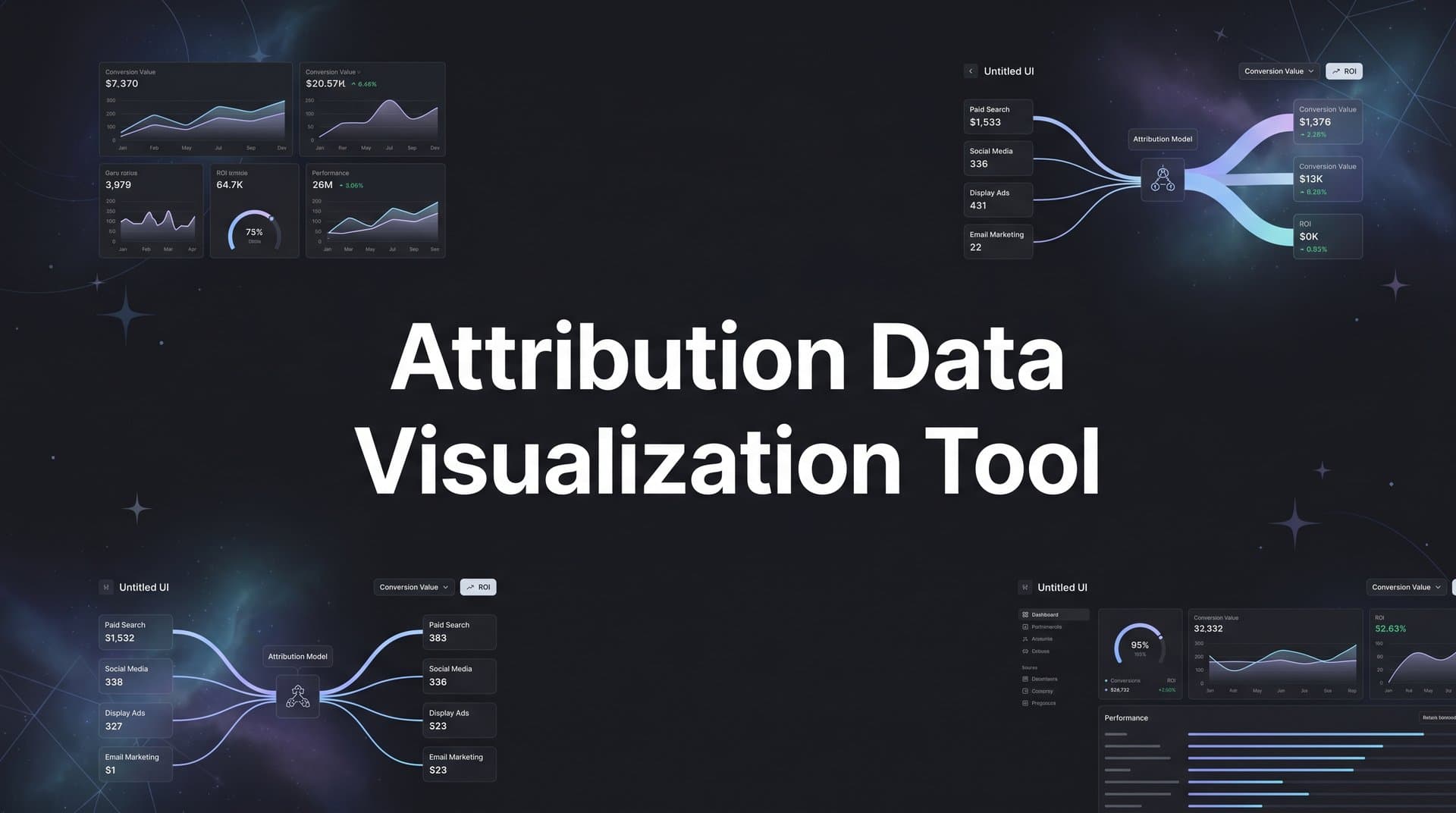
But collecting data is only half the job. The tool then applies attribution models to assign credit. A first-touch model gives all credit to the initial interaction. Last-touch credits the final touchpoint before conversion. Linear attribution spreads credit evenly across all touchpoints. More sophisticated data-driven models use algorithms to weight each interaction based on its actual influence on conversion.
The visualization layer sits on top of this attribution logic. Instead of showing you database tables or CSV exports, it presents the information graphically. Customer journeys appear as flow diagrams showing the actual path from awareness to purchase. Channel performance shows up as comparison charts making it instantly clear which platforms drive the most revenue. Conversion trends appear as line graphs revealing patterns over time.
The transformation is dramatic. Raw data says "User 47283 clicked ad ID 9284710 at 14:32:07 on April 15." Visualized data shows you that this user represents one of 47 people who saw a Meta ad first, then searched on Google three days later, and finally converted after clicking a retargeting ad. You see this pattern repeated across hundreds of customers, revealing that Meta awareness campaigns feed your Google search conversions.
That's the core function: connecting fragmented tracking data, applying attribution logic, and displaying the results in visual formats that reveal patterns you'd never spot in spreadsheets.
Why Spreadsheets Fall Short for Attribution Analysis
Spreadsheets are powerful tools. They're just not built for modern marketing attribution.
The fundamental problem is complexity. A single customer journey might include ten touchpoints across five platforms over three weeks. If you're running campaigns on Meta, Google, LinkedIn, TikTok, and email, and you're tracking 500 conversions per month, you're dealing with thousands of individual data points. Each touchpoint has multiple dimensions: platform, campaign, ad set, creative, timestamp, device, location.
You can export all this data into a spreadsheet. But then what? You're looking at rows and rows of timestamps and campaign IDs. To answer "which channel drives the most revenue?", you need to manually match conversion events back to their source touchpoints, account for multi-touch journeys, avoid double-counting, and somehow visualize the results. This is where fixing attribution data discrepancies becomes a critical skill.
Even if you're a spreadsheet wizard with pivot tables and formulas, this takes hours. And by the time you finish your analysis, your campaign performance has already shifted. You're making decisions based on data that's already outdated.
The time lag kills agility. Modern paid advertising requires fast iteration. You launch new creatives, test different audiences, adjust budgets based on performance. If your reporting process takes two days, you're flying blind. You're spending money on campaigns that might be underperforming while you wait for your spreadsheet analysis to tell you what happened yesterday.
But the bigger issue is pattern recognition. Human brains are wired to spot patterns in visual information. Show someone a line graph trending upward, and they instantly understand "this is improving." Show them the same data as 50 rows of numbers, and they need to study it carefully to reach the same conclusion.
This becomes critical when you're trying to understand customer journeys. A spreadsheet might show you that User A touched five campaigns before converting. But it can't easily show you that 200 other users followed nearly identical paths. It can't reveal that prospects who see your Meta awareness campaign first are three times more likely to convert than those who start with a Google search. These patterns exist in the data, but they're invisible in spreadsheet format.
Spreadsheets also struggle with comparisons. You want to see how Meta performance compares to Google, TikTok, and LinkedIn simultaneously. In a spreadsheet, you're building multiple pivot tables, copying data between sheets, creating charts manually. In a visualization tool, you're looking at a single dashboard showing all four channels side by side with their revenue contribution, cost per acquisition, and conversion rates instantly comparable.
The limitation isn't your spreadsheet skills. It's that spreadsheets were designed for financial modeling and data storage, not for revealing complex multi-dimensional patterns in real-time marketing data. They're the wrong tool for the job.
Five Visualization Types That Reveal Campaign Performance
Different questions require different visualizations. Here are the five types that unlock the most valuable marketing insights.
Customer Journey Flow Diagrams: These show the actual paths people take from first touchpoint to conversion. Imagine a Sankey diagram where the left side shows all possible entry points (Meta ad, Google search, LinkedIn post, direct traffic), the middle shows subsequent touchpoints, and the right side shows conversions. The width of each flow represents volume—you can literally see that 300 people started with a Meta ad, 180 of them later clicked a Google ad, and 45 of those converted.
This visualization answers questions spreadsheets can't touch. Which entry points lead to the most conversions? Where do people drop off? What's the most common path to purchase? You spot patterns like "prospects who engage with Meta first and then see a retargeting ad convert at twice the rate of those who only see one touchpoint." This insight drives budget allocation decisions immediately.
Channel Comparison Charts: Bar charts and pie charts showing revenue contribution across platforms side by side. You see that Meta drove 40% of attributed revenue, Google drove 35%, LinkedIn drove 15%, and email drove 10%. Below that, you see cost per acquisition for each channel, making it instantly clear which platforms deliver the best ROI. Implementing cross-platform attribution makes these comparisons possible.
The power here is unified comparison. Each platform's native dashboard makes its own performance look good. Meta shows you Meta conversions. Google shows you Google conversions. But when you add them up, you get 150% of your actual conversions because they're double-counting. A visualization tool deduplicates and shows true contribution, revealing which channels actually deserve more budget.
Time-Based Trend Visualizations: Line graphs showing how attribution shifts over time. You might see that Meta's revenue contribution was 50% in January, dropped to 35% in February, then climbed back to 45% in March. This reveals seasonal patterns, the impact of campaign changes, and emerging trends.
These visualizations help you understand cause and effect. You launched a new campaign on March 15th. Did it actually improve performance? The trend line shows you immediately. You increased Meta budget in week two. Did revenue increase proportionally, or did you hit diminishing returns? The graph reveals the answer without complex calculations.
Cohort Analysis Views: These group users by shared characteristics (acquisition date, first touchpoint, campaign source) and show how each cohort performs over time. You might see that users acquired through Meta in January have a 25% conversion rate after 30 days, while those acquired through Google have a 35% conversion rate in the same timeframe.
This visualization type reveals long-term value patterns. Some channels might drive quick conversions but low lifetime value. Others might take longer to convert but deliver better customers. Cohort views make these patterns visible, informing not just immediate campaign optimization but strategic channel investment decisions.
Funnel Visualizations: These show conversion rates at each stage of your customer journey. You see that 10,000 people clicked ads, 3,000 visited your pricing page, 800 started a trial, and 200 became customers. The width of each funnel stage makes drop-off points visually obvious.
The insight comes from comparing funnels across different segments. The funnel for Meta traffic might show a 30% click-to-trial rate, while Google traffic shows 45%. This tells you that Google attracts more qualified traffic, or that your Meta targeting needs refinement. You can also compare funnels over time to see if conversion rates are improving or declining at specific stages.
Each visualization type answers different questions. Flow diagrams reveal journey patterns. Comparison charts show channel performance. Trend lines expose changes over time. Cohort analysis uncovers long-term value. Funnels highlight conversion bottlenecks. Together, they transform attribution data from numbers in a database to insights that drive decisions.
Selecting the Right Tool for Your Marketing Stack
Not all attribution visualization tools are built the same. Here's what matters when evaluating options.
Start with integration requirements. The tool needs to connect to every platform you use for marketing. If you're running Meta ads, Google ads, and LinkedIn campaigns, the tool must have native integrations with all three. If you're using HubSpot or Salesforce as your CRM, it needs to pull deal data from there. If you track website behavior with Google Analytics or a custom solution, it needs access to that data too. A comprehensive marketing attribution tool with integrations eliminates these connectivity headaches.
Partial integrations create blind spots. A tool that connects to Meta and Google but not LinkedIn will show you incomplete customer journeys. You'll see someone click a Meta ad and then convert, missing the LinkedIn touchpoint in between that actually influenced the decision. Comprehensive integrations ensure you're visualizing the complete picture, not just the parts one vendor can track.
Attribution model flexibility matters significantly. Different models reveal different insights, and you need the ability to compare them. A tool that only offers last-touch attribution will consistently undervalue your awareness campaigns. One that only offers first-touch will undervalue your retargeting and conversion-focused efforts.
Look for tools offering multiple models: first-touch, last-touch, linear, time-decay, position-based, and ideally data-driven attribution. More importantly, you should be able to switch between models easily and see how your channel performance changes under different attribution logic. A thorough multi-touch attribution tool comparison can help you evaluate these capabilities across vendors.
Real-time versus batch processing represents a critical tradeoff. Real-time tools update dashboards continuously as new data arrives. You see campaign performance change throughout the day, enabling immediate optimization. Batch processing tools update once daily or even weekly, trading immediacy for data accuracy and completeness.
Real-time feels better, but it comes with caveats. Conversion events might not sync instantly from your CRM. Attribution calculations might change as more data arrives. What looks like a winning campaign at noon might show different results by end of day once all conversions are processed. Batch processing ensures all data is complete before displaying results, reducing false signals.
The right choice depends on your optimization cadence. If you're testing new creatives daily and need immediate feedback, real-time matters. If you're making weekly budget decisions based on complete data, batch processing might serve you better. Some tools offer both: real-time preliminary data with batch-processed confirmed results.
Finally, consider customization and sharing capabilities. Can you build custom dashboards for different stakeholders? Your CEO needs a high-level revenue attribution view. Your media buyer needs campaign-level performance details. Your content team needs to see which blog posts drive conversions. A good tool lets you create different views for different audiences without forcing everyone to look at the same overwhelming dashboard.
Putting Your Visualization Tool to Work
You've selected a tool and connected your data sources. Now comes the practical work of building dashboards that drive decisions.
Start with three essential views. First, create a channel overview dashboard showing revenue attribution across all your marketing platforms. This becomes your daily check-in view. You see at a glance which channels are performing, which are underperforming, and where your budget is going. Include total attributed revenue, cost per acquisition, and return on ad spend for each channel. Add a trend line showing how these metrics have changed over the past 30 days. Exploring the best data visualization tools for marketing analytics can help you identify which platforms excel at these overview dashboards.
Second, build a campaign performance dashboard drilling into individual campaigns within each channel. This is where your media buyers live. They need to see which specific Meta campaigns drive results, which Google ad groups perform best, which LinkedIn audiences convert. Include metrics like click-through rate, conversion rate, and cost per conversion. Make it easy to sort by performance and identify both winners to scale and losers to pause.
Third, create a conversion path dashboard showing actual customer journeys. This view reveals how touchpoints work together. You see that prospects typically interact with three touchpoints before converting, that Meta awareness campaigns feed Google search traffic, that retargeting ads close deals that started weeks earlier. This dashboard informs strategy more than daily optimization, showing you how your channels complement each other.
These three dashboards cover the essential bases: overall performance, campaign-level details, and strategic journey insights. You can build more specialized views later, but start here.
Next, create stakeholder reports tailored to different audiences. Your executive team doesn't need campaign-level details. They need a one-page view showing total marketing spend, attributed revenue, overall ROI, and how these numbers compare to last month and last quarter. Use simple visualizations: a single bar chart comparing channel performance, a line graph showing revenue trends, key metrics in large, clear numbers.
Your media buying team needs the opposite: granular detail they can act on. Give them access to campaign dashboards with the ability to filter by date range, channel, and campaign type. Include enough detail that they can identify which specific ads, audiences, and placements drive results. Make it easy to export data for deeper analysis when needed. Teams focused on revenue attribution tracking particularly benefit from this level of granularity.
Your content and creative teams need different insights entirely. Show them which blog posts, landing pages, and ad creatives appear most frequently in converting customer journeys. Reveal which messages resonate, which calls-to-action work, which visual styles drive engagement. This feedback loop improves creative production over time.
Finally, use visual insights to drive actual budget decisions. This is where visualization pays off. You notice that Meta's cost per acquisition has increased 40% over the past two weeks while Google's has stayed flat. The visualization makes this trend obvious. You reallocate budget from Meta to Google, testing whether Google can scale efficiently with more spend.
You see that prospects who engage with three or more touchpoints convert at five times the rate of single-touch prospects. This insight drives a strategic shift: instead of optimizing each channel in isolation, you invest in multi-touch campaigns designed to create multiple impressions across platforms.
You spot that conversion rates spike on Tuesdays and Wednesdays but drop on weekends. You adjust ad scheduling to concentrate budget on high-converting days, improving overall efficiency without changing anything else about your campaigns.
These decisions flow naturally from visual insights. The data was always there, but visualization makes the patterns obvious enough to act on confidently.
Putting It All Together: From Data to Decisions
The journey from scattered platform data to unified visual insights transforms how marketing teams operate. Instead of spending hours reconciling reports and building spreadsheets, you're looking at dashboards that show exactly what's working and what's not.
Attribution data visualization bridges the gap between collecting data and using it. You're already tracking touchpoints across Meta, Google, LinkedIn, your website, and your CRM. The visualization tool connects these data points, applies attribution logic, and presents the results in formats your brain can process instantly. Customer journey flows reveal how channels work together. Comparison charts show which platforms deserve more budget. Trend lines expose emerging patterns before they become obvious in raw numbers.
The transformation isn't just visual—it's operational. Teams make faster decisions because insights are immediate. Budget allocation improves because channel performance is clearly comparable. Campaign optimization accelerates because you see what's working in real time rather than days later. Strategic planning gets better because you understand how the entire marketing system functions, not just individual pieces.
This is how modern marketing teams operate. They don't guess which campaigns drive revenue. They don't wait for monthly reports to reveal what happened weeks ago. They see their marketing performance clearly, understand the complete customer journey, and optimize based on data they can trust.
The difference between good marketing and great marketing often comes down to visibility. You can't improve what you can't see clearly. Attribution data visualization gives you that clarity.
Moving Forward with Clear Marketing Insights
Seeing your marketing performance clearly is the first step to scaling what works. Attribution data visualization tools transform the chaos of multi-platform campaigns into insights you can act on immediately. You move from wondering which campaigns drive revenue to knowing with confidence. You shift from reactive reporting to proactive optimization. You turn data collection into data-driven growth.
The marketing teams winning today aren't necessarily spending more—they're seeing more clearly. They understand how their channels work together, which touchpoints matter most, and where to invest for maximum impact. They've moved beyond platform-specific metrics to unified attribution that reveals the complete picture.
Ready to elevate your marketing game with precision and confidence? Discover how Cometly's AI-driven recommendations can transform your ad strategy—Get your free demo today and start capturing every touchpoint to maximize your conversions.