You have dashboards. Lots of them. Meta Ads Manager, Google Ads, TikTok, your CRM, Google Analytics, maybe a spreadsheet or two stitched together with hope and formulas. And yet, when someone asks you which campaigns are actually driving revenue, you hesitate.
That hesitation is not a skills problem. It is a data problem. Each platform you run ads on tells its own version of the story, optimized to make itself look as valuable as possible. Meta claims the conversion. Google claims the conversion. Meanwhile, your actual revenue numbers tell a quieter, more complicated truth.
This is the core frustration facing marketers today: access to more data than ever, but less clarity about what actually works. The dashboards multiply, the reports pile up, and the signal gets buried under noise. The result is budget decisions made on incomplete information, campaigns scaled based on inflated metrics, and money left on the table because the real winners never got identified.
Not all marketing analytics dashboards are created equal. Some generate reports. Others drive decisions. The difference between them comes down to a handful of specific capabilities that separate dashboards delivering genuine value from those producing expensive confusion. This guide breaks down exactly what those capabilities are, why they matter, and how to evaluate whether your current setup is working for you or against you.
Why Most Dashboards Leave Marketers Guessing
Every major ad platform comes with its own native dashboard. Meta Ads Manager, Google Ads, TikTok Ads Manager, LinkedIn Campaign Manager. These tools are polished, feature-rich, and genuinely useful for managing campaigns within their own ecosystems. The problem starts when you try to use them together to understand the full picture.
Each platform uses its own attribution model, its own conversion windows, and its own definition of success. When a customer sees a Meta ad on Monday, clicks a Google search result on Wednesday, and converts on Friday, both platforms will often claim full credit for that sale. Add a third or fourth touchpoint and the overlap compounds further. When you sum up the conversions reported across your platforms, the total frequently exceeds your actual revenue by a significant margin. That gap is not a glitch. It is a structural feature of how platform-native dashboards are designed.
Beyond the double-counting problem, there is the vanity metrics trap. Impressions, clicks, click-through rate, reach: these numbers are easy to measure, easy to report, and easy to optimize for. They are also largely disconnected from the outcomes that actually matter to your business. A campaign can generate thousands of clicks and deliver almost no revenue. A campaign with a modest click-through rate can drive a disproportionate share of your best customers.
Dashboards that surface impressions and CTR as headline metrics are not useless, but they are incomplete. The metrics that actually drive budget decisions are cost per acquisition, return on ad spend, and customer lifetime value. These numbers require connecting ad performance data to actual sales outcomes, which most platform-native dashboards cannot do on their own. This is why unreliable marketing analytics data remains one of the biggest obstacles to effective budget allocation.
The third layer of the problem is data fragmentation. Your ad platforms live in one world. Your CRM lives in another. Your website analytics live in a third. Each system captures a piece of the customer journey, but none of them see the whole thing. A lead that comes in through a paid search ad, gets nurtured through email, and converts through a retargeting campaign on Meta represents a journey that no single platform can fully describe.
When marketers try to piece this together manually, pulling exports from multiple platforms and merging them in spreadsheets, they spend hours on work that should take minutes, and they still end up with an incomplete picture. The blind spots that result from these data silos are where budget gets wasted and where winning campaigns go unrecognized. A unified marketing analytics dashboard eliminates these silos by bringing every channel into one view.
Five Traits of Dashboards That Actually Drive Decisions
So what separates a dashboard that generates real value from one that generates reports nobody acts on? After looking at how high-performing marketing teams use analytics tools, a clear pattern emerges. The dashboards that drive the best decisions share five specific characteristics.
Cross-platform unification: The most important trait is the ability to pull data from every ad channel into a single, unified view. When you can see Meta, Google, TikTok, LinkedIn, and any other channel you run in one place, with consistent metrics and consistent attribution, you can make genuine apples-to-apples comparisons. You stop asking "how is my Meta campaign performing?" and start asking "which channel is delivering the best return on this budget?" That shift in framing leads to much smarter allocation decisions.
Revenue attribution at the core: A high-value dashboard does not stop at the click. It connects ad interactions to actual revenue outcomes, whether that means completed purchases, qualified leads in your CRM, or closed deals. This requires integrating with your CRM and sales data, not just your ad platforms. When revenue is the north star metric, every other number in the dashboard gets interpreted through a lens that actually matters to your business. Understanding the purpose of attribution in digital marketing is essential to building this kind of revenue-connected view.
Real-time data with actionable recommendations: There is a meaningful difference between a dashboard that tells you what happened last week and one that surfaces opportunities right now. If a campaign starts underperforming on Tuesday, you want to know on Tuesday, not when you pull your weekly report on Friday. Better still, you want the dashboard to tell you not just that something changed, but what you should do about it. AI-powered recommendations that flag optimization opportunities in real time move a dashboard from a passive reporting tool to an active decision-support system.
Multi-touch attribution built in: Customer journeys rarely follow a straight line from ad click to purchase. A dashboard that only measures last-click or first-click attribution will consistently misattribute credit and lead you to make budget decisions based on a distorted picture. Dashboards built on multi-touch attribution models distribute credit across the full journey, giving you a more accurate view of what is actually contributing to conversions.
Accurate underlying data: All of the above capabilities depend on one thing: the quality of the data feeding the dashboard. A beautifully designed dashboard built on inaccurate or incomplete tracking data will lead you to confident, wrong conclusions. This is why data collection methodology, specifically how conversions are tracked and verified, is a foundational requirement rather than an afterthought.
When these five traits come together in a single platform, the dashboard stops being a reporting tool and becomes a genuine competitive advantage. Marketing teams that operate from this kind of clarity move faster, waste less, and scale more confidently than those piecing together insights from fragmented sources.
How Multi-Touch Attribution Changes What You See
Attribution sounds like a technical concept, but at its core it answers a simple question: which marketing interactions deserve credit for this conversion? The answer you get depends entirely on the model you use, and different models tell dramatically different stories.
Let's walk through a practical example. A potential customer sees a Meta video ad on a Tuesday and does not click. On Thursday, they search for your product on Google, click an ad, and browse your website for a few minutes before leaving. On Saturday, they see a retargeting ad on Meta, click through, and make a purchase.
Under a last-click model, Meta retargeting gets 100% of the credit. Under a first-touch model, the Google search ad gets 100% of the credit, even though the customer had already been exposed to your brand through Meta. Under a linear model, credit is split equally across all touchpoints. Under a data-driven model, credit is distributed based on statistical analysis of which touchpoints actually correlate with conversions across your full dataset.
Each of these models produces a different picture of what worked. Last-click consistently overvalues retargeting and undervalues the top-of-funnel activity that created the demand in the first place. First-touch does the opposite. Linear is more balanced but treats every touchpoint as equally important regardless of its actual influence. Data-driven attribution, when built on a large enough dataset, tends to produce the most accurate picture because it reflects real patterns in your customers' behavior. The growing role of machine learning in marketing analytics is what makes these data-driven models increasingly powerful and accessible.
Why does this matter for budget decisions? Because if you are running on last-click attribution and it tells you retargeting is your highest-performing channel, you might scale retargeting spend aggressively while cutting back on the awareness campaigns that are actually generating the audience you are retargeting. The result is a shrinking pool of potential customers and declining returns over time.
Dashboards built on multi-touch attribution give you a fundamentally more accurate view of your marketing mix. They reveal which channels are doing the heavy lifting at different stages of the funnel, which combinations of touchpoints correlate with your highest-value customers, and where you can reallocate budget to improve overall performance. Exploring the different types of marketing analytics helps you understand which approach best fits your business model and customer journey complexity.
Server-Side Tracking and the Data Accuracy Gap
Even the most sophisticated attribution model is only as good as the data it receives. And right now, the data feeding most marketing dashboards is increasingly incomplete.
Traditional analytics tracking relies on JavaScript pixels placed in the browser. When a user visits your site and completes a purchase, the pixel fires and sends that conversion data to your ad platforms and analytics tools. This approach worked reasonably well for years. But the landscape has shifted significantly.
Ad blockers prevent pixels from firing on a growing share of browsers. Apple's App Tracking Transparency framework limits the ability to track users across apps on iOS devices. Cookie-based tracking has become less reliable as browsers restrict third-party cookies and users clear their cookies more frequently. The cumulative effect is that browser-based tracking systematically undercounts conversions, sometimes by a significant margin. Understanding the digital marketing strategy that tracks users across the web is critical for grasping why these privacy changes have such a profound impact on data accuracy.
When your dashboard is missing conversions, everything downstream is distorted. Your cost per acquisition looks higher than it actually is. Your ROAS looks lower. Campaigns that are actually performing well appear to be underperforming, and you may pause or cut spend on them based on incomplete data.
Server-side tracking addresses this problem by moving the tracking logic off the browser and onto your server. Instead of relying on a pixel in the user's browser to fire correctly, your server sends conversion data directly to your analytics and ad platforms. This approach bypasses ad blockers, is not affected by browser privacy settings, and captures conversions that browser-based tracking would miss.
The downstream effect of more accurate tracking extends beyond your own dashboard. When you feed richer, more complete conversion data back to platforms like Meta and Google, their machine learning algorithms have better signal to work with. They can identify the characteristics of your actual converting customers more precisely, improve their targeting, and optimize your campaigns more effectively. Better data into the ad platform algorithms means better targeting, lower acquisition costs, and improved return on ad spend over time. This is one of the key real-time marketing analytics benefits that compounds as your dataset grows.
This is why server-side tracking is not just a technical nicety. It is a foundational requirement for any marketing analytics setup that wants to deliver accurate, actionable insights in the current privacy environment.
Turning Dashboard Insights Into Budget Decisions
Having a great dashboard is only valuable if it leads to better decisions. The gap between seeing data and acting on it is where many marketing teams lose momentum. Here is how to close that gap systematically.
Start with channel-level performance comparison. A unified dashboard lets you see, in a single view, which channels are delivering the best cost per acquisition and ROAS. When you can compare Meta, Google, and other channels on the same metrics with the same attribution model applied consistently, the underperformers become obvious. From there, the budget reallocation decision is straightforward: shift spend away from channels delivering poor returns and toward those delivering strong ones.
This sounds simple, but it requires the kind of cross-platform visibility that most fragmented dashboard setups cannot provide. When each platform is reporting its own numbers with its own attribution, you cannot make meaningful comparisons. A unified marketing analytics platform changes that entirely.
AI marketing analytics tools take this a step further. Rather than waiting for you to spot patterns manually, AI can surface insights proactively. It might identify that a specific ad creative is outperforming others across multiple platforms, that a particular audience segment converts at a significantly higher rate, or that spend in a certain geographic market is delivering diminishing returns. These are patterns that exist in your data but that would take hours of manual analysis to uncover. AI surfaces them in seconds.
The practical framework for staying on top of this looks something like this:
Weekly review: Check ROAS and cost per acquisition by channel and campaign. Flag any significant changes from the prior week. Review AI recommendations and act on the highest-confidence ones. Pause or adjust campaigns that are clearly underperforming.
Monthly review: Analyze trends over a longer time horizon. Look at customer lifetime value by acquisition channel to understand which sources bring in your best customers, not just your most conversions. Evaluate your attribution model outputs and consider whether your budget mix reflects what the data is telling you.
Continuous optimization: Set up alerts for significant metric changes so you are notified when something shifts rather than discovering it days later. Treat your dashboard as a live system rather than a weekly report, and build the habit of checking in regularly rather than reactively.
The goal is to move from a posture of reviewing what happened to one of continuously steering toward better outcomes. That shift is what the best marketing analytics dashboards make possible.
Putting It All Together: Choosing a Dashboard Built for Revenue
By now, the criteria for a high-value marketing analytics dashboard are clear. You need cross-platform unification so you can compare channels on equal footing. You need multi-touch attribution so credit is distributed accurately across the full customer journey. You need server-side tracking so the data feeding your dashboard is complete and reliable. You need real-time insights and AI-powered recommendations so you can act on opportunities as they emerge rather than after the fact. And you need revenue as the central metric, connecting every ad interaction to actual business outcomes.
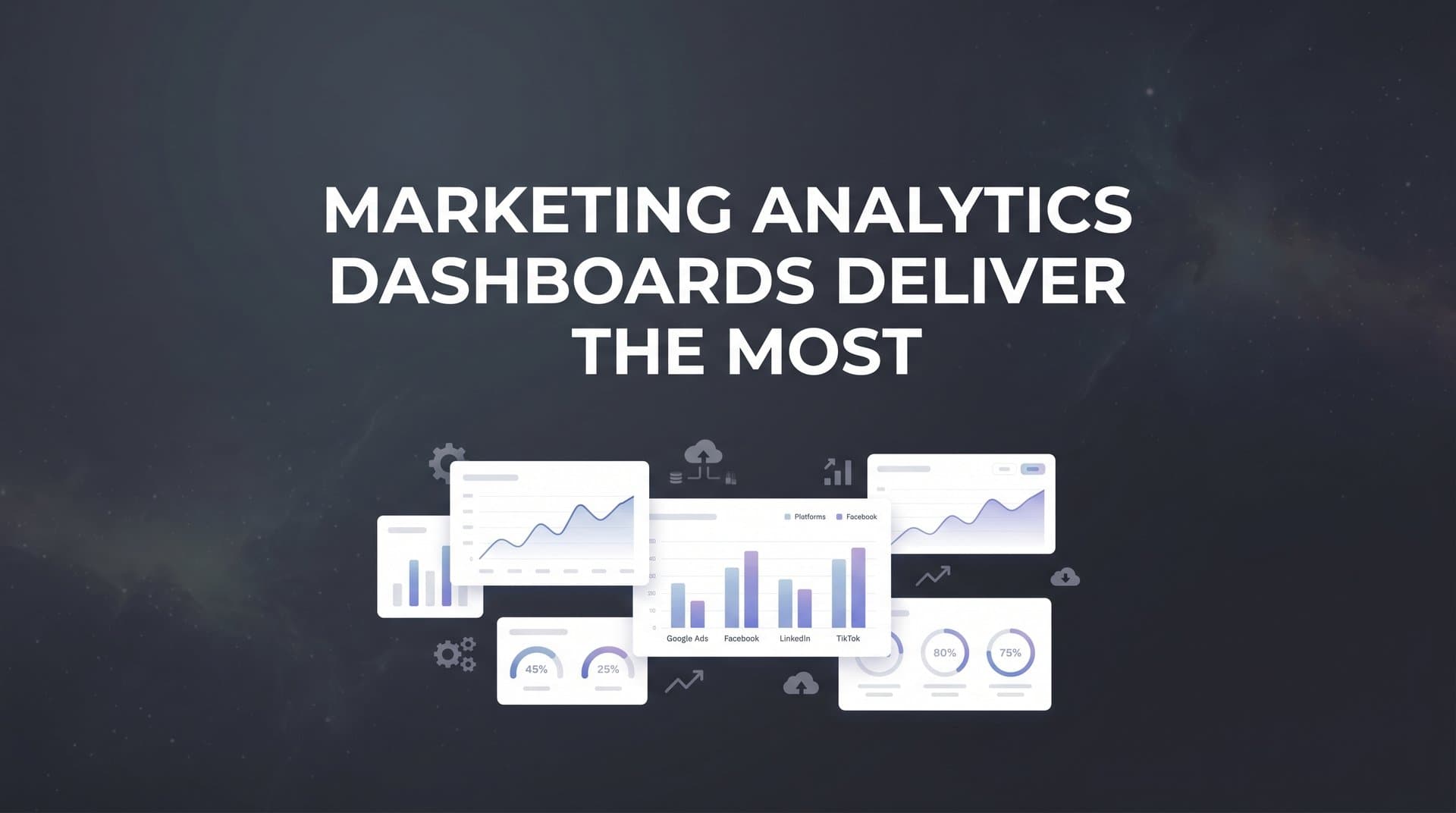
These are not aspirational features. They are practical requirements for any marketing team that wants to make confident, data-driven budget decisions in 2026. The marketing analytics dashboards that deliver the most value are the ones built around all of these capabilities working together.
This is exactly what Cometly is built to do. Cometly connects your ad platforms, CRM, and website into a single attribution platform that shows you exactly which ads and channels are driving leads and revenue. Its server-side tracking captures conversions that browser-based pixels miss, giving you a more complete and accurate picture of campaign performance. Multi-touch attribution models distribute credit across every touchpoint so you understand the full customer journey rather than just the last click. AI-powered recommendations surface optimization opportunities across every channel, helping you identify high-performing creatives, audiences, and campaigns without hours of manual analysis. And Cometly feeds enriched conversion data back to Meta, Google, and other ad platforms, improving their algorithms' ability to target and optimize on your behalf.
The result is a marketing analytics setup where every decision is grounded in accurate, complete, revenue-connected data. You stop guessing which channels work. You stop reconciling conflicting reports from competing platforms. You start scaling what actually drives growth.
Take a look at your current dashboard setup and ask yourself honestly: can it answer the question of which ads are driving revenue, across every channel, with a single consistent view? If the answer is no, or if the answer requires a spreadsheet and a few hours of work, it is worth exploring what a purpose-built attribution platform can do for your team.
Get your free demo and see how Cometly brings cross-platform clarity, accurate attribution, and AI-driven recommendations together in one platform built for revenue-focused marketing teams.