
In today's competitive landscape, running marketing without a clear dashboard is like flying a plane blindfolded. While data is abundant, the real challenge lies in focusing on the metrics that truly matter. Generic KPIs lead to generic results, but the right marketing dashboard KPIs transform raw data into a strategic roadmap, revealing what's working, what's not, and where your next dollar will deliver the highest return. This isn't just about tracking numbers; it's about building a predictable engine for growth.
Many marketers struggle with a fragmented view of performance, piecing together reports from various platforms and failing to see the complete customer journey. This often leads to misattributed credit, wasted ad spend, and missed opportunities. The solution is a unified dashboard centered on KPIs that connect every marketing action to a business outcome. This guide moves beyond surface-level metrics to uncover deep, actionable insights.
We'll explore the foundational marketing dashboard KPIs that every marketer should have on their dashboard, including crucial metrics like Customer Acquisition Cost (CAC), Return on Ad Spend (ROAS), and Customer Lifetime Value (CLV). For each KPI, we will provide a clear definition, the formula for calculation, industry benchmarks, and practical tips for visualization. This will empower you to build a dashboard that drives intelligent, profitable decisions.
1. Customer Acquisition Cost (CAC)
Customer Acquisition Cost (CAC) is one of the most fundamental marketing dashboard KPIs, representing the total investment required to convince a potential customer to make their first purchase. It provides a direct measure of your marketing and sales funnel's efficiency. By quantifying the cost of winning each new customer, CAC helps businesses determine the profitability of their acquisition strategies and ensures sustainable growth.
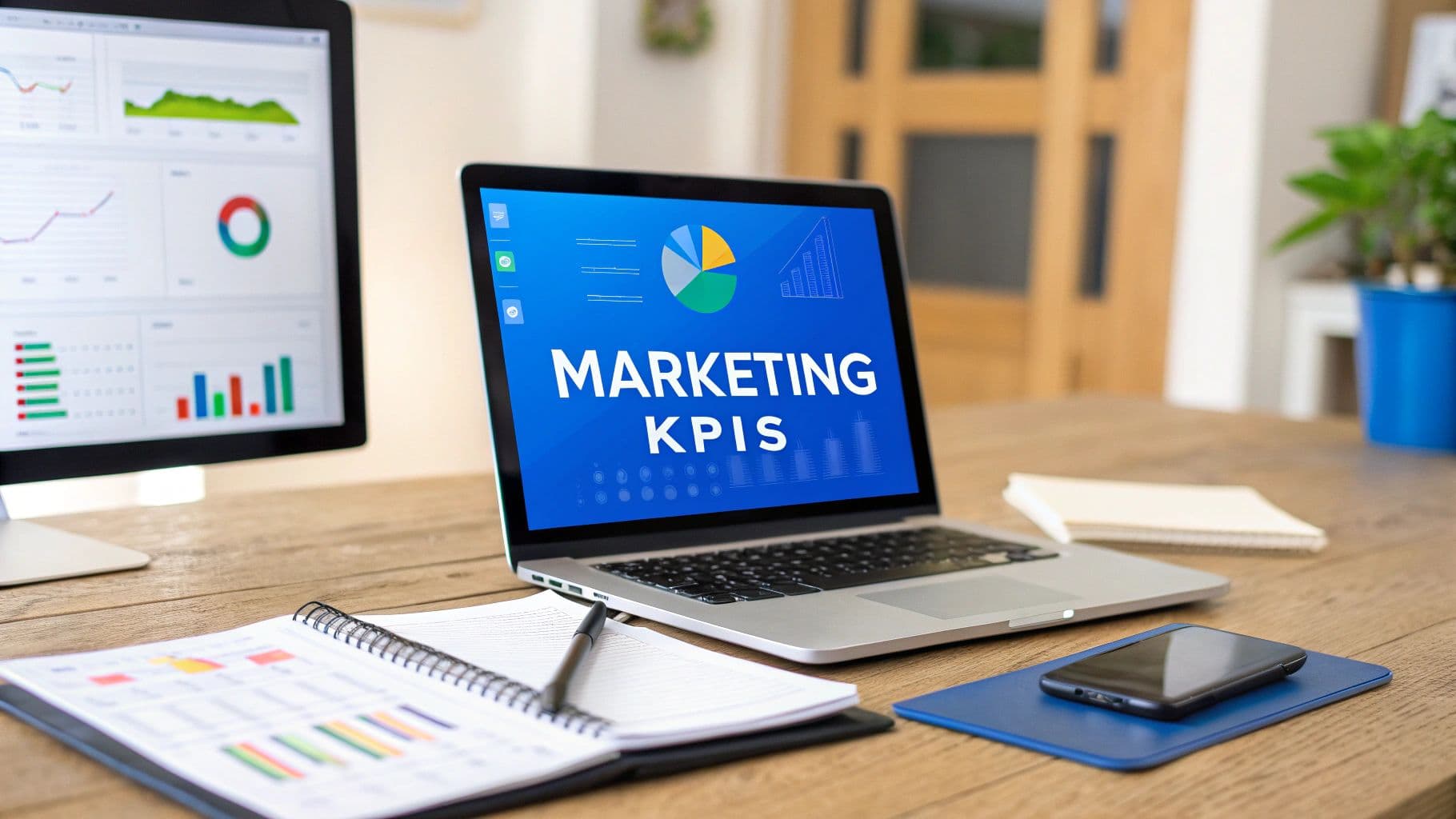
 7 Essential Marketing Dashboard KPIs for 2025
This metric goes beyond just ad spend. A comprehensive CAC calculation includes all associated marketing and sales expenses, such as salaries, tools, and creative production costs, divided by the number of new customers acquired during a specific period.
Calculating and Benchmarking CAC
The formula for Customer Acquisition Cost is straightforward but powerful:
Formula:CAC = (Total Marketing Costs + Total Sales Costs) / Number of New Customers Acquired
For example, if a SaaS company spends $40,000 on marketing and $10,000 on sales in a quarter and acquires 500 new customers, its CAC is $100. Understanding this figure is crucial, but its true power comes from context. E-commerce brands, for instance, use CAC to ensure the initial purchase value and subsequent orders will outweigh the acquisition cost.
Key Insight: A healthy business model typically exhibits a Customer Lifetime Value (LTV) to CAC ratio of at least 3:1. A ratio closer to 1:1 indicates you are spending too much, while a ratio of 5:1 or higher might suggest you are underinvesting in marketing and missing growth opportunities.
How to Visualize CAC on Your Dashboard
Effectively visualizing CAC helps stakeholders grasp performance at a glance.
- Trend Line: Display CAC over time (monthly or quarterly) to monitor efficiency and spot negative trends early.
- Bar Chart by Channel: Segment CAC by acquisition source (e.g., Organic Search, Paid Social, Referrals) to identify the most and least efficient channels.
- Gauge Chart: Compare your current CAC against a preset target or benchmark for a quick health check.
For a deeper dive into industry standards, you can learn more about average CAC for B2B SaaS on Cometly.com.
Actionable Tips for Optimizing CAC
Simply tracking CAC isn't enough; the goal is to improve it. For actionable insights on optimizing this vital KPI, explore these proven strategies to reduce Customer Acquisition Cost. Incorporate cohort analysis to see how CAC evolves for different customer groups over time. This helps you understand if initial acquisition costs for a specific cohort pay off through higher long-term value. Also, track the CAC payback period, which measures how long it takes to recoup the acquisition cost from a new customer. A shorter payback period improves cash flow and accelerates sustainable growth.
2. Return on Advertising Spend (ROAS)
Return on Advertising Spend (ROAS) is a critical marketing dashboard KPI that measures the gross revenue generated for every dollar spent on advertising. Unlike broader metrics like ROI, ROAS focuses exclusively on the direct financial performance of specific advertising campaigns, making it indispensable for optimizing media spend and evaluating campaign effectiveness. It provides a clear, immediate indicator of which ad channels and strategies are driving the most value for the business.
 7 Essential Marketing Dashboard KPIs for 2025
Popularized by platforms like Google Ads and Facebook Ads Manager, ROAS helps performance marketers make data-driven decisions about budget allocation. By isolating advertising costs from other marketing expenses, it gives teams a granular view of profitability, enabling them to scale successful campaigns and cut underperforming ones with confidence.
Calculating and Benchmarking ROAS
The formula for ROAS is direct and powerful for assessing campaign health:
Formula:ROAS = Total Revenue from Advertising / Total Advertising Spend
For example, if an e-commerce brand spends $5,000 on a Google Ads campaign and generates $20,000 in revenue directly attributable to those ads, the ROAS is 4:1 (or 400%). This means for every dollar spent, the company earned four dollars back. E-commerce brands using Facebook ads often aim for a 3x to 5x ROAS, while Amazon PPC campaigns might accept a lower 2x to 3x ROAS due to the added value of improved organic ranking and customer data.
Key Insight: A "good" ROAS is not universal; it depends heavily on your profit margins and business model. A high-revenue, low-margin business needs a much higher ROAS to be profitable compared to a high-margin business. Always factor in your Cost of Goods Sold (COGS) and other operating expenses when setting your target ROAS.
How to Visualize ROAS on Your Dashboard
An effective ROAS visualization makes campaign performance instantly clear.
- Bar Chart by Campaign/Channel: Compare ROAS across different channels (e.g., Google Ads, Facebook Ads, LinkedIn Ads) or individual campaigns to see where your ad spend is most productive.
- Time-Series Line Chart: Track ROAS over time (daily, weekly, or monthly) to identify performance trends and the impact of optimizations.
- Color-Coded Scorecards: Use scorecards to display the overall ROAS and individual campaign ROAS against predefined targets (e.g., green for above target, red for below).
Actionable Tips for Optimizing ROAS
Simply monitoring ROAS is the first step; the real value comes from improving it. To get started, you can explore these 30 tips to improve ad performance on Cometly.com. Set different ROAS targets for different campaign objectives; a brand awareness campaign will naturally have a lower ROAS than a bottom-of-funnel conversion campaign. Also, use view-through attribution where appropriate to capture the full impact of visual ads that influence conversions without a direct click. Segmenting ROAS by product category or customer segment can also reveal hidden opportunities for optimization.
3. Marketing Qualified Leads (MQLs)
Marketing Qualified Leads (MQLs) are prospects who have shown significant interest in your brand based on their engagement with your marketing efforts. This KPI acts as a critical handoff point between the marketing and sales departments, signifying that a lead is ready for direct sales outreach. Tracking MQLs is essential for measuring the top-of-funnel effectiveness and quantifying marketing's direct contribution to the sales pipeline.
 7 Essential Marketing Dashboard KPIs for 2025
Unlike a raw lead, an MQL has met a predefined set of criteria that indicate a higher likelihood of becoming a customer. These criteria often combine demographic information (like company size or job title) and behavioral data (such as downloading an ebook, attending a webinar, or visiting a pricing page multiple times). This qualification process, popularized by platforms like HubSpot and Marketo, ensures the sales team invests its time in the most promising opportunities.
Calculating and Benchmarking MQLs
While there isn't a single formula for MQLs, the process involves setting up a lead scoring system. This system assigns points to leads based on specific actions and attributes.
Process:Lead Score = (Demographic/Firmographic Fit Score) + (Engagement Score)
A lead becomes an MQL once it crosses a predetermined score threshold. For example, a B2B SaaS company might designate anyone with a score over 75 as an MQL, while a manufacturing firm might qualify leads based on a combination of specific content downloads and stated company revenue. The key is to define what an "ideal" lead looks like in collaboration with your sales team.
Key Insight: The ultimate measure of MQL quality is the MQL-to-SQL (Sales Qualified Lead) conversion rate. A low conversion rate (e.g., below 10-15% for B2B) suggests your MQL criteria may be too broad, sending underqualified leads to sales. A very high rate might mean the criteria are too strict, and marketing is missing opportunities.
How to Visualize MQLs on Your Dashboard
Visualizing MQLs helps marketing leaders understand lead flow and quality.
- Line Chart: Track the total number of MQLs generated weekly or monthly to monitor volume and identify trends.
- Funnel Visualization: Show the conversion rates from visitor to lead, lead to MQL, and MQL to SQL to highlight bottlenecks.
- Stacked Bar Chart: Break down MQLs by source (e.g., Organic, Paid, Events) to see which channels generate the highest quality leads.
Actionable Tips for Optimizing MQLs
Continuously refining your MQL strategy is crucial for aligning marketing and sales. For a comprehensive guide on managing your leads, explore these 5 steps to improving your lead tracking process on Cometly.com. Use marketing automation to nurture leads that are interested but not yet qualified, delivering targeted content until they are ready for sales. Regularly schedule meetings with the sales team to review MQL quality and adjust lead scoring rules based on their real-world feedback on which leads convert best.
4. Website Conversion Rate
Your website is often the central hub of your digital marketing efforts, and its ability to turn visitors into leads or customers is paramount. The Website Conversion Rate measures the percentage of visitors who complete a desired action, known as a conversion. This KPI is a direct reflection of your website's effectiveness and is fundamental to understanding how well your design, copy, and user experience resonate with your audience.
 7 Essential Marketing Dashboard KPIs for 2025
Tracking this metric is essential for identifying optimization opportunities and justifying marketing spend. Whether it's a purchase, a form submission, or a newsletter signup, the conversion rate tells you how persuasive your online presence truly is. It's one of the most critical marketing dashboard KPIs for connecting traffic generation with tangible business outcomes.
Calculating and Benchmarking Conversion Rate
The formula for Website Conversion Rate is simple, but its application is highly versatile:
Formula:Website Conversion Rate = (Number of Conversions / Total Number of Visitors) * 100
For example, if an e-commerce store receives 20,000 visitors in a month and generates 400 sales, its conversion rate is 2%. Context is key, as benchmarks vary widely. A B2B website tracking demo requests might see a 1-3% conversion rate, while a highly targeted landing page for a paid campaign could achieve rates of 5-15% or more.
Key Insight: Don't just track your overall site conversion rate. Segmenting by traffic source (e.g., Organic vs. Paid Social), device (Desktop vs. Mobile), and page type (Homepage vs. Landing Page) will reveal critical performance differences and uncover hidden optimization opportunities.
How to Visualize Conversion Rate on Your Dashboard
A clear visualization helps stakeholders quickly assess website performance.
- Line Chart: Plot the conversion rate over time (daily, weekly, or monthly) to monitor trends and the impact of site changes or campaigns.
- Bar Chart by Source/Channel: Compare the conversion rates of different traffic sources to understand which channels deliver the most motivated visitors.
- Funnel Visualization: Map out the steps in your conversion process (e.g., View Product -> Add to Cart -> Checkout) to identify where users are dropping off.
- Gauge or Scorecard: Display the current overall conversion rate against a set goal for an immediate performance snapshot.
Actionable Tips for Optimizing Conversion Rate
Monitoring this KPI is the first step; the next is continuous improvement. For a detailed guide, you can review these 5 easy ways to improve your conversion rate on Cometly.com. Start by implementing a rigorous A/B testing program for critical elements like headlines, calls-to-action (CTAs), and page layouts. Also, track micro-conversions, such as video plays or PDF downloads, to understand user engagement leading up to a final conversion. Analyzing user session recordings and heatmaps can provide qualitative insights into user behavior and friction points that data alone can't explain.
5. Customer Lifetime Value (CLV/LTV)
Customer Lifetime Value (CLV or LTV) is a predictive marketing dashboard KPI that represents the total net profit a business can reasonably expect from a single customer over the entire duration of their relationship. It shifts the focus from short-term gains, like a single purchase, to the long-term health and profitability of your customer base. Understanding CLV is essential for making strategic decisions about marketing spend, customer retention, and overall business strategy.
This forward-looking metric helps you identify your most valuable customers, allowing you to tailor experiences and marketing efforts to retain them. For subscription-based businesses like Netflix or SaaS companies, CLV is the cornerstone of their financial model, directly influencing how much they can justify spending on content, product development, and customer acquisition to ensure sustainable growth.
Calculating and Benchmarking CLV
While there are several ways to calculate CLV, a common and effective method involves the average purchase value, purchase frequency, and customer lifespan.
Formula:CLV = Average Purchase Value x Average Purchase Frequency x Average Customer Lifespan
For example, if a customer at an e-commerce store spends an average of $75 per order, makes 4 purchases per year, and remains a customer for 3 years, their CLV would be $900 ($75 x 4 x 3). This figure tells you the upper limit of what you should spend to acquire a similar customer.
Key Insight: The relationship between CLV and Customer Acquisition Cost (CAC) is one of the most critical health indicators for a business. A healthy CLV:CAC ratio is generally considered to be 3:1 or higher. This signifies that for every dollar spent acquiring a customer, you generate three dollars in lifetime value, indicating a profitable and scalable marketing engine.
How to Visualize CLV on Your Dashboard
Visualizing CLV effectively helps your team understand long-term value creation.
- Trend Line: Plot the average CLV over time (quarterly or annually) to track the impact of retention and upselling initiatives.
- Cohort Analysis Chart: Group customers by their acquisition month or quarter and track their cumulative CLV over time. This reveals which cohorts are most valuable.
- Bar Chart Comparison: Segment CLV by acquisition channel or customer demographic to pinpoint your most profitable audiences and marketing sources.
For a deeper analysis, especially for subscription models, you can explore strategies for maximizing LTV for SaaS growth on Cometly.com.
Actionable Tips for Optimizing CLV
Improving CLV is synonymous with building a healthier, more resilient business. Focus on increasing customer loyalty and order value. Implement a customer loyalty program to reward repeat purchases and encourage advocacy. Use email marketing and personalization to suggest relevant products, driving upsells and cross-sells. Most importantly, invest in exceptional customer service to reduce churn and extend the average customer lifespan, which directly multiplies their total value. Regularly update your CLV calculations as your pricing, product offerings, or business model evolves.
6. Marketing Attribution Revenue
Marketing Attribution Revenue is a critical KPI that connects marketing activities directly to financial outcomes. It quantifies how much revenue can be credited to specific channels, campaigns, or touchpoints along the customer journey. This KPI moves beyond vanity metrics like clicks or impressions to measure the real-world impact of your marketing efforts on the bottom line, enabling smarter budget allocation and strategic optimization.
Understanding revenue attribution is essential for proving marketing's value and building a data-driven strategy. It helps businesses see which initiatives are driving growth and which are underperforming, ensuring every marketing dollar is invested for maximum return.
Calculating and Benchmarking Marketing Attribution Revenue
Calculating this KPI isn't based on a single, universal formula but rather on an attribution model. Different models distribute credit for a conversion differently across various touchpoints. Common models include Last-Touch, First-Touch, Linear, and Data-Driven.
Formula (Example using Last-Touch Attribution):Marketing Attribution Revenue = Total Revenue from Conversions Where [Channel X] was the Final Touchpoint
For example, a multi-channel retailer might find that while social media ads initiated many customer journeys, email marketing was the final touchpoint for $50,000 in sales last month. This highlights email's crucial role in closing deals. B2B companies often use attribution to justify long-term investments in content marketing, tracing revenue back to initial blog post views or webinar sign-ups that occurred months prior.
Key Insight: No single attribution model is perfect. The most effective approach is often to compare different models (e.g., Last-Touch vs. First-Touch vs. Data-Driven) to gain a holistic view. A Data-Driven model, like the one offered by Google Analytics, uses machine learning to assign credit based on how each touchpoint actually contributed to conversions, providing the most accurate, albeit complex, picture.
How to Visualize Marketing Attribution Revenue on Your Dashboard
Visualizing attribution data makes complex customer journeys understandable.
- Stacked Bar Chart: Display total revenue broken down by contributing channel (e.g., Organic, Paid, Email) to show which channels generate the most value.
- Funnel Visualization: Map revenue contribution at each stage of the marketing funnel to identify high-impact touchpoints and drop-off points.
- Pie Chart or Donut Chart: Show the percentage of total revenue attributed to each campaign for a quick overview of performance.
Actionable Tips for Optimizing Marketing Attribution Revenue
Accurate attribution requires a disciplined approach to data collection and analysis.
- Test Different Models: Experiment with various attribution models to see which one best reflects your unique sales cycle and customer behavior.
- Implement Consistent UTM Tracking: Use UTM parameters rigorously across all digital campaigns to ensure every link is trackable and data flows correctly into your analytics platform.
- Leverage Integrated Platforms: Use marketing automation or analytics tools with built-in attribution capabilities, like HubSpot or Adobe Analytics, to simplify data collection and reporting.
- Consider All Touchpoints: Where possible, incorporate both online and offline interactions (e.g., event attendance, sales calls) into your model for a complete view of the customer journey.
7. Email Marketing Metrics (Open Rate, Click Rate, Conversion Rate)
Email Marketing Metrics are a collection of crucial performance indicators that gauge the effectiveness and engagement of your email campaigns. These metrics, prominently featured on any comprehensive marketing dashboard, track how your audience interacts with the content you send, from the moment it lands in their inbox to the final conversion. Monitoring these KPIs is essential for refining email strategy, improving audience segmentation, and ultimately driving revenue through one of the highest ROI marketing channels.
The core metrics provide a granular view of your campaign's journey. Open Rate reveals the effectiveness of your subject line and sender reputation, Click-Through Rate (CTR) measures how compelling your content and call-to-action are, and Conversion Rate ties email activity directly to business goals like sales or sign-ups.
Calculating and Benchmarking Email Metrics
Each metric tells a different part of the story, and their formulas are fundamental for any email marketer.
Formulas:
Open Rate = (Total Unique Opens / Number of Emails Delivered) * 100Click-Through Rate (CTR) = (Total Unique Clicks / Number of Emails Delivered) * 100Conversion Rate = (Number of Conversions / Number of Emails Delivered) * 100
For example, a B2B newsletter sent to 10,000 delivered contacts that gets 2,500 unique opens has a 25% open rate. If 500 recipients click a link, the CTR is 5%. Benchmarks vary significantly by industry and email type. A promotional e-commerce email might see a 15-25% open rate, while a highly anticipated welcome email series can achieve rates of 40-60%.
Key Insight: Look beyond individual metrics and analyze the flow between them. A high open rate with a low CTR could signal a disconnect between your subject line and email content. Similarly, a high CTR with a low conversion rate may point to issues on your landing page, not the email itself. Tracking the click-to-conversion rate offers a more precise measure of email-driven success.
How to Visualize Email Metrics on Your Dashboard
An effective dashboard visualizes email performance in a way that is both comprehensive and easy to digest.
- Funnel Chart: Display the journey from emails sent to delivered, opened, clicked, and converted to quickly identify drop-off points in your campaign funnel.
- Trend Lines: Plot Open Rate, CTR, and Conversion Rate over time to monitor campaign health and the impact of optimization efforts.
- Comparison Bar Charts: Segment performance by campaign type (e.g., newsletter, promotional, transactional) or audience segment to uncover what resonates most with different groups.
Actionable Tips for Optimizing Email Metrics
Consistent optimization is key to maximizing the value of your email channel. For practical guidance on improving performance, many platforms like Mailchimp provide extensive resources on industry standards. Implement A/B testing on subject lines and send times to systematically improve open rates. Regularly clean your email list by removing inactive subscribers to boost deliverability and ensure your metrics remain accurate. Most importantly, use audience segmentation to deliver highly relevant content, which is the surest path to improving all key email marketing metrics.
Key KPIs Comparison of 7 Marketing Metrics
Metric | Implementation Complexity 🔄 | Resource Requirements ⚡ | Expected Outcomes 📊 | Ideal Use Cases 💡 | Key Advantages ⭐ |
|---|---|---|---|---|---|
Customer Acquisition Cost (CAC) | Medium – Requires cost tracking across channels | Medium – Marketing, sales data and finance | Clear ROI on acquisition spend, budget optimization | Businesses optimizing customer acquisition spend | Measures acquisition efficiency and sustainability |
Return on Advertising Spend (ROAS) | Low – Simple revenue and ad cost calculation | Low – Ad spend and revenue data | Immediate campaign performance feedback | Advertising campaign effectiveness analysis | Directly links ad spend to revenue outcomes |
Marketing Qualified Leads (MQLs) | Medium – Need lead scoring and criteria setup | Medium – CRM/marketing automation platforms | Measures marketing contribution to sales pipeline | Lead generation and sales alignment | Improves sales efficiency, focuses on quality leads |
Website Conversion Rate | Low – Web analytics tracking | Low – Analytics tools | Measures site effectiveness, identifies optimization | Website performance and user experience improvement | Direct metric of conversion success |
Customer Lifetime Value (CLV/LTV) | High – Predictive modeling and cohort analysis | High – Requires historical data & analytics | Long-term revenue prediction, informs retention | Subscription models, repeat business | Guides acquisition and retention investments |
Marketing Attribution Revenue | High – Multi-touch attribution setup | High – Integration of marketing & sales data | Comprehensive revenue impact of marketing channels | Multi-channel marketing budget optimization | Data-driven budget allocation and channel insight |
Email Marketing Metrics | Low – Standard email platform tracking | Low – Email service provider | Engagement insights, campaign optimization | Email campaign performance measurement | Fast, cost-effective engagement feedback |
Unify Your KPIs and Accelerate Growth with a Smarter Dashboard
Throughout this guide, we've dissected the seven core marketing dashboard KPIs that form the bedrock of any data-driven growth strategy. From the foundational efficiency of Customer Acquisition Cost (CAC) to the long-term profitability measured by Customer Lifetime Value (LTV), each metric provides a distinct window into your performance. We've explored the nuances of Return on Advertising Spend (ROAS), the top-of-funnel velocity of Marketing Qualified Leads (MQLs), and the crucial conversion points on your website.
However, the most profound insights don't come from tracking these KPIs in isolated silos. True strategic power is unlocked when you weave these disparate threads together into a single, cohesive narrative. The goal is to move beyond simply knowing your numbers and to start understanding the dynamic relationships between them. This is the difference between reactive reporting and proactive optimization.
From Disconnected Metrics to a Unified Growth Engine
Think of your marketing efforts as a complex machine. Viewing just one gear, like Email Open Rate, tells you very little about the machine's overall output. The real story emerges when you see how that gear's performance affects the next one, and the next.
Consider these interconnected questions that a unified dashboard helps you answer:
- CAC & LTV Relationship: How does a higher CAC from a specific channel, like LinkedIn Ads, correlate with a higher LTV from the customers acquired there? Is the upfront investment justified by long-term value?
- MQL & Conversion Rate Impact: If we successfully increase our MQL volume by 20%, what is the corresponding impact on our overall Website Conversion Rate? Does lead quality suffer as quantity increases?
- ROAS & Attribution Revenue: Which specific ad creative is driving the highest ROAS? More importantly, how does that ROAS translate into actual Marketing Attribution Revenue when considering the full multi-touch customer journey?
Answering these questions is impossible when your data is fragmented across Google Analytics, your email platform, your ad managers, and a dozen spreadsheets. The administrative burden of manually connecting these dots not only wastes valuable time but also introduces a high risk of error, leading to flawed conclusions and misguided strategies.
The Bridge Between Marketing and Sales
This holistic view shouldn't stop at the marketing department's edge. The data story must continue seamlessly into the sales funnel for a complete picture of business health. When marketing and sales teams operate from a shared set of data, you create a powerful feedback loop. Marketing can see which lead sources generate the most closed-won deals, not just MQLs, allowing for smarter budget allocation.
To truly unify your marketing and sales data, it’s essential to master sales KPI dashboard creation to align both teams and accelerate growth. This alignment ensures that everyone, from the content marketer to the account executive, is rowing in the same direction, focused on the ultimate goal: sustainable revenue generation. A shared dashboard transforms inter-departmental conversations from debates based on opinion to decisions based on unified truth.
Key Takeaway: The ultimate value of marketing dashboard KPIs isn't in the individual metrics themselves, but in their ability to tell a comprehensive story about your customer's journey and your business's health. Your dashboard should be more than a report; it should be an interactive, strategic tool that connects every marketing action directly to a business outcome.
By embracing this unified approach, you elevate your role from a marketing tactician to a strategic growth driver. You stop defending budgets and start demonstrating undeniable ROI, building a predictable engine that fuels the entire organization.
Ready to stop guessing and start knowing exactly what works? Cometly provides a single source of truth, unifying all your marketing dashboard KPIs to give you a clear, real-time view of your ad performance and customer journey. See precisely how every dollar you spend translates into revenue and make optimization decisions with confidence by visiting Cometly today.