A good digital marketing report is so much more than a data dump. It’s a strategic tool, the kind that translates a bunch of metrics into a clear, compelling story about business growth. The best ones connect channel performance directly to high-level goals and give stakeholders actionable insights they can actually use.
A report that lands successfully moves way beyond just telling you what happened. It explains why it happened and, most importantly, what to do next.
Why Most Marketing Reports Fail to Make an Impact
Let’s be honest: most marketing reports are destined for a digital drawer. They’re glanced at once and then forgotten forever. They usually show up as a dense pile of disconnected metrics pulled from Google Ads, Meta, and Google Analytics, leaving executives scratching their heads and asking, "So, what's actually working here?"
That all-too-common scenario points to a fundamental problem.
The issue isn’t a lack of data; it’s the absence of a clear narrative. So many marketers fall into the trap of just presenting numbers—clicks, impressions, conversion rates—without ever connecting them back to the bottom line. This approach turns the report into a boring historical record instead of what it should be: a forward-looking strategic asset.
The Shift from Data Dump to Strategic Narrative
A truly effective report reframes this entire process. Its main job isn't just to show performance but to prove value, justify budgets, and steer future strategy. This takes a real shift in mindset, moving from simple data collection to intentional storytelling. You become a translator, turning complex analytics into a straightforward story about growth and opportunity.
This is how you transform scattered data points into a unified, actionable plan.
 Report on digital marketing: A Quick Guide to Actionable Stakeholder Insights
This visual breaks down the journey from data chaos to a clear, strategic story—all built on a unified source of truth. Getting away from tangled, disconnected metrics is the first real step toward creating reports that actually command attention.
Building Reports That Drive Decisions
If you want to build a report that stakeholders actually read and act on, you need a foundation of trust. That starts with clean, unified data. When numbers from different platforms tell conflicting stories, it completely erodes confidence and brings decision-making to a grinding halt.
A single source of truth is non-negotiable for creating reports that can withstand scrutiny and get your budget approved.
This focus on clarity and credibility is vital for teams of all sizes. For agencies managing multiple clients, mastering this skill is even more critical. If you're looking to improve how you communicate results, exploring different approaches to marketing agency reporting can give you some incredibly valuable frameworks.
The goal is to make your report the most anticipated document of the month—a tool that empowers leadership with the confidence to make bold, data-backed decisions. It should answer questions before they're even asked and provide solutions, not just problems.
Ultimately, a powerful digital marketing report does more than just inform; it persuades. It tells a cohesive story that:
- Demonstrates ROI: Clearly links marketing spend to revenue and business growth.
- Highlights Wins: Showcases successful campaigns and explains the strategy behind them.
- Identifies Opportunities: Pinpoints areas for improvement and proposes specific actions.
- Builds Trust: Presents a transparent and accurate picture of marketing performance.
Setting Goals and Choosing Metrics That Matter
Before you pull a single data point, you need a blueprint. A great digital marketing report always starts with a clear definition of what success actually looks like for your business. This means moving beyond vague goals like "get more leads" and into the realm of concrete, measurable objectives.
 Report on digital marketing: A Quick Guide to Actionable Stakeholder Insights
This is about swapping ambiguity for precision. Instead of a soft goal, you commit to a specific target. Think: achieving a 5x Return on Ad Spend (ROAS) for a new product launch. Or maybe lowering the Customer Acquisition Cost (CAC) for a SaaS trial by 20% this quarter. These aren't just goals; they're performance benchmarks that give every metric context and purpose.
From Business Goals to Relevant KPIs
Once you’ve locked in your main objective, the next step is picking the Key Performance Indicators (KPIs) that will actually track your progress. The right KPIs depend entirely on your business model—the numbers that matter for an e-commerce brand are worlds away from what a lead gen company needs to watch.
A classic mistake is getting distracted by vanity metrics. Things like impressions or page views might look impressive on a chart, but they don't tie back to revenue. The key is to focus on metrics that directly reflect business health and growth.
To connect your goals to the right metrics, you need to understand which KPIs are most relevant for your specific business type.
Matching KPIs to Core Business Objectives
If your business objective is to increase revenue, the most important e-commerce KPIs to track are Average Order Value (AOV), Return on Ad Spend (ROAS), and Customer Lifetime Value (LTV). For SaaS companies, the key revenue-focused KPIs are Monthly Recurring Revenue (MRR), Annual Recurring Revenue (ARR), and Expansion MRR. For lead generation businesses, the revenue KPIs that matter most are Revenue Per Lead (RPL) and Closed-Won Deal Value.
If your objective is to improve profitability, e-commerce teams should focus on Contribution Margin, Cost of Goods Sold (COGS), and Customer Acquisition Cost (CAC) to understand true profit after costs. SaaS teams should prioritize the LTV to CAC Ratio and Gross Margin to ensure growth is efficient and sustainable. Lead gen teams should pay close attention to Cost Per Acquisition (CPA) and Return on Marketing Investment (ROMI) to confirm marketing spend is producing profitable outcomes.
If your goal is to boost conversion, e-commerce brands should track Cart Abandonment Rate, Website Conversion Rate, and Add-to-Cart Rate to see where buyers drop off and what’s improving purchase behavior. SaaS teams should measure Free Trial to Paid Conversion Rate, Lead-to-Trial Conversion Rate, and Demo Request Rate to understand how effectively interest turns into customers. Lead gen teams should focus on Lead-to-MQL Rate, MQL-to-SQL Rate, and Form Submission Rate to monitor funnel performance and qualification.
If you want to enhance efficiency, e-commerce companies should monitor Marketing Expense Ratio and Time to Purchase to evaluate how quickly and cost-effectively customers convert. SaaS companies should track Customer Churn Rate, Time to Value (TTV), and Lead Velocity Rate to ensure retention stays strong and growth remains predictable. Lead gen businesses should focus on Cost Per Lead (CPL), Lead Quality Score, and Sales Cycle Length to improve pipeline speed and reduce wasted spend.
Choosing the right metrics is a crucial step that sets the direction for your entire report. For a deeper dive, check out these detailed marketing KPI examples that provide frameworks for different business types.
Choosing an Attribution Model That Fits Your Journey
With your goals and KPIs lined up, you now have to decide how to give credit for conversions. This is where attribution models come in, and your choice here fundamentally shapes the story your data tells. An attribution model is just the set of rules that determines how credit for a sale gets assigned to the different touchpoints a customer interacts with.
Think about it. A customer might first see your brand on a TikTok ad, later click a Google search ad, and finally buy after getting an email. So, which channel gets the credit? The answer depends entirely on your model.
- First-Touch Attribution: This model gives 100% of the credit to the very first interaction. It’s great for understanding which channels are bringing new people into your world.
- Last-Touch Attribution: This is the most common (and often most misleading) model. It gives all the credit to the final touchpoint before the conversion. It’s simple, but it completely ignores all the hard work your other channels did to get the customer there.
- Multi-Touch Attribution (e.g., Linear, Time-Decay): These models are much more sophisticated, distributing credit across multiple touchpoints. A linear model gives equal credit to every interaction, while a time-decay model gives more credit to the touchpoints closer to the final conversion.
Choosing a last-touch model for a business with a long sales cycle is like giving all the credit for a championship win to the player who scored the final point, ignoring the assists, defense, and coaching that made it possible.
The right model really depends on your typical customer journey. For products with a short, impulsive buying cycle, last-touch might be good enough. But for B2B services or high-ticket items with longer consideration phases, a multi-touch model gives you a far more accurate picture of what’s actually driving results. This strategic choice is the bedrock of a credible and insightful report on digital marketing.
Gathering and Trusting Your Marketing Data
A powerful digital marketing report lives and dies on one thing: trustworthy data. But let's be honest, getting reliable data is one of the biggest headaches marketers face. Your information is probably scattered across Google Analytics, various ad platforms, and your CRM—and half the time, it tells a confusing, contradictory story.
This isn't just a minor annoyance; it's a direct threat to your credibility. The moment a stakeholder sees a discrepancy—like Meta claiming 50 sales while your CRM only shows 40—their trust in the entire report vanishes. This is where the real work begins. Before you build a single chart, you have to create a single source of truth.
The Challenge of a Disconnected Data World
Modern marketing campaigns are a data explosion. You've got click data from Google Ads, engagement metrics from social platforms, and conversion events firing in your analytics tools. It's a mess. And privacy updates like iOS 14 and the rise of ad blockers have only made it worse, punching huge holes in the data you can actually collect.
These gaps lead to all the frustrating problems we know too well:
- Inaccurate ROAS: You can't possibly calculate a true Return on Ad Spend if you aren't tracking every conversion that comes through the door.
- Misattributed Conversions: Old-school, last-click models give all the glory to the final touchpoint, completely ignoring the channels that did the heavy lifting to get the customer there in the first place.
- Wasted Budget: Without a clear, unified picture of what's working, you end up throwing money at channels based on gut feelings or, worse, bad data.
This is why data validation isn't some optional step you can skip. It’s a non-negotiable part of the process. You have to get in there and actively compare data across your platforms to find and understand the discrepancies before you even think about building your report.
Creating a Single Source of Truth
The only real solution to data chaos is to unify everything into one central hub. Instead of trying to pull numbers from five different dashboards and hoping they match, a unified system brings it all together, de-duplicates conversions, and applies one consistent attribution model across all of your channels. The result? A single, reliable dataset that everyone on the team can actually trust.
Modern solutions that use server-side tracking are especially good at this. Unlike traditional client-side tracking (which runs in the user's browser and gets blocked all the time), server-side tracking sends data from your server directly to the marketing platforms. This method is far more resilient to ad blockers and privacy settings, which means you get much, much more accurate data.
The global advertising market has grown immensely, with worldwide ad spending on track to reach nearly $1.1 trillion. In an ecosystem that massive, the pressure to prove your budget is working is intense. Attribution platforms are essential for tracking which channels provide the best ROI, ensuring every dollar is accounted for. Check out more global ad spending trends at abbeymecca.com.
A single source of truth isn't just a technical setup; it's a strategic advantage. It gives you the confidence to make bold decisions, knowing your data is complete, accurate, and defensible.
Making the switch from fragmented data to a unified view is foundational. It’s the difference between a flimsy report that falls apart under the first question and an authoritative one that actually drives strategy. To learn more about how to pull this off, check out our guide on data integration best practices. By tackling data integrity head-on, you ensure your report on digital marketing is built on a rock-solid foundation that stakeholders can truly believe in.
Telling a Story with Data Visualization
Let’s be honest: a raw spreadsheet full of numbers isn’t just overwhelming, it’s a headache. A column of data doesn't tell a story. But the right chart or dashboard? That can instantly turn the same complex information into a clear, intuitive narrative that anyone can grasp in seconds.
This is the whole point of data visualization. It’s where your digital marketing report stops being a collection of facts and becomes a powerful strategic tool.
The goal isn't just to make your data look good. It's about picking the right visuals to answer specific business questions. We need to move beyond those cluttered, generic dashboards and start designing with a clear purpose. Every single visual element should help stakeholders immediately see what’s working, what isn’t, and why—without having to squint at rows of numbers.
Choosing the Right Visual for the Job
The type of chart you pick has a huge impact on how your data is understood. A line chart is perfect for showing a trend over time, but a pie chart can be a disaster unless you're showing simple parts of a single whole. The key is to match the visual to the story you’re trying to tell.
Here are a few practical examples from my own experience:
- ROAS Over Time: A simple trend line is the best way to show if your Return on Ad Spend is improving, declining, or staying flat month-over-month. It instantly answers, "Are we getting more or less efficient?"
- Channel Performance Breakdown: A stacked bar chart works wonders for showing how different channels (like Google, Meta, and TikTok) contribute to your total conversions or revenue in a specific period.
- Funnel Drop-off Rates: A funnel chart gives you a crystal-clear, immediate picture of where you’re losing potential customers in the conversion process, from that first click to the final purchase.
A great dashboard doesn't just present data; it guides the viewer's eye to the most important insights. It’s designed to answer the big questions first, with the option to drill down for more detail if needed.
Designing Dashboards for Different Audiences
Not every stakeholder needs the same firehose of information. A CEO and a campaign manager care about completely different things, and your dashboards need to reflect that. A one-size-fits-all approach just leads to confusion and people tuning out.
The fix is to create tailored views. An executive dashboard should be all about the big picture—the bottom-line metrics. Think overall revenue, total ROAS, and customer acquisition cost. It’s designed to communicate business impact, fast.
On the other hand, a campaign manager's dashboard needs to get way more granular. It should be packed with tactical metrics like click-through rate (CTR), cost-per-click (CPC), and conversion rates for specific ads and audiences. This is a dashboard built for day-to-day optimization.
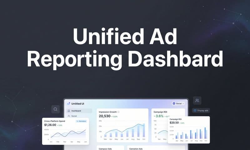
Here’s an example of a unified dashboard in Cometly that visualizes the entire customer journey, from ad click to conversion.
This kind of view lets you see how all your channels are working together, making complex performance data instantly understandable for any stakeholder.
Unifying the Customer Journey in a Single View
Digital advertising is absolutely dominant, now accounting for 75.2 percent of global ad spending. With search advertising projected to hit $295 billion and social media at $210 billion, the customer journey is more complex than ever. You can discover more insights about global advertising trends on datareportal.com, but the takeaway is clear: knowing how to attribute revenue to specific touchpoints is non-negotiable.
A truly powerful dashboard visualizes this entire journey. It connects the dots from the first ad a customer sees on Facebook, to the Google search they perform a week later, and finally to the email that prompts their purchase.
This unified view, powered by accurate attribution, is what separates a basic report from a strategic one. It lets you see the real impact of each channel, not just the one that got the final click. For more tips, check out our guide on creating effective data visualization dashboards.
Transforming Data into Actionable Insights
 Report on digital marketing: A Quick Guide to Actionable Stakeholder Insights
This is where a good report becomes a great one. Raw data and slick-looking charts are fine, but they're just the starting point. The real value is in the story you tell with them.
It's about getting past the what and digging into the why—and most importantly, outlining what we do next.
Without that layer of analysis, you’re just handing over numbers. With it, you're providing strategic direction. This commentary is what separates a routine update from a document that actually drives business decisions and proves your team's value.
From Observation to Recommendation
A classic mistake is just stating an observation and letting the reader figure out what it means. This creates more work for stakeholders and buries your insights. The trick is to connect the data point to a cause and then propose a specific, measurable action.
Let's look at a real-world example. A weak observation sounds like this:
- "Our Facebook CPA increased to $50 this month."
Sure, it's a fact, but it's not helpful. There's no context, no cause, and no path forward. An actionable insight, on the other hand, digs deeper and builds a narrative that leads directly to a solution.
An actionable insight reads: "Our Facebook CPA rose to $50 this month, likely due to ad fatigue in our primary audience as frequency hit 5.8. I recommend we test three new creative concepts and allocate 15% of the budget to a new lookalike audience to reduce costs and re-engage users."
This version nails it. It identifies a probable cause (ad fatigue), supports it with a metric (frequency), and proposes a clear, testable solution. This simple framework—Observation, Cause, and Action—is the foundation of every powerful report on digital marketing.
Tailoring the Narrative for Your Audience
Just like you build different dashboards for different stakeholders, you have to tailor your narrative. The C-suite and your marketing team have completely different priorities, and your commentary needs to reflect that.
Your goal is to provide the right level of detail to the right people.
- For the C-Suite and Executives: Focus on the bottom line. Tie every insight back to high-level goals like revenue, ROI, and market share. Keep it short, strategic, and emphasize the financial impact.
- For Marketing Managers and Teams: This is where you can get tactical. Dive into the granular details of campaign performance, A/B test results, and specific optimization opportunities. Your recommendations should be concrete actions they can implement immediately.
Adding Deeper Context to Your Analysis
To make your insights truly powerful, you have to look beyond the numbers in your ad platforms. Broader market trends, competitor moves, and customer sentiment all provide critical context that explains why your data is fluctuating.
For instance, applying sentiment analysis for social media can reveal the emotional context behind performance. Are people talking positively or negatively about your brand? A sudden dip in sentiment could explain why a campaign's ROAS dropped, even if your targeting was solid.
Other qualitative data points add immense value, too:
- Customer Feedback: Are support tickets mentioning a common issue with a product you're advertising?
- Review Analysis: What are the common themes in recent customer reviews?
- Competitor Monitoring: Did a major competitor launch a huge sale or a new product this month?
By weaving these external factors into your narrative, you create a much richer and more accurate picture of performance. You stop being a data reporter and become a strategic analyst who understands the entire business environment. For a closer look at turning numbers into strategy, check out our guide to creating actionable data.
Putting Your Report to Work: Automation and Presentation
You’ve put in the work to build a report that’s packed with data-backed insights. Awesome. But a great report that no one acts on is just a pretty document. The final—and arguably most important—step is making sure your findings actually drive decisions.
This is all about getting the right information to the right people, at the right time, without chaining yourself to a spreadsheet every Monday morning.
Automation is your best friend here. Let's be honest, manually pulling a comprehensive report on digital marketing every week is not just a drag; it’s a recipe for mistakes. Modern tools can schedule your reports to run automatically, dropping a dashboard link or a PDF right into your stakeholders' inboxes.
Setting this up frees you from the grunt work of data collection and gives you more time for what really matters: analyzing the results, spotting trends, and figuring out what to do next. It turns reporting from a chore into a reliable communication channel that keeps everyone on the same page.
How to Structure Your Presentation for Influence
Whether you're in a live meeting or just sending a summary email, how you deliver your findings is everything. Don’t just click through a slide deck. Guide the conversation with a strong, clear story. For complex data, exploring features for advanced reporting can give you more powerful ways to structure your narrative.
The key is to start with the most important takeaway—the bottom line.
Lead with the conclusion. Instead of a slow build-up, hit them with the headline upfront: "This month, our marketing efforts generated $150,000 in new revenue at a 5.2x ROAS, mostly thanks to that new video campaign." This grabs their attention immediately and frames the entire conversation.
Once you’ve landed the headline, the rest of your presentation should simply support that key result. A structure that works time and time again is:
- The Big Picture: State the most critical results and takeaways right away.
- What Worked & Why: Highlight the big wins and explain the strategy that drove them.
- Challenges & Opportunities: Be upfront about what didn’t go as planned and, more importantly, what you’re going to do about it.
- Clear Next Steps: Lay out the specific, actionable things you recommend for the next week or month.
Get Ahead of the Questions and Drive Action
Your report’s job isn’t just to inform; it’s to make something happen. The best way to do that is to walk into the room completely prepared. Before any meeting, put yourself in your audience's shoes—especially leadership—and think about what they’re going to ask.
- "What was our total ROI on this?"
- "Why did that channel do so much better than the others?"
- "What are the biggest risks to hitting next month's goal?"
When you answer these questions before they're even asked, you show that you're thinking strategically and build a ton of confidence in your plan.
Finally, frame your recommendations as clear, data-backed next steps, not just suggestions. This small shift moves the conversation from debating the data to discussing the strategy, ensuring all your hard work actually moves the business forward.
Got Questions? We’ve Got Answers.
 Report on digital marketing: A Quick Guide to Actionable Stakeholder Insights
Even with a great game plan, you're bound to run into a few tricky spots when building out your marketing reports. Let's tackle some of the most common questions we hear from marketers in the trenches.
One of the first questions that always comes up is, "How often should I be sending these reports?" There’s no single right answer—it really depends on who you’re talking to. Campaign managers deep in the weeds need weekly reports to make quick, tactical adjustments. Your leadership team, on the other hand, is better served with a monthly or quarterly report that zooms out to focus on high-level trends and ROI.
Another classic headache is dealing with data discrepancies. You know the feeling: Meta Ads says you got 100 conversions, but Google Analytics is only showing 80. The best way to solve this is to stop relying on platform-native reporting and implement a unified tracking system. This creates a single source of truth that applies one consistent attribution model across all your channels, ending the data arguments for good.
What Should a Digital Marketing Report Actually Include?
A truly effective report tells a story, guiding the reader from your initial goals to the final outcomes and, most importantly, what you plan to do next. To get it right, you need a few core components every single time.
- Executive Summary: Start with a quick, high-level overview of the most important results and your top recommendations. Let's be real—this is often the only part senior leadership will read, so make it count.
- Performance vs. Goals: This is where you connect the dots. Directly compare your key KPIs against the objectives you laid out at the beginning of the period. Did you hit your numbers? Why or why not?
- Channel-Specific Breakdown: Dive into the details for each channel, whether it's paid search, social media, email marketing, or something else. Show what’s working and what isn’t on a granular level.
- Actionable Insights & Recommendations: Don't just show the data; explain why it looks the way it does. Propose specific, data-backed actions for the next period. This is your chance to show you’re thinking strategically.
The most important part of any report is the "so what?" factor. Anyone can pull numbers. Your job is to interpret them. Explain what the data means for the business and provide a clear path forward. This is what turns a simple update into an indispensable strategic tool.
Finally, people always ask what makes a report actionable. The answer is specificity. Vague suggestions like "we should improve our social media presence" are completely useless. An actionable recommendation sounds like this: "Test three new video ad concepts on TikTok targeting our Lookalike Audience, with the goal of lowering CPA by 15% in the next 30 days." It’s precise, it’s measurable, and it gives the team a clear directive.
Ready to build a single source of truth and create marketing reports your stakeholders will actually trust? Cometly unifies your data, provides accurate attribution, and gives you the clear insights needed to drive growth. See how it works at https://www.cometly.com.