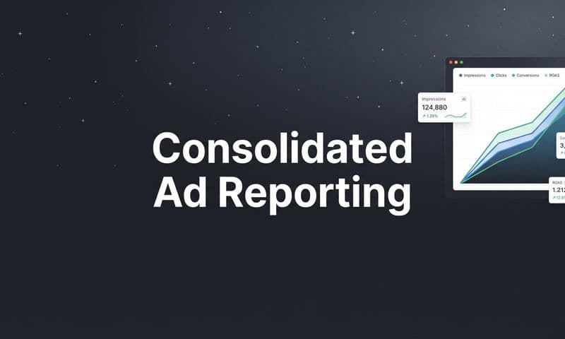
Data visualisation dashboards act as a marketing cockpit, turning scattered metrics into actionable intelligence. They serve up live performance data so teams can pilot campaigns with confidence.
Understanding Data Visualisation Dashboards
Imagine stepping into an aircraft cockpit where every gauge seems out of sync. A thoughtfully built dashboard replaces that chaos, merging ad platform reports, CRM entries, and server logs into one clear display.
This birds-eye view lays out campaign spend, conversion rates, and lead flow side by side. No more hopping between spreadsheets or juggling tools—just a coherent story that shows which channels drive revenue.
- Unified metrics in one interface enhance focus and cut down mistakes.
- Visual alerts flag oddities before they balloon into overspend.
- Interactive filters make it easy to drill down by campaign, date, or cohort.
- Shareable snapshots keep your team and stakeholders on the same page.
- Automated refresh ensures you’re always looking at the latest numbers.
How Dashboards Simplify Marketing Data
Think of dashboards as your flight instruments for marketing. They take care of tedious data wrangling so you can see spend trends, attribution gaps, and ROI shifts at a glance.
In fact, 83% of enterprises rely on dashboards to guide decisions as digital data swells past 120 zettabytes globally. In the United States, spending on these tools is set to hit $2.5 billion by 2025. Discover more insights about the data visualization tools market
This integration transforms raw figures into a narrative map, showing you which ad creative soars, which audience lags, and where shifting budget gives you the biggest bump.
- Metric layering adds context without clutter.
- Color-coded trends speed up critical insights.
- Segmented cohorts reveal hidden audience pockets.
- Drill-down charts expose root causes of performance swings.
Key Functions Of A Dashboard
A strong dashboard blends big-picture summaries with deep-dive panels—and keeps everyone on track.
- Snapshot metrics for quick health checks.
- Drill-down panels for root-cause analysis.
- Scheduled reports to update stakeholders automatically.
- Collaborative annotations so teams can share insights in context.
Integration with platforms like Cometly ties in server-side tracking and CRM sync. That means fewer blind spots and faster refinements.
Core Benefits For Decision Making
Dashboards translate complex attribution models into easy visuals. You spot patterns faster than any spreadsheet ever could—fueling agile tweaks that boost ROI.
“A unified dashboard cuts analysis time in half and boosts campaign agility.”
For a hands-on guide, explore our data analytic dashboard implementation tips to start building your marketing cockpit today.
When your dashboard becomes the hub for marketing attribution, flying blind stops. Clear visuals, real-time data, and smart layouts ensure you always understand why campaigns succeed or stumble.
Building Your Dashboard for Actionable Insights
Imagine your marketing dashboard as a precision engine: it refines raw data into clear decisions. At its heart are three metric types—KPIs, leading indicators, and diagnostic metrics—working in concert.
- Key Performance Indicators (KPIs) reveal outcomes like ROAS and total revenue, showing how you stack up against your goals.
- Leading Indicators—think click-through rates or site sessions—offer early clues about where performance is heading.
- Diagnostic Metrics break down funnel drop-offs or attribution shifts to explain why numbers moved.
Pulling these metrics into one view gives you both a rear-view mirror and a roadmap.
Key Metrics You Must Track
First off, ROAS (Return On Ad Spend) is non-negotiable for gauging budget efficiency. Yet by itself, ROAS can miss early warning signs of shifting audience behavior. That’s where leading indicators step in, flagging opportunities or problems before they hit your bottom line.
Essential KPIs for Marketing Attribution Dashboards
Before you dive deeper, here’s a snapshot of the must-watch metrics, what they measure, and why they’re so important:
KPI (Key Performance Indicator) | What It Measures | Why It Matters for Attribution |
|---|---|---|
Return on Ad Spend (ROAS) | Revenue generated for every dollar spent on advertising | Clarifies true investment returns and informs budget allocation across channels |
Click Through Rate (CTR) | Percentage of impressions that result in clicks | Acts as an early signal of ad relevance and engagement before conversions occur |
Funnel Drop Off Rate | Percentage of users who abandon between funnel steps | Identifies where attribution credit is lost due to friction in the conversion path |
By tracking these side by side, you get a solid framework for both performance assessment and accurate attribution.
Segment Data With Granularity
Don’t stop at overall figures. Drill down by campaign, channel, device or customer cohort to uncover hidden patterns. For instance, one traffic source might deliver 80% of your conversions, while another eats budget without results.
Segmenting:
- Reveals which age group or interest drives the highest engagement
- Exposes underperforming channels that drain spend
- Guides precise adjustments to creative, audience targeting or bid strategies
 Smarter Marketing with Data Visualisation Dashboards
Structure Information Hierarchically
A clear hierarchy keeps the overview crisp for leaders and the details accessible for execution teams.
- Executive Summary: High-level KPIs, trend lines and alerts
- Mid-Level View: Segmented metrics, channel comparisons and regional breakdowns
- Operational View: Raw data tables, drill-down filters and session logs
“A clear hierarchy in dashboards helps every user focus on what matters most.”
Turn structure into impact with our guide on creating actionable data.
For more on tying these insights to user behavior, explore customer experience analytics.
Best Practices for Accuracy and Actionability
Keep your dashboard healthy by:
- Auditing Data Feeds regularly to catch glitches early
- Standardizing Naming Conventions so every team reads metrics the same way
- Setting Alert Thresholds for sudden spikes or drops in key figures
- Adjusting Refresh Rates based on campaign pace—from hourly for live launches to daily for evergreen channels
In one e-commerce rollout, a team boosted ROAS by 25% in eight weeks simply by segmenting conversion paths and tightening attribution rules.
Use these guidelines to move from passive reporting to proactive strategy.
Next Steps For Implementation
Ready to build a dashboard that drives decisions? Follow these steps:
- Connect Data Sources: Hook up your CRM, ad platforms and server-side tracking
- Prioritize Metrics: Focus on the top three metrics that truly inform decisions—drop everything else
- Validate Connections: Map each data feed, test for accuracy and confirm end-to-end integrity
- Choose Visuals Wisely: Match chart types to metric behavior—trend lines for growth, bar charts for comparisons, funnels for conversion stages
With this roadmap, your marketing dashboard becomes more than a report—it’s a living guide to your next strategic move. Start building today and watch insights turn into action.
Designing Dashboards People Actually Use
A dashboard either greets you with clarity or leaves you fumbling. In that moment you decide: is this map a shortcut or a dead-end?
Picture a dashboard as a neighborhood guide. If tiny streets hide the main avenues, drivers get lost.
On the other hand, a clear layout sweeps away distractions and points users straight to what matters.
 Smarter Marketing with Data Visualisation Dashboards
Below, we’ll show you how to build dashboards your team actually opens, reads, and acts on. We start with visual hierarchy, whitespace, color choices, then pick the perfect chart.
Guide The Eye
Our eyes hunt for order, not chaos. With a smart hierarchy, you lead users on a deliberate path. Big, bold headlines spotlight top-line insights first. Then clean spacing and balanced colors keep their focus where it counts.
- Visual Hierarchy: Use size, color, and placement to rank data.
- Whitespace: Let each widget breathe so the eye can rest.
- Color Theory: Highlight crucial numbers without overwhelming.
- Consistent Layout: Predictable patterns make scanning second nature.
Choose The Right Chart
Every chart type tells its own story—and some stories need a specific narrator. A line chart can reveal seasonality like no other. Bars win at side-by-side comparisons. Always match your data’s tale with the tool that speaks it best.
- Bar Chart: Ideal for comparing distinct categories
- Line Graph: Perfect for tracking trends over time
- Scatter Plot: Uncovers correlations at a glance
- Pie Chart: Breaks a total into its constituent parts
Before you drop any chart in place, ask: what question is this answering?
Integrate Market Trends
Small businesses embraced drag-and-drop designers with a 43% jump last year. Meanwhile, data visualization tools hit $5.9 billion in market value and are on track to reach $10.2 billion at an 11.6% CAGR.
Read Technavio’s full market outlook:
https://www.technavio.com/report/data-visualization-tools-market-industry-analysis
Avoid Common Mistakes
Even seasoned pros can slip up. A cluttered panel or skewed axis instantly erodes trust.
“Misleading scales and endless rows turn insights into puzzles.” — Design Expert
- Jamming in too many metrics blurs the main point
- Inconsistent scales or chopped-off axes warp the truth
- Rainbow color schemes distract rather than guide
- Non-responsive layouts vanish on mobile screens
Practical Examples
Hungry for real-world templates and inspiration? Check out our guide on marketing dashboard examples:
https://www.cometly.com/post/marketing-dashboard-examples
To nail each visual decision, study these 10 essential data visualization best practices.
Blending hierarchy with the right charts and proven tips makes dashboards actionable. A handful of minor tweaks can boost comprehension by over 50% in tests. Then users don’t just glance—they engage.
Case Study Highlight
One e-commerce team swapped text-heavy tables for concise visual snapshots. The result? Page engagement doubled. Time on page climbed from two to four minutes. That extra trust sped up decisions and lifted conversion rates by 18% in just 30 days.
Takeaways
- Focus on clarity, not stuffing every metric into one screen
- Use whitespace and color like signposts, not decoration
- Choose chart types that fit the data’s narrative
- Always test with real users and refine based on feedback
These tactics turn raw figures into a story stakeholders can follow—and act on.
Next Steps
- Audit existing dashboards to find clutter or misaligned panels
- Rearrange elements so the eye moves from big-picture to details
- Invite team feedback and tweak charts, colors, and layout
- Schedule quarterly reviews to refresh metrics and design
- Celebrate small wins to keep everyone invested
Master these techniques and watch adoption—and impact—take off.
Connecting Your Data For A Single Source Of Truth
Imagine your dashboard as the cockpit of a plane—every gauge must work together. Unifying first-party tracking with server-side tracking brings all your signals into one cohesive view.
That blend removes hidden biases and fills the gaps between a click and a conversion. Suddenly, you’re spotting genuine patterns instead of chasing phantom data.
 Smarter Marketing with Data Visualisation Dashboards
Core Data Sources To Connect:
- Google Analytics for web behavior and session insights
- Facebook Ads and TikTok Ads for campaign delivery metrics
- Shopify or your e-commerce platform for order and revenue data
- CRM systems like Salesforce for lead and customer details
- Server logs or CDPs for backend tracking and enriched events
Choosing Your Connection Tools
Each data stream needs a reliable connector or API to feed your BI platform. Server-side solutions—such as Cometly’s one-click conversion sync—ensure ad platform imports arrive intact. Open connectors, ETL pipelines or native integrations via webhooks can fill in any blanks.
“Clean data is trustworthy data—missing fields lead to wrong insights.”
Follow These Steps:
- Set up your API credentials and permissions
- Define your data schema and naming conventions
- Schedule regular syncs to capture new events
This routine keeps your dashboards fresh, with minimal lag and maximum accuracy.
Accounting For Global Market Growth
Pulling all sources together isn’t just good practice—it’s critical in a booming industry. The global data visualization market sits at $10.92 billion today and is projected to climb to $18.36 billion, driven by cloud-based interactive dashboards and AI features. Learn more about data visualization market growth on Mordor Intelligence.
Bridging CRM And Ad Data
To tie ad clicks back to real revenue, you need CRM records alongside click IDs or UTM parameters. Then sync conversion statuses—like Closed Won or subscription start dates—for a full attribution picture.
Practical Steps To Link CRM And Ads:
- Map UTM fields and custom properties between systems
- Use server-side endpoints to push conversion events automatically
- Test matching logic with sample data before full rollout
This end-to-end model delivers clarity by channel, campaign, and ad. For a deeper dive, check out our guide on data integration best practices.
Ensuring Data Hygiene And Trust
Regular checks catch schema changes or missing fields before they skew your reports.
- Validate row counts after each sync
- Implement error logs and real-time alerts
- Clean and normalize data types such as dates and currencies
- Archive historical snapshots for audit trails
Version-control your ETL scripts and document transformations. Use staging environments to test updates and avoid breaking live dashboards.
A single source of truth only works when the truth is checked daily.
When your feeds are reliable, dashboards shift from confusing to commanding—every team trusting the same insights.
Next Steps And Ongoing Maintenance
A robust Single Source Of Truth needs ongoing care:
- Schedule a weekly audit to confirm connectors run smoothly
- Review dashboard refresh logs to spot latency or failures
- Update your data model when you add new campaigns, channels, or platforms
- Train stakeholders on reading the unified dashboard to align on key metrics
- Iterate quickly on anomalies and keep a changelog of pipeline edits
Follow these steps and your dashboard becomes more than a report-card—it’s a growth engine guiding every decision.
From Data Overload To Decisive Action
Too much information can stall your team. A data visualisation dashboard only becomes powerful when it leads to decisive action, not just more slides.
Imagine conflicting numbers between ad platforms and your CRM creating doubt instead of clarity. That’s where regular troubleshooting and a solid framework come in.
In this final chapter, you’ll find a hands-on checklist and a troubleshooting toolkit. You’ll see how to turn passive reports into a strategic engine that drives real change.
By pairing clear routines with precise fixes, your team swaps endless decks for targeted next steps after each dashboard review. Data stops being historical— it becomes the fuel for agile decision-making.
Common Dashboard Problems And Solutions
Before issues erode trust, catch them early. This table helps you identify common pitfalls and resolve them quickly.
Problem | Potential Cause | Recommended Solution |
|---|---|---|
Data Mismatch Across Platforms | Inconsistent attribution windows and reporting timeframes | Standardize attribution windows and align reporting definitions across tools |
Attribution Model Conflicts | Overlapping touchpoints with competing credit weights | Select a single allocation model or apply consistent multi touch attribution rules |
Stale Data Feeds | API rate limits, sync errors, or integration failures | Implement alerting, monitoring, and retry logic for failed data syncs |
Late Conversions | Time lag between ad interaction and final purchase | Use lookback windows and recency based analysis to capture delayed impact |
Once you’ve spotted a recurring issue, resolve it before it undermines confidence in your numbers.
Key Insight A dashboard only drives action when its numbers are trustworthy.
Troubleshooting often starts with a quick data audit and a cross-reference of your top metrics:
- Verify UTM parameters match across landing pages
- Compare CRM records against ad platform conversions
- Audit server-side logs for missing events
Building A Data Driven Culture
Turning dashboards into living playbooks takes more than great charts. It takes discipline and accountability.
- Schedule bi-weekly review meetings with clear agendas
- Assign an owner for each KPI and insight tracker
- Document decisions with timestamped annotations
- Encourage cross-departmental reviews (marketing, sales, finance)
Celebrate data-driven wins to reinforce positive behavior. Over time, this routine embeds a mindset where decisions come from insights, not instinct.
Actionable Next Steps
Use this list to ensure your dashboard shapes a profitable future.
- Validate data sources and define sync schedules
- Set concrete action items from each dashboard meeting
- Align metrics with quarterly business goals
- Embed feedback loops for continuous improvement
- Monitor performance shifts and adjust tactics quickly
Learn to connect insights with execution by exploring our guide on dashboard data analytics.
Taking action on insights can boost ROI by over 30% in under six months.
Align your review cadence with campaign lifecycles: daily checks for seasonal promos, weekly for evergreen campaigns. Track progress with monthly dashboards and tweak your checklist as you go.
Implement now.
Frequently Asked Questions
Marketing teams often hit walls when setting up dashboards. Below, you’ll find answers to the most common hurdles and best practices to keep your visual reports sharp and actionable.
What Is the Biggest Mistake People Make With Data Visualisation Dashboards?
The number-one error is data dumping—jamming in every possible metric and leaving no room for focus. Stakeholders end up staring at 12 disconnected charts and wondering what matters.
Instead, curate your dashboard around core goals. Group related KPIs, add interactive filters, and guide users straight to insights.
- Include only metrics tied to clear business objectives.
- Group similar KPIs to build visual coherence.
- Use interactive filters to prevent clutter.
When To Update Your Dashboard
Timing is everything. Fast-moving ad campaigns demand real-time or hourly updates to catch performance shifts as they happen.
Strategic dashboards tracking quarterly goals usually only need daily or weekly refreshes. That balance keeps noise low and impact high.
- Real-time or hourly for active ad campaigns.
- Daily for content performance and SEO.
- Weekly or monthly for executive summaries.
“Matching update frequency to decision needs prevents noise and supports timely actions.”
Can I Build a Dashboard Without Being a Data Scientist?
Yes. Modern BI tools have drag-and-drop builders and prebuilt connectors. You can link Google Analytics or Shopify without touching code.
Templates cover e-commerce funnels, agency reports, and more—freeing your team to focus on analysis, not setup.
- Pick a tool with native connectors to your data sources.
- Leverage templates for campaign tracking and ROI analysis.
- Customize visual themes to match your brand guidelines.
User-friendly dashboards let marketers focus on insights rather than technical setup.
Additional Tips And Resources
Audit your dashboards monthly to remove stale charts and keep things relevant. Encourage peers to critique visuals and metrics.
For hands-on examples, dive into case studies of marketing attribution dashboards—real layouts show how to balance charts, layout, and interactivity.
What Charts Work Best For Different Data?
Right chart choice makes trends pop off the page. Use a line graph for time series and a bar chart to compare categories at a glance.
- Line Graphs reveal growth or decline over time.
- Bar Charts highlight differences between groups.
- Scatter Plots uncover correlations between variables.
- Funnel Charts map conversion stages for e-commerce and lead flows.
Test chart readability with actual users and keep iterating based on feedback.
Ready to streamline your marketing attribution? Sign up for Cometly and unify every touchpoint in one intuitive platform: Cometly