What If Looker Studio Isn’t Cutting It?
Imagine you’re in a meeting, ready to present insights from your data, but your analytics tool is throwing errors, making it hard to visualize the information. Frustrating, right? Many users of Looker Studio find themselves in similar situations, grappling with the complexities of setting up their data visualizations and struggling to get the insights they need. While Looker Studio offers powerful capabilities, it can sometimes feel overwhelming, particularly for those who need quick, actionable insights without the steep learning curve.
As businesses continue to evolve, the demand for more flexible, user-friendly analytics tools is on the rise. Many users report common pain points with Looker Studio, such as integration limitations with other platforms, a complex setup process, and concerns about pricing. The result? A growing number of professionals are seeking alternatives that better suit their needs.
By exploring various tools that can serve as effective Looker Studio alternatives, you can find solutions that not only simplify data visualization but also enhance your overall analytics strategy. Whether you’re looking for something user-friendly, AI-driven, or deeply integrative, there’s a tool out there that can meet your unique requirements.
Let’s dive into the top 8 tools that can help you overcome the challenges you've faced with Looker Studio and elevate your data analytics experience.
1. Cometly
Best for: Marketing professionals seeking AI-driven analytics and attribution.
Cometly is a powerful marketing attribution platform designed to track customer journeys across multiple channels, offering insights into which ads and channels drive leads and revenue.
 Discover 7 Essential Tools For Marketing Analytics To Drive Effective Campaigns
Overview & Background
Cometly connects your ad platforms, CRM, and website to provide a comprehensive view of how users interact with your marketing efforts. This platform is particularly suited for marketers who want to analyze ad performance in real time and understand the effectiveness of their campaigns.
Key Features
1. Comprehensive Touchpoint Tracking: Cometly captures every interaction a customer has with your brand, from ad clicks to CRM events, enabling you to see the full customer journey.
2. AI-Driven Insights: The platform leverages AI to provide recommendations based on user interactions, helping you identify high-performing ads and optimize your campaigns.
3. Customizable Dashboards: Users can create tailored dashboards that reflect their unique KPIs and business goals, making data interpretation more straightforward.
How It Works
To get started, users connect their ad accounts, CRM, and website to Cometly. The tool then tracks all relevant data points and presents them through an intuitive dashboard. This allows marketers to quickly visualize performance across various channels and make data-driven decisions.
Pricing & Plans
Cometly offers various pricing tiers based on the features required and the scale of your marketing efforts. They provide a free demo to help potential users evaluate the platform.
Why It's Great for Marketing Professionals
Cometly stands out for its ability to provide deep insights into marketing performance, making it an essential tool for any marketing team looking to maximize their ad spend and improve ROI.
2. Tableau
Best for: Organizations needing advanced data visualization capabilities.
Tableau is known for its robust data visualization capabilities, allowing users to create intricate visual representations of their data without the need for extensive coding knowledge.
 Discover 7 Essential Metorik Alternatives To Enhance Your Marketing Analytics
Overview & Background
Tableau has established itself as a leader in the analytics space, providing users with the tools they need to explore and visualize data effortlessly. Its drag-and-drop interface simplifies the process of creating complex visualizations, making it a favorite among data analysts.
Key Features
1. User-Friendly Interface: The intuitive drag-and-drop functionality allows users to build visualizations quickly without extensive technical expertise.
2. Extensive Visualization Options: Tableau offers a wide variety of chart types and graph options, enabling users to tell compelling stories with their data.
3. Strong Community Support: Tableau has a vibrant community that provides resources, tutorials, and forums for users seeking assistance or inspiration.
How It Works
Users can connect Tableau to various data sources, including spreadsheets, databases, and cloud services. Once connected, they can create dashboards and reports that dynamically update as new data comes in, ensuring insights are always current.
Pricing & Plans
Tableau offers a free version with limited features, while its paid plans include additional functionalities and support options, catering to different organizational needs.
Why It's Great for Enterprises
Tableau is ideal for organizations that require advanced analytics and visualization capabilities, making it perfect for data-heavy industries like finance and healthcare. Learn more about top Tableau alternatives.
3. Microsoft Power BI
Best for: Teams using Microsoft products for seamless integration.
Microsoft Power BI is a business analytics tool that provides interactive visualizations and business intelligence capabilities with an interface simple enough for end users to create their own reports and dashboards.
 Discover 7 Top Tableau Alternatives To Enhance Your Data Visualization
Overview & Background
Power BI integrates natively with other Microsoft applications, making it a compelling choice for organizations already using tools like Excel, Azure, and Teams. It helps streamline the reporting process and enhances collaboration across teams.
Key Features
1. Real-Time Data Access: Power BI allows users to access and analyze data in real-time, which is crucial for making timely decisions.
2. Collaboration Features: Integrated with Microsoft Teams, Power BI fosters collaboration by allowing teams to share insights and reports seamlessly.
3. AI Capabilities: The platform includes AI features that help users analyze data patterns and generate insights automatically.
How It Works
Users can connect Power BI to various data sources, including Excel spreadsheets, on-premises databases, and cloud services. The tool then enables users to build interactive reports and dashboards that can be shared across the organization.
Pricing & Plans
Power BI offers a free version with essential features, while the Pro and Premium versions provide advanced capabilities and additional storage, catering to larger organizations.
Why It's Great for Microsoft Users
Power BI is particularly advantageous for organizations that already rely on Microsoft products, as it ensures a smooth workflow and enhances data collaboration.
4. Google Data Studio
Best for: Small businesses and startups seeking free reporting solutions.
Google Data Studio is a free tool that allows users to create visual reports and dashboards using data from various sources, helping businesses make informed decisions without incurring costs.
 Discover 10 Top Sisense Alternatives To Enhance Your Data Analytics
Overview & Background
Google Data Studio empowers users to transform their data into informative, easy-to-read, shareable dashboards. Its free access and user-friendly interface make it an excellent option for startups and small businesses.
Key Features
1. Free to Use: Google Data Studio is completely free, making it accessible to businesses of all sizes.
2. Easy Data Integration: Users can connect to various data sources, including Google Analytics, Google Ads, and third-party tools, to visualize their data.
3. Customizable Reports: The drag-and-drop interface allows users to create reports tailored to their specific needs and preferences.
How It Works
Users can start by selecting data sources and then designing their reports using pre-built templates or custom layouts. The final product can be shared easily with stakeholders, enhancing collaboration.
Pricing & Plans
As a free tool, Google Data Studio does not require any subscription fees, making it a budget-friendly option for businesses.
Why It's Great for Startups
Google Data Studio is perfect for small businesses needing basic analytics tools without the financial burden, allowing them to focus on growth and optimization.
5. Qlik Sense
Best for: Organizations needing associative data exploration capabilities.
Qlik Sense is a data analytics tool that provides users with powerful data exploration capabilities through its unique associative model.
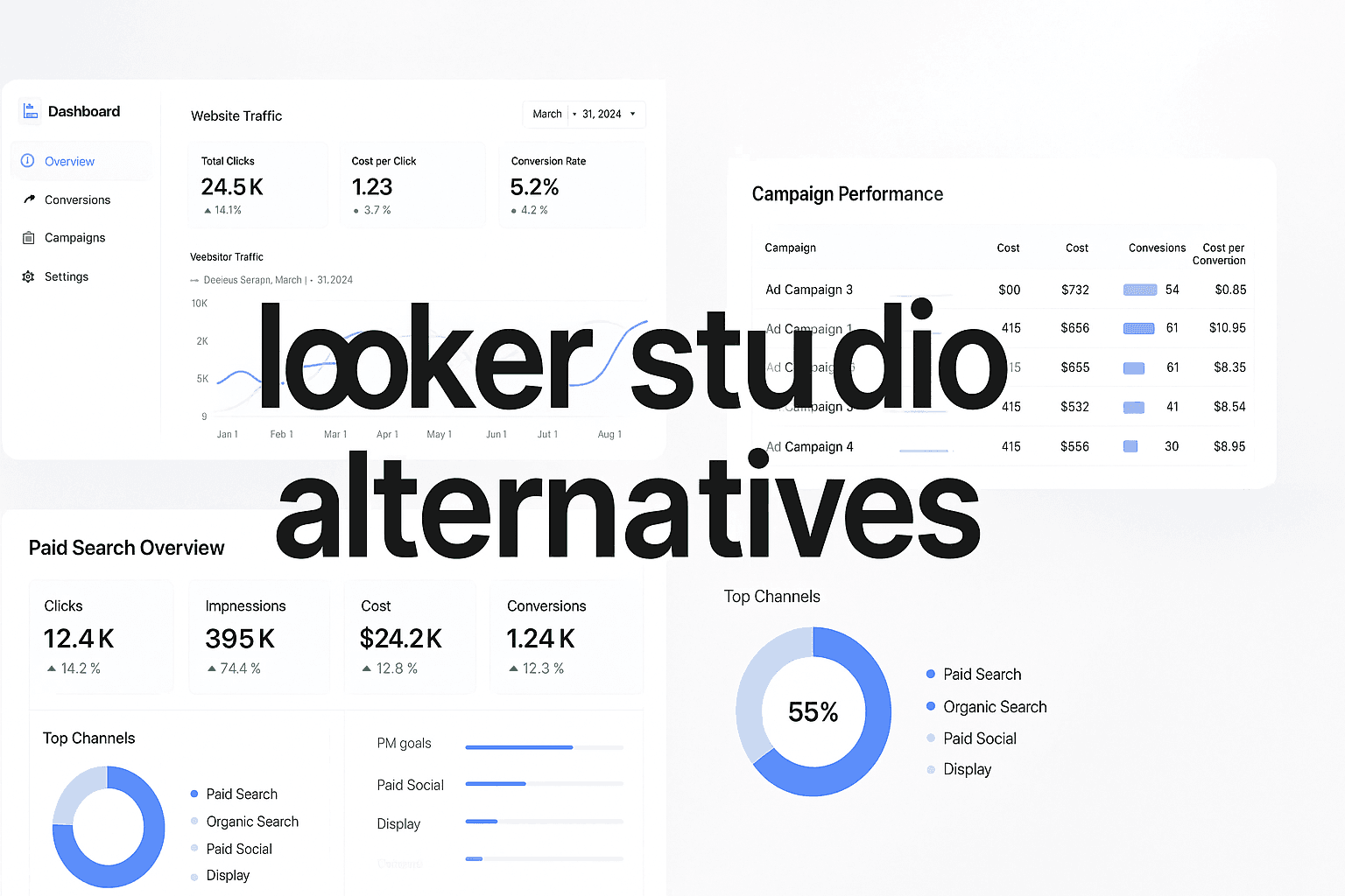
 Top 8 Looker Studio Alternatives To Enhance Your Data Analytics Experience
Overview & Background
Qlik Sense is designed to facilitate data discovery and exploration, allowing users to make connections between various data points effortlessly. Its associative model enables users to navigate through complex datasets intuitively.
Key Features
1. Associative Model: Qlik Sense allows users to explore relationships between data points, uncovering insights that traditional linear models may miss.
2. Smart Search: This feature enhances data discovery by enabling users to find relevant data quickly and easily.
3. Interactive Dashboards: Users can create dynamic dashboards that engage stakeholders and facilitate deeper understanding of the data.
How It Works
After connecting to data sources, users can interactively explore their data through Qlik Sense’s intuitive interface, allowing for real-time analysis and insight generation.
Pricing & Plans
Qlik Sense offers various pricing options, including a free version that gives users access to essential features, making it suitable for organizations of all sizes.
Why It's Ideal for Data Analysts
Qlik Sense is particularly well-suited for organizations handling complex datasets, as its associative model can reveal insights that drive strategic decision-making. Learn more about top Qlik alternatives.
6. Sisense
Best for: Developers looking to embed analytics into applications.
Sisense is an analytics platform designed to help organizations embed analytics into their applications, enhancing user engagement and data utilization.
 Top 8 Looker Studio Alternatives To Enhance Your Data Analytics Experience
Overview & Background
With a focus on embedded analytics, Sisense allows developers to integrate analytics capabilities directly into their applications, providing users with insights without the need to switch platforms.
Key Features
1. Embedded Analytics: Sisense excels in providing customizable dashboards that can be embedded into existing applications, allowing for a seamless user experience.
2. Strong Data Modeling: Users can create complex data models that enhance the depth of analytics available within their applications.
3. User-Friendly Interface: The platform is designed to be intuitive, enabling both technical and non-technical users to generate insights easily.
How It Works
To use Sisense, developers can integrate the platform into their applications and customize the analytics features based on user needs, ensuring relevant insights are readily available.
Pricing & Plans
Sisense offers flexible pricing options based on the features required and the scale of the deployment, making it suitable for various organizations.
Why It's Great for Product Teams
Sisense is particularly beneficial for software developers looking to provide embedded analytics capabilities, enhancing their applications' value and usability. Learn more about top Sisense alternatives.
7. HubSpot
Best for: Businesses looking for an integrated marketing and sales platform.
HubSpot is a comprehensive platform that provides tools for marketing, sales, and customer service, making it an all-in-one solution for businesses aiming to enhance their analytics capabilities.
 6 Best Attribution Tools For Marketing To Track Real Revenue In 2025
Overview & Background
HubSpot is designed to help businesses grow by providing a suite of tools that cover various aspects of customer relationship management (CRM). Its user-friendly interface and robust functionalities make it suitable for organizations of all sizes, particularly those focusing on inbound marketing strategies.
Key Features
1. Integrated Analytics Dashboard: HubSpot offers a unified dashboard that consolidates marketing, sales, and service metrics, allowing users to track performance across different channels in one place.
2. Marketing Automation: The platform includes powerful automation features that help streamline marketing campaigns, enabling users to nurture leads effectively with personalized content.
3. CRM Integration: HubSpot’s CRM capabilities allow for seamless tracking of customer interactions, making it easier for teams to collaborate and manage relationships.
How It Works
Users can create marketing campaigns within HubSpot by selecting their target audience, designing emails, and setting up workflows to automate follow-ups. The analytics dashboard provides real-time insights into campaign performance, helping businesses make data-driven decisions quickly.
Pricing & Plans
HubSpot offers a free version with basic features, while its paid plans provide advanced functionalities and support options tailored to the needs of growing businesses.
Why It's Great for All-in-One Solutions
HubSpot stands out for its ability to integrate various aspects of marketing and sales into one platform, making it particularly beneficial for teams looking to enhance collaboration and drive growth through data insights. Learn more about top HubSpot Marketing Attribution alternatives.
8. Domo
Best for: Organizations seeking an all-in-one business intelligence solution.
Domo is a comprehensive business intelligence platform that integrates data from various sources, providing users with a holistic view of their organization's performance.
 Top 8 Looker Studio Alternatives To Enhance Your Data Analytics Experience
Overview & Background
Domo offers a complete suite of tools for data visualization, reporting, and dashboard creation, making it a strong contender in the business intelligence space.
Key Features
1. All-in-One Dashboard: Domo’s platform allows organizations to consolidate their reporting needs into a single dashboard, improving efficiency and data accessibility.
2. Extensive App Integration: The platform supports integration with numerous applications, enhancing collaboration and data sharing across teams.
3. Real-Time Data Visualization: Users can create real-time dashboards that reflect current business metrics, facilitating timely decision-making.
How It Works
After connecting their data sources, users can build dashboards that provide insights across various departments, ensuring that all stakeholders have access to relevant information.
Pricing & Plans
Domo offers various pricing plans based on the features required, ensuring that organizations can find a solution that fits their budget and needs. Learn more about top Domo alternatives.
Why It's Ideal for Comprehensive BI Needs
Domo is perfect for organizations that require an all-in-one solution for business intelligence, allowing them to manage all their data reporting needs in one place.
Navigating Your Path to Better Data Visualization
By understanding the unique strengths of each alternative to Looker Studio, you can make informed decisions that enhance your data visualization and analytics capabilities. Tools like Cometly, Tableau, and Power BI offer distinct features that cater to different business needs, from in-depth analytics to seamless integrations with existing platforms.
As you consider these alternatives, think about how each tool aligns with your organization's goals and the specific challenges you face. Evaluating your requirements against the features offered by these tools can significantly impact your analytics success.
For those looking to enhance their marketing analytics with real-time insights and comprehensive attribution, get your free demo of Cometly today at https://www.cometly.com/sign-up-now. This could be your first step toward a more insightful and data-driven approach to marketing.