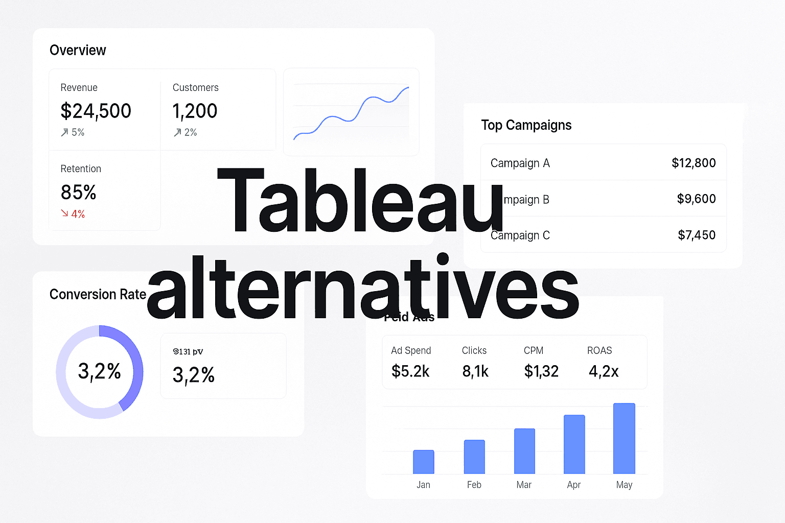
Navigating The Data Visualization Landscape
In today's data-driven world, businesses are increasingly reliant on data visualization tools to make sense of complex data sets. Imagine a marketing team struggling to understand their campaign performance due to the limitations of their current tools. They find themselves overwhelmed by intricate data, unable to derive actionable insights, and ultimately, this hampers their ability to make informed decisions. This is a common scenario for many organizations using Tableau, which, while powerful, often presents challenges such as high costs, steep learning curves, and integration limitations.
Many businesses face these hurdles, prompting the need for alternatives that can better serve their unique analytics requirements. For instance, a marketing team might find Tableau inadequate for their complex data needs, leading them to seek out more intuitive and cost-effective solutions. By the end of this article, you'll know exactly which tools can offer the capabilities you need to enhance your data strategy without the frustrations that often accompany Tableau.
In this listicle, we'll explore the top alternatives to Tableau that not only provide robust data visualization capabilities but also enhance the overall data analysis experience. Let's dive into the top 7 tools that can help you elevate your data insights and decision-making processes.
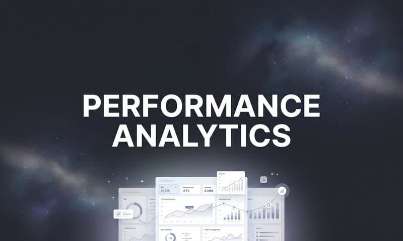
1. Cometly
Best for: Real-time marketing analytics and attribution.
Cometly is a marketing attribution platform that specializes in tracking customer interactions across multiple channels in real time.
 Discover 7 Top Tableau Alternatives To Enhance Your Data Visualization
Overview & Background: Cometly has emerged as a game-changer for marketing teams, enabling them to capture every touchpoint of the customer journey. By providing a comprehensive view of how ads and channels drive leads and revenue, it allows marketers to make data-driven decisions with confidence.
Key Features:
1. Multi-Touch Attribution: Cometly tracks every customer interaction, giving marketers insights into which ads are truly driving conversions.
2. Customizable Dashboards: Users can create tailored dashboards that highlight key performance indicators relevant to their campaigns.
3. Automated Reporting: This feature simplifies reporting processes, allowing teams to focus on strategy rather than data compilation.
How It Works: Cometly connects seamlessly with various ad platforms, CRMs, and websites to track the entire customer journey. This integration ensures that marketers can analyze ad performance and optimize their campaigns in real time.
Pricing & Plans: Cometly offers flexible pricing plans based on the features needed and the scale of use. This allows businesses to choose a plan that fits their budget while providing essential capabilities.
Why It's Great for Marketers: Cometly empowers marketing professionals to understand what drives revenue effectively. By leveraging AI-driven insights, teams can refine their strategies and scale campaigns with confidence.
2. Power BI
Best for: Seamless integration with Microsoft products.
Power BI is a business analytics tool developed by Microsoft that provides interactive visualizations and business intelligence capabilities with a user-friendly interface.
 Discover 7 Top Tableau Alternatives To Enhance Your Data Visualization
Overview & Background: Power BI is particularly valuable for organizations already using Microsoft products, as it integrates smoothly with tools like Excel and Azure. This makes it an excellent choice for businesses looking to leverage their existing Microsoft ecosystem.
Key Features:
1. Natural Language Queries: Users can ask questions in plain English and receive visual data insights, making data exploration accessible to all.
2. Interactive Dashboards: Power BI allows users to create dynamic dashboards that can be customized to meet specific business needs.
3. AI Capabilities: With AI-driven insights, users can uncover trends and patterns in their data without extensive data science knowledge.
How It Works: Power BI connects to various data sources, allowing users to import and visualize data quickly. Its integration with Excel means that users can easily transition from spreadsheets to interactive reports.
Pricing & Plans: Power BI offers a free version with limited features, while the Pro version and Premium options provide more advanced capabilities at competitive prices.
Why It's Great for Microsoft Ecosystem Users: Power BI is ideal for businesses entrenched in Microsoft products, as it allows for enhanced collaboration and streamlined workflows.
3. Qlik Sense
Best for: Interactive data storytelling and exploration.
Qlik Sense is a data visualization tool that focuses on making data analytics accessible and engaging through storytelling.
 Discover 7 Top Tableau Alternatives To Enhance Your Data Visualization
Overview & Background: Qlik Sense stands out with its associative model, allowing users to explore data in a non-linear fashion, which is particularly useful for uncovering hidden insights.
Key Features:
1. Drag-and-Drop Interface: Users can easily create visualizations without needing extensive technical skills.
2. Dynamic Dashboards: Qlik Sense allows for the creation of dashboards that automatically update as new data comes in.
3. Real-Time Analytics: Users can analyze data as it changes, providing timely insights that drive decision-making.
How It Works: The platform uses a unique associative engine to connect data from various sources, enabling users to visualize complex relationships in their data.
Pricing & Plans: Qlik Sense offers flexible pricing, including options for both cloud and on-premise deployments, making it accessible for businesses of all sizes. Learn more about top Qlik alternatives.
Why It's Great for Data Storytellers: Qlik Sense is perfect for organizations that want to create engaging narratives with their data, making it easier to communicate insights to stakeholders.
4. Looker
Best for: Data analytics for Google Cloud users.
Looker is a data platform that specializes in data exploration and analytics, particularly for organizations utilizing Google Cloud services.
 10 Powerful Ruler Analytics Alternative Tools To Elevate Your Marketing Strategy
Overview & Background: Looker enables businesses to create custom metrics and reports, making it a great choice for data-driven organizations invested in the Google ecosystem.
Key Features:
1. LookML: A unique modeling language that allows users to define metrics and dimensions in a way that can be reused across reports.
2. Interactive Dashboards: Users can create interactive dashboards that adapt to the latest data, providing a clear view of performance metrics.
3. Seamless Google Integration: Looker integrates perfectly with Google’s data warehouse, BigQuery, enhancing data exploration capabilities.
How It Works: Looker’s architecture allows for real-time data exploration, enabling users to uncover insights quickly and collaborate effectively.
Pricing & Plans: Looker provides customized pricing based on organizational needs, ensuring that businesses can select a plan that fits their budget and requirements. Learn more about top Looker Studio alternatives.
Why It's Great for Google Cloud Users: Looker is particularly beneficial for organizations using Google Cloud, as it streamlines data analytics and reporting processes.
5. Domo
Best for: Unifying data from multiple sources.
Domo is a cloud-based business intelligence platform that focuses on providing a comprehensive view of business data by aggregating information from various sources.
 Discover 7 Top Tableau Alternatives To Enhance Your Data Visualization
Overview & Background: Domo excels in unifying data from different applications, allowing businesses to gain a holistic view of their operations, which is crucial for effective decision-making.
Key Features:
1. Real-Time Data Updates: Domo provides real-time updates, ensuring that users are always working with the latest information.
2. Customizable Dashboards: Users can create dashboards tailored to their specific needs, making it easier to track KPIs and performance metrics.
3. Collaboration Tools: Domo fosters collaboration by allowing teams to share insights and data easily.
How It Works: Domo connects to a wide range of data sources, from spreadsheets to cloud applications, enabling comprehensive data analysis.
Pricing & Plans: Domo offers a variety of pricing plans, catering to different organizational needs and sizes, making it accessible for both small businesses and large enterprises. Learn more about top Domo alternatives.
Why It's Great for Businesses Needing Holistic Views: Domo is ideal for organizations that require a unified view of their data to drive strategic decisions.
6. Sisense
Best for: Embedded analytics and complex data integration.
Sisense is a powerful analytics platform designed to handle large datasets and provide embedded analytics solutions.
 Discover 7 Top Tableau Alternatives To Enhance Your Data Visualization
Overview & Background: Sisense is particularly useful for organizations that need to embed analytics within their applications, enabling them to offer value-added insights to their users.
Key Features:
1. Powerful Data Modeling: Sisense allows users to create complex data models that can handle massive datasets efficiently.
2. AI-Driven Insights: The platform leverages AI to provide users with actionable insights derived from their data.
3. Embedded Analytics: Sisense enables businesses to integrate analytics capabilities directly into their applications.
How It Works: Sisense’s architecture allows it to process and analyze large volumes of data quickly, ensuring that users can derive insights without delays.
Pricing & Plans: Sisense offers flexible pricing tailored to the specific needs of different organizations, making it accessible to a wide range of users. Learn more about top Sisense alternatives.
Why It's Great for Embedded Solutions: Sisense is ideal for businesses looking to enhance their products with robust analytics capabilities.
7. Firebolt
Best for: High-performance analytics for large datasets.
Firebolt is a cloud-based data platform designed specifically for analytics, providing fast query performance even on massive datasets.
 Discover 7 Top Tableau Alternatives To Enhance Your Data Visualization
Overview & Background: Firebolt aims to optimize data analytics for organizations that require speed and efficiency in processing large volumes of data. Its architecture is engineered to handle complex queries and deliver insights rapidly, making it a suitable choice for businesses looking to enhance their data capabilities.
Key Features:
1. Blazing Fast Performance: Firebolt utilizes a unique architecture that allows users to run queries much faster than traditional databases, which is crucial for real-time analytics.
2. Seamless Scalability: The platform can scale effortlessly to accommodate growing data needs, ensuring that performance remains consistent as data volumes increase.
3. Integrated Data Warehouse: Firebolt combines storage and compute resources in a way that optimizes cost and performance, allowing users to focus on analysis rather than infrastructure management.
How It Works: Firebolt integrates with existing data sources and allows users to run complex analytics queries efficiently. Its architecture is designed to minimize latency and maximize throughput, making it ideal for data-intensive applications.
Pricing & Plans: Firebolt offers flexible pricing based on usage, which allows organizations to pay for only what they need, making it a cost-effective option for data analytics.
Why It's Great for Large Data Users: Firebolt is particularly advantageous for companies that work with large datasets and require fast, reliable analytics. By delivering insights at speed, it empowers organizations to make data-driven decisions swiftly and effectively.
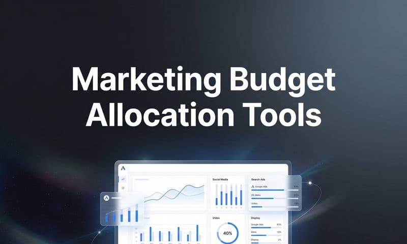
Elevating Your Data Strategy With The Right Tool
Choosing the right data visualization tool is crucial for maximizing insights and enhancing decision-making. The tools highlighted in this article each bring unique strengths to the table. For instance, Cometly shines in real-time marketing analytics, while Power BI excels in seamless integration with Microsoft products. Qlik Sense offers engaging data storytelling capabilities, whereas Looker provides robust data exploration in the Google Cloud ecosystem. Domo's strength lies in unifying data from multiple sources, Sisense is perfect for those needing embedded analytics, and Chartio simplifies the data exploration process for non-technical users.
Before making a choice, consider your organization’s specific needs, budget, and technical capabilities. Implementing a new tool can significantly improve your data strategy, leading to better insights and outcomes. As you explore these Tableau alternatives, remember that the right tool can transform how you visualize and interact with your data.
To take your marketing analytics to the next level, get your free demo with Cometly today and see how our platform can empower your team with real-time insights and data-driven strategies.