You're staring at three browser tabs: Meta Ads Manager showing one set of conversion numbers, Google Analytics displaying different traffic sources, and your CRM reporting yet another version of lead quality. Each platform insists its data tells the real story. Meanwhile, your stakeholders want to know one simple thing: which campaigns are actually driving revenue?
This is the paradox of modern marketing. We have more data than ever before, but extracting meaning from it feels like searching for patterns in static. The problem isn't lack of information—it's that raw numbers, spreadsheets, and platform-specific reports don't reveal the strategic insights hiding within your data.
Marketing analytics visualization transforms this chaos into clarity. It's the discipline of converting complex, multi-platform marketing data into visual formats that your brain can process instantly. When done right, visualization doesn't just make data prettier. It accelerates the path from observation to action, revealing trends, anomalies, and opportunities that would remain invisible in spreadsheet rows.
Beyond Spreadsheets: Why Visual Data Transforms Marketing Decisions
Your brain processes visual information approximately 60,000 times faster than text. This isn't marketing hype—it's cognitive science. When you look at a line chart showing campaign performance over time, your visual cortex identifies the trend before your conscious mind finishes reading the axis labels.
This processing speed advantage matters enormously when you're managing multiple campaigns across platforms. A spreadsheet with 500 rows of daily performance data requires methodical scanning, mental calculation, and deliberate pattern recognition. The same data visualized as a time-series chart reveals the story instantly: this campaign peaked on weekends, that one declined after creative refresh, this channel shows consistent growth.
Visualization excels at surfacing patterns that numerical tables actively hide. Consider attribution data across a customer journey with eight touchpoints. In a spreadsheet, you see eight rows with timestamps and channel names. In a Sankey diagram or flow visualization, you immediately see which paths convert most frequently, where customers drop off, and which channel combinations drive the highest-value conversions. Understanding attribution challenges in marketing analytics becomes much easier when you can see the data visually.
The business cost of delayed insights compounds quickly in digital marketing. Every day you spend manually analyzing cross-platform data is a day your competitors might be reallocating budget to better-performing channels. When a campaign starts underperforming, visual dashboards surface the problem within hours. Spreadsheet analysis might catch it after days of accumulated waste.
Think about anomaly detection. A sudden 40% drop in conversion rate buried in row 247 of a CSV file might go unnoticed until your weekly review. The same drop displayed as a line chart with automatic threshold alerts triggers immediate investigation. You can pause spending, diagnose the tracking issue, and resume optimization before significant budget burns.
This speed advantage extends beyond problem detection to opportunity recognition. Visual correlation analysis can reveal unexpected patterns: perhaps your LinkedIn ads don't convert directly, but customers who see them convert 30% faster through other channels. This insight—nearly impossible to spot in raw data—becomes obvious when you visualize multi-touch attribution paths.
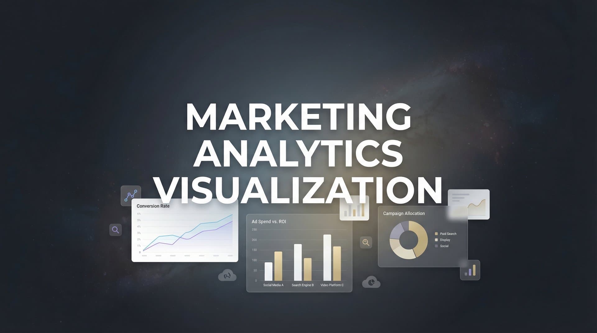
Essential Chart Types Every Marketer Should Master
Different marketing questions demand different visual approaches. Mastering the right chart type for each analysis transforms your ability to extract insights quickly and communicate findings clearly to stakeholders.
Funnel Visualizations: The classic marketing funnel chart remains essential because it answers a critical question: where are we losing potential customers? A properly constructed funnel shows the percentage of users progressing from awareness through consideration to conversion, with the visual width of each stage proportional to the volume. The gaps between stages immediately reveal your biggest optimization opportunities.
Advanced funnel visualization goes beyond simple stage progression. Segment your funnels by traffic source, device type, or customer demographic. When you discover that mobile users drop off at checkout at twice the rate of desktop users, you've found a high-impact optimization target. When organic search traffic converts at 3x the rate of paid social, you've identified a budget reallocation opportunity.
Time-Series Charts: Line and area charts tracking metrics over time form the backbone of campaign performance monitoring. These visualizations excel at revealing trends, seasonality, and the impact of specific changes. Did that creative refresh improve performance? The time-series chart shows the before-and-after instantly.
Layer multiple metrics on time-series charts to reveal relationships. Plot cost per acquisition alongside conversion volume—you might discover that your lowest CPA days actually produce fewer total conversions, suggesting you're underspending on high-intent traffic. Overlay campaign launches, creative changes, or external events as vertical markers to understand what drove performance shifts.
Attribution Flow Diagrams: Understanding the multi-touch customer journey requires visualizations that show paths, not just endpoints. Sankey diagrams and flow charts illustrate how customers move between touchpoints before converting. Each path's thickness represents volume, making the most common conversion journeys immediately obvious.
These diagrams reveal insights impossible to extract from last-click attribution. You might discover that while paid search gets credit for most conversions, nearly all those customers first engaged with your content marketing. Or that customers who see both LinkedIn and YouTube ads convert at significantly higher rates than those exposed to either channel alone. Exploring marketing attribution analytics helps you understand these complex relationships.
Heatmaps and Correlation Matrices: When analyzing relationships between multiple variables, heatmaps transform complex correlation data into instantly readable color gradients. A correlation heatmap might reveal that high email engagement correlates strongly with conversion rate but weakly with initial purchase value—suggesting email works better for activation than for attracting high-value customers initially.
Geographic heatmaps show performance variation across locations, helping you identify expansion opportunities or underperforming regions that need different creative approaches. Time-of-day heatmaps reveal when your audience is most responsive, informing ad scheduling decisions.
Building Dashboards That Drive Action, Not Just Awareness
A dashboard filled with charts doesn't automatically create value. The difference between decorative data visualization and decision-driving dashboards lies in intentional design focused on specific actions.
Start by separating vanity metrics from decision-driving KPIs. Impressions and reach feel important, but they rarely inform tactical decisions. Conversion rate, customer acquisition cost, return on ad spend, and customer lifetime value directly connect to business outcomes and guide budget allocation. Your primary dashboard should feature metrics that actually change how you manage campaigns. Understanding which marketing analytics metrics matter most is essential for effective dashboard design.
The Hierarchy of Metrics: Effective dashboards present information in layers. The top level shows the three to five metrics that define success for your business: total revenue attributed to marketing, blended customer acquisition cost, and perhaps marketing-influenced pipeline value. These north star metrics answer the executive question: is marketing working?
The second layer breaks down performance by channel, campaign, or customer segment. This tactical view helps marketing managers identify which specific initiatives are driving the top-level results. The third layer provides granular detail for optimization: ad-level performance, keyword data, audience segment analysis, and creative testing results.
This hierarchy serves different stakeholders without overwhelming anyone. Executives see the summary view that answers their strategic questions. Marketing managers access the channel breakdown that informs budget decisions. Campaign specialists drill into the granular data that guides daily optimization.
Designing for Different Stakeholders: Your CFO doesn't need to see click-through rates. Your paid search specialist doesn't need to see quarterly revenue forecasts. Effective dashboard design matches information density to the user's role and decision-making needs.
Executive dashboards emphasize trends over time and comparison to goals. Use large, clear visualizations with minimal clutter. Include year-over-year comparisons and progress toward quarterly targets. Avoid jargon—speak in business terms like revenue, profit margin, and customer acquisition efficiency.
Tactical dashboards for marketing managers need more detail and interactivity. Enable filtering by date range, channel, or campaign. Include comparison views that show performance relative to benchmarks or previous periods. Surface both wins and problems—highlight campaigns exceeding targets alongside those burning budget inefficiently. The top marketing analytics dashboard companies understand these stakeholder differences.
Real-Time Versus Historical Views: Real-time dashboards serve active campaign management. When you're running time-sensitive promotions or testing new creative, you need to see performance updates within hours, not days. Real-time views help you catch problems quickly and capitalize on unexpected wins by scaling budget to high-performers.
Historical analysis serves strategic planning and learning. Weekly, monthly, and quarterly views reveal seasonal patterns, long-term trends, and the lasting impact of major changes. These views inform annual planning, budget allocation across quarters, and strategic decisions about channel mix.
The most effective dashboard strategies combine both. Your primary view shows today's performance and recent trends. With one click, you can zoom out to see how current performance compares to historical patterns, helping you distinguish between normal fluctuation and meaningful change.
Cross-Platform Visualization: Unifying Data From Every Channel
The fragmentation of marketing data across platforms creates one of the biggest visualization challenges. Meta defines conversions differently than Google. TikTok attributes on a different window than LinkedIn. Your CRM tracks leads that may or may not match the conversion events your ad platforms report.
This isn't just an inconvenience. It's a fundamental barrier to understanding true channel performance. When you're comparing Meta's reported ROAS to Google's, you're not comparing apples to apples—you're comparing apples to something that might be an orange, might be a different variety of apple, and might be measured by weight while the first was measured by volume.
Creating Unified Views: Effective cross-platform visualization requires bringing data together under consistent definitions. This means establishing a single source of truth for what constitutes a conversion, what attribution window you're using, and how you're calculating metrics like customer acquisition cost across channels. A multi-channel marketing analytics dashboard solves this fragmentation problem.
Unified dashboards normalize metrics so comparisons become meaningful. Instead of showing Meta's reported conversions alongside Google's reported conversions—which use different tracking methods and attribution models—you show conversions from both platforms as measured by your unified tracking system. Now you're actually comparing performance on equal terms.
This unified view reveals insights that platform-specific reporting obscures. You might discover that while Meta shows lower conversion volume than Google, customers acquired through Meta have 40% higher lifetime value. Or that TikTok rarely gets last-click credit but heavily influences conversions attributed to other channels. These insights only emerge when you can visualize the complete, unified customer journey.
The Server-Side Tracking Advantage: Privacy changes—iOS tracking restrictions, cookie deprecation, browser privacy features—have degraded the accuracy of client-side tracking that most ad platforms rely on. This directly impacts visualization quality. If your tracking only captures 60% of actual conversions, your visualizations are telling stories based on incomplete data.
Server-side tracking bypasses many of these limitations by capturing conversion events directly from your server rather than relying on browser pixels. This approach provides more complete, accurate data, which means your visualizations reflect reality more closely. When you're making budget decisions based on visualized performance data, accuracy isn't optional—it's the foundation of sound strategy.
Platforms that implement robust server-side tracking can visualize the full customer journey with confidence. You see the actual impact of each channel, not just the impact that survived tracking restrictions. This accuracy becomes especially critical for multi-touch attribution visualization, where missing touchpoints completely distort the story of how customers convert.
Handling Attribution Model Differences: Different platforms use different attribution models, and your unified visualization should make these differences transparent rather than hiding them. Create comparison views that show how performance looks under various attribution models: first-touch, last-touch, linear, time-decay, and data-driven. Understanding marketing attribution software vs traditional analytics helps clarify these distinctions.
These comparative visualizations often reveal that your "best" and "worst" channels flip depending on attribution model. Paid search dominates in last-touch attribution but content marketing shows much stronger influence in first-touch or linear models. Rather than declaring one model "correct," use these insights to understand each channel's role in your marketing ecosystem.
From Visualization to Optimization: Closing the Loop
Visualization only creates value when it drives better decisions. The path from seeing an insight to acting on it should be as short as possible—ideally, your visualization system should suggest specific optimizations based on what the data reveals.
Visual Insights to Budget Decisions: Effective performance visualization makes budget reallocation decisions obvious. When you can see at a glance that Channel A delivers $40 customer acquisition cost while Channel B delivers $80 CAC, the reallocation decision is clear—assuming both channels can scale at those efficiency levels.
More sophisticated visualization reveals when to increase or decrease spend on specific campaigns. If your dashboard shows that a campaign's efficiency improves as you scale spend (decreasing CPA with increasing budget), that's a signal to allocate more resources. If efficiency degrades with scale (rising CPA as budget increases), you've found the optimal spend level.
Time-based visualization helps optimize budget allocation across days and hours. Heatmaps showing conversion rate by time of day and day of week reveal when your audience is most responsive. Use these insights to implement dayparting strategies, concentrating budget during high-conversion windows and reducing spend during low-efficiency periods.
AI-Powered Pattern Recognition: While human pattern recognition is powerful, AI can analyze millions of data points to surface opportunities that would take hours of manual exploration to discover. Modern analytics platforms use machine learning to identify performance patterns, predict outcomes, and recommend optimizations. Exploring AI marketing analytics reveals how these capabilities transform decision-making.
AI-powered recommendations might identify that campaigns using certain keyword combinations consistently outperform others, or that specific audience segments convert at significantly higher rates. These insights can be visualized as opportunity scores or recommendation lists, directing your attention to the highest-impact optimization opportunities.
The combination of human judgment and AI-powered analysis creates the most effective optimization loop. AI surfaces patterns and opportunities. Visualization presents them in context with your broader performance. You apply strategic judgment to decide which recommendations align with your business goals and brand positioning.
Feeding Better Data to Ad Platforms: The optimization loop extends beyond your internal decisions. Modern ad platforms use machine learning to optimize delivery, but their algorithms are only as good as the data they receive. When you feed back accurate, enriched conversion data to platforms like Meta and Google, you improve their ability to find and convert similar customers.
This creates a virtuous cycle. Better tracking and visualization help you understand which conversions are most valuable. You configure your conversion sync to send this enriched data—including conversion value, customer type, and lifetime value predictions—back to ad platforms. Their algorithms use this richer data to optimize delivery more effectively. Your campaigns perform better, generating more data for analysis and visualization.
Visualizing this feedback loop helps you understand its impact. Compare campaign performance before and after implementing enhanced conversion tracking. Track how algorithmic performance improves as platforms receive more complete data. These visualizations justify the investment in better tracking infrastructure by showing the concrete performance gains it delivers.
Putting It All Together: Your Visualization Strategy Roadmap
Building an effective marketing analytics visualization system starts with clarity about what decisions you need to make, then works backward to the data and visualizations required to make those decisions confidently.
Start With Decisions, Not Data: Before building dashboards, list the specific decisions your marketing team makes regularly. Budget allocation across channels. Creative refresh timing. Audience expansion or refinement. Campaign pause or scale decisions. For each decision, identify what information would make that choice clearer and more confident. Learning how to leverage analytics for marketing strategy starts with this decision-first mindset.
This decision-first approach prevents the common trap of visualizing everything and optimizing nothing. You build focused dashboards that answer specific questions rather than general-purpose displays that overwhelm users with information they don't need for the task at hand.
Building a Data-Driven Culture: Effective visualization democratizes data access across your organization. When stakeholders at every level can see performance clearly, they develop intuition about what works and what doesn't. This shared understanding accelerates decision-making and reduces the bottleneck of data requests to analysts.
Make dashboards accessible and self-explanatory. Include brief descriptions of what each metric means and why it matters. Use consistent color coding across visualizations—green for positive trends, red for concerning patterns. Design for the least data-savvy user who needs to understand the information.
Regular dashboard reviews create accountability and learning. Weekly or monthly sessions where teams review performance visualizations together build collective understanding of what drives results. These sessions transform visualization from passive reporting into active strategy discussion. Effective marketing analytics and reporting practices make these reviews more productive.
Implementation Next Steps: Start small and expand iteratively. Begin with a single dashboard focused on your most critical decision—typically budget allocation across channels. Get this core visualization right before adding complexity.
Invest in unified tracking infrastructure before building elaborate visualizations. Beautiful charts displaying inaccurate data drive poor decisions. Ensure your tracking captures complete, accurate conversion data across all platforms and touchpoints. Server-side tracking implementation should precede dashboard development, not follow it.
Choose tools that balance power with accessibility. Your visualization platform should handle complex multi-touch attribution and cross-platform data unification, but present insights in formats that non-technical stakeholders can understand and act on immediately. Reviewing the best data visualization tools for marketing analytics helps you make the right choice.
Your Path to Visual Intelligence
Marketing analytics visualization isn't about creating aesthetically pleasing charts for presentation decks. It's about compressing the time between data collection and strategic action. Every hour you save in analysis is an hour you can spend optimizing campaigns, testing new approaches, and scaling what works.
The marketers who win in increasingly competitive digital channels are those who can see patterns faster, understand attribution more completely, and optimize more aggressively than their competitors. Visualization is the accelerant that makes this speed possible.
The best visualization systems connect every touchpoint to revenue outcomes. They don't just show you that traffic increased or that engagement improved—they show you exactly which marketing activities drove customers to convert and generate revenue. This connection between action and outcome is what transforms marketing from cost center to measurable growth driver.
As privacy regulations tighten and tracking becomes more complex, the quality of your underlying data becomes even more critical. Visualization built on accurate, complete data from server-side tracking provides the confidence to make bold optimization decisions. Visualization built on fragmented, incomplete data leads to false insights and wasted budget.
Ready to elevate your marketing game with precision and confidence? Discover how Cometly's AI-driven recommendations can transform your ad strategy—Get your free demo today and start capturing every touchpoint to maximize your conversions.