A marketing performance dashboard is really just your command center. It pulls all your most important marketing data into one place, turning a mess of numbers into something you can actually use to see what’s working and what’s not.
From Data Overload to Strategic Clarity
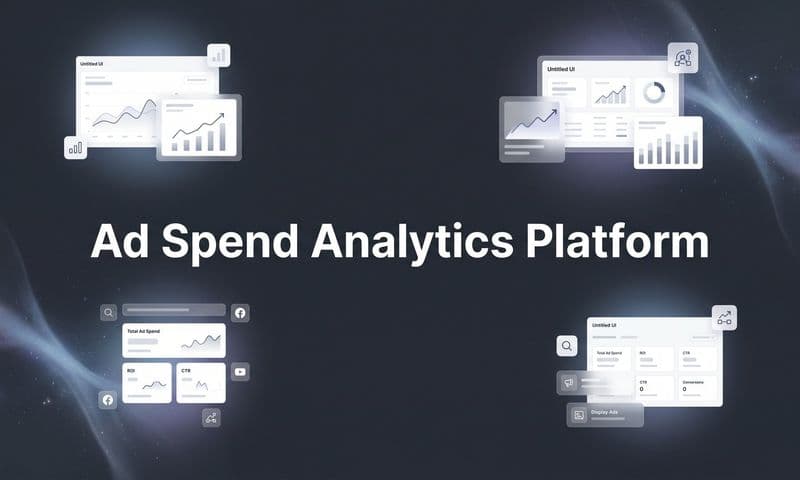
 Build a Marketing Performance Dashboard That Drives Growth
Trying to run a modern marketing team without a good dashboard is like trying to pilot a ship in a storm with no map and no compass. You’re just guessing. Most marketers are drowning in data from dozens of different places—Google Analytics, social media platforms, ad networks, CRMs—but starving for actual insight.
This flood of information usually creates more confusion than clarity. Sure, you might know your website traffic, your cost per click, and your email open rates. But can you easily see how those things actually connect to drive revenue? It’s a huge problem. In fact, a recent survey found that nearly 40% of marketers rarely or never measure how their campaigns contribute to business growth, even though they have tons of data. You can explore more about these marketing metric challenges and how to overcome them.
This is exactly the problem a marketing performance dashboard is built to solve. It acts as a single source of truth, cutting through all the noise to tell you a clear story about your performance.
Transforming Noise into Signal
A well-designed dashboard does more than just show you a bunch of numbers; it gives them context. Instead of logging into ten different tools to piece together how a campaign performed, you see the entire story on a single screen.
A marketing performance dashboard is your strategic compass. It aligns every activity with core business objectives, ensuring that every dollar spent and every hour invested is moving the company forward. It’s the bridge between marketing efforts and measurable results.
It does this by focusing on several core functions that bring immediate value to any marketing team. These functions help teams shift from putting out fires to proactively building a strategy guided by real-time data.
Choosing Metrics That Actually Matter
A marketing performance dashboard is only as good as the data you put in it. Stuffing it with irrelevant or surface-level numbers is like having a car dashboard that only shows your tire pressure and window tint level. Sure, it’s information, but it won’t tell you how fast you're going or if you’re about to run out of fuel.
The real key is to move past “vanity metrics” and zero in on KPIs that directly reflect business health.
Things like social media likes or total page views feel good to look at, but they often have zero connection to what actually matters: revenue and growth. A truly effective dashboard cuts through all that noise. It prioritizes the numbers that tell a clear story about how your marketing is creating real, tangible value.
This means picking KPIs that line up with each stage of the marketing funnel—from that first moment of awareness all the way through to customer loyalty and, of course, revenue.
Aligning Metrics with the Marketing Funnel
Your marketing funnel isn’t just one big thing; it's a journey made up of distinct stages. Each stage has its own goal, and because of that, it needs different metrics to tell you if it's working. A powerful marketing performance dashboard organizes your KPIs around this journey, giving you a clear window into performance at every single step.
This infographic gives a simple look at how a few core metrics are all connected, often forming the foundation of a solid dashboard.
 Build a Marketing Performance Dashboard That Drives Growth
As you can see, high-level numbers like website traffic are the starting point, which then feed into more specific conversion and engagement scores. It highlights just how interconnected all this performance data really is.
Let's break down the essential metric categories you should be thinking about for your own dashboard.
Traffic and Awareness Metrics
This is the very top of your funnel (TOFU). The main goal here is simple: attract the right audience. Instead of just chasing total visitors, you need to focus on the quality of that traffic.
Key metrics to watch include:
- Organic Traffic: How many people are finding you through search engines?
- Referral Sources: Which other websites are sending valuable traffic your way?
- New vs. Returning Visitors: Are you attracting new eyeballs while also keeping your existing audience engaged?
Lead Generation Metrics
Once you’ve got an audience, the next job is to turn them into actual leads. This is where your dashboard starts tracking that critical shift from an anonymous visitor to a known contact in your system. You need to know more than just how many leads you're getting; you need to understand their quality and what it cost you to get them.
Important metrics here are:
- Number of New Leads: The raw count of new contacts.
- Lead Conversion Rate: The percentage of visitors who become leads.
- Cost Per Lead (CPL): How much you're spending to acquire each new lead.
By pulling this data into one place, you can instantly spot what's working and what isn't in your lead generation machine.
From Leads to Revenue
Generating a bunch of leads is great, but it's only half the story. A high-performing dashboard has to connect those leads to what the business really cares about: sales and revenue. This means you need to track metrics much further down the funnel.
The most powerful shift you can make is from measuring activity to measuring impact. A great dashboard doesn't just show you what you did; it shows you what you accomplished.
To make that happen, your dashboard has to include metrics that measure how efficiently you acquire customers and, ultimately, the financial return on your marketing spend. This is how you prove your value to the C-suite and other stakeholders.
Customer Acquisition Metrics
These KPIs track how effectively you’re turning leads into paying customers. Honestly, they’re some of the most important numbers on any marketing performance dashboard.
- Conversion Rate: This is the percentage of leads who take that final desired action, like making a purchase or signing up. Tracking this by channel helps you find your most profitable marketing avenues.
- Customer Acquisition Cost (CAC): This is the total cost of your marketing and sales efforts to get one new customer. The goal is always to keep your CAC as low as possible, especially when compared to how much that customer is worth.
Revenue and ROI Metrics
This is the bottom line—literally. These metrics tie your marketing activities directly to financial results, proving once and for all that your campaigns are successful.
- Return on Investment (ROI): The ultimate measure of profitability. It simply calculates the revenue generated from your campaigns versus what you spent to run them. A positive ROI shows that marketing is a revenue driver, not just a cost center.
- Customer Lifetime Value (CLV): This metric predicts the total revenue you can expect from a single customer over the entire course of your relationship. Comparing your CLV to your CAC is an incredibly powerful way to gauge the long-term health and sustainability of your whole marketing strategy.
By pulling metrics from each of these categories, you'll build a dashboard that gives you a complete, 360-degree view of your performance. For a deeper look at this topic, check out our full guide on digital marketing performance metrics.
Designing Your Dashboard for Instant Insight
 Build a Marketing Performance Dashboard That Drives Growth
A great marketing dashboard does more than just show you numbers; it tells you a story. It's the critical bridge between raw, messy data and a clear, actionable insight. It’s what separates a cluttered spreadsheet that gives you a headache from a visual guide that empowers quick, confident decisions.
Think of it like an airplane cockpit. A pilot doesn't see every single mechanical reading at once. Instead, the most vital information—altitude, speed, direction—is displayed front and center, intuitively. Your dashboard should work the same way, putting clarity first to guide your strategy.
The goal is to create an experience that feels effortless. When someone glances at your dashboard, they shouldn't have to hunt for meaning. The insights should practically jump off the page, making performance analysis a natural part of the workflow, not a chore.
Choosing the Right Visual for the Job
Not all charts are created equal. The type of visualization you pick has a huge impact on how easily your team can understand the data. Using the wrong chart can hide important trends or lead to the wrong conclusions, defeating the whole purpose of having a dashboard.
Matching the chart to the data’s story is key. Each visual has a specific strength, and knowing which one to pull out of your toolbox is a fundamental design skill.
- Line Charts for Trends: The absolute best way to show how a metric changes over time. Use a line chart to track your website traffic month-over-month or see how your Cost Per Lead (CPL) fluctuates during a campaign.
- Bar Charts for Comparisons: Perfect for comparing distinct groups or categories. A bar chart makes it easy to see which marketing channel drove the most conversions or which social media platform has the highest engagement.
- Pie Charts for Composition: These are great for showing parts of a whole, but use them with caution. A pie chart can effectively display the percentage breakdown of your traffic sources (like Organic, Paid, and Direct) as long as you have fewer than five or six categories. Any more, and it becomes a confusing mess.
Structuring for Clarity and Context
Once you’ve picked the right visuals, how you arrange them is just as important. A logical layout guides the user’s eye through the data, telling a coherent story that moves from a high-level overview down to the nitty-gritty details.
A proven structure is the "inverted pyramid." Start with your most critical, top-line business metrics right at the top. This gives executives and stakeholders an instant snapshot of overall performance without ever needing to scroll.
Your dashboard should answer the most important questions first. A stakeholder should be able to glance at the top of the screen and know within five seconds whether things are on track, improving, or need immediate attention.
From there, you can flow into the specifics. Group related metrics together. For example, put all your SEO metrics (organic traffic, keyword rankings) in one section and your paid ad metrics (impressions, CPC, conversions) in another. This creates a clean, organized experience that keeps people from feeling overwhelmed.
For a deeper look at what goes into a powerful dashboard, you might find our guide on building a marketing analytics dashboard really helpful.
Tailoring Dashboards for Different Audiences
A single, one-size-fits-all dashboard almost never works. The information a CMO needs to see is completely different from what a social media manager needs for their day-to-day work. The most effective marketing teams create tailored views for different roles.
- The Executive View: This is a high-level summary focused purely on business impact. It should feature metrics like Return on Investment (ROI), Customer Acquisition Cost (CAC), and total revenue from marketing. The visuals here need to be simple and crystal clear.
- The Marketing Manager View: This dashboard gets a bit more tactical. It includes performance data by channel, campaign-specific results, and funnel metrics like lead-to-customer conversion rates. It’s all about a manager’s core responsibilities.
- The Specialist View: This is the most granular view, built for the person deep in the weeds of a specific channel. An SEO specialist's dashboard, for example, would dive into keyword performance, backlink acquisition, and technical site health—metrics a CMO probably doesn't need to see.
By creating these distinct views, you make sure every team member gets exactly the information they need to do their job well. It turns the dashboard from a simple report into an indispensable tool for the entire organization.
Real-World Dashboard Examples and Templates
All the theory is great, but seeing a marketing dashboard in action is where the lightbulb really goes on. A dashboard isn't some rigid, one-size-fits-all report. It’s a flexible tool that you shape around your specific business goals, designed to answer your most pressing questions with clear, targeted data.
To bring this to life, let’s walk through three common templates. Each one is built for a core marketing function, showing how different KPIs and visuals work together to help you make smarter decisions. Think of these as blueprints you can adapt for your own team.
SEO Performance Dashboard
Think of your website's organic search traffic as a garden. You need to know which seeds are sprouting, which plants need more water, and where the weeds are taking over. An SEO performance dashboard is your complete gardening toolkit. Its entire purpose is to show you how well you’re attracting attention from search engines like Google.
This dashboard cuts through the noise to answer critical questions like:
- Which keywords are actually bringing in traffic that converts?
- Are we holding onto our top search rankings, or are competitors pushing us down?
- How does our organic traffic growth this quarter stack up against the last one?
Your go-to metrics here will be Organic Sessions, Keyword Rankings, Click-Through Rate (CTR) from search results, and Backlink Acquisition. A line chart is perfect for visualizing growth over time, while a simple table can give you a quick, at-a-glance view of how your target keywords are performing.
Social Media Engagement Dashboard
A solid social media dashboard looks past the vanity metrics. Follower count is nice, but what really matters is how many people are actually interacting with your brand in a way that drives real business results. This dashboard is all about tracking meaningful actions.
It’s built to answer strategic questions, such as:
- Which social platform is sending us the most qualified leads or sales?
- What kind of content—video, image, or text—gets our audience to actually engage?
- What’s our Engagement Rate (likes, comments, shares) looking like on our most important platforms?
This dashboard would feature metrics like Conversion Rate from social traffic, Cost Per Acquisition from your ad campaigns, and platform-specific engagement data. Putting these metrics into bar charts makes it incredibly easy to see which channels deserve more of your time and budget. For more ideas, you can check out these other marketing dashboard examples that cover a range of different goals.
Lead Generation Dashboard
This is the command center for your entire sales funnel. It gives you a clean, top-to-bottom view of your pipeline's health, from the very first touchpoint all the way to a closed deal. Its job is to shine a light on bottlenecks and show you where to focus your optimization efforts.
This example from HubSpot zeroes in on lead acquisition, tracking new contacts and form submissions.The charts give a quick visual summary of new contacts and where they came from, so you can immediately see which channels are pulling their weight.
A complete lead gen dashboard answers the most important questions marketing has to answer:
- How many Marketing Qualified Leads (MQLs) are we bringing in every month?
- What’s our conversion rate from MQL to Sales Qualified Lead (SQL)?
- What’s our average Cost Per Lead (CPL), and how does it change from one campaign to another?
By visualizing the entire funnel, you can stop guessing where leads are dropping off and start making data-driven improvements. This dashboard connects marketing activity directly to sales outcomes, making it invaluable for demonstrating ROI.
Funnel charts are fantastic for visualizing the conversion rates between each stage, while bar charts make it easy to compare the performance of different campaigns or lead magnets. Tracking these metrics ensures your team isn't just busy, but actually productive.
Putting Your Dashboard into Action
 Build a Marketing Performance Dashboard That Drives Growth
A marketing dashboard that just sits there, unused, is nothing more than a collection of pretty charts. Its real power is only unlocked when it becomes a living, breathing part of your team’s daily rhythm and strategic planning.
Think of it less like a static portrait on the wall and more like the navigation system in your car—constantly guiding your next turn. Integrating the dashboard into your workflow is what transforms it from a passive reporting tool into a dynamic engine for continuous improvement. This means moving beyond occasional glances and building a real cadence for review and action.
This shift toward integrated tools isn't just a trend; it's becoming standard practice. The global marketing dashboard market is projected to grow significantly through 2033, driven by the need for companies to connect their marketing efforts directly to sales and optimize the entire customer journey. This tells you just how critical these tools have become for modern business.
Setting Your Review Cadence
To make your dashboard truly effective, you have to build routines around it. A structured review schedule ensures that insights aren't just seen, but acted upon. Different cadences serve different purposes, creating a multi-layered approach to performance management.
- Daily Check-in (5–10 minutes): This is your quick health check. Look for any major anomalies—a sudden drop in traffic, a spike in ad spend—that require immediate attention.
- Weekly Tactical Meeting (30–60 minutes): This is for your campaign-level review. Use the dashboard to assess pacing against weekly goals, analyze which channels are performing best, and make tactical adjustments for the week ahead.
- Monthly Strategic Review (60–90 minutes): This is your high-level look-back. Analyze broader trends, connect performance to your primary KPIs like CAC and ROI, and use the insights to inform your strategy for the next month.
From Insight to Experiment
Your dashboard is your best source for new ideas. When you spot an interesting trend or a potential problem, the next step isn't just to fix it—it's to learn from it. This is how you cultivate a truly data-driven culture.
A dashboard doesn't just give you answers; it helps you ask better questions. Use it to form a hypothesis, then launch a marketing experiment to test it. This turns your data into a repeatable growth process.
For instance, if your dashboard shows a specific ad creative has a much higher click-through rate, don't just put more money behind it. Turn it into an experiment: launch variations of that creative across different platforms to see if the success is repeatable. Tracking these tests is a crucial part of your overall marketing campaign analytics.
To truly get the most out of your setup, you can even Automate your dashboard with a Dashboard API. By making the dashboard the centerpiece of discussion, you turn it into a proactive tool that powers sustainable growth.
Common Questions About Marketing Dashboards
Even with a solid grasp of what a marketing dashboard does, a few practical questions always pop up when it's time to actually build and use one. Getting those "what if" and "how-to" questions answered early can make the whole process smoother and help you see the value way faster.
Let's tackle some of the most common questions marketers have. Think of this as a quick-start guide to clear up any confusion and get you on the right track from day one.
How Often Should I Update My Dashboard Data?
The right answer here really depends on what you're tracking and how fast you need to react. If you're running a fast-moving paid ad campaign, you absolutely need daily or even real-time data. You have to know if your Cost Per Click (CPC) is spiking right now, not what it was last Tuesday.
On the other hand, for high-level, strategic metrics like Customer Lifetime Value (CLV) or overall organic traffic, a weekly or monthly refresh is perfectly fine. These numbers don't swing wildly from day to day, and looking at them over a longer stretch gives you a much clearer picture of real trends, not just minor daily noise.
A good rule of thumb is to match your data refresh rate to your decision-making speed. If you make decisions daily, get daily data. If you plan strategy monthly, monthly data gives you the right context.
What Is the Difference Between a Dashboard and a Report?
This is a super common point of confusion, but the distinction is pretty important. Here's the easiest way to think about it: a dashboard is a live, interactive tool for monitoring, while a report is a static snapshot for analysis.
- A Marketing Dashboard: This is like the cockpit of an airplane. It’s built for at-a-glance, real-time monitoring of what’s happening right now. It helps you spot problems and opportunities as they unfold.
- A Marketing Report: This is more like the post-flight analysis. It’s a static document—like a PDF or slide deck—that dives deep into what happened over a specific period (like a quarterly review) and explains why it happened.
Both are critical, but they serve different jobs. Your dashboard answers, "What's happening now?" Your report answers, "What happened last month, and what did we learn?"
How Do I Handle Attribution in My Dashboard?
Attribution—figuring out which marketing touchpoints get credit for a conversion—is easily one of the biggest headaches for marketers. A customer might see a Facebook ad, click a Google Search result, and open an email before finally buying. So, who gets the credit?
A good dashboard should let you look at your data through different attribution models. A "last-touch" model is the simplest, but it’s often misleading because it ignores everything that happened before the final click. More advanced models, like linear or time-decay, give you a much more balanced view.
Often, the best solution is to integrate a specialized tool built for this exact challenge. To really get this right, you need to understand how to measure marketing attribution across the entire customer journey. This makes sure your dashboard isn't just showing you numbers, but telling you the true story of what's actually driving sales.
Quick Answers to Common Questions
Getting your dashboard set up is a huge step toward making smarter, data-driven decisions that actually grow your business.
Ready to stop guessing and start knowing exactly what’s driving your growth? Cometly provides a crystal-clear view of your marketing performance, connecting every ad, click, and campaign directly to revenue. Unify your data, perfect your attribution, and scale with confidence. Get started with Cometly today!