At its core, a data analysis dashboard is a visual command center for your business. Think of it like a pilot's cockpit—it pulls all your most critical flight data from different systems into one place, giving you an at-a-glance view of everything you need to know to stay on course.
Instead of hunting through spreadsheets, a dashboard centralizes key performance indicators (KPIs) and transforms them into easy-to-read charts, graphs, and tables.
Transforming Raw Data Into Actionable Insights
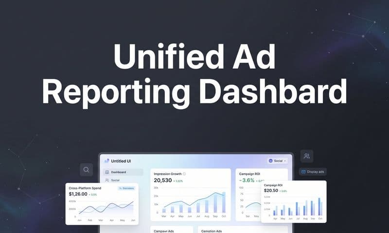
 Build a Better Data Analysis Dashboard
Ultimately, a great dashboard tells a story with your data. No more digging through static reports or endless rows of numbers. You get a live, interactive summary of what’s happening in your business right now. And this isn't some complex tool reserved for data scientists—it’s built for everyone on the team.
Marketing teams can track campaign ROI in real-time. Sales leaders can watch their pipelines fill up. Executives can get a high-level pulse on the health of the entire organization. The goal is to stop just collecting data and start using it to make smarter, faster decisions.
Why Dashboards Are Essential for Modern Business
A well-designed dashboard is the ultimate silo-buster. When different departments pull information from their own separate sources, you inevitably end up with conflicting numbers and misaligned priorities. A dashboard acts as a single source of truth, ensuring everyone is on the same page.
This alignment helps build a data-driven culture where decisions are backed by hard evidence, not just gut feelings.
This shift is more than just a trend; it's a massive industry movement. The global data analytics market is expected to rocket from USD 64.75 billion in 2025 to an incredible USD 658.64 billion by 2034. That kind of explosive growth tells you just how vital these tools have become for any business that wants to stay agile and competitive.
A dashboard empowers teams by making data accessible, understandable, and actionable. It democratizes information, allowing anyone in the organization to spot trends, identify opportunities, and address issues before they escalate.
From Static Reports to Interactive Exploration
What really separates a modern dashboard from an old-school report is interactivity. A traditional report is a fixed snapshot in time, but a dashboard invites you to explore.
Typically, users can:
- Filter data to zero in on specific time periods, regions, or customer segments.
- Drill down into charts to see the raw numbers behind a high-level metric.
- Customize views to focus only on the KPIs that matter most to their role.
This turns users from passive readers into active explorers of their own data. To see how different platforms approach this, it’s worth checking out various tools like Cashboard solutions. For a complete walkthrough on what it takes to build one, check out our guide to creating a powerful data analytic dashboard.
The Anatomy of an Effective Dashboard
What separates a confusing, cluttered dashboard from a powerful, intuitive one? The difference lies in its core components. An effective data analysis dashboard isn't just a random collection of charts; it's a carefully constructed narrative that guides you from a high-level summary down to the nitty-gritty details with absolute clarity.
 Build a Better Data Analysis Dashboard
Think of it like the blueprint for a house. Every room has a purpose, every hallway connects logically, and the overall layout is designed so you can find what you need without a map. The same principles apply here, ensuring every element has a job to do in telling your data's story.
The Language of Data Visualization
At the heart of any dashboard are its visuals. Choosing the right chart is like choosing the right words to make a point—the wrong choice can muddle your message, while the right one makes it instantly click. Each chart type has its own superpower.
- Line Charts: These are perfect for showing trends over time. Use them to track website traffic month-over-month or daily sales figures to easily spot patterns, seasonality, or growth.
- Bar Charts: When you need to compare different groups, bar charts are your best friend. They’re great for showing which marketing channel brought in the most leads or comparing product sales across regions.
- Pie Charts: Use these sparingly, and only when you need to show parts of a whole—like the percentage breakdown of your customer base by age group. They work best with fewer than six categories to avoid becoming a colorful, unreadable mess.
- Scatter Plots: Ideal for revealing relationships between two different variables. For example, you could plot ad spend against conversion rates to see if there’s a direct connection.
This visual language is the foundation of a dashboard that communicates insights at a glance. To see these principles in action, check out these powerful marketing dashboard examples that bring data to life.
Just throwing data into any chart won't cut it. You have to match the chart type to the story you want the data to tell.
Here’s a quick guide to help you pick the right visualization for the job.
Choosing the Right Chart for Your Data
Data Relationship | Recommended Chart Type | Best Use-Case Example |
|---|---|---|
Trends over time | Line Chart | Tracking monthly revenue over the past year. |
Comparing categories | Bar Chart or Column Chart | Comparing sales performance across different product lines. |
Parts of a whole | Pie Chart or Donut Chart | Showing the percentage breakdown of traffic sources to a website. |
Correlation between variables | Scatter Plot | Plotting customer satisfaction scores against product price points. |
Geographical data | Map Chart | Visualizing sales distribution by state or country. |
Single, key metric | Scorecard or Gauge | Displaying the current Customer Acquisition Cost (CAC). |
Picking the right chart makes the difference between a dashboard that informs and one that confuses. Always ask yourself: "What is the single most important takeaway I want someone to get from this visual?" and work backward from there.
Selecting Meaningful KPIs
A dashboard crammed with dozens of metrics is a dashboard that says nothing at all. The best designs are built around a handful of carefully selected Key Performance Indicators (KPIs). These are the specific, measurable metrics that tie directly back to your most important business goals.
A great KPI is more than just a number; it's a direct measure of progress toward a critical goal. It separates the signal from the noise, focusing attention on what truly drives success.
Before adding any metric, ask yourself: "Does this number help me make a better decision?" If the answer is no, it's likely a vanity metric—a number that looks impressive but offers no strategic value, like total page views without any context on user engagement. A well-designed data analysis dashboard prioritizes action over vanity.
Interactive Elements That Empower Users
The real power of a modern dashboard comes from its interactivity. Static reports give you a monologue, but interactive elements turn it into a dynamic conversation, letting users ask and answer their own questions on the fly.
These features transform passive viewers into active analysts.
- Filters: Let users slice and dice the data. They can narrow the view to a specific date range, geographic location, or marketing campaign, giving them a perspective tailored to their exact needs.
- Drill-Downs: This feature lets users click on a high-level data point to see what's behind it. For instance, you could click on a total sales figure for a month to see a day-by-day breakdown or even individual transactions.
- Tooltips: These are the small pop-up windows that appear when you hover over a data point. They provide extra context or exact figures without cluttering the main view.
By combining clear visuals, focused KPIs, and empowering interactive features, you create a dashboard that does more than just show data. You build a powerful analytical tool that drives understanding and fuels smarter, faster decision-making.
Harnessing Real-Time Data for Smarter Decisions
In a business world that moves at lightning speed, yesterday's information is already old news. The real power of a modern data analysis dashboard is its ability to serve up insights in real time, shifting your strategy from reactive to proactive. It’s the difference between reading last month’s newspaper and watching a live news broadcast.
 Build a Better Data Analysis Dashboard
Static reports are like a rearview mirror; they’re great for seeing where you've been. A dynamic, live dashboard, on the other hand, is your front windshield—it shows you what’s happening on the road right now. This immediacy means you’re making decisions based on current conditions, not outdated snapshots.
This capability is so critical that the market for these tools is exploding. Valued at around USD 12 billion in 2023, it's on track to hit USD 32 billion by 2032. That incredible growth highlights just how much businesses now rely on instant data to stay competitive. You can dig deeper into the real-time dashboard market trends to see how fast things are moving.
From Hindsight to Foresight
When you rely only on historical data, you're always playing catch-up. A real-time dashboard lets you see trends as they emerge, spot issues the moment they happen, and jump on opportunities before they vanish. It’s all about shaping the future, not just analyzing the past.
Think about these scenarios where live data is a game-changer:
- E-commerce Management: During a flash sale, a manager can watch inventory levels drop in real time. If a hot item is about to sell out, they can instantly swap the homepage banner to promote another product, saving the sale.
- Social Media Advertising: A marketing team monitors live ad engagement. If a new creative is tanking, they can pause it and shift the budget to a winner within minutes, not days.
- Logistics and Supply Chain: A fulfillment center tracks packages live on the floor. If a bottleneck forms at the packing station, managers get an alert and can redeploy staff to clear it before it causes major delays.
In every case, the ability to act on live information prevents lost revenue, wasted ad spend, and operational headaches.
A real-time data analysis dashboard transforms your organization from a passive observer of past events into an active participant in present outcomes. It closes the gap between insight and action.
The Competitive Advantage of Immediacy
The speed at which you make informed decisions is a massive competitive advantage. While your competitors are waiting for their weekly reports to figure out what went wrong last Tuesday, a live dashboard lets you fix problems before they even escalate. That kind of agility is a game-changer.
Here are the core benefits you get:
- Enhanced Operational Awareness: You get a constant pulse on your business vitals, from website traffic to production output. This complete visibility lets you know exactly how you’re performing at any given moment.
- Faster Problem Resolution: Spot anomalies or performance dips instantly. A sudden drop in website conversions or a spike in support tickets can be investigated and handled immediately.
- Increased Agility and Responsiveness: Quickly adapt to shifting market conditions or customer behaviors. Real-time data lets you pivot on the fly, ensuring you stay effective.
Ultimately, harnessing real-time data isn't just about speed; it's about precision. It allows you to make smarter, more accurate decisions because they’re based on the most current information available. This is how modern businesses don't just survive—they thrive.
Strategic Benefits of Using Dashboards
A great data analysis dashboard does more than just throw numbers on a screen; it fundamentally changes how your business operates. When you integrate dashboards into your core strategy, you graduate from simple reporting and start unlocking real, tangible value across your entire organization. It’s about creating a shared language for performance.
When marketing, sales, and finance teams all look at the same centralized data, the conversations shift instantly. Instead of debating whose numbers are right, teams can finally focus on what the numbers actually mean and collaborate on what to do next. This shared visual context breaks down the walls between departments and gets everyone pulling in the same direction.
Fostering a Culture of Accountability
Transparent performance tracking is one of the most powerful things a well-built dashboard delivers. When key metrics are visible to everyone, it naturally creates a sense of ownership. Every person on the team can see exactly how their work contributes to the bigger picture.
This visibility empowers people to take initiative. A marketer can see an ad creative is tanking and pause it. A sales rep can spot a dip in their conversion rate and tweak their approach. They can do all of this without waiting for a weekly report from their manager. That proactive mindset is the cornerstone of a truly data-driven culture.
This shift is driving massive market growth for a reason. The Business Value Dashboard market is projected to jump from USD 2.1 billion in 2025 to USD 10.3 billion by 2035—a crystal-clear sign of how essential these tools have become. You can dig into the trends driving this dashboard market growth to see why so many organizations are investing heavily in this tech.
Uncovering Hidden Insights and Predicting Trends
By pulling data from all your different sources into one place, a dashboard becomes an incredible tool for discovery. It helps you connect the dots and spot correlations you’d otherwise completely miss. You might find out that a forgotten blog post is secretly driving high-quality leads, or that customers from one specific region have a much higher lifetime value.
These are the kinds of insights that lead to smarter, more confident decisions:
- Spot your top performers: Instantly see which marketing campaigns, sales channels, or products are knocking it out of the park.
- Predict what's next: By analyzing historical trends, you can make much more accurate forecasts for sales, revenue, and customer demand.
- Measure true ROI: A dashboard makes it far easier to connect your spending to actual results, giving you a clear, honest picture of your return on investment.
For anyone looking to get started, picking the right platform is everything. Modern solutions can pull all this information together automatically. You can learn more about what to look for in our guide to the best analytics dashboard software on the market today.
A dashboard isn’t just a piece of technology; it’s a strategic asset. It transforms raw data into a clear narrative that helps you understand past performance, optimize current operations, and confidently shape your future.
Ultimately, a dashboard is the connective tissue for a modern, data-fluent organization. It gives every single person the information they need to contribute effectively, making it an indispensable part of any real growth strategy.
How to Build Your First Data Dashboard
Moving from theory to practice is where a data analysis dashboard truly comes alive. Building your first one might feel like a huge technical hurdle, but it really just boils down to a structured, five-stage process anyone can follow. Think of it less like coding and more like answering a series of logical questions.
This framework will take you from a blank screen to a powerful tool that actually delivers business insights. By focusing on the why before the what, you make sure the final product isn't just a bunch of pretty charts, but something strategically valuable.
Stage 1: Define Your Purpose
Before you touch a single data source or pick a chart type, you have to answer the most important question of all: "What decisions will this dashboard help me make?" Without a clear purpose, a dashboard is just digital decoration.
Start by figuring out who you're building it for. Is it for a CEO who just needs a high-level, 30,000-foot view? Or is it for a marketing manager who needs to dig deep into daily campaign performance? Each audience has totally different needs, and that will dictate every metric you choose to show.
From there, list the top 3-5 questions your dashboard absolutely must answer. For instance:
- Which of our marketing channels are actually driving qualified leads?
- What's our customer churn rate, and is it trending up or down?
- How is the sales team tracking against their quarterly quotas?
Getting clear on these questions first gives you a roadmap and keeps you from getting lost in a sea of data that doesn't matter.
Stage 2: Find and Connect Your Data Sources
With your purpose locked in, it's time to hunt down the data needed to answer those questions. The problem is, this data rarely lives in one place. It’s usually scattered across your CRM, various ad platforms, website analytics tools, and payment processors. The goal here is to bring all those disparate sources together.
This is where you'll map out your data pipeline. For example, if you want to track marketing ROI, you'll need ad spend data from platforms like Facebook Ads and Google Ads, conversion data from your website, and revenue data from a payment system like Stripe. Centralizing this information is the foundational step to creating a single source of truth.
Stage 3: Choose the Right Tools
Now for the fun part: picking the software that will bring your dashboard to life. The market is full of great tools, each with its own strengths. Your choice will hinge on your budget, your technical comfort level, and the specific data sources you need to connect.
Many businesses start their journey with one of the big players in the space.
Popular Dashboard Tool Comparison
Choosing your dashboarding software is a critical step that impacts everything from ease of use to the depth of insights you can uncover. To help you get started, here's a quick comparison of three of the most popular tools on the market, each catering to slightly different needs and skill sets.
Tool | Best For | Key Feature | Learning Curve |
|---|---|---|---|
Google Data Studio | Beginners and Google ecosystem users | Free to use with seamless integration with Google products. | Low |
Tableau | Deep, complex data exploration | Powerful and flexible visualization capabilities. | Medium to High |
Microsoft Power BI | Businesses using the Microsoft stack | Strong integration with Excel and other Microsoft products. | Medium |
Making the right choice here is key for long-term success, as migrating platforms later can be a real headache. For a much deeper dive, our guide on choosing a marketing analytics platform breaks down the options to help you decide.
Stage 4: Design an Intuitive Layout
A great dashboard doesn't make you think. It guides your eye naturally to the most important information, prioritizing clarity over clutter. Start with a logical structure. Place your most critical, high-level KPIs at the top-left, since that's where our eyes naturally go first when reading a screen.
Good dashboard design is about subtraction, not addition. The goal is to remove distractions until only the most essential insights remain, presented in the clearest way possible.
Use visual hierarchy to your advantage. Generous whitespace helps separate different sections, while intentional color choices can highlight key trends (think green for positive growth, red for a decline). Make sure your chart labels are dead simple and easy to read. The whole point is to create a user experience that feels completely effortless.
This infographic shows how a well-designed dashboard drives real strategic benefits, like better collaboration, accountability, and smarter strategy.
 Build a Better Data Analysis Dashboard
By centralizing data, dashboards create a shared understanding that empowers teams to work together, track progress transparently, and make smarter decisions.
Stage 5: Test and Refine
Here's a secret: your first version of the dashboard is never the final one. Once you have a working prototype, get it in front of the people who will actually be using it and ask for brutally honest feedback. Are the charts easy to understand? Is anything confusing? Is there any information missing that would help them make better decisions?
Use this feedback to iterate and improve. A data analysis dashboard is a living tool that should evolve right alongside your business. Review its effectiveness regularly and be ready to make tweaks as your goals and priorities shift. This continuous improvement loop is what turns a good dashboard into an absolutely indispensable business asset.
Dashboard Design Best Practices
Even the most powerful data is useless if it’s presented in a confusing or overwhelming way. Great dashboard design is about more than just making things look pretty; it's about clarity, intuition, and guiding the user's eye to what matters most. A well-designed data analysis dashboard turns a good tool into an indispensable one.
The goal here is to create an experience that feels effortless. Your users should be able to glance at the dashboard and grasp the key takeaways in seconds, no instruction manual needed. This all comes down to a clean, uncluttered layout that presents information in a logical order.
Create a Clear Visual Hierarchy
The first rule of effective design is to establish a clear visual hierarchy. Your dashboard needs a natural flow that pulls attention to the most critical information first. A tried-and-true method is placing your most important, high-level KPIs at the top-left of the screen—that's where the eye naturally lands.
Think of it like the front page of a newspaper. The biggest headline goes right at the top. From there, the information should flow down into more detailed charts and tables, letting users drill down into the data as they see fit.
An effective dashboard doesn't just show you data; it tells you a story. It starts with the conclusion (your main KPIs) and then provides the supporting details for those who want to explore further.
Use Color with Purpose
Color is an incredibly powerful tool, but it can create chaos in a hurry if you're not careful. Resist the urge to use a rainbow of different colors just for the sake of it. Instead, use color strategically and consistently to add meaning and highlight what’s important.
- Highlight Key Data: Use a single, bright accent color to call out the most important data points, like a sudden spike in sales or a dip in conversions.
- Maintain Consistency: Use the same color for the same metric across all charts. If revenue is blue in one chart, it should be blue everywhere else to avoid any confusion.
- Consider Accessibility: Be mindful of colorblindness. There are tools available to check if your color palettes are accessible to everyone, ensuring your dashboard is universally understandable.
This deliberate approach to color makes your visuals far more scannable and impactful. You can find more tips for creating clear visuals in our guide to data visualization dashboards.
Tailor the Design to Your Audience
A one-size-fits-all dashboard almost never works. The design, complexity, and the metrics you display should be tailored specifically to the people who will be using it. A dashboard built for a CEO, for instance, is going to look completely different from one designed for a data analyst.
An executive-level dashboard should focus on high-level summaries and progress toward major business goals. It needs to be simple, scannable, and focused on outcomes. On the other hand, an analyst’s dashboard can be much more granular, packed with filters, drill-downs, and detailed data tables meant for deep exploration. To make sure your dashboard is both functional and engaging, it helps to consider broader 9 Best Practices for User Interface Design.
Always start by asking: who is this for, and what do they need to accomplish with it?
Frequently Asked Questions
Jumping into the world of data can bring up a lot of questions. We’ve put together some straightforward answers to the most common things people ask about data analysis dashboards to help clear things up.
Dashboard vs. Report: What's the Difference?
It’s easy to mix these two up since they both show data, but they serve very different purposes.
Think of a report as a static snapshot—like a photograph of your business at one specific moment. It’s a detailed, historical look at what happened, like a quarterly sales summary. It’s fixed, final, and great for record-keeping.
A dashboard, on the other hand, is like a live video feed. It’s dynamic, interactive, and built for exploration. You can filter data, drill down into the details, and watch metrics update in real-time. A report tells you what happened, but a dashboard helps you see why it's happening, right now.
A report gives you a fixed summary of the past. A dashboard gives you an interactive view of the present, empowering you to ask and answer your own questions on the fly.
How Often Should I Update My Dashboard?
There's no single right answer here—it all comes down to the speed of your business and the decisions you need to make. The ideal update frequency for your data analysis dashboard should match the pace of the actions you plan to take.
- Real-Time: This is non-negotiable for fast-moving operations. Think e-commerce flash sales or live ad campaign monitoring where a few minutes can make or break your results.
- Daily: Perfect for tracking day-to-day progress toward bigger goals. This is great for monitoring a sales team’s pipeline or keeping an eye on daily website traffic.
- Weekly or Monthly: Best suited for high-level strategic reviews. Use this cadence for analyzing marketing campaign ROI or tracking your progress against quarterly business objectives.
The key is to align the data refresh rate with the decision-making cycle it fuels.
Can I Build a Dashboard Without Knowing How to Code?
Absolutely. The old idea that you need to be a developer to build a powerful dashboard is a total myth these days. Modern business intelligence (BI) and analytics platforms have made dashboard creation accessible to pretty much everyone, regardless of their technical background.
Tools like Google Data Studio, Tableau, and Microsoft Power BI all use friendly, drag-and-drop interfaces. You can connect your data sources, pick from pre-built chart templates, and design your layout with just a few clicks. The focus has shifted from writing code to thinking strategically—what are your goals, and what are the right metrics to tell that story?
Ready to stop guessing and start knowing exactly what drives your growth? Cometly provides a complete marketing attribution platform that unifies your data, tracks every touchpoint, and delivers clear, actionable insights in a customizable dashboard. See how Cometly can transform your analytics today.