Ever tried flying a plane using last month's weather report? It's a recipe for disaster. You're flying blind.
Running a business without a data analytics dashboard is startlingly similar. Think of it as your strategic cockpit, turning overwhelming streams of raw data into a single, interactive control panel for real-time decision-making.
From Raw Data to Real-Time Decisions
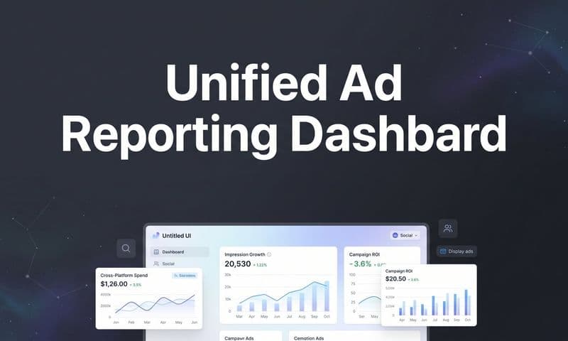
 How To Create A Data Analytics Dashboard
A good dashboard acts as a universal translator for your business. It takes complex numbers from sales figures, web traffic, and customer feedback and weaves them into a clear story about what’s happening right now. This instant translation cuts through the noise, letting you spot trends as they emerge, not weeks later.
The Power of Visual Storytelling
Instead of forcing you to dig through dense spreadsheets, a data analytics dashboard presents information visually. This is a game-changer because our brains process images thousands of times faster than text. Key performance indicators (KPIs) are displayed through intuitive charts and graphs, making complex information digestible at a glance.
This visual clarity means every team member, from the CEO to a marketing specialist, can understand performance metrics without needing a degree in statistics. It truly democratizes data and gets everyone on the same page. You can learn more about turning complex information into actionable insights by exploring a dedicated big data analytics platform.
The table below breaks down the core functions of a dashboard and how they directly impact business outcomes.
FunctionBusiness ImpactData AggregationPulls data from multiple sources (CRM, ads, web) into one unified view.Real-Time MonitoringTracks KPIs and metrics as they happen, eliminating reporting lag.Visual RepresentationConverts numbers into charts and graphs for quick, intuitive understanding.Interactive ExplorationAllows users to drill down, filter, and segment data to uncover deeper insights.
Ultimately, a dashboard transforms scattered data points into a coherent, strategic asset that fuels smarter, faster decisions across the entire organization.
Driving Proactive Business Strategy
The real magic of a dashboard isn't just seeing what happened yesterday; it's about making proactive, not reactive, decisions today. It gives you the confidence to steer your organization toward its next big win by answering critical questions instantly.
This hunger for immediate insight is rapidly reshaping the market.
The global real-time dashboard market was valued at approximately $12 billion in 2023. It’s forecasted to hit about $32 billion by 2032, growing at a compound annual growth rate (CAGR) of 11.5%.
This explosive growth shows just how quickly businesses are ditching historical reports for live, dynamic tools. The ability to monitor operations, track campaign performance, and understand customer behavior in real time is no longer a luxury—it's a competitive necessity.
So, Why Does Your Business Actually Need This Dashboard?
 How To Create A Data Analytics Dashboard
Let's move past the theory. The real magic of a data analytics dashboard is in the tangible, game-changing results it delivers. Think of it as the ultimate silo-buster. It creates a single source of truth that gets your entire organization on the same page.
When every team—from marketing to sales to operations—is working from the same set of numbers, you eliminate departmental friction and costly misunderstandings. Instead of marketing looking at one report and sales at another, everyone is seeing the same real-time picture. That unity is the foundation for a cohesive, goal-oriented strategy.
Shift From Reactive to Proactive Decisions
Monitoring your key performance indicators (KPIs) in real time is the difference between reacting to problems and getting ahead of them. You can spot small issues before they snowball into major crises.
Imagine a marketing manager noticing a sudden drop in ad click-through rates. With a dashboard, they can immediately pause the campaign to figure out what's wrong. Without it, that insight might have taken days or even weeks to surface, burning through thousands in wasted ad spend.
This kind of agility is a massive competitive advantage, letting you pivot based on live feedback from the market. It's a core reason why building an effective marketing performance dashboard is so critical for modern teams. You’re no longer just observing your business; you’re actively steering it.
Automate Reporting and Reclaim Your Time
One of the most immediate wins is the sheer efficiency you gain from automated reporting. Be honest: how much time does your team currently spend pulling data from different platforms, wrestling with spreadsheets, and building manual reports every week?
A data analytics dashboard handles all of that for you. Data flows in from all your connected sources and updates your visuals automatically. This frees up your team from the soul-crushing task of data entry.
Instead of spending hours on manual reporting, your team can invest that time in what truly matters: analyzing the data, forming strategies, and executing on insights.
Not only does this save a ton of time, but it also slashes the risk of human error that creeps in with manual data handling. The result is a more accurate and efficient operation, plain and simple.
Drive Real Growth with Actionable Insights
The practical applications are where the value becomes undeniable. A well-designed data analytics dashboard provides insights that directly impact your bottom line.
Consider these real-world scenarios:
- E-commerce Marketing: A marketing team sees that a specific ad creative is getting tons of clicks but has a terrible conversion rate. Using their dashboard, they reallocate the budget in real time to the ads that are actually generating sales, instantly maximizing their return on ad spend (ROAS).
- Operations Management: An operations lead spots a sudden spike in shipping delays from a specific warehouse on their logistics dashboard. They can immediately drill down to find the root cause—a staffing shortage—and fix it before it blows up into a widespread customer satisfaction issue.
- SaaS Product Teams: A product manager monitors user engagement metrics and sees that users are consistently dropping off at a particular step in the onboarding flow. This provides clear, hard evidence to prioritize a redesign of that feature.
These examples show that a dashboard isn't some nice-to-have luxury; it's the engine for competitive agility. The demand for these capabilities is exploding, with the global data analytics market projected to surpass $658 billion by 2034. The software segment—which includes these dashboards—already holds a dominant 67.8% share, driven by the intense need for real-time data processing.
Essential Features of a High-Impact Dashboard
Not all dashboards are created equal. A truly powerful data analytics dashboard is way more than a collection of pretty charts—it’s an interactive, dynamic tool built for exploration. To tell the difference between a high-impact dashboard and a glorified report, you need to know which features actually drive results.
These are the elements that turn passive viewing into an active conversation with your data. They give you the power to ask questions, dig deeper, and find the real story behind the numbers. Without them, you’re just looking at a prettier spreadsheet.
Customizable and Relevant Visualizations
The heart of any great dashboard is its ability to tell a story with visuals. But the type of visual you use is everything. A bar chart is perfect for comparing categories, while a line chart is king for showing trends over time. A heat map? It can instantly show you where the action is.
A high-impact dashboard lets you pick and customize the right visual for the right data. This isn't just about making things look good; it's about making them clear. When you tailor the visuals, the key insights jump right off the screen, preventing confusion and keeping everyone focused on what truly matters.
This graphic shows just how critical certain features are for businesses today.
 How To Create A Data Analytics Dashboard
As you can see, the ability to pull in live data is the most widely adopted feature. It’s a clear sign that businesses need up-to-the-minute information to compete.
Interactive Elements for Deep Dives
Static charts show you the "what," but interactive elements help you discover the "why." This is where a top-tier data analytics dashboard really shines, letting you go from a 30,000-foot view down to the nitty-gritty details in just a couple of clicks.
The most important interactive features include:
- Drill-Downs: This lets you click on a high-level number (like total quarterly sales) to break it down into its components (like sales by region, then by city, and all the way down to a single store).
- Filters: Users can slice and dice the entire dashboard view by specific criteria—think date ranges, customer segments, or ad channels—to isolate variables and see what's really driving performance.
- Hover-Over Details: Simply mousing over a data point can reveal extra context or precise figures without cluttering up the main view.
These features transform passive data consumption into an active investigation, turning every user into a data explorer.
A dashboard without interactivity is just a report. A dashboard with interactivity is a conversation with your data. It allows for a dynamic exchange where each answer leads to a new, more insightful question.
Real-Time Data Connectivity
Making decisions on old data is basically just guessing. The single most important feature of any modern data analytics dashboard is its ability to connect to and display data in real time. This ensures your strategy is always grounded in today's reality, not last week's history.
For businesses, this means your dashboard needs a constant stream of fresh data from sources like your ad platforms, CRM, and e-commerce store. Choosing the right analytics dashboard software is what makes these connections seamless and reliable.
Collaboration and Sharing Features
Insights are only powerful if they’re shared and acted upon. A high-impact dashboard should be the central hub where your team comes together to make data-driven decisions, breaking down information silos for good.
Essential collaboration tools include:
- Easy Sharing: The ability to send the entire dashboard or a specific view to colleagues with a simple link, making sure everyone is looking at the same source of truth.
- Annotations and Comments: Team members should be able to add notes directly onto charts to ask questions, call out important findings, or give context to others.
- Scheduled Reports: Automatically email dashboard snapshots to stakeholders daily, weekly, or monthly to keep everyone in the loop without any manual work.
These features turn the dashboard from a personal analysis tool into a collaborative strategy room where data drives collective action.
Building Your First Data Analytics Dashboard
 How To Create A Data Analytics Dashboard
Making the jump from knowing what a data analytics dashboard is to actually building one can feel like a huge leap. But here’s the secret: it’s less about being a technical wizard and more about thinking strategically. If you follow a clear, step-by-step process, you can build a powerful tool that gives you real, actionable insights.
The whole process starts not with data, but with a simple question: "Why?" A dashboard without a clear purpose is just a pretty collection of charts. Before you even think about connecting a single data source, you have to nail down the specific business questions you need to answer.
Start with Your Strategic Goals
First things first, you need to identify the key performance indicators (KPIs) that actually matter to your business. It's so easy to fall into the trap of tracking everything you can get your hands on, but that just leads to a cluttered, confusing dashboard that creates more noise than clarity.
Instead, focus on the metrics that directly measure whether you're winning or losing.
To figure out the right KPIs, ask yourself questions like:
- What's the main goal of this project or department? (e.g., increase customer retention)
- Which metrics will tell us if we're succeeding or failing? (e.g., churn rate, customer lifetime value)
- What will we do if a certain metric goes up or down? (e.g., if the churn rate spikes, we'll launch a re-engagement campaign)
This goal-first approach guarantees that every single element on your data analytics dashboard has a job to do, guiding your team toward smarter decisions.
Gather and Connect Your Data Sources
Once you know what you need to measure, the next step is figuring out where that information lives. Your business data is probably scattered all over the place—in your CRM, ad accounts, random spreadsheets, and payment processors. This is where a robust dashboard platform like Cometly comes in. It's designed to pull all those different sources together seamlessly.
The goal is to create a single source of truth. This means connecting to various APIs and databases to pull all the relevant info into one central hub. This step alone saves you from the soul-crushing, error-prone task of manually exporting and mashing up data. For many businesses, trying to handle this integration in-house is a massive headache.
This exact challenge is fueling a huge market trend. Data analytics outsourcing is projected to grow from $10.89 billion in 2025 to a massive $47.65 billion by 2030, as more companies look for expert help to manage complex data and get better insights. You can find more details on this growth from Mordor Intelligence.
Design for Clarity and User Experience
With your goals set and your data connected, it's time to think about the visuals. The layout and charts you pick are critical. A poorly designed dashboard can easily hide important insights in plain sight. The number one rule is to prioritize clarity and create an experience that’s actually intuitive to use.
A great dashboard tells a clear story at a glance. It should guide the user's eye from the most important, high-level KPIs down to more granular details, making complex information easy to digest for everyone, not just data experts.
Stick to these proven design practices:
- Use a Logical Layout: People naturally look at the top-left of a screen first, so put your most critical KPIs there. Group related metrics together to tell a cohesive story.
- Choose the Right Visuals: Match your chart type to your data's purpose. Line charts are perfect for showing trends over time, bar charts are great for comparisons, and pie charts work for showing parts of a whole (but use them sparingly!). Our guide on data visualization dashboards has more tips on picking the best charts.
- Embrace White Space: Don't try to cram everything into one view. White space makes your dashboard feel less overwhelming and helps the most important data points stand out.
Test, Gather Feedback, and Iterate
Your first draft is never the final version. A data analytics dashboard should be a living tool that grows and changes with your business. Once you have a working prototype, the final step is to get it in front of the people who will actually use it and ask for their honest feedback.
Ask them questions like, "Does this make sense?" and "What's missing that would help you do your job better?" Use their answers to make small, iterative improvements. This collaborative loop ensures the dashboard isn't just technically correct, but genuinely valuable to the people relying on it every day to move the business forward.
Common Dashboard Design Mistakes to Avoid
A brilliant data analytics dashboard can be utterly ruined by a few simple design flaws. You can have perfect data and the most powerful features in the world, but if the design is off, you’ve just built a confusing mess instead of a strategic cockpit.
Avoiding these common pitfalls is the key to making sure your dashboard actually helps people make smarter decisions, rather than just being a collection of charts.
The single biggest offender? Data clutter. It’s so tempting to cram every metric you can find onto one screen, thinking more information is always better. But in reality, the opposite is true. An overloaded dashboard just creates noise, forcing users to hunt for the insights that really matter.
Think of it like trying to have a conversation in a loud, crowded room. You can’t focus on what’s important because of all the background noise. A cluttered dashboard does the same thing to your data, burying the critical signals under an avalanche of visual static.
Choosing the Wrong Chart for the Job
Another critical mistake is using the wrong type of visualization for your data. This doesn't just make things unclear; it can actively mislead your team and push them toward the wrong conclusions. Every chart type has a specific job, and matching the right visual to your data's purpose is non-negotiable.
For example, using a pie chart to show a trend over time is a classic error. Pie charts are for showing parts of a whole at a single point in time. For trends, a line chart is the clear winner, instantly showing upward or downward movement.
Here’s a simple framework to guide your choices:
- To Compare Values: Use a bar chart. It’s perfect for seeing how different categories stack up against one another, like sales figures by region.
- To Show a Trend Over Time: A line chart is your best friend. It clearly illustrates performance changes across days, weeks, or months.
- To Show Composition: A pie chart or a stacked bar chart works well, but only for a few categories. They show how individual parts make up a whole.
- To Show Relationships: A scatter plot helps you see the correlation between two different variables, such as ad spend versus conversions.
Presenting Numbers Without Context
Perhaps the most damaging mistake of all is just throwing numbers on a screen without any context. A number on its own is meaningless. Seeing that you had 1,500 new sign-ups last week sounds good, but is it? Compared to what?
Without context, your data is just a number floating in space. It has no real meaning or actionable value.
A metric without context is a fact without a story. It tells you what happened, but it doesn't tell you if it's good, bad, or indifferent. Actionable insights come from comparison and perspective.
To make your data analytics dashboard truly powerful, you have to give every key metric a frame of reference. This is easier than it sounds. You can:
- Show Historical Comparison: Put the current metric right next to the data from a previous period (like this month vs. last month).
- Display Target Goals: Show the metric next to the goal you’re trying to hit. This immediately tells you if you're on track.
- Include Averages: Add a moving average to smooth out daily spikes and dips, revealing the real underlying trend.
By sidestepping these common errors—data clutter, wrong chart choices, and a lack of context—you ensure your dashboard doesn't just present data. It tells a clear, compelling story that drives intelligent action.
The Future of Data Analytics Dashboards
The data analytics dashboard as we know it is starting to feel a little… dated. For years, dashboards have been great at showing us what happened. But that’s no longer enough. We’re stepping into a new era of analytics—one that’s intelligent, predictive, and even conversational.
The future isn’t just about looking in the rearview mirror; it’s about seeing what’s coming around the corner and knowing exactly what to do about it.
This huge shift is being powered by artificial intelligence (AI) and machine learning (ML). Instead of just visualizing last quarter's numbers, the dashboards of tomorrow will actively forecast what’s next. Imagine a dashboard that doesn't just show a dip in sales, but predicts a 30% drop next quarter based on market trends—and then recommends specific actions to stop it from happening.
The Rise of Conversational Analytics
Another game-changer is the arrival of natural language processing (NLP). This is the tech that’s completely changing how we interact with our data. Forget fumbling with complex filters and clunky menus. Soon, you’ll just ask your dashboard questions in plain English.
Think of it like having a quick chat with a data-savvy colleague. You could ask, "Which ad campaign had the best ROI last month?" and get an instant, visualized answer. This makes data exploration feel natural and opens it up to everyone in the company, not just the trained analysts. It’s breaking down the final wall between business users and their own complex data.
The goal of future dashboards is to eliminate the need for specialized training. By enabling users to ask questions naturally, these tools empower faster, more curious exploration, turning every team member into a data analyst.
Embedded Analytics Delivering Insights Everywhere
Finally, the whole idea of a standalone data analytics dashboard is starting to fade. The future lies in embedded analytics, where insights are delivered directly inside the business apps you already use every day.
What does that look like? Your CRM could display customer health scores and churn predictions right on a contact's profile. Your project management tool might show real-time budget forecasting right inside a project view. This approach makes data-driven action feel effortless because the information you need appears at the exact moment you need to make a decision.
As these capabilities become more common, it's essential to understand the broader landscape of modern business intelligence tools that are making this possible.
These aren't just small upgrades. Predictive insights, conversational queries, and embedded analytics represent a fundamental change in how we work with data, making it a proactive and seamless part of our daily jobs.
Frequently Asked Questions
Even with a clear plan, it's natural to have a few questions before diving into a new tool. This section tackles the most common things people ask about data analytics dashboards, giving you straightforward answers so you can move forward with confidence.
We'll clear up the difference between dashboards and old-school reports, show you how to pick metrics that actually matter, and explain who these tools are really for.
What Is the Difference Between a Report and a Dashboard?
Think of a traditional report, like a monthly sales summary, as a snapshot in time. It’s a static picture that captures what happened in the past. It’s useful for looking back, but you can’t really interact with it.
A data analytics dashboard, on the other hand, is like a live video feed of your business. It’s dynamic, interactive, and updates in near real-time. That interactivity is the game-changer—it lets you click around, dig deeper into the numbers, and ask new questions on the spot. You’re no longer just reading a document; you're actively exploring your data.
How Do I Choose the Right KPIs for My Dashboard?
Here’s the secret: start with your business goals, not your data. Before you even think about metrics, ask yourself, "What are we actually trying to achieve?" Your key performance indicators (KPIs) should be the numbers that directly tell you if you're getting closer to that goal.
Avoid "vanity metrics"—numbers that look impressive on the surface but don't actually help you make decisions. Instead, focus on KPIs that give you a clear signal about the health of your business and point to your next move.
For instance, if your main goal is to improve customer retention, don't obsess over website traffic. Instead, you should be tracking metrics like churn rate, customer lifetime value (CLV), and repeat purchase rate. Always tie your KPIs back to a real business outcome.
Do I Need to Be a Data Scientist to Use a Dashboard?
Absolutely not. In fact, that's the whole point. While someone with a bit more technical know-how might handle the initial setup of connecting data sources, modern dashboards are built for everyday business users. The goal is to make data easy for everyone to understand.
These tools are designed to empower managers, marketers, and sales teams to find their own answers without needing to write code or run complex statistical models. The dashboard does all the heavy lifting, turning raw data into clear visuals you can act on immediately.
Ready to stop guessing and start seeing what truly drives your marketing success? Cometly provides the unified data analytics dashboard you need to track every touchpoint, attribute revenue accurately, and optimize your ad spend with confidence. Get started with Cometly today!