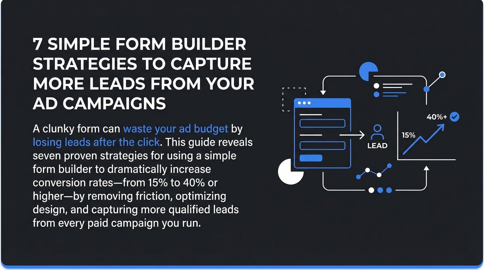
Your ad campaigns drive traffic, but what happens when visitors land on your forms? A clunky, confusing form experience can tank conversion rates and waste your ad spend. Every click you pay for represents an opportunity—but if your form creates friction, you're essentially burning budget on traffic that never converts.
The good news: choosing and optimizing a simple form builder can dramatically improve how many leads you capture from every campaign. The difference between a 15% conversion rate and a 40% conversion rate isn't always about better traffic—it's often about removing obstacles between the click and the conversion.
This guide walks through proven strategies for selecting, building, and optimizing forms that convert. You'll learn how to turn more clicks into qualified leads and get better data flowing back to your ad platforms, so your campaigns get smarter with every submission.
1. Choose an AI-Powered Form Builder
The Challenge It Solves
Traditional form builders give you a blank canvas and basic templates, but they don't help you understand what's actually working. You're left guessing which fields to include, how to structure questions, and why certain visitors abandon halfway through. Without intelligent insights, you're optimizing blind—making changes based on hunches rather than data-driven recommendations.
The Strategy Explained
AI-powered form builders like Orbit AI analyze user behavior patterns in real time and provide actionable suggestions for improvement. These platforms can identify which form fields cause the most drop-off, recommend optimal field ordering, and even adapt the form experience based on how users interact with it. The AI learns from thousands of form submissions to surface insights you'd never spot manually.
 11 Best Free Appointment Schedulers to Streamline Your Bookings in 2026
Think of it as having a conversion rate optimization expert constantly monitoring your forms and telling you exactly what to fix. Instead of running weeks of A/B tests to discover that one field is killing conversions, the AI flags it immediately and suggests alternatives.
Implementation Steps
1. Evaluate AI form builders based on their intelligence capabilities—look for platforms that offer behavior analysis, smart field suggestions, and adaptive form logic rather than just basic analytics.
2. Set up your first form with Orbit AI by connecting it to your existing marketing stack, ensuring the AI has access to conversion data and can track the full visitor journey from ad click to submission.
3. Review the AI-generated insights weekly during your first month, implementing the highest-impact recommendations first—typically field reduction, reordering, or adding conditional logic based on user responses.
Pro Tips
Start with your highest-traffic landing pages first. The AI needs sufficient data volume to generate reliable insights, so prioritize forms that receive at least 100 visitors per week. Once you've optimized your main conversion paths, expand to lower-traffic pages with the learnings you've gained.
2. Design Mobile-First Forms
The Challenge It Solves
Most businesses still design forms on desktop and then adapt them for mobile as an afterthought. The result? Mobile visitors encounter tiny tap targets, awkward input fields, and layouts that require constant zooming and scrolling. When mobile traffic represents the majority of your paid campaign clicks, this approach directly sabotages your ROI.
The Strategy Explained
Mobile-first design means building your form for small screens from the ground up, then enhancing it for larger displays. This approach forces you to prioritize clarity and simplicity—every element must justify its presence. Touch targets become larger, input types match mobile keyboards (number pads for phone fields, email keyboards for email fields), and the visual hierarchy becomes crystal clear.
The key is maintaining visual consistency between your ad creative and your form. If your Facebook ad shows a clean, simple design with plenty of white space, your form should mirror that aesthetic. Jarring design shifts between ad and landing page create subconscious friction that kills conversions.
Implementation Steps
1. Open your form builder on a mobile device and build the entire form experience using only your phone—this forces you to experience every friction point your visitors encounter and makes poor design choices immediately obvious.
2. Set minimum touch target sizes of 44x44 pixels for all interactive elements including buttons, checkboxes, and dropdown menus to prevent frustrating mis-taps that make users feel clumsy.
3. Use input type attributes strategically so mobile devices display the appropriate keyboard—type="tel" for phone numbers, type="email" for emails, inputmode="numeric" for numbers—reducing the cognitive load of keyboard switching.
Pro Tips
Test your forms on actual devices, not just browser emulators. Real phones reveal issues with tap accuracy, keyboard behavior, and scrolling that desktop testing misses. Keep a few older devices around specifically for form testing—if it works smoothly on a three-year-old phone, it'll work for everyone.
3. Reduce Form Fields to Essentials
The Challenge It Solves
Sales teams want every possible data point upfront. Marketing wants detailed segmentation information. The result is bloated forms that ask for company size, industry, budget range, timeline, pain points, and a dozen other fields before someone can even download a guide. Each additional field represents another opportunity for visitors to decide the value isn't worth the effort.
The Strategy Explained
Field reduction isn't about collecting less data—it's about collecting it smarter. Start by identifying the absolute minimum information needed to create value for the lead. For most B2B offers, that's name and email. Everything else can come later through progressive profiling, where you collect additional information across multiple interactions rather than demanding it all upfront.
The psychology is simple: people evaluate forms based on perceived effort versus perceived value. A three-field form for a valuable resource feels fair. A twelve-field form for the same resource feels like an interrogation. By reducing initial friction, you capture more leads, then enrich those profiles over time through subsequent interactions, email responses, and CRM data enrichment tools.
Implementation Steps
1. Audit your current forms and mark each field as "critical" (can't follow up without it), "valuable" (helps with segmentation), or "nice to have" (would be useful but not essential)—then delete everything that isn't critical for your initial form.
2. Implement progressive profiling in your marketing automation platform so returning visitors see different questions on subsequent form submissions, gradually building a complete profile without overwhelming anyone in a single interaction.
3. Use data enrichment services to append firmographic data (company size, industry, revenue) automatically based on email domain, eliminating the need to ask for information you can obtain programmatically.
Pro Tips
If stakeholders push back on field reduction, run a split test. Create a minimal version alongside your current form and let the data settle the argument. In most cases, the shorter form will generate significantly more submissions, and the slight decrease in initial data richness is easily offset by higher volume and progressive profiling.
4. Implement Multi-Step Forms
The Challenge It Solves
Sometimes you genuinely need more than three or four fields—qualification forms, detailed assessments, or complex service requests require substantial information. Presenting everything on a single page creates visual overwhelm. Visitors see a wall of fields, make a snap judgment about effort required, and bounce before entering a single character.
The Strategy Explained
Multi-step forms break complex data collection into logical stages, showing only a few fields at a time. Each step feels manageable, and progress indicators create a sense of momentum rather than burden. The psychological principle at work is the "endowed progress effect"—once someone completes step one, they're invested in finishing. They've already given you information, and abandoning now means wasting that effort.
The structure also allows you to ask easier questions first (name, email) before progressing to questions that require more thought (budget range, timeline, specific challenges). This gradual escalation of commitment works with human psychology rather than against it.
Implementation Steps
1. Map your required fields into logical groupings—typically starting with basic contact information, then moving to qualifying questions, and finishing with any optional details or preferences that help with personalization.
2. Keep each step to 2-4 fields maximum, ensuring visitors can complete each screen in 10-15 seconds without scrolling, which maintains momentum and prevents the perception of endless questions.
3. Add a clear progress indicator at the top showing "Step 2 of 4" or a visual progress bar so visitors know exactly how much remains, reducing anxiety about form length and abandonment due to uncertainty.
Pro Tips
Enable partial submission tracking so you can follow up with people who abandon mid-form. If someone completes step one (giving you their email) but drops off at step two, you've still captured a lead. Many form builders allow you to trigger abandoned form emails that bring people back to complete the remaining steps.
5. Connect Forms to Your Marketing Stack
The Challenge It Solves
Disconnected tools create data silos and delayed follow-up. A lead submits a form, but it takes hours to sync with your CRM. Your sales team doesn't see it until the next day. Meanwhile, your ad platforms have no idea a conversion happened, so they can't optimize toward similar audiences. Every gap in your data flow represents lost opportunity and wasted ad spend.
The Strategy Explained
Modern form builders should integrate seamlessly with your entire marketing ecosystem—CRM, email automation, ad platforms, and analytics tools. When someone submits a form, several things should happen simultaneously: the lead enters your CRM with proper source attribution, conversion events fire to Facebook and Google Ads, your automation platform triggers appropriate follow-up sequences, and your attribution system records the complete journey from first click to conversion.
This connected approach serves two critical purposes. First, it enables immediate follow-up while the lead is still engaged. Second, it feeds conversion data back to ad platforms, helping their algorithms identify and target similar high-value prospects. The faster and more accurately you can report conversions, the better your campaigns perform. Understanding ad platform data synchronization is essential for maintaining this seamless flow of information.
Implementation Steps
1. Connect your form builder to your CRM using native integrations or tools like Zapier, ensuring every submission creates or updates a contact record with complete source attribution including campaign, ad set, and creative details.
2. Implement conversion tracking pixels from all your ad platforms directly on your form confirmation page, or use a server-side tracking solution that sends conversion events reliably even when browser-based tracking fails due to privacy restrictions.
3. Set up automated workflows that trigger immediately upon form submission—sending confirmation emails, notifying sales reps, adding leads to nurture sequences, and updating lead scores based on the information provided.
Pro Tips
Test your integrations regularly by submitting test leads and verifying they appear correctly in every system with all expected data fields populated. Integration failures often happen silently—your form still works, but data stops flowing to connected systems. Weekly test submissions catch these issues before they cost you real leads.
New to the concept? Start with our explainer on what is cost per lead form completion.
6. Add Trust Signals and Social Proof
The Challenge It Solves
Form abandonment often stems from trust concerns rather than friction. Visitors wonder: Will you spam them? Sell their information? Actually deliver what you promised? These unspoken anxieties create hesitation, and hesitation creates abandonment. Without explicit trust signals, you're asking people to take a leap of faith with their contact information.
The Strategy Explained
Strategic placement of trust elements near your form can dramatically reduce anxiety and boost completion rates. This includes customer testimonials that speak to the value of what you're offering, security badges that signal data protection, privacy statements that explicitly promise not to spam or sell information, and social proof elements like "Join 10,000+ marketers" that demonstrate others have trusted you successfully.
The key is relevance and authenticity. A generic "100% secure" badge means nothing. A specific testimonial from someone in your target audience describing exactly what they gained from your offer creates genuine confidence. Place these elements where they're most needed—typically just above or beside the form, where visitors are making their final decision.
Implementation Steps
1. Add a clear, specific privacy statement directly below your form that addresses the primary concern—typically something like "We'll never spam you or share your email. Unsubscribe anytime with one click."
2. Include 1-2 short testimonials from customers who benefited from the specific resource or offer you're promoting, focusing on concrete outcomes rather than vague praise like "great company."
3. Display relevant trust badges such as security certifications, industry association memberships, or recognizable client logos if appropriate for your audience—but only include badges that your target audience will recognize and value.
Pro Tips
Video testimonials placed near forms often outperform text-based social proof because they're harder to fake and create stronger emotional connection. A 15-second clip of a real customer describing their results can be more persuasive than any written copy. Keep it short and focused on the specific value they received.
7. Track Form Analytics Continuously
The Challenge It Solves
Most marketers track form submissions as a binary outcome—converted or didn't convert. This surface-level view hides critical insights about where and why people abandon. You might see a 25% conversion rate and think it's acceptable, not realizing that 80% of visitors who start your form abandon at a specific field. Without granular analytics, you're flying blind on optimization opportunities.
The Strategy Explained
Comprehensive form analytics track every interaction: which fields get filled out, where people abandon, how long they spend on each field, which fields get corrected most often, and how completion rates vary by traffic source or device type. This data reveals specific friction points you can fix rather than forcing you to guess at improvements. Understanding what is form completion rate and how to measure it properly is the foundation of effective form optimization.
For example, if analytics show that 60% of people who reach your phone number field abandon without completing the form, you've identified a clear problem. Maybe the field validation is too strict, maybe people don't want to share their phone number for this offer, or maybe the field label is confusing. The data points you toward the solution.
Implementation Steps
1. Implement field-level tracking in Google Analytics or your form builder's native analytics, setting up events that fire when visitors interact with each field, complete each field, and submit the form.
2. Create a weekly dashboard that shows completion rate, average time to complete, abandonment rate by field, and completion rate segmented by traffic source and device type—this becomes your optimization roadmap. Leveraging real-time marketing performance monitoring tools can help you spot issues before they significantly impact your results.
3. Set up alerts for significant changes in form performance so you're notified immediately if completion rates drop suddenly, which often indicates a technical issue or broken integration that needs urgent attention.
Pro Tips
Record session replays of form interactions using tools like Hotjar or Microsoft Clarity. Watching real users struggle with your form reveals usability issues that raw analytics miss. You'll see people clicking the wrong buttons, getting confused by labels, or abandoning because of unexpected behavior. Five session replays often provide more actionable insights than a month of aggregate data.
Putting It All Together
Start with strategy one—selecting the right AI-powered form builder like Orbit AI that gives you intelligent optimization recommendations from day one. This foundation makes every subsequent strategy easier to implement and measure. Once you've chosen your platform, immediately tackle mobile optimization and field reduction. These two changes alone can double your conversion rates within a week.
With your forms converting well, focus on the integrations that feed quality data back to your ad platforms. This creates a virtuous cycle where better form data leads to better ad targeting, which drives more qualified traffic, which generates more high-quality conversions. Understanding how to improve Facebook Ads performance with better data demonstrates exactly how this feedback loop works in practice.
Implement these strategies systematically rather than all at once. Make one meaningful change, measure the impact for a week, then move to the next optimization. This disciplined approach lets you understand which changes drive results and builds organizational confidence in form optimization as a conversion lever. Adopting a data-driven vs data-informed mindset helps you balance quantitative insights with strategic judgment.
Your forms are the bridge between ad spend and revenue. Every percentage point improvement in form conversion rate directly impacts your cost per lead and overall campaign ROI. Treat form optimization with the same rigor you apply to ad creative and targeting—it deserves equal attention and resources. Implementing proper ad campaign performance tracking ensures you can measure the full impact of your form improvements on overall campaign success.
Ready to elevate your marketing game with precision and confidence? Discover how Cometly's AI-driven recommendations can transform your ad strategy—Get your free demo today and start capturing every touchpoint to maximize your conversions.