Think of a web analytics dashboard as your business's command center. It's the one place where all the complex, messy data from your website and marketing efforts gets translated into a clear, visual story. Instead of drowning in spreadsheets, you get a unified view of your most critical metrics, letting you monitor performance, catch trends, and make smart decisions without getting lost in the weeds.
Why Web Analytics Dashboards Are Your Command Center
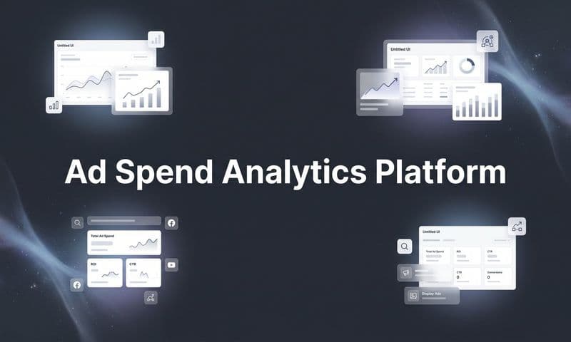
 Web Analytics Dashboards: Turn Data Into Revenue with Smarter Marketing
Trying to run a modern business without a proper web analytics dashboard is like a pilot attempting to fly a 747 without any instruments. You might feel like you're moving forward, but you have no real idea of your altitude, speed, or direction. You're essentially flying blind, relying on gut feelings when you need precision. This is exactly why a well-designed dashboard isn't a luxury—it's non-negotiable.
It’s built to cut through the noise. All that raw data from countless sources—website traffic, ad campaigns, social media, sales platforms—gets consolidated. No more juggling a dozen different reports. Everything you need is in one cohesive view.
A Single Source of Truth
One of the biggest hurdles for any growing team is working from different sets of data. It leads to conflicting priorities, misaligned strategies, and a whole lot of wasted effort. A centralized dashboard solves this by knocking down data silos and creating a single source of truth that everyone can trust and rally around.
- For Marketing: It instantly shows which campaigns are actually driving conversions and which ones are just burning cash.
- For Sales: It shines a light on the lead sources that are bringing in the most qualified, ready-to-buy prospects.
- For Leadership: It delivers a high-level overview of the key performance indicators (KPIs) that tie marketing activities directly to revenue.
This shared understanding gets everyone on the same page, fostering collaboration and making sure the entire company is pulling in the same direction. To get a better sense of how dashboards can centralize your data, check out our guide on dashboard data analytics.
From Data Collection to Actionable Insights
At the end of the day, the goal isn't just to collect data; it's to actually understand it. Web analytics dashboards are specifically designed to turn numbers into signals you can act on. By visualizing trends and patterns, they empower you to answer critical business questions with confidence.
A great dashboard transforms your data from a rearview mirror into a GPS. It stops you from just looking at what already happened and starts guiding you on where to go next. It’s what enables proactive, data-backed decisions that fuel real, sustainable growth.
The market is exploding for a reason. Projections show the web analytics market hitting USD 16.36 billion by 2030, a surge driven by businesses that are hungry for advanced dashboards to dissect user behavior and sharpen their strategies. Learn more about the web analytics market growth. This massive investment highlights a simple truth: in today's world, the companies that see their data clearly are the ones that win.
Building a High-Impact Marketing Dashboard
 Web Analytics Dashboards: Turn Data Into Revenue with Smarter Marketing
A great marketing dashboard does more than just throw numbers on a screen. It tells a story about your business performance. To build one that actually drives results, you need to think beyond simply dropping in a few charts. Each element should be a building block in a visual narrative that answers your team's most urgent questions.
The secret is matching the right visualization to the right question. A line chart is perfect for showing trends, like how your organic traffic has grown over the last quarter. A funnel, on the other hand, is brilliant for mapping out the customer journey and instantly showing you where people are dropping off between awareness and purchase.
And sometimes, a simple bar chart is the best tool for the job—especially when you need to compare the performance of different marketing channels side-by-side. This kind of clarity helps your team immediately see which channels are winners and which ones need another look.
Choosing KPIs That Actually Matter
The real foundation of any high-impact web analytics dashboards is selecting the right Key Performance Indicators (KPIs). It's incredibly easy to fall into the trap of tracking "vanity metrics"—things like social media likes or impressions that feel good but don't connect to real business outcomes. A powerful dashboard cuts right through that noise.
To get there, you have to tie your KPIs directly to your strategic business goals. This simple step ensures that every single metric on your dashboard has a purpose and contributes to the larger story of your company's growth.
A smart way to organize your dashboard is to group KPIs by core business objectives:
- Acquisition: These metrics tell you how well you're attracting new customers. They answer the question, "Are we reaching the right people, and how much is it costing us?"
- Engagement: Once you get people to your site, what happens next? Engagement KPIs measure how users are interacting with your content and your brand.
- Revenue: This is the bottom line. These are the metrics that connect all your marketing efforts directly to sales and profitability.
Structuring your dashboard this way creates a logical flow that mirrors the customer journey, making it easy for anyone on your team to understand performance at a glance.
Key Metrics for Your Strategic Goals
Let's make this more concrete by breaking down some essential KPIs for each category. These are the numbers that move beyond vanity and give you actionable insights into your marketing performance.
When you're building out a marketing dashboard, it's crucial to pick the most relevant data points for your business. For an even more exhaustive list, this guide on the top e-commerce metrics and KPIs to track is a fantastic resource.
Here's a look at how you might structure these KPIs in a goal-oriented dashboard.
Essential KPIs for Your Marketing Dashboard
This table breaks down key performance indicators by their marketing objective, helping you build a dashboard that directly reflects your business goals.
Marketing performance metrics can be grouped by objective to better understand how different parts of your funnel are performing. For acquisition, one of the most important KPIs is Cost Per Acquisition (CPA), which measures how much you spend to acquire a single new paying customer. It is calculated by dividing total ad spend by the number of new customers and helps evaluate the efficiency of your campaigns. Another key acquisition metric is Traffic by Source, which shows where your visitors are coming from and helps you decide where to allocate budget. For example, you might see 5,000 visits from organic search and 3,000 from paid social.
Click-Through Rate (CTR) is also an acquisition-focused metric that measures the percentage of people who click an ad after seeing it. This KPI indicates how compelling your ad creative and messaging are and is calculated by dividing total clicks by total impressions and multiplying by 100.
For engagement, Conversion Rate is a primary KPI that measures the percentage of visitors who complete a desired action, such as making a purchase or submitting a form. It is calculated by dividing total conversions by total visitors and multiplying by 100. Another important engagement metric is Bounce Rate, which measures the percentage of visitors who leave your site after viewing only a single page. For example, a 45 percent bounce rate means nearly half of visitors exited without engaging further.
When evaluating revenue performance, Return on Ad Spend (ROAS) is a critical KPI that measures how much revenue is generated for every dollar spent on advertising. It is calculated by dividing total revenue from ads by total ad spend and helps determine overall ad profitability. Average Order Value (AOV) is another key revenue metric that shows the average amount a customer spends per transaction. This is calculated by dividing total revenue by the number of orders and is useful for identifying opportunities to increase revenue through upsells or pricing strategies.
By organizing your dashboard around goal-oriented KPIs like these, you create a clear path from initial marketing action to final business impact.
A well-crafted dashboard forces you to be honest about your performance. It replaces opinions with facts, making it clear what's working and what's not, which is the first step toward meaningful improvement.
For those looking to tie all these elements together into a cohesive view, our detailed guide on creating a marketing performance dashboard offers practical steps and advanced templates. This strategic approach transforms your dashboard from a simple reporting tool into a command center for growth.
Designing Dashboards for Clarity and Action
Let’s be honest: the most powerful data in the world is useless if it’s buried in a confusing, cluttered mess. A great dashboard isn’t just about showing numbers; it’s about revealing insights in a single glance. The design of your web analytics dashboards is the single biggest factor that determines whether they become an indispensable tool for action or just another forgotten browser bookmark.
Effective design starts with understanding how people actually read screens. We instinctively scan in an "F" pattern—we look at the top-left, move across the top, and then scan down the left side. This is the core of visual hierarchy. Your most critical, big-picture KPI, like overall Return on Ad Spend (ROAS) or total conversions, belongs right there in that top-left sweet spot. All your supporting metrics can then flow logically from that anchor point.
This same principle of purpose applies to color, too. Too many dashboards are splashed with a rainbow of colors for decoration, but all that does is create visual noise. Instead, use color with intent. Stick to a neutral, muted palette for most of your charts. This allows you to use a single, bright color—like a sharp red or a vibrant green—to instantly draw the eye to what really matters: a sudden drop in performance or a campaign that’s blowing past its goals.
Creating an Intuitive User Experience
The ultimate acid test for any dashboard is what I call the 60-second rule: can a stakeholder look at it and grasp the key takeaways in under a minute? Hitting that level of clarity comes down to a few simple user experience (UX) principles.
- Group Related Metrics: Keep metrics that influence each other together. For example, your Cost Per Acquisition (CPA) should sit right next to your Conversion Rate and total Ad Spend. This creates logical "zones" that tell a cohesive story at a glance.
- Use White Space Generously: Don't try to cram every inch of the screen with charts and numbers. White space isn't empty space; it’s a design tool that gives your data room to breathe, reducing cognitive load and making each element easier to understand.
- Choose the Right Chart for the Job: We touched on this earlier, but it’s worth repeating. A line chart is for trends over time. A bar chart is for comparing categories. A funnel chart is for visualizing a process. Using the wrong visualization for the data is a fast track to confusion.
Your dashboard should feel less like a dense financial report and more like a clear, compelling infographic. Its primary job is to communicate, not just to display data.
As businesses pour more resources into their digital strategies, the demand for clear, actionable dashboards is exploding. North America is a major player in this shift, accounting for 38% of the global web analytics market growth. This boom is all about one thing: the urgent need to make sense of the overwhelming data coming from millions of online interactions. For a deeper dive into visualization, our article on data visualization dashboards offers even more practical tips.
Battle-Tested Dashboard Templates
To bring these principles to life, you don't need to reinvent the wheel. Adapting a proven template can save you a ton of time and ensure you're focusing on the metrics that actually move the needle. For a more comprehensive look at this, you can explore more designing dashboards best practices to really sharpen your data visualization skills.
Here are three versatile templates you can use as a starting point:
- The CMO Command Center: This is the high-level, strategic view. It focuses on the big picture: overall marketing ROI, customer lifetime value (CLV), and total revenue broken down by channel. It’s built for executives who need a quick pulse on business health without getting bogged down in the nitty-gritty of individual campaigns.
- The Paid Media Dashboard: Designed for the hands-on campaign manager, this dashboard gets much more granular. It tracks ROAS, CPA, and conversion rates for specific platforms (like Google Ads or Meta Ads) and individual campaigns, making it perfect for rapid optimization and budget shifts.
- The E-commerce Health Monitor: This template is a must-have for any online store. It delivers a real-time snapshot of sales performance, highlighting key metrics like Average Order Value (AOV), cart abandonment rate, and top-selling products. It helps teams instantly spot checkout issues or identify which products are flying off the virtual shelves.
How to Build Your First Dashboard Step By Step
So you've got the design principles down. Now it's time for the fun part: getting your hands dirty and building your first dashboard from the ground up. This isn't about being a tech wizard; it's about thinking strategically. The single biggest mistake marketers make is diving straight into the tool and dragging charts onto a canvas without a clear plan.
The most critical step—and the one that gets skipped the most—is defining the dashboard's purpose. Before you even think about connecting a data source, you need to answer two simple questions:
- Who is this for? A dashboard for your CMO should be high-level, focused on ROI and big-picture trends. But a dashboard for your paid media specialist needs to get granular, showing campaign-level metrics and creative performance. The audience dictates everything.
- What questions does it need to answer? Every single chart and metric should have a job. It should exist to answer a specific, important question, like "Which ad platform is giving us the best return?" or "Where are users dropping off in our sales funnel?"
Without clear answers, you'll end up with a "data dump"—a cluttered mess of numbers that gives you plenty of information but zero actual insight.
Connect Your Essential Data Sources
Once your purpose is crystal clear, it’s time to gather the ingredients. A truly useful web analytics dashboard pulls data from multiple platforms to create one unified view of performance. Think of it like cooking: you need a little bit of everything to see the whole picture.
Your core data sources will almost always include:
- Website Analytics: This is your foundation. Google Analytics 4 (GA4) provides the crucial data on traffic, user behavior, and what people are doing on your site.
- Advertising Platforms: You need to connect directly to Google Ads, Meta Ads, TikTok Ads, and anywhere else you spend money. This is how you track campaign performance and ad spend accurately.
- CRM or E-commerce Platform: Integrating data from tools like Shopify, Salesforce, or HubSpot is how you connect marketing efforts directly to sales, leads, and actual revenue.
Connecting these sources ensures you're not just looking at surface-level metrics like clicks. You're tracing the entire customer journey from the first touch to the final sale. To create a dashboard that truly shows business impact, you'll need to select the right KPIs. For more guidance, explore our in-depth guide to choosing the best marketing dashboard KPIs.
This simple infographic breaks down the core design stages, emphasizing hierarchy, color, and clarity.
 Web Analytics Dashboards: Turn Data Into Revenue with Smarter Marketing
As you can see, a logical structure is the foundation. From there, you use color with intention, and the final focus is on making everything crystal clear.
Real-Time vs. Aggregated Data
As you start hooking up your data sources, you'll come across two types of data: real-time and aggregated. Knowing the difference is key to building a useful dashboard.
Real-time data is like a live news feed. It gives you an immediate, up-to-the-second look at what's happening right now. It's perfect for monitoring a flash sale or watching the first few hours of a new campaign launch.
Aggregated data, on the other hand, is like a historical summary. It gathers and processes data over a set period—like a day, week, or month—to show you the bigger trends and patterns. Both are valuable. You need real-time data for quick reactions and aggregated data for long-term strategic planning. A great dashboard often has a mix of both.
Segment Your Data to Uncover Insights
The final step in building your first dashboard is to slice and dice your data through segmentation. This is where the real "aha!" moments happen. Segmentation is just a fancy word for breaking down your overall data into smaller, more specific groups to understand performance on a much deeper level.
Let's say you're building a dashboard for an e-commerce campaign. Instead of just looking at your overall conversion rate, you could segment your data by:
- Traffic Source: Are visitors from Google Ads converting at a higher rate than visitors from Facebook? This tells you exactly where to put your budget.
- Device Type: Is your mobile conversion rate terrible compared to desktop? That's a huge red flag that you might have a problem with your mobile checkout flow.
- Customer Demographics: Are your ads hitting home with a specific age group or location? This helps you sharpen your ad targeting for much better results.
By applying these segments, you go from just reporting what happened to understanding why it happened. This is what transforms your web analytics dashboard from a passive reporting tool into an active, strategic asset that actually guides your decisions and fuels business growth.
Connecting Your Data for a Complete Picture
 Web Analytics Dashboards: Turn Data Into Revenue with Smarter Marketing
A dashboard built on fragmented data tells a fragmented story. You might see a spike in ad clicks on one platform and a jump in sales on another, but the line connecting those two events is blurry at best. This disconnect is where marketing budgets get wasted and golden opportunities slip through the cracks. The whole point of a powerful web analytics dashboard is to unify your data into a single source of truth.
But there’s a problem. Traditional client-side tracking, which leans heavily on browser cookies, is becoming less and less reliable. Ad blockers, privacy updates like iOS 14+, and new browser restrictions often stop tracking pixels from ever firing. The result? Your dashboard is full of holes, and your most successful campaigns look like they're underperforming.
The Power of Reliable Data Collection
To build a dashboard you can actually trust, you need a much more durable way to collect data. This is where server-side tracking completely changes the game. Instead of relying on the user's browser to send data, your website's server sends it directly to your analytics and ad platforms.
This approach neatly bypasses most of the issues plaguing client-side tracking, giving you a far more accurate and complete dataset to work with.
- Improved Accuracy: Server-side tracking isn't stopped by ad blockers or most browser privacy settings, which means more of your conversion data actually gets captured.
- Enhanced Data Control: You get full control over exactly what data is sent to each platform, improving both security and compliance.
- Deeper Insights: By unifying data on the server, you can finally connect website behavior to your CRM and other backend systems for a true full-funnel view.
This gives you an unblinking look at what is truly driving revenue.
Moving Beyond Last-Click Attribution
Once you have reliable data flowing in, the next step is making sense of it. For years, marketers have leaned on last-click attribution, a model that gives 100% of the credit for a sale to the very last thing a customer did before converting.
Imagine this: a customer sees your ad on TikTok, reads a blog post a week later, gets an email, and then finally clicks a Google Ad to make a purchase. In a last-click world, Google gets all the glory, while TikTok, your blog, and your email get completely ignored. This model paints a dangerously misleading picture, causing you to undervalue the channels that build awareness and nurture leads.
Last-click attribution is like giving all the credit for a championship win to the person who scored the final point, ignoring the assists, the defense, and the coaching that made it possible.
To truly understand performance, you need a more sophisticated approach. Multi-touch attribution models distribute credit across multiple touchpoints in the customer journey, giving you a holistic view of how your channels work together to drive conversions. You finally start seeing the real story of your marketing. To learn more about unifying these different data points, explore these data integration best practices.
A modern web analytics dashboard built on a platform like Cometly doesn't just show you data; it helps you connect the dots. By mapping the entire customer journey, from the first ad they saw to the final purchase, it provides an honest, clear view of what’s actually driving your revenue. This clarity allows you to stop guessing and start investing in the campaigns and channels that deliver real results.
Common Dashboard Mistakes and How to Avoid Them
Look, even the most beautifully designed web analytics dashboards can end up being totally useless if you fall for a few common traps. Building a dashboard is honestly just half the battle. The real work is keeping it relevant and clear so it delivers value over the long haul.
If you can steer clear of these mistakes, your dashboard will become a go-to tool for your team, not just another forgotten bookmark.
The biggest trap I see teams fall into is data dumping. This is what happens when you cram every metric you can possibly think of onto a single screen. It turns into a cluttered, overwhelming mess that doesn't clarify anything—it just creates analysis paralysis. The fix? Be ruthless about what you include. Every single chart and number must serve the dashboard’s one core purpose.
Another classic error is getting distracted by vanity metrics. These are the numbers that look great on the surface—like page views or social media followers—but have zero connection to actual business results. A dashboard full of vanity metrics might make you feel good, but it won’t help you make smarter calls about where to put your marketing budget.
A dashboard should be a tool for action, not a museum of interesting but irrelevant data points. If a metric doesn't help you answer a critical business question, it doesn't belong.
Keeping Your Dashboard Relevant and Actionable
To keep your dashboard from becoming a static report that's outdated the second you build it, you need to bake in active monitoring and review processes. A great dashboard isn’t a one-and-done project; it’s a living tool that should evolve right alongside your business goals.
Here are a few things you can do to keep your dashboard sharp and effective:
- Set Up Automated Alerts: You can configure alerts for major spikes or dips in your most important KPIs. This instantly turns your dashboard from a passive report into an active early-warning system, letting you jump on opportunities or threats before it’s too late.
- Schedule Regular Reviews: Block off time every week or two for the team to review the dashboard together. Talking through the trends and insights as a group keeps everyone on the same page and helps build a culture where decisions are backed by real data.
- Iterate and Refine: Don’t be afraid to change your dashboard. As your marketing strategies evolve, your KPIs should too. Get in the habit of asking your team, "Is this still telling us what we need to know?" That simple question will keep your web analytics dashboards focused, relevant, and powerful.
Frequently Asked Questions
As you get your hands dirty with web analytics dashboards, you’ll inevitably run into a few common questions. Getting these sorted out early on is the key to building something that actually works for you and your team. Let's clear up some of the most frequent ones.
What Is the Difference Between a Dashboard and a Report?
This is a classic, and the best way to think about it is like this: a dashboard is your car's live speedometer, while a report is the detailed service history you get from the mechanic.
- A dashboard is your real-time, at-a-glance view of the most important numbers. It’s built for quick checks and immediate action—letting you see what’s happening right now so you can spot problems or opportunities instantly.
- A report is a static, deep-dive analysis of performance over a set period, like last month or last quarter. It’s for stepping back, analyzing what has happened, and making bigger strategic decisions.
Both are critical, but they solve different problems. Dashboards are for monitoring; reports are for analyzing.
How Often Should I Check My Marketing Dashboard?
There's no single right answer here—it really comes down to your role and what you're responsible for. The best cadence is the one that allows you to take meaningful action.
A paid media buyer who’s managing daily ad spend should be in their dashboard daily, maybe even a few times a day. They need to catch performance dips or spikes in real time to optimize campaigns on the fly. On the other hand, a CMO looking at the big picture might only need to check in weekly to see if the team is on track to hit quarterly goals.
The goal is to find a rhythm that helps you see real trends and react quickly without getting bogged down by the daily noise and minor fluctuations.
Can I Build a Powerful Dashboard with Free Tools?
Absolutely. While dedicated platforms like Cometly offer sophisticated features like server-side tracking and unified attribution, you can build a seriously effective starter dashboard without spending a dime.
Google Looker Studio (what used to be called Data Studio) is the perfect place to start. You can pull data directly from Google Analytics, Google Ads, and other sources to create custom, shareable web analytics dashboards. It’s an incredible way for any business on a budget to get hands-on experience and start delivering real value right away. Once your needs outgrow it, you can always graduate to a more specialized tool.
Ready to stop guessing and start seeing the full picture of your marketing performance? Cometly unifies your data into a single source of truth, giving you the clarity to optimize ad spend and drive real growth. Discover what you've been missing and build a dashboard you can trust at https://www.cometly.com.