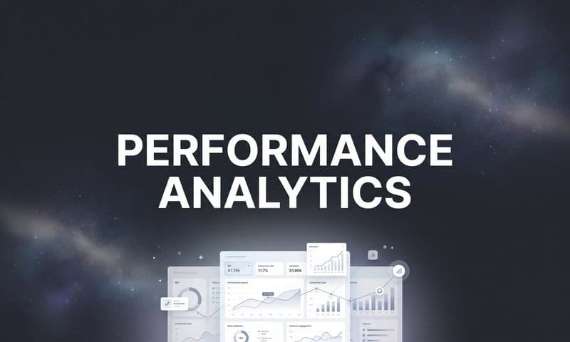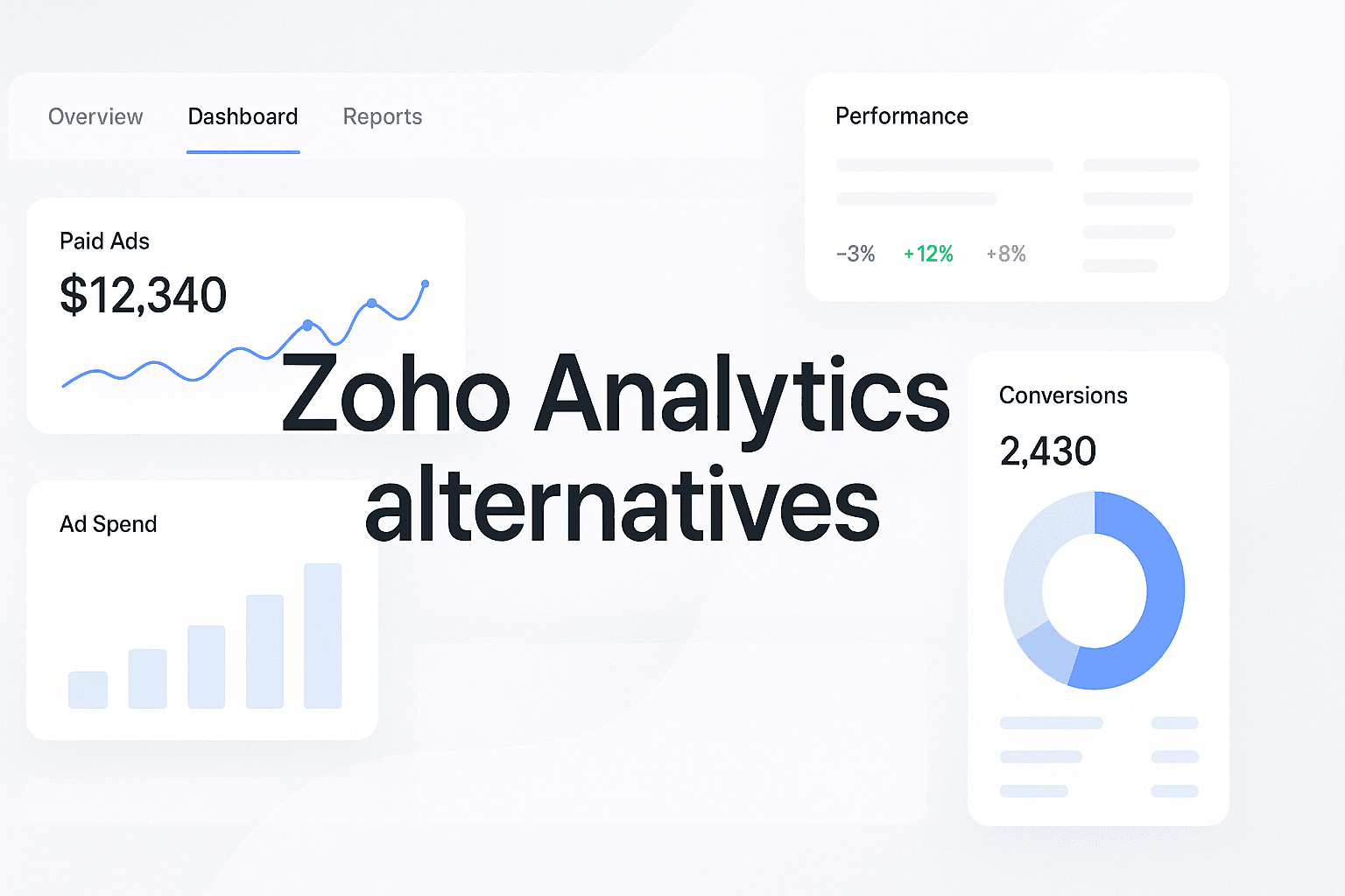
What if your analytics tool held you back? Imagine you’re a marketing manager with a critical campaign running, and you’re eagerly waiting for insights to gauge its success. You log into Zoho Analytics, only to find a complex interface that leaves you frustrated. You try to dig deeper into your data, but the reports are inadequate, and the insights you desperately need seem just out of reach. You’re not alone—many users have reported similar frustrations with Zoho Analytics, citing challenges like a steep learning curve and limited functionality. This is where exploring alternatives becomes essential.
In today’s data-driven world, having the right analytics tool can significantly impact your marketing strategies and overall business decisions. While Zoho Analytics has its merits, many organizations find they need more robust solutions that offer better user experiences, feature sets, and support. By evaluating your options, you can find a tool that not only meets your needs but also enhances your team's productivity and decision-making capabilities. Let's dive into the top 8 Zoho Analytics alternatives that can help you gain deeper insights and drive your marketing success.
1. Cometly
Best for: Marketing professionals looking for comprehensive attribution tracking.
Cometly is a powerful marketing attribution and analytics platform that shows exactly which ads and channels drive leads and revenue.
 Discover 8 Zoho Analytics Alternatives To Elevate Your Marketing Insights
Cometly provides an integrated view of customer interactions across multiple touchpoints, ensuring marketers can track the entire customer journey in real time. This tool is particularly beneficial for businesses that rely on digital advertising and want to optimize their marketing spend.
Overview & Background: As digital marketing becomes increasingly complex, the need for precise attribution has never been higher. Cometly’s platform allows users to capture every touchpoint, from ad clicks to CRM events, offering a complete view of the customer journey.
Key Features:
1. Multi-Touch Attribution Modeling: Cometly helps you understand how different channels contribute to conversions, moving beyond simple last-click models.
2. Real-Time Performance Tracking: Monitor your campaigns as they run, allowing for immediate adjustments based on performance data.
3. AI-Driven Recommendations: Utilize AI to identify successful ads and campaigns, enabling marketers to scale their efforts efficiently.
How It Works: Cometly connects seamlessly with various ad platforms, CRMs, and websites. By centralizing data, it allows marketers to visualize customer interactions and assess the effectiveness of their marketing strategies.
Pricing & Plans: Cometly offers tiered pricing plans based on the number of users and features required, making it accessible for both small businesses and larger enterprises.
Why It's Great for Marketers: Cometly empowers marketers with the insights needed to make data-driven decisions, optimizing ad spend and improving ROI.
2. Tableau
Best for: Organizations focused on data visualization and storytelling.
Tableau is renowned for its powerful data visualization capabilities, enabling users to create interactive and shareable dashboards.
 Discover 7 Essential Metorik Alternatives To Enhance Your Marketing Analytics
Tableau allows businesses to visualize their data in a way that makes complex information accessible and understandable. Its intuitive drag-and-drop interface simplifies the creation of stunning visual reports, transforming raw data into actionable insights.
Overview & Background: Tableau has positioned itself as a leader in the business intelligence space, catering to users who prioritize visual storytelling in their analytics.
Key Features:
1. Extensive Data Connectivity: Tableau can connect with a wide variety of data sources, from spreadsheets to databases, ensuring comprehensive analysis capabilities.
2. Powerful Analytics Tools: Users can perform advanced analytics and create complex visualizations that facilitate better decision-making.
3. Collaboration Features: Tableau allows teams to collaborate on dashboards and reports in real time, enhancing teamwork and communication.
How It Works: Users can easily import data, create visualizations, and share insights across teams. Tableau's interactive dashboards provide a dynamic view of data, allowing users to explore and analyze trends effectively.
Pricing & Plans: Tableau's pricing varies based on deployment options and user requirements, making it suitable for a range of budgets. Learn more about top Tableau alternatives.
Why It's Great for Data Storytelling: Tableau's focus on visualization helps businesses present data in a compelling way, making it easier to communicate insights to stakeholders.
3. Microsoft Power BI
Best for: Teams already using Microsoft products looking for seamless integration.
Microsoft Power BI is a robust business analytics tool that provides interactive visualizations and business intelligence capabilities.
 Discover 7 Top Tableau Alternatives To Enhance Your Data Visualization
Power BI integrates seamlessly with other Microsoft products, making it an ideal choice for organizations already leveraging the Microsoft ecosystem.
Overview & Background: As part of Microsoft 365, Power BI offers familiar interfaces and features that streamline the analytics process for businesses.
Key Features:
1. Data Modeling and Visualization: Power BI enables users to create complex data models and visualizations that enhance analytical capabilities.
2. Customizable Dashboards: Users can tailor dashboards to meet specific reporting needs, providing relevant insights at a glance.
3. AI-Driven Insights: The platform incorporates AI capabilities to help users derive insights from their data quickly.
How It Works: Power BI allows users to connect to various data sources, prepare data models, and create visual reports that can be shared across the organization.
Pricing & Plans: Power BI offers competitive pricing with a free version available, along with premium subscriptions for more advanced features.
Why It's Great for Microsoft Users: Power BI’s integration with Microsoft products enhances productivity and simplifies data analysis for teams familiar with the Microsoft ecosystem.
4. Google Data Studio
Best for: Users seeking a free and flexible data visualization tool.
Google Data Studio offers a free platform for creating customizable reports and dashboards.
 Discover 10 Top Sisense Alternatives To Enhance Your Data Analytics
Data Studio allows users to visualize data from various Google services and other external sources, making it a versatile tool for marketers and analysts.
Overview & Background: As a free tool, Google Data Studio democratizes data visualization, enabling users to create engaging reports without financial investment.
Key Features:
1. Custom Report Creation: Users can design tailored reports that meet their specific analytical needs.
2. Collaboration Features: Teams can work together to create and edit reports in real time, enhancing communication and insight sharing.
3. Data Source Integration: Google Data Studio connects easily with various data sources, including Google Analytics, Ads, and Sheets.
How It Works: Users can drag and drop elements to build reports, customize visuals, and share insights across teams or with clients.
Pricing & Plans: Google Data Studio is free to use, making it an attractive option for small businesses and freelancers.
Why It's Great for Budget-Conscious Users: Its zero-cost advantage allows users to access powerful analytics and visualization tools without financial constraints.
5. Looker
Best for: Mid-sized to large organizations looking for scalable data analytics solutions.
Looker is a data analytics platform designed to provide businesses with scalable solutions for data analysis.
 10 Powerful Ruler Analytics Alternative Tools To Elevate Your Marketing Strategy
Looker’s ability to connect directly to databases enables real-time analytics, making it suitable for organizations that prioritize growth and data-driven decision-making.
Overview & Background: Looker focuses on providing businesses with the tools needed to analyze data effectively and make informed decisions.
Key Features:
1. Real-Time Data Analytics: Looker connects directly to databases, allowing for immediate access to data insights.
2. Custom Model Creation: Users can build custom data models that cater to their specific analytical needs.
3. Collaboration and Sharing Capabilities: Looker facilitates teamwork by allowing users to share insights and dashboards easily.
How It Works: Looker enables users to create queries and visualizations using a user-friendly interface, making data exploration accessible for non-technical users.
Pricing & Plans: Looker’s pricing is based on the number of users and the features required, positioning it as a premium solution for serious data analysts. Learn more about top Looker Studio alternatives.
Why It's Great for Growing Organizations: Looker’s scalability ensures that it can adapt as a business's data needs evolve, supporting growth and innovation.
6. Qlik Sense
Best for: Organizations needing robust self-service analytics capabilities.
Qlik Sense empowers users to conduct self-service analytics, allowing for greater flexibility in data exploration.
 Discover 8 Zoho Analytics Alternatives To Elevate Your Marketing Insights
Qlik Sense’s associative data model provides users with the ability to explore data freely, making it a popular choice for data analysts.
Overview & Background: Qlik Sense is designed to facilitate self-service analytics, enabling users to uncover insights independently.
Key Features:
1. Interactive Dashboards: Users can create dynamic dashboards that enhance data interaction and engagement.
2. Data Discovery Tools: Qlik Sense allows users to explore data relationships and patterns effortlessly.
3. Collaboration Features: Teams can share insights and collaborate on data analysis projects seamlessly.
How It Works: Qlik Sense’s intuitive interface allows users to drag and drop elements to explore data, creating visualizations that tell compelling stories.
Pricing & Plans: Qlik Sense offers flexible pricing options based on user needs, making it accessible for various organizational sizes. Learn more about top Qlik alternatives.
Why It's Great for Data Analysts: Its self-service capabilities empower analysts to conduct in-depth analysis without relying on IT support.
7. Domo
Best for: Companies needing an all-in-one business intelligence solution.
Domo is an all-in-one business intelligence solution that integrates various data sources for comprehensive analytics.
 Discover 8 Zoho Analytics Alternatives To Elevate Your Marketing Insights
Domo’s platform consolidates data management, visualization, and reporting, making it a powerful tool for organizations seeking to streamline their analytics efforts.
Overview & Background: As businesses increasingly seek comprehensive solutions, Domo provides an integrated approach to data analytics.
Key Features:
1. Data Integration from Multiple Sources: Domo connects with various data sources, allowing for a holistic view of organizational data.
2. Real-Time Analytics: Users can access live data insights, enabling prompt decision-making.
3. Mobile Access to Dashboards: Domo’s mobile capabilities allow users to access insights on the go, enhancing flexibility.
How It Works: Domo consolidates data into a single platform, facilitating analysis and reporting across departments.
Pricing & Plans: Domo’s pricing structure is based on user requirements, making it a suitable option for various company sizes. Learn more about top Domo alternatives.
Why It's Great for Comprehensive Analytics: Its all-in-one capabilities reduce the complexity of managing multiple tools, providing a streamlined approach to data management.
8. Sisense
Best for: Organizations seeking a customizable analytics solution.
Sisense offers a customizable analytics solution that allows organizations to build tailored dashboards and reports.
 Discover 8 Zoho Analytics Alternatives To Elevate Your Marketing Insights
Sisense’s platform is designed for businesses that need flexibility in their analytics tools, enabling users to create custom workflows and visualizations.
Overview & Background: Sisense focuses on providing businesses with the tools needed to create personalized analytics experiences.
Key Features:
1. Customizable Dashboards: Users can design dashboards tailored to their specific needs, enhancing usability and relevance.
2. Data Modeling Capabilities: Sisense facilitates advanced data modeling, allowing users to create complex queries and visualizations.
3. Integration with Various Data Sources: The platform can connect to numerous data sources, ensuring comprehensive data analysis.
How It Works: Sisense's powerful platform allows users to build and share analytic applications, fostering collaboration and insight generation.
Pricing & Plans: Sisense’s pricing is competitive, with various options available based on organizational needs and user requirements. Learn more about top Sisense alternatives.
Why It's Great for Customization Enthusiasts: Sisense’s flexibility allows businesses to adapt the tool to their unique processes and workflows.
Making the Right Choice - A Path Forward in Data Analytics
In summary, selecting the right analytics tool is crucial for driving effective marketing strategies and making informed business decisions. Each alternative to Zoho Analytics offers unique features and capabilities tailored to different organizational needs. For example, Cometly excels in marketing attribution, while Tableau and Power BI shine in data visualization.
As you explore these alternatives, consider your specific requirements, such as integration capabilities, user experience, and budget constraints. Remember that the right analytics tool can significantly enhance your data-driven decision-making process and improve overall business performance.
If you're ready to elevate your marketing analytics and make data-driven decisions with confidence, get your free demo of Cometly today!