In today's data-driven landscape, executives and team leads are often drowning in metrics but starved for insights. The gap between raw data and actionable strategy is where effective management reporting makes its mark. A well-structured management reporting template doesn't just present numbers; it tells a story about performance, highlights critical trends, and flags potential risks before they escalate.
It transforms complex datasets from platforms like Google Analytics, your CRM, and marketing attribution tools into a clear, concise narrative that stakeholders can understand and act upon. However, finding the right template, one that balances detail with clarity and is flexible enough for your specific needs, is a significant challenge. Many teams waste countless hours wrestling with spreadsheets or building dashboards from scratch, only to end up with a report that's either too dense or too superficial.
This guide cuts through the noise. We've curated a comprehensive list of the 12 best resources for a management reporting template available today, from dynamic, integrated platforms like Asana and ClickUp to versatile, downloadable files from hubs like Template.net and Vertex42. For each resource, we provide screenshots, direct links, and a breakdown of its ideal use case, from high-level executive summaries to granular marketing KPI dashboards. We'll explore their implementation nuances and show you how to connect them with powerful data sources to create a single source of truth for your business performance.
Template.net offers a vast and frequently updated library of downloadable templates, making it an excellent starting point for teams needing a structured document quickly. Its main advantage is the sheer volume and variety of formats available, catering to users who prefer working within familiar office suites like Microsoft Word, Google Docs, or Apple Pages rather than specialized dashboarding tools. This makes it ideal for creating static, print-ready reports or documents that require extensive narrative alongside data.
The platform is particularly useful for project status updates, monthly summaries, or executive briefings where qualitative analysis is just as important as the key performance indicators. Each management reporting template comes with pre-built sections like "Executive Summary," "Financial Overview," and "Action Items," which helps standardize reporting across an organization.
While many templates are free, the most professional and visually appealing designs are often locked behind a "Pro" subscription. The user experience is straightforward: search for your desired report type, select a format, and download. However, be aware that quality can vary, so it's wise to preview a few options before committing.
Template Usage Tip: To integrate data from a platform like Cometly, you would first run your attribution or KPI report, export the key metrics and charts as images or CSV files, and then manually insert them into the downloaded Word or Google Docs template. This approach is best for periodic, high-level summaries rather than real-time, interactive analysis.
Website: https://www.template.net
For teams that live inside a project management ecosystem, ClickUp offers powerful, integrated reporting templates that transform operational data into management insights. Unlike static documents, ClickUp's templates are living systems built within its workspace. They are designed for teams that want to generate reports directly from the tasks, projects, and goals they are already tracking, eliminating the need for manual data entry and consolidation. This makes it a superior choice for dynamic, recurring reports tied to active workstreams.
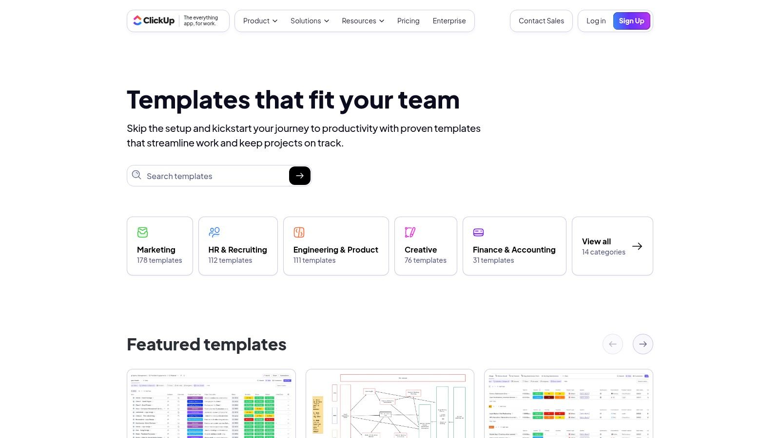
The platform provides ready-to-use templates like the "Management Report" and "Project Status Report," which come pre-configured with custom fields, statuses, and dashboard widgets. This setup is ideal for performance reviews, sprint summaries, and daily progress updates, as reports automatically reflect real-time task completion and milestone achievement. The templates are designed to be used directly within ClickUp, leveraging its different views like lists, boards, and forms.
ClickUp's templates are free to use with an account, but the most impactful reporting features, like advanced Dashboards and automation, are on paid plans. The user experience is seamless for existing ClickUp users, as adding a template is just a few clicks. However, it requires adopting the ClickUp workspace model, which may be a significant commitment for new teams. The setup guides on each template page are clear and helpful for implementation.
Template Usage Tip: To incorporate data from Cometly, you can use ClickUp’s integrations (via Zapier or its API on paid plans) to automatically create or update tasks with key metrics like ROAS or CPA. For example, a low ROAS on a campaign in Cometly could trigger an automated task in your ClickUp management report, flagging it for review. This creates a powerful, action-oriented reporting loop.
Website: https://clickup.com/templates
HubSpot's Resources Library is a goldmine for high-quality, business-ready templates, especially for those in marketing and sales. Unlike generic repositories, HubSpot offers curated reporting packs that often include both a KPI spreadsheet (Excel/Google Sheets) and a corresponding presentation deck (PowerPoint/Google Slides). This integrated approach helps teams not only track metrics but also present their findings effectively.

The platform excels at providing context alongside its templates, often bundling them with how-to guides and best practices. This makes it a valuable educational tool, not just a download center. The focus is clearly on practical application, providing a solid foundation for building a comprehensive management reporting template tailored to marketing performance and analytics. For teams looking to enhance their reporting, HubSpot's resources provide excellent examples of what a powerful digital marketing report should contain.
All templates are free to download, but they are gated behind a lead-capture form, requiring you to provide your contact information. The user experience is seamless: you find a resource, fill out a short form, and receive the download link. The quality is consistently professional, reflecting HubSpot's brand standards.
Template Usage Tip: To populate a HubSpot monthly marketing report with Cometly data, export your key ad performance metrics like ROAS, CPA, and conversion rates. You can then paste these values directly into the provided Excel or Google Sheets KPI tracker. The pre-built charts will update automatically, which you can then copy and paste into the companion PowerPoint or Google Slides template for your monthly review.
Website: https://www.hubspot.com/resources/templates
For teams whose work and projects already live within a project management tool, Asana provides built-in reporting templates that turn daily tasks into live management dashboards. Instead of creating a static document, this approach offers a dynamic, real-time view of project progress, team workload, and milestone completion. It excels at operational reporting, where the data is directly tied to the tasks being executed within the platform.
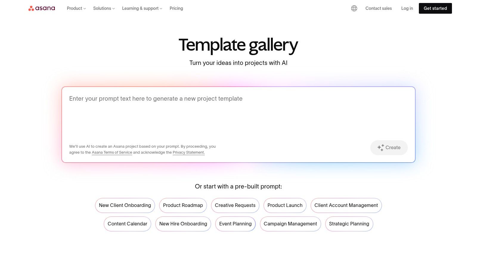
Asana's template gallery includes pre-configured setups for project status reports, progress summaries, and executive dashboards. These templates leverage custom fields, automated status updates, and visual charts to provide an at-a-glance overview without leaving the workspace. This makes it an incredibly efficient management reporting template solution for internal teams who need continuous visibility into operational performance.
The power of Asana’s reporting lies in its integration with the core work management features. While basic templates are available on free plans, advanced reporting capabilities, including custom dashboards and deeper analytics, require a paid subscription. The user experience is seamless for existing Asana users, as reporting is an extension of their daily workflow.
Template Usage Tip: To incorporate external metrics from a tool like Cometly, you can create custom fields in Asana for key performance indicators (e.g., "Ad Spend," "ROAS," "Leads Generated"). Periodically, you would manually update these fields with data exported from Cometly, allowing you to view project-related tasks alongside crucial business performance metrics in a single dashboard.
Website: https://asana.com/templates
Smartsheet is a dynamic work management platform that excels at creating integrated management reporting templates directly linked to project plans, tasks, and resource allocation. Unlike static document templates, Smartsheet's reports are live dashboards that pull real-time data from across multiple sheets and projects. This makes it a powerful choice for PMOs, operations managers, and teams that need a single source of truth for portfolio-level and multi-project reporting.
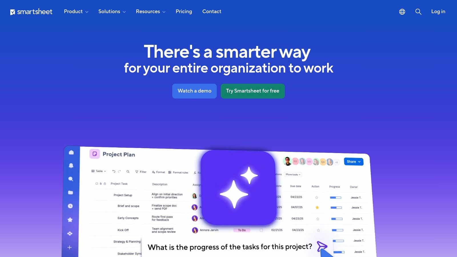
The platform is designed for enterprise-grade governance, offering robust sharing permissions, filters, and workspaces to control who sees what. This is crucial for management reporting that involves sensitive financial or performance data. Its strength lies in consolidating complex project information into clear, actionable executive dashboards and summaries, which you can learn more about in these marketing dashboard examples.
Smartsheet’s full reporting capabilities, including advanced resource management insights, are primarily available in its higher-tier Business and Enterprise plans. While the platform has a learning curve, its power in creating automated, cross-functional reports is a significant advantage for larger organizations. For those exploring different platforms, a list of Smartsheet alternatives can help identify the best tools for your team's reporting template needs.
Template Usage Tip: To incorporate Cometly data, you can use a data integration tool like Zapier to automatically add new rows or update cells in a Smartsheet "data sheet" whenever specific events occur in Cometly. Your management report dashboard can then be configured to pull data from this sheet, providing a near real-time view of ad performance alongside project milestones.
Website: https://www.smartsheet.com
Airtable transcends traditional spreadsheets by offering a highly flexible database-like platform where you can build completely custom, live management reports. Its strength lies in creating bespoke reporting workflows that combine data from multiple sources into a single, interactive view. Instead of static documents, Airtable provides dynamic "Interfaces" and dashboards that can be tailored to specific stakeholder needs, from high-level executive summaries to granular operational metrics.
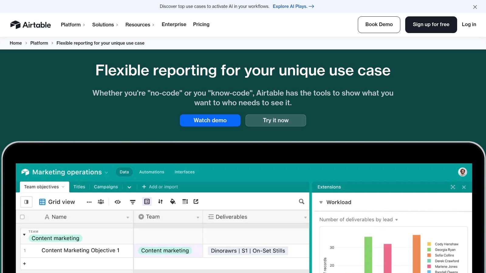
This platform is ideal for teams that need to not only visualize data but also manage the underlying projects or records directly within the report. Using a combination of its no-code interface builder, chart extensions, and scripting capabilities, you can design a central reporting hub that integrates with tools like Google Sheets, HubSpot, or other CRMs, providing a real-time source of truth for your business performance.
Airtable's flexibility is its biggest asset, but it also comes with a steeper learning curve compared to simple template sites. While basic reporting is accessible on its free tier, more advanced features like extensions, scripting, and higher automation limits are reserved for paid plans. The platform excels at creating a highly specific management reporting template from the ground up, tailored precisely to your operational workflows.
Template Usage Tip: To integrate Cometly data, you can use Airtable’s API or a third-party automation tool like Zapier. Set up a workflow that pulls key campaign metrics from Cometly and populates a dedicated table in your Airtable base. From there, you can use Airtable Interfaces to build live charts and summaries, creating an interactive dashboard that updates automatically.
Website: https://www.airtable.com/product/reporting
Vertex42 is a long-standing and trusted source for high-quality Excel and Google Sheets templates, specializing in clean, functional, and lightweight spreadsheets. Its strength lies in providing business and project management tools that are easy to download and customize without the bloat of overly complex systems. This makes it a perfect choice for managers who are proficient in Excel or Sheets and prefer to build their reports from a solid, logical foundation.
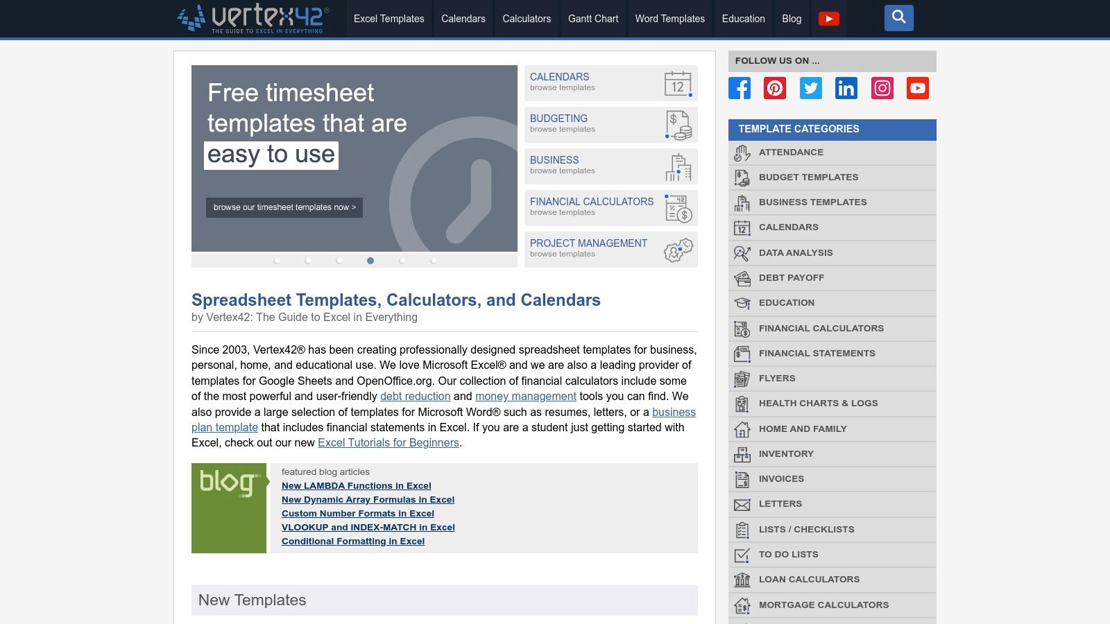
The platform offers a robust selection of dashboards, project status trackers, and strategic planning tools like the Hoshin Kanri X-Matrix. Each management reporting template includes clear instructions, helping users understand the formulas and structure so they can adapt it to their specific needs. Its no-frills approach prioritizes functionality and clarity over elaborate visual design, appealing to those who need to get the job done efficiently. A well-structured spreadsheet can serve as a powerful data analysis dashboard when manual updates are sufficient.
Most templates on Vertex42 are free, making it an accessible resource for businesses of all sizes, though some of the more advanced or comprehensive templates are sold as "Pro" versions. The user experience is simple: find your template, choose your format (Excel or Google Sheets), and download. The files are lightweight and fully editable, giving you complete control. However, this also means they are static and lack the real-time data integration of dedicated dashboard software.
Template Usage Tip: To populate a Vertex42 dashboard with Cometly data, export a CSV of your campaign performance or attribution results. You can then copy and paste the relevant columns into the "Data" tab of the spreadsheet. The pre-built charts and summary tables will automatically update, providing a quick and clear overview for your report.
Website: https://www.vertex42.com
Miro is a collaborative online whiteboard platform that excels at turning reporting into a visual and interactive experience. Its template library, especially the community-driven Miroverse, offers frameworks for project status updates, A3/Kaizen problem-solving reports, and executive summaries. This approach moves beyond static documents, enabling teams to build reports collaboratively in real-time, making it perfect for workshop-style review meetings or strategic planning sessions where visual context is key.

The platform is uniquely suited for building a management reporting template that requires flowcharts, mind maps, or customer journey maps alongside traditional KPIs. Instead of just presenting numbers, you can visually connect performance data to strategic initiatives on a single board, providing a holistic view that is difficult to achieve in a standard spreadsheet or document. Once complete, these visual reports can be exported to PDF for wider distribution.
Miro offers a vast collection of free templates, but the quality and complexity of community-submitted options in Miroverse can vary. The strength of Miro lies in its collaborative nature, not in its data-crunching capabilities, making it less ideal for reports that require complex calculations or direct database connections. However, for visual storytelling with data, it is an exceptional tool. Explore how to effectively present your findings with our guide on data visualization dashboards.
Template Usage Tip: To incorporate data from a platform like Cometly, take screenshots of your key performance charts and attribution funnels. You can then paste these images directly onto the Miro board and use virtual sticky notes, arrows, and text boxes to add commentary and connect the data points to your team’s action items.
Website: https://miro.com/templates
SlideModel specializes in professional PowerPoint and Google Slides templates, making it a go-to resource for managers who present their findings in slide decks. Instead of document-based reports, its strength lies in providing executive-ready presentation assets, including business report slides, data-driven charts, and infographics. This platform is perfect for crafting compelling visual narratives for board meetings, stakeholder updates, or team presentations where clarity and design polish are paramount.

The platform offers a deep library of templates designed for specific business needs, such as annual reports, project roadmaps, and KPI dashboards. Each management reporting template is fully editable, allowing users to easily adapt colors, fonts, and layouts to match their company's branding, ensuring a consistent and professional look across all presentations.
SlideModel operates on a subscription model, with plans offering a set number of downloads or unlimited access, which is cost-effective for teams that frequently create presentations. While the visuals are high-quality, the templates function within a presentation environment, meaning they are designed for summarizing data rather than deep, interactive analysis. The user experience is excellent, with a powerful search function that helps you quickly find relevant slides.
Template Usage Tip: To incorporate data from Cometly, you can export key performance charts and data points. Then, use SlideModel's editable chart templates by inputting your metrics directly into the linked Excel sheet within PowerPoint. For visuals like attribution funnels, you can screenshot the chart from Cometly and place it into a designated image placeholder in a slide.
Website: https://slidemodel.com
Envato Elements is a subscription service offering unlimited downloads from a massive catalog of creative assets, including thousands of high-quality presentation templates. It is an invaluable resource for teams that need to produce visually stunning, professionally designed management reports in presentation formats like PowerPoint, Google Slides, or Keynote. The platform’s strength lies in its vast variety and modern aesthetic, allowing you to create compelling narratives for board meetings, annual summaries, or client updates.
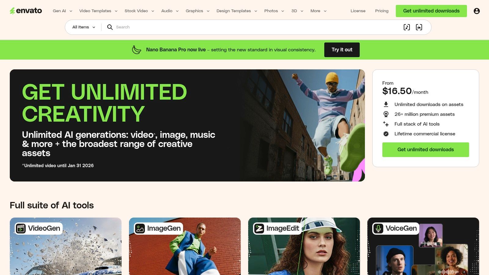
Unlike static document templates, these slide decks are designed for storytelling, making them perfect for presenting complex data with impactful visuals. For those who don't need a full subscription, its sister site, GraphicRiver, allows for one-off purchases of individual templates. This flexibility makes it a go-to for both recurring reporting needs and one-time high-stakes presentations.
The sheer volume of options means you will need to spend some time curating and finding the perfect management reporting template for your needs. However, the quality is consistently high, and the included commercial license provides peace of mind. The subscription model of Elements encourages experimentation, as you can download and test multiple templates without extra cost.
Template Usage Tip: To populate an Envato template with data from a tool like Cometly, export your key dashboards, charts, and attribution metrics as high-resolution images. You can then drag and drop these visuals into the pre-designed slide layouts, adding your own executive summary and narrative to complete the report. This method is highly effective for creating polished, presentation-ready decks for stakeholders.
Website: https://elements.envato.com
ProjectManager.com offers a collection of free, downloadable templates focused on project and portfolio reporting. Its strength lies in providing simple, standardized formats in Microsoft Word and Excel, making them highly accessible for teams that rely on traditional office software. These templates are particularly effective for creating straightforward progress and status reports that don't require complex data visualizations or live dashboards.
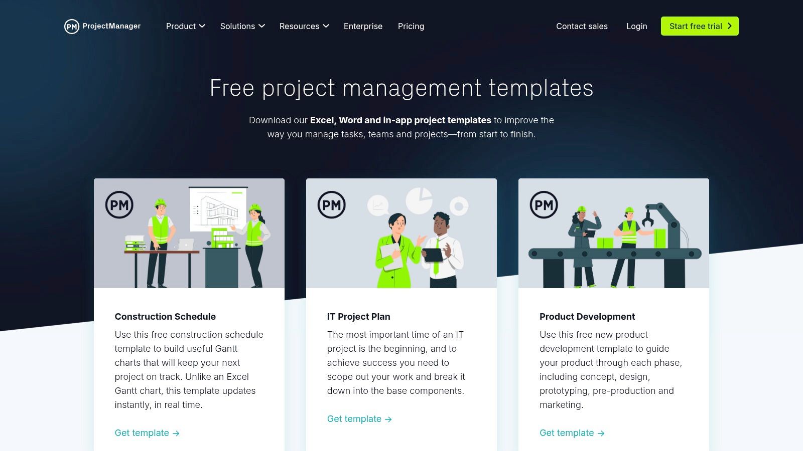
The platform’s templates often incorporate the popular RAG (Red, Amber, Green) status style, providing a quick visual reference for project health. With pre-defined sections for an executive summary, milestones, and KPIs, these documents serve as an excellent starting point for standardizing communication within a project or to stakeholders. They are an ideal choice for weekly team updates or monthly executive summaries.
While the templates are free and easy to download, they are static documents. This means they require manual updates and lack the real-time capabilities of the integrated ProjectManager.com software suite. Users will likely need to rebrand the templates and customize them to fit specific executive or client-facing requirements, as they are quite generic out of the box. For those managing multiple accounts, integrating these static reports into more robust client reporting tools can streamline the workflow.
Template Usage Tip: To populate this management reporting template with data from a tool like Cometly, export your key ad spend, ROAS, and conversion metrics into a CSV file. You can then copy and paste the crucial figures into the KPI sections of the Excel or Word template, adding your own narrative analysis in the executive summary.
Website: https://www.projectmanager.com/templates
Microsoft offers a massive collection of free, built-in templates directly within its Office suite (Word, Excel, PowerPoint) and online via Microsoft Create. This native integration is its greatest strength, as it provides a familiar and accessible starting point for anyone using Microsoft 365. The platform excels at providing a solid foundation that users can easily customize with their own branding, making it ideal for maintaining corporate identity across all documentation.
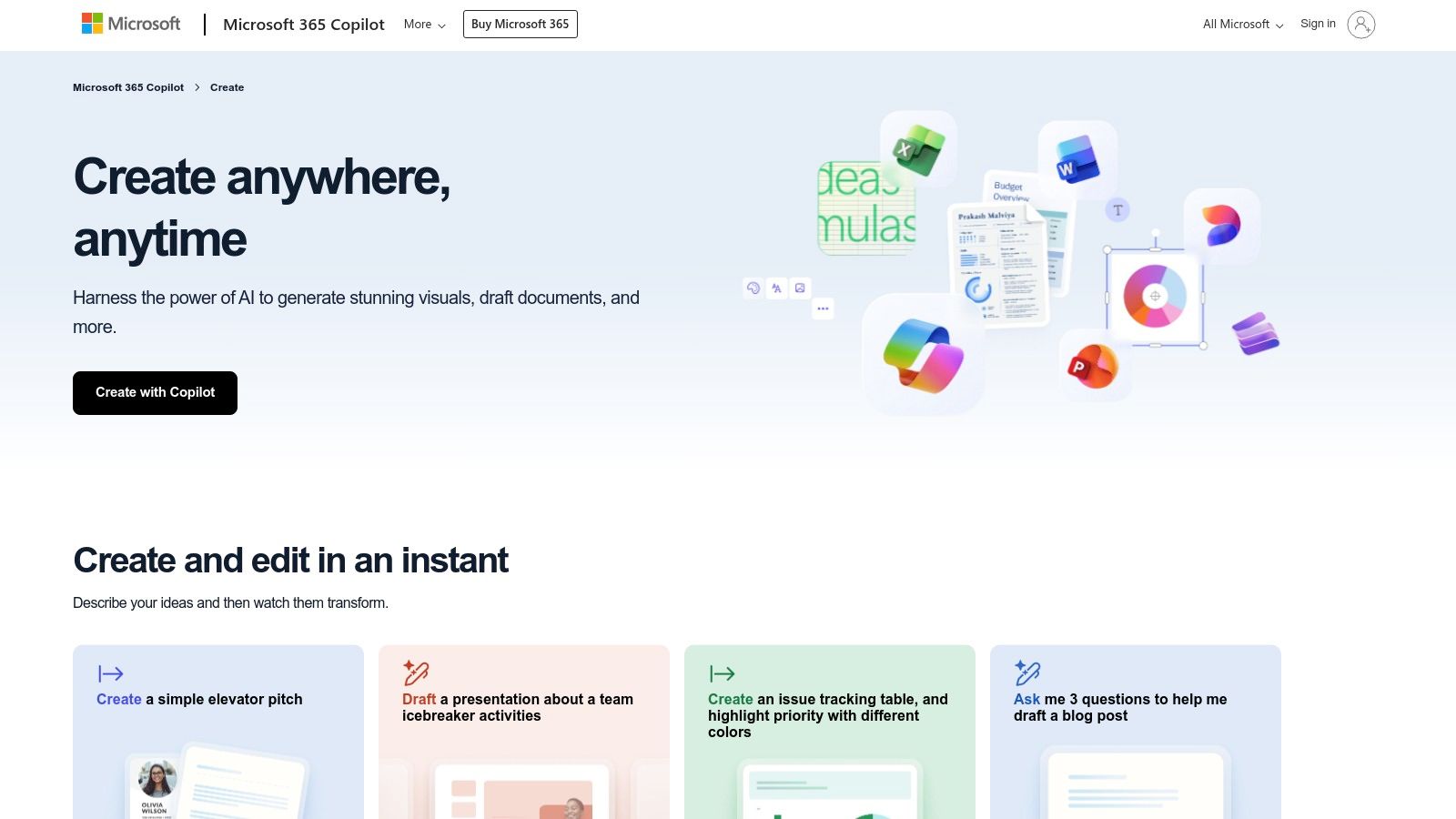
These templates are perfect for standard business communications like weekly project updates, financial summaries, or internal performance reviews. Because they are native to Office apps, creating a new report is as simple as navigating to "File > New" and searching for the desired format. This seamless experience removes the friction of downloading files from third-party sites.
The primary benefit is cost and accessibility, as all templates are free for Microsoft 365 users. While convenient, many designs can be generic and often require significant customization to look unique. The Excel-based templates offer the most power, allowing users to connect to data sources, but this requires technical skill to set up.
Template Usage Tip: To populate a Microsoft Excel management reporting template with your key metrics, first export your campaign data from a tool like Cometly as a CSV file. You can then import this data directly into the Excel sheet. From there, you can configure charts and pivot tables to automatically update when new data is added, creating a semi-automated reporting system.
Website: https://create.microsoft.com
We've explored a diverse landscape of tools, from dedicated project management platforms like Asana and ClickUp to versatile spreadsheet powerhouses like Smartsheet and Vertex42. Each offers a unique starting point, a pre-built structure designed to organize your key performance indicators. But the journey from a downloaded file to a dynamic decision-making engine is where the real work begins.
Choosing the right management reporting template is only the first step. The true transformation occurs when that static document becomes a living, breathing reflection of your business's pulse, automatically updated with accurate, cross-channel data. This distinction is critical; a report that requires hours of manual data entry each week is a chore, not a strategic asset. It often leads to outdated insights and decisions based on lagging information.
The fundamental challenge with any template is populating it with meaningful data. A marketing attribution dashboard from HubSpot is only as powerful as the conversion data you feed it. A weekly KPI report from a Smartsheet template loses its impact if the ad spend and revenue figures are pulled from siloed, disconnected platforms.
This is where the concept of a single source of truth becomes paramount. To move beyond surface-level reporting, you must:
Selecting the best foundation for your reporting depends entirely on your current tech stack, team workflow, and strategic objectives.
Ultimately, the most effective management reporting template is one that your team will actually use and trust. The key is to connect it to a reliable data engine, like Cometly, which ensures the numbers are always accurate and attributable. This integration transforms your reporting from a historical record into a predictive, forward-looking tool that actively drives growth. To truly activate your reporting strategy and ensure your templates lead to actionable insights, consider engaging with external experts who can guide you on the bigger picture of business intelligence consulting services.
This strategic approach turns a simple template into the command center for your marketing and sales operations, empowering you to optimize spend, identify your most profitable channels, and make every decision with data-backed confidence.
Ready to populate your new management reporting template with data you can actually trust? Cometly connects all your marketing channels and sales data to provide a single source of truth for attribution. Stop guessing and start making decisions with clarity by visiting Cometly to see how it can power your reports.