
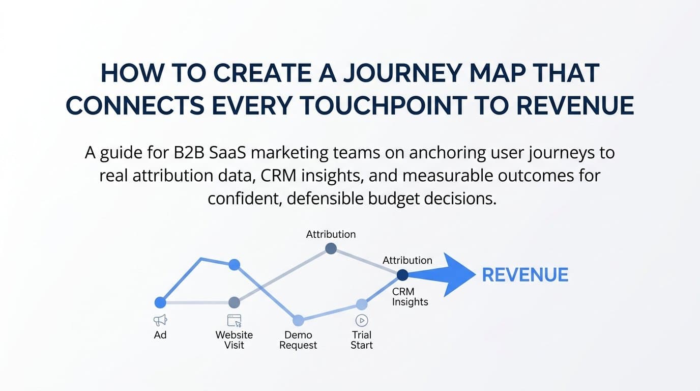
A journey map is one of the most powerful tools a B2B SaaS marketing team can build. It visualizes exactly how a prospect moves from first awareness to becoming a paying customer, capturing every interaction, decision point, and channel along the way. Without one, you are essentially guessing which touchpoints matter and which campaigns deserve more budget.
For B2B SaaS companies running paid ads across multiple channels, this guesswork gets expensive fast. Budgets get allocated based on gut feel, last-click data, or whoever makes the loudest argument in the planning meeting. None of those approaches hold up when a CFO asks you to justify your spend.
The challenge is that most journey maps stop at the surface level. They capture broad stages like "awareness" and "consideration" but fail to connect those stages to real conversion data. The result is a pretty diagram that does not actually drive decisions. It lives in a slide deck, gets referenced once in a quarterly review, and then quietly becomes irrelevant.
This guide takes a different approach. You will learn how to build a journey map that is grounded in real attribution data, tied to your CRM, and connected to the metrics that matter most: pipeline, revenue, and ad ROI. Whether you are a marketing leader trying to justify budget, a growth team optimizing campaigns, or an agency building reporting frameworks for clients, this step-by-step process will give you a journey map that is both strategic and measurable.
By the end, you will have a working map that shows which channels bring in prospects, which touchpoints accelerate decisions, and where leads drop off before converting. You will also understand how to use attribution data to keep your map accurate over time rather than letting it go stale after one workshop.
Let's get into it.
Step 1: Define Your Ideal Customer Profile and Buying Stages
Before you open a single tool or template, you need to be precise about who this map is for. This is where most teams go wrong. They build one generic journey map that tries to represent every type of buyer, and the result is a map that accurately represents no one.
Start by identifying the specific persona your map will cover. Think in terms of role, company size, industry, pain points, and goals. A VP of Marketing at a 50-person SaaS company has a fundamentally different buying journey than a Director of Demand Generation at a 500-person company, even if both are evaluating the same product. Pick your highest-value ICP segment and build the first map around them.
Once you have your persona locked in, map out the distinct buying stages for your B2B SaaS product. A useful starting framework covers five stages:
Awareness: The prospect recognizes a problem or gap and begins looking for information. They may not know your product exists yet.
Consideration: The prospect is actively researching solutions. They are comparing options, reading reviews, and engaging with content.
Evaluation: The prospect has a shortlist. They are looking at demos, talking to sales, and doing deeper due diligence.
Decision: The buying committee is aligned and a purchase decision is being made. Legal, procurement, and finance may be involved.
Post-Sale Expansion: The customer is onboarded and you are now working to retain and grow the account. This stage matters for net revenue retention and upsell attribution.
Here is something critical to internalize: B2B buying stages are rarely linear. A prospect might jump from awareness directly to evaluation after watching a demo on demand, then cycle back to consideration when a new stakeholder joins the conversation. Your map needs to acknowledge this non-linearity rather than pretend every buyer follows a clean sequence.
Also define who influences each stage. In most B2B SaaS deals, multiple stakeholders are involved. The end user has different concerns than the economic buyer. The IT team has different objections than the marketing team. Noting these dynamics on your map will help you design touchpoints that speak to the right person at the right moment.
Success indicator: You can clearly articulate who the map is for, what problem they are solving, and the approximate timeline from first touch to closed deal. If you cannot answer those three questions in two sentences each, keep refining before moving on.
Step 2: Gather Real Touchpoint Data From Your Channels and CRM
This is where your journey map separates itself from the whiteboard exercise most teams do. Instead of building from assumptions, you are going to build from evidence.
Pull data from every major channel your team uses: Google Ads, Meta, LinkedIn, your CRM, and your website analytics. You are looking for patterns in how qualified prospects actually interact with your brand before they convert, not how you think they do.
Start with first-touch sources. Which channels are introducing your brand to prospects who eventually become customers? This is not the same as which channels drive the most traffic or the most leads. You want to filter specifically for contacts that ended up in your pipeline or closed as customers. Many teams are surprised to find that a channel they have been deprioritizing is actually responsible for a disproportionate share of high-quality first touches.
Next, look at mid-funnel touchpoints. These are the interactions that happen after initial awareness but before a prospect requests a demo or enters an active sales cycle. Common mid-funnel touchpoints in B2B SaaS include:
Retargeting ads: Prospects who visited your site and are now seeing your ads across other platforms.
Email sequences: Nurture campaigns triggered by content downloads or webinar registrations.
Webinars and virtual events: High-intent touchpoints that often appear in the journeys of prospects who later convert.
Content downloads: Whitepapers, reports, and guides that signal a prospect is actively researching solutions in your category.
Review site visits: G2, Capterra, and similar platforms often appear in the journeys of prospects who are in active evaluation.
Now cross-reference your CRM pipeline data with your ad platform data. The goal is to identify which campaigns correlate with closed-won deals, not just lead volume. A campaign that generates a hundred leads but zero closed deals is not performing well, even if it looks impressive in a top-level report.
This is exactly where relying on last-click reporting creates problems. Last-click attribution credits the final touchpoint before conversion and ignores everything that came before it. For B2B SaaS companies with long sales cycles, this approach systematically undervalues awareness and mid-funnel channels that do significant work earlier in the journey.
Multi-touch attribution gives you a more complete picture by capturing the sequence of interactions rather than crediting just one. When you can see the full path from first ad click to closed-won deal, you start to understand which combinations of touchpoints produce the best outcomes.
Success indicator: You have a list of the top eight to twelve touchpoints that appear most frequently in the journeys of your converted customers. These are your map's backbone.
Step 3: Identify Drop-Off Points and Conversion Gaps
A journey map that only shows you where prospects go is only half the picture. You also need to know where they stop.
Start by comparing the volume of contacts at each stage against the volume that advance to the next. If you have a thousand prospects entering the consideration stage but only two hundred making it to evaluation, that is a significant drop-off worth investigating. The goal is not to eliminate drop-off entirely (some attrition is natural and healthy) but to identify where the rate is unusually high relative to what you would expect.
Flag touchpoints with high exposure but low conversion rates as friction points. For example, if a large percentage of your prospects are visiting your pricing page but very few are requesting a demo afterward, something about that experience is creating hesitation. It could be pricing clarity, the absence of a strong CTA, or a mismatch between what the ad promised and what the page delivers.
Look for time gaps between stages. If prospects are entering your email nurture sequence but not advancing to a demo request for sixty or ninety days, that is a signal that your nurture content is not creating enough urgency or relevance. Time gaps often indicate a lack of the right content at the right moment rather than a lack of interest from the prospect.
Segment your drop-off analysis by traffic source. This is a step many teams skip, and it leads to misleading conclusions. A channel that appears to have a high overall conversion rate might be masking the fact that one traffic source converts well while another stalls consistently at the mid-funnel stage. When you segment by source, you can make much more precise decisions about where to invest and where to pull back.
Document your findings directly on your journey map as annotations. Do not keep this analysis in a separate spreadsheet where it will be forgotten. When the gaps are visible alongside the touchpoints, your team can see the full picture in one view and prioritize improvements more effectively.
Success indicator: You can point to at least two or three specific stages where pipeline velocity slows and offer a hypothesis for why. A hypothesis is enough at this stage. You will test it as you optimize.
Step 4: Assign Attribution Models to Each Stage of the Journey
Attribution is not a single answer. It is a set of lenses, and the lens you choose should match the question you are trying to answer.
Different attribution models tell different parts of the story. First-touch attribution shows you what drives awareness. It credits the very first interaction a prospect had with your brand before converting. If you want to understand which channels are most effective at introducing your product to the right audience, first-touch is the model to use.
Last-touch attribution credits the final interaction before conversion. It is useful for understanding what closes deals, but it often overstates the importance of bottom-of-funnel touchpoints while ignoring everything that built the relationship earlier. Using last-touch as your only model is one of the most common and costly mistakes in B2B SaaS marketing.
Multi-touch attribution distributes credit across multiple touchpoints in the journey. There are several variations: linear attribution spreads credit evenly, time-decay attribution gives more credit to touchpoints closer to conversion, and position-based attribution weights the first and last touches more heavily. Data-driven attribution, when you have enough conversion volume, uses statistical modeling to assign credit based on each touchpoint's actual contribution to conversion.
The practical approach for journey mapping is to apply different models at different stages:
Awareness stage: Use first-touch attribution to evaluate which channels and campaigns are most effective at bringing the right prospects into your ecosystem.
Mid-funnel stages: Use multi-touch or data-driven attribution to understand which combinations of touchpoints produce the highest conversion rates from consideration through to evaluation.
Decision stage: Use last-touch or position-based attribution to identify what is most effective at closing deals and moving prospects from demo to closed-won.
One of the most valuable exercises you can do at this step is to compare what your attribution data says against what your team believes. In many organizations, there are long-held assumptions about which channels "work" that turn out to be contradicted by actual data. Attribution data has a way of surfacing those contradictions clearly, and those moments of realization are often where the biggest optimization opportunities live.
Success indicator: Each stage of your journey map has a defined attribution lens and you know which data source validates that stage. You are no longer using a single model to answer all questions.
Step 5: Build the Visual Map and Document Touchpoint Details
Now you are ready to put the map together. The format matters less than the clarity and usability of the output. Choose a format your team will actually use and reference regularly, whether that is a spreadsheet, a visual tool like Miro or Lucidchart, or an analytics dashboard that surfaces journey data in real time.
Structure the map horizontally by buying stage and vertically by channel or touchpoint type. This layout makes it easy to see which channels are active at which stages and where there are gaps in your coverage. If you have no touchpoints mapped to the evaluation stage for your LinkedIn channel, that is immediately visible and actionable.
For each touchpoint, document four things:
The channel: Where does this interaction happen? Paid search, LinkedIn ads, email, organic content, review sites?
The content or ad format: What is the prospect actually seeing or engaging with? A video ad, a blog post, a case study, a retargeting banner?
The action taken by the prospect: What does a successful interaction look like? A click, a form submission, a content download, a demo request?
The conversion event it maps to: Which tracked event in your analytics or CRM corresponds to this touchpoint? This is what connects your visual map to your live data.
Where available, include intent signals alongside the click data. Search query themes, content topics consumed, and pages visited add context that pure click data cannot provide. A prospect who has visited your pricing page three times and downloaded two comparison guides is in a very different mindset than a prospect who clicked a top-of-funnel awareness ad once. Your map should reflect those differences.
Keep the map clean and scannable. The temptation is to include every possible interaction, but that quickly turns the map into something no one can read. Focus on the high-impact touchpoints you identified in Step 2 and use annotations for the edge cases.
Success indicator: A stakeholder who was not involved in building the map can look at it and understand the full journey within five minutes. If it takes longer than that, simplify.
Step 6: Connect Your Map to Live Revenue and Pipeline Data
This is the step that transforms your journey map from a static document into a dynamic growth tool. Without a live data connection, your map will be accurate for a few weeks and then gradually drift out of alignment with reality as campaigns change and buyer behavior shifts.
Integrate your journey map framework with a live attribution platform so the touchpoint data updates in real time. This means connecting your ad platforms, your CRM, and your website tracking into a single data layer that reflects what is actually happening across your full customer journey.
Link your ad spend data to pipeline and revenue outcomes. The metric you are working toward is cost-per-pipeline and cost-per-revenue by channel and touchpoint, not just cost-per-click or cost-per-lead. When you can see that a particular LinkedIn campaign is generating pipeline at a lower cost than your Google Search campaigns, you have the data you need to make confident budget decisions.
Set up conversion events for every key stage transition in your funnel:
Ad click to landing page visit: Confirms the ad is driving relevant traffic.
Landing page to form submission: Confirms the landing page is converting interest into action.
MQL to SQL: Confirms marketing-qualified leads are being accepted by sales as sales-qualified.
SQL to demo: Confirms the sales process is progressing to meaningful conversations.
Demo to closed-won: Confirms the full funnel is converting to revenue.
Use server-side tracking and Conversion API integrations to ensure your ad platform data reflects actual downstream revenue rather than surface-level clicks or leads. Browser privacy changes and ad blockers have significantly reduced the reliability of pixel-based tracking in recent years. Server-side tracking sends conversion data directly from your server to ad platforms, bypassing the limitations of client-side tracking and giving you a much more accurate signal to optimize against.
Platforms like Cometly are built specifically for this kind of integration. By connecting your ad platforms, CRM, and website into a single attribution view, Cometly gives you the real-time touchpoint data that keeps your journey map accurate and actionable. You can see which campaigns are driving movement through each stage of the funnel and send enriched conversion signals back to Meta, Google, and other ad platforms to improve their targeting and optimization algorithms.
Review the map against live data on a regular cadence. Monthly is the minimum. As your campaign mix evolves and buyer behavior shifts, the touchpoints that matter most will change, and your map needs to reflect that.
Success indicator: You can open your attribution dashboard and see which campaigns are driving movement through each stage of the journey in real time. The map is no longer a snapshot. It is a live view.
Step 7: Use Your Journey Map to Optimize Campaigns and Allocate Budget
This is where all the work pays off. You now have a data-backed view of your customer journey, and you can use it to make smarter decisions about where to invest and where to pull back.
Start by shifting budget toward the channels and campaigns that appear most frequently in the journeys of your highest-value converted customers. This sounds straightforward, but it requires resisting the pull of vanity metrics. A channel with a lower lead volume but a higher rate of appearing in closed-won journeys deserves more budget, not less.
Use the drop-off data from Step 3 to prioritize where to add or improve content, retargeting sequences, or sales follow-up. If you identified a consistent gap between the consideration and evaluation stages, that is where you focus next. Maybe it is a new retargeting campaign aimed at prospects who visited your features page. Maybe it is a stronger email sequence that addresses the objections prospects raise during that phase. Let the data tell you where to focus rather than defaulting to what feels intuitive.
Test changes at specific stages rather than overhauling the entire funnel at once. When you change too many variables simultaneously, you cannot isolate what is driving improvement. Make one targeted change, measure the impact on stage conversion rates, and then move to the next opportunity.
Share the journey map with your sales team. This is a step that marketing teams often overlook, but it creates significant alignment. When a sales rep can see which marketing touchpoints a prospect has experienced before a demo call, they can tailor their conversation accordingly. A prospect who has watched three product videos and downloaded a competitive comparison guide is ready for a different conversation than someone who clicked a single ad.
Revisit your attribution models quarterly. Buyer behavior evolves, your product evolves, and your market evolves. The model that accurately reflected how your buyers made decisions a year ago may no longer be the right fit. Regular review ensures your attribution approach stays calibrated to reality.
Success indicator: You have made at least one concrete budget reallocation or campaign change based directly on insights from your journey map and attribution data. The map has influenced a real decision, not just a conversation.
Putting It All Together
Building a journey map is not a one-time exercise. It is a living framework that should evolve as your buyers change, your campaigns shift, and your attribution data reveals new patterns. The steps above give you a structured process to go from a blank canvas to a data-backed map that your entire go-to-market team can use.
Here is a quick checklist to confirm you have covered the essentials:
ICP and buying stages defined: You know exactly who the map is for and the stages they move through.
Real touchpoint data gathered: You have pulled data from your channels and CRM rather than relying on assumptions.
Drop-off points identified: You know where pipeline velocity slows and have hypotheses for why.
Attribution models assigned: Each stage has the right attribution lens applied to it.
Visual map built: The map documents key touchpoints with enough context to be actionable.
Live data connected: Your map updates in real time and reflects current campaign performance.
Optimization decisions made: The map has driven at least one concrete change to your campaigns or budget allocation.
Platforms like Cometly make the data side of this process significantly more reliable. By connecting your ad platforms, CRM, and website into a single attribution view, Cometly gives you the accurate, real-time touchpoint data that turns a static journey map into a dynamic growth tool. You can capture every touchpoint from first ad click to closed-won revenue, get AI-driven recommendations on which campaigns to scale, and feed enriched conversion signals back to Meta and Google to improve their optimization algorithms.
If you want to see which ads and channels are actually driving revenue across your full customer journey, Get your free demo today and start building a journey map that is grounded in real data from day one.