Most B2B SaaS marketing teams track clicks, form fills, and pipeline stages in isolation. But customers do not experience your brand in isolated moments. They move through a series of touchpoints, from the first ad impression to onboarding to renewal conversations, and the quality of each interaction shapes whether they convert, expand, or churn.
A brand experience map gives you a structured way to document, analyze, and optimize every one of those moments. More importantly, when you pair your brand experience map with attribution data, you stop guessing which touchpoints actually drive revenue and start making decisions backed by real customer behavior.
Think of it like this: a brand experience map without attribution data is a hypothesis. With attribution data, it becomes a revenue strategy.
This guide walks you through building a brand experience map from scratch, step by step, with a focus on connecting qualitative experience insights to the quantitative attribution data that tells you what is actually working. Whether you are a marketing leader at a growth-stage SaaS company or part of a demand generation team trying to align campaigns to the full customer journey, this process will help you identify gaps, prioritize investments, and build a more consistent, revenue-generating brand experience.
B2B SaaS buying journeys are complex by nature. Multiple stakeholders, longer sales cycles, and a mix of digital and human touchpoints mean that no single interaction tells the whole story. Different decision-makers may encounter your brand in very different ways before a deal closes. That complexity is exactly why a structured map is so valuable. It forces you to see the full picture rather than optimizing one channel at a time while ignoring the rest.
By the end of this guide, you will have a clear, actionable framework for mapping your brand experience, scoring your touchpoints, identifying gaps, and building an optimization plan grounded in real data.
Step 1: Define the Scope and Audience Segments for Your Map
Before you open a spreadsheet or draw a single swimlane, you need to get specific about what you are mapping and for whom. This is the step most teams rush through, and it is the reason so many brand experience maps end up as beautiful documents that no one actually uses.
The first decision is audience. Choose a specific customer segment or ideal customer profile to map rather than trying to cover all buyers at once. If you serve multiple segments, pick the one that represents your highest-value customers or your most common conversion path. You can always build additional maps later. Starting broad produces a map that is too vague to act on.
The second decision is scope. Define the start and end points of the journey you are mapping. Are you mapping from first ad impression to closed-won? From trial start to expansion? From demo request to onboarding completion? Each of these is a legitimate scope, but they require different data sources and produce different insights. Pick one and commit to it.
The third decision is what counts as a brand experience. Align your team on this before moving forward. A brand experience includes every interaction a customer has with your company: paid ads, organic content, your website, email sequences, sales conversations, product onboarding, support interactions, and even third-party touchpoints like review sites or word-of-mouth referrals. If your team has a narrow definition, you will miss touchpoints that matter.
A practical exercise here is to write a one-sentence scope statement and get explicit agreement from everyone involved. Something like: "We are mapping the brand experience of a VP of Marketing at a growth-stage SaaS company, from their first paid ad impression to their first expansion conversation, over an average sales cycle." That sentence keeps the whole team anchored as the work progresses.
Common pitfall: Mapping too broadly and producing a document that covers every segment, every channel, and every stage simultaneously. The result is a map that is technically comprehensive but practically useless because no one knows where to start.
Success indicator: A clear one-sentence scope statement that your whole team agrees on before moving to Step 2.
Step 2: Gather Real Data on How Customers Actually Interact With Your Brand
Now that your scope is defined, you need to replace assumptions with evidence. This step is where the work gets grounded in reality, and it is where most teams discover that their mental model of the B2B customer journey is incomplete.
Start with your attribution data. Pull reports that show which channels and touchpoints customers engage with before converting. Look at the sequence of interactions, not just the last click. If your attribution tool supports multi-touch models, use them here. You want to understand which touchpoints appear consistently in the journeys of customers who actually close, expand, or retain.
Next, go into your CRM. Review the average number of touchpoints before a deal closes, the time between key milestones, and whether certain sequences of interactions correlate with faster or higher-value deals. Your CRM data will also reveal which touchpoints are currently tracked and which are invisible to your reporting.
Qualitative data is equally important. Conduct short customer interviews or review recorded sales calls to capture what customers actually experienced at each stage. Ask them how they first heard about you, what made them take the next step, and what almost made them walk away. These conversations surface the texture of the experience that quantitative data cannot capture on its own.
Supplement this with behavioral data from your website. Session recordings, heatmaps, and on-site engagement metrics show you how prospects interact with your content, where they get stuck, and which pages they visit before requesting a demo or starting a trial. This data connects the ad click to what happens next.
The goal of this step is to connect ad platform data with CRM events so you can see the full sequence of interactions, not just isolated moments. When you can trace a customer from a LinkedIn ad impression through a G2 review visit, a demo request, a sales sequence, and into onboarding, you have the raw material for a brand experience map that actually reflects reality.
Success indicator: A data set that shows both the channels customers used and what they experienced at each one, covering at least the major stages of the journey you defined in Step 1.
Step 3: Map the Touchpoints Across Every Stage of the Journey
With your data in hand, you are ready to build the actual map. This is the step where everything becomes visual and cross-functional teams can engage with the work together.
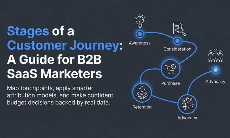
Organize touchpoints into journey stages. A practical framework for B2B SaaS includes Awareness, Consideration, Evaluation, Purchase, Onboarding, and Retention. These stages reflect the way buyers actually move through a decision, and they map naturally to the channels and interactions your team manages.
For each touchpoint, document three things: the channel where the interaction happens, the message or content the customer encountered, and the intended action you want them to take next. This three-part structure keeps the map actionable rather than purely descriptive. You are not just cataloging what exists; you are documenting what each touchpoint is supposed to accomplish.
As you build the map, distinguish between brand-controlled touchpoints and third-party touchpoints. Brand-controlled touchpoints include your ads, emails, website, product, and sales conversations. Third-party touchpoints include review platforms like G2 or Capterra, word-of-mouth referrals, analyst coverage, and community discussions. Both categories matter, but they require different optimization strategies. You can directly control the quality of a brand-controlled touchpoint. For third-party touchpoints, you influence them indirectly through the quality of your product and customer relationships.
Here's where your attribution data becomes especially useful. Flag any touchpoint where attribution data shows high engagement but low conversion. These are your experience gaps. High traffic to a pricing page with low demo requests, for example, suggests a messaging or friction problem at that specific touchpoint. Your map should make these gaps visible so they cannot be ignored. Using the right customer journey mapping tools can help your team surface these patterns more efficiently.
For format, a table or swimlane diagram works well for cross-functional teams. The visual structure matters less than the completeness of the information. What you want is a document that a sales leader, a product manager, and a demand generation marketer can all read and immediately understand their role in the customer experience.
Success indicator: Every major touchpoint is documented with its stage, channel, content or message, intended action, and current performance status based on your attribution data.
Step 4: Score Each Touchpoint on Experience Quality and Revenue Impact
Not all touchpoints deserve equal attention. This step gives you a principled way to prioritize where to invest your optimization efforts, based on data rather than gut feeling.
Rate each touchpoint on two dimensions. The first is experience quality: how well does this touchpoint serve the customer? Does it answer their questions, reduce friction, and move them forward with confidence? The second is revenue impact: how much does this touchpoint actually influence conversion or expansion?
For revenue impact scores, lean on your attribution data. Look at how often a touchpoint appears in the journeys of customers who converted, and compare that to how often it appears in journeys that stalled or churned. Touchpoints that consistently appear in winning journeys have high revenue impact. Touchpoints that are frequently visited but rarely associated with closed deals have low measured impact, which could mean they are genuinely low-value or that they are not being tracked properly.
For experience quality scores, draw on customer feedback, NPS data, and qualitative research from your interviews. You can also use behavioral signals like bounce rates, time on page, and scroll depth as proxies for experience quality on digital touchpoints. A page with high traffic but a very high bounce rate is likely delivering a poor experience relative to what visitors expected when they clicked through. A structured customer experience analysis gives you a repeatable framework for turning these signals into actionable scores.
Once you have scores for both dimensions, the prioritization logic becomes clear.
High revenue impact, low experience quality: These are your most urgent priorities. Customers are engaging with these touchpoints in their path to purchase, but the experience is letting them down. Improving these touchpoints has a direct line to conversion rate improvement.
High experience quality, low measured revenue impact: These touchpoints may be genuinely underperforming, or they may simply be under-tracked. Before deprioritizing them, verify that your tracking is capturing the full picture. If the tracking is solid and the impact is still low, consider whether the touchpoint is serving the wrong stage of the journey.
Low on both dimensions: These are candidates for elimination or significant redesign. Continuing to invest in touchpoints that neither serve customers well nor influence revenue is a resource drain.
Common pitfall: Scoring based on gut feeling rather than data. This consistently leads teams to optimize high-visibility touchpoints, like the homepage or a flagship ad campaign, that may have little actual revenue influence for the specific segment you are mapping.
Success indicator: A prioritized list of touchpoints ranked by the gap between their experience quality score and their revenue contribution score, with your highest-priority optimizations clearly identified.
Step 5: Identify Experience Gaps and Attribution Blind Spots
Your map is only as useful as the data behind it. This step is about auditing both the experience and the tracking infrastructure to make sure you are not optimizing based on an incomplete picture.
Start by looking for stages in the journey where you have no attribution data at all. This almost always signals a tracking gap rather than an absence of customer activity. If you have no data on what happens between a prospect downloading a content asset and requesting a demo two weeks later, that does not mean nothing happened. It means your tracking did not capture it.
Check whether your conversion events are firing correctly at each digital touchpoint. Browser-based pixels miss a growing share of events due to ad blockers, browser privacy restrictions, and cross-device journeys. Server-side tracking and Conversion API integrations address this by sending conversion data directly from your server to ad platforms, bypassing the limitations of client-side tracking. If you are relying solely on pixel-based tracking, you are likely undercounting touchpoint influence across your map.
Look for moments in the journey where customers drop off unexpectedly. These drop-off points often reveal brand experience inconsistencies: a disconnect between the promise made in an ad and the reality of the landing page, or a gap between what the sales team communicates and what the product actually delivers in onboarding. Attribution data can show you where drop-off happens; qualitative research tells you why.
Cross-reference your map with your attribution model to confirm you are capturing credit for all revenue-influencing touchpoints. If you are using a last-click model, you are almost certainly undervaluing mid-funnel touchpoints that warm prospects up before they convert. Understanding the full range of revenue attribution models gives you a more accurate picture of which interactions across the full journey are contributing to revenue.
Pay particular attention to common blind spots in B2B SaaS journeys: organic social interactions, direct traffic from word-of-mouth, event and conference touchpoints, and offline conversations between sales reps and prospects. These interactions often influence deals significantly but rarely show up in standard attribution reports.
Success indicator: Every touchpoint on your map either has a corresponding tracking event confirmed to be firing correctly, or has a documented reason why it cannot be tracked and a plan for how to account for its influence qualitatively.
Step 6: Build an Action Plan to Optimize High-Priority Touchpoints
A brand experience map that does not lead to action is just documentation. This step turns your insights into a concrete improvement plan with owners, deadlines, and measurable outcomes.
For each high-priority touchpoint identified in Step 4, define a specific improvement action. Vague intentions like "improve the demo page" do not move the needle. Specific actions do: "Rewrite the demo page headline to address the top objection surfaced in sales call recordings, with an A/B test launching by the end of the month." Every action should have an owner and a deadline.
Prioritize changes that improve both experience quality and tracking coverage simultaneously. When you improve a touchpoint's experience and fix its tracking at the same time, you get better conversion data and better attribution data in one effort. This compounds the value of the work.
For ad touchpoints, use enriched conversion data to improve targeting and creative relevance. When your ad platform receives accurate, detailed conversion signals, its optimization algorithms can identify and reach more of the right buyers. This is where server-side tracking and Conversion API integrations directly improve campaign performance, not just reporting accuracy. Teams looking to sharpen their approach can benefit from reviewing proven tips to improve ad performance alongside their touchpoint optimization work.
For website touchpoints, align messaging to the specific stage of the journey the visitor is in. A prospect in the Awareness stage needs different messaging than one who has already attended a demo and is in the Evaluation stage. If your website delivers the same message to everyone regardless of where they are in the journey, you are leaving conversion on the table.
For post-sale touchpoints, ensure that onboarding and expansion conversations are tracked and connected to revenue outcomes. Retention and expansion are often the highest-value parts of a B2B SaaS revenue model, but they are frequently the least instrumented. Connecting onboarding completion rates, feature adoption milestones, and customer success interactions to expansion revenue gives you a complete picture of what drives long-term value.
Success indicator: A documented action plan with at least three high-priority improvements assigned to specific team members, with clear deadlines and defined success metrics for each.
Putting Your Brand Experience Map Into Practice
Building the map is the beginning, not the end. The real value comes from using it as a living document that evolves as your attribution data reveals new patterns in customer behavior.
Review your brand experience map quarterly alongside your attribution reports. As you implement the optimizations from your action plan, your attribution data will show whether those changes are moving the needle. Touchpoints that improve in experience quality should start showing up more consistently in winning customer journeys. If they do not, that is a signal to dig deeper into why.
Share the map cross-functionally. When sales, marketing, and product teams all have visibility into the full customer journey, they can make better decisions about how their work contributes to or detracts from the overall experience. A sales team that understands which ad campaigns are warming up their prospects can have more relevant conversations. A product team that sees where onboarding drop-off is happening can prioritize the right improvements.
Use a platform like Cometly as the data backbone for your map. Cometly connects ad platform data, CRM events, and conversion tracking into a single view, giving you the multi-touch attribution data you need to keep your map grounded in reality. As new customer journeys complete and new patterns emerge, your map should reflect what the data is telling you, not what you assumed when you first built it.
Here is a quick-start checklist to confirm you have completed each step: scope defined with a one-sentence statement, real data gathered from attribution and CRM sources, touchpoints mapped across all journey stages, experience quality and revenue impact scores assigned, gaps and blind spots identified and documented, and an action plan built with owners and deadlines.
A brand experience map without attribution data is a hypothesis. With attribution data, it becomes a revenue strategy. The difference is the data layer, and that data layer is what separates teams that optimize based on intuition from teams that optimize based on evidence.
Your Next Steps
Building a brand experience map is a six-step process that moves from defining your scope to taking action on your highest-priority touchpoints. Start with a specific segment and a clear scope. Gather real data from your attribution tools, CRM, and customer interviews. Map every touchpoint across the full journey. Score each touchpoint on experience quality and revenue impact. Identify the gaps in both experience and tracking. Then build an action plan that assigns specific improvements to specific people.
The teams that get the most value from this process are the ones who treat it as an ongoing practice rather than a one-time project. Every quarter, your attribution data will surface new insights about which touchpoints are influencing revenue and which are falling short. Your map should reflect those insights.
Your six-step checklist:
1. Define scope and audience segment
2. Gather attribution and qualitative data
3. Map touchpoints across all journey stages
4. Score touchpoints on experience quality and revenue impact
5. Identify experience gaps and attribution blind spots
6. Build an action plan with owners and deadlines
Ready to connect every touchpoint in your brand experience map to real revenue data? Get your free demo and see how Cometly captures every interaction across your customer journey, from the first ad click to closed-won revenue, so your brand experience map is always backed by the data it needs to drive real decisions.