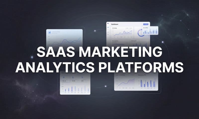
Raw marketing data is everywhere. You've got ad metrics in Google Ads, engagement stats in Meta, pipeline data in your CRM, and website behavior in GA4. But staring at spreadsheets full of numbers rarely tells you what's actually working. The real question isn't whether you have enough data. It's whether you can see it clearly enough to act on it.
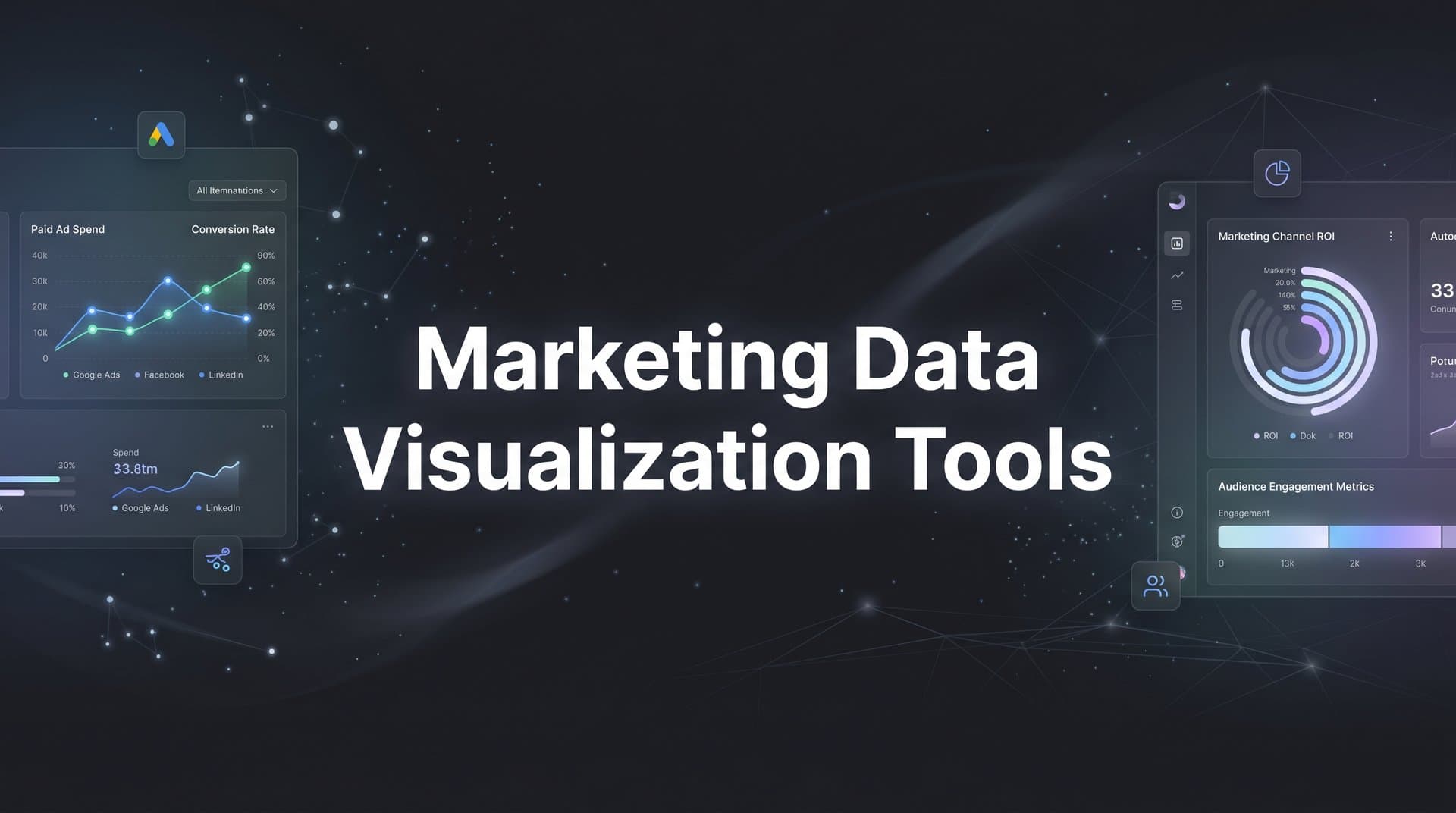
That's where marketing data visualization tools come in. The right platform transforms scattered metrics into dashboards, attribution reports, and performance charts that reveal the story behind your ad spend. Whether you're a solo marketer trying to prove ROI or an agency managing dozens of client campaigns, the tools below were selected for their marketing-specific features, integration depth, ease of use for non-technical teams, and real-time data capabilities.
Here are the top marketing data visualization tools worth considering in 2026.
1. Cometly
Best for: Marketers who need attribution-driven visualization connecting ad spend to actual revenue
Cometly is an AI-powered marketing attribution and analytics platform that visualizes the full customer journey, from the first ad click all the way through to closed revenue.
 10 Best Marketing Data Visualization Tools in 2026
Where This Tool Shines
Most visualization tools show you what happened. Cometly shows you why it happened and what to do next. Its multi-touch attribution dashboards connect every touchpoint in the customer journey to actual conversions, so you can see which ads, channels, and campaigns are genuinely driving revenue rather than just generating clicks.
What sets Cometly apart from general BI tools is its focus on signal accuracy. Server-side tracking addresses the data gaps created by iOS privacy changes and cookie deprecation, giving you a cleaner, more complete picture of campaign performance. Pair that with AI-powered recommendations and you're not just visualizing data, you're getting direction on where to scale and where to cut.
Key Features
Multi-Touch Attribution Dashboards: Visualize which ads and channels contribute to conversions across the full customer journey, with multiple attribution model comparisons.
AI-Powered Recommendations: The AI Ads Manager analyzes campaign performance and surfaces recommendations for scaling high-performing campaigns and pausing underperformers.
Server-Side Tracking: Captures conversion data accurately even when browser-based tracking fails due to ad blockers, iOS restrictions, or cookie limitations.
Conversion Sync: Feeds enriched, conversion-ready event data back to Meta, Google, and TikTok so their algorithms can optimize toward better-quality signals.
AI Chat: Query your marketing data in natural language without needing to build custom reports or know SQL.
Best For
Cometly is built for digital marketers and growth teams running paid campaigns across multiple platforms who need to go beyond surface-level metrics. It's particularly valuable for teams frustrated by attribution gaps caused by iOS changes or cookie loss, and for anyone who wants AI-driven guidance alongside their performance data.
Pricing
Custom pricing based on ad spend and feature requirements. A free demo is available to explore the platform before committing.
2. Looker Studio
Best for: Marketers who need free, flexible dashboards connected to Google's ecosystem
Looker Studio is Google's free data visualization platform that turns data from Google Ads, GA4, Search Console, and hundreds of third-party sources into shareable, interactive reports.
 9 Best Client Reporting Dashboard Software Tools in 2026
Where This Tool Shines
For teams already living inside Google's ecosystem, Looker Studio is a natural starting point. The native connectors for Google Ads, GA4, BigQuery, and Sheets mean you can pull your most critical marketing data without any setup friction. Building a campaign performance dashboard takes minutes, not days.
The community connector library extends Looker Studio well beyond Google properties. You can connect Facebook Ads, LinkedIn, HubSpot, and dozens of other platforms through third-party connectors, though the quality and reliability of those connectors varies. The ability to share and embed interactive reports makes it a solid choice for client-facing work on a budget.
Key Features
Completely Free: Unlimited reports, unlimited dashboards, and unlimited sharing at no cost.
Native Google Integrations: Direct connectors for Google Ads, GA4, Search Console, BigQuery, and Google Sheets with no middleware required.
800+ Community Connectors: Extend data coverage to third-party platforms, though connector quality varies by provider.
Shareable Interactive Reports: Reports can be shared via link or embedded into websites and client portals.
Template Gallery: Pre-built dashboard templates for common marketing use cases accelerate setup.
Best For
Freelancers, small marketing teams, and agencies that primarily work within Google's ad ecosystem. Also a strong choice as a free visualization layer when paired with a data pipeline tool like Supermetrics or Funnel.io.
Pricing
Completely free with no usage limits on reports or dashboards.
3. Tableau
Best for: Enterprise teams that need advanced data exploration and complex visualizations
Tableau is an industry-leading business intelligence platform known for its powerful drag-and-drop visualization engine and deep analytical capabilities.
 10 Best Marketing Data Visualization Tools in 2026
Where This Tool Shines
Tableau earns its reputation in environments where data complexity is high. Its visualization engine handles dozens of chart types, and the ability to create calculated fields, use Level of Detail expressions, and apply statistical modeling makes it a genuine analytical powerhouse. For enterprise marketing teams working with large datasets or complex multi-source data, Tableau can surface insights that simpler tools miss.
The learning curve is real, though. Getting the most out of Tableau typically requires someone comfortable with data modeling concepts. That said, Tableau Prep helps with data cleaning and transformation before it hits your dashboards, and Tableau Public offers a free option for teams that want to publish dashboards externally.
Key Features
Drag-and-Drop Visualization Engine: Dozens of chart types with a visual interface that makes complex visualizations accessible to non-developers.
Advanced Analytics: Calculated fields, LOD expressions, and built-in statistical modeling for deeper data exploration.
Tableau Prep: Data preparation and transformation tool for cleaning and shaping data before visualization.
Enterprise Governance: Robust permissions, row-level security, and data governance features for large teams.
Tableau Public: Free option for creating and publishing dashboards to a public audience.
Best For
Enterprise marketing teams and data analysts who need sophisticated visualization and are comfortable investing time in setup and training. Less ideal for small teams that need fast, out-of-the-box marketing dashboards.
Pricing
Tableau Viewer starts at $15 per user per month. Creator licenses start at $75 per user per month. Enterprise pricing is available for larger deployments.
4. Databox
Best for: Marketing teams and agencies that need real-time KPI dashboards with minimal setup
Databox is a real-time KPI dashboard platform with 100+ one-click integrations, pre-built marketing templates, and automated performance alerts designed for marketers who want fast answers without technical overhead.
 9 Best Ad Platform Reporting Tools to Sharpen Your Campaign Insights in 2026
Where This Tool Shines
Databox is built for speed. The combination of one-click integrations, pre-built templates, and a mobile app means you can have a working marketing dashboard in under an hour. For agencies managing multiple client accounts, the ability to set goal-based alerts means you get notified when something goes off track rather than discovering it during a weekly review.
The benchmarking feature is a genuinely useful differentiator. It lets you compare your performance metrics against anonymized industry peers, giving context to your numbers that most visualization tools simply don't offer.
Key Features
100+ Native Integrations: Covers HubSpot, Google Ads, Facebook Ads, Shopify, and many other common marketing platforms with one-click setup.
Pre-Built Templates: Ready-to-use dashboard templates for common marketing scenarios reduce setup time significantly.
Goal Tracking and Alerts: Set KPI targets and receive automated alerts when performance dips below threshold.
Mobile App: Real-time push notifications and dashboard access on iOS and Android.
Benchmarking: Compare your metrics against anonymized industry data to understand relative performance.
Best For
Marketing managers and agency teams who need fast, reliable KPI visibility across multiple platforms without needing a data engineer to set things up. Great for teams that want proactive alerts rather than reactive reporting.
Pricing
A free plan is available with limited connections. Paid plans start at $47 per month, scaling with the number of data sources and users.
5. Klipfolio (PowerMetrics)
Best for: Teams that want to standardize and govern marketing KPIs across the organization
Klipfolio is a metric-centric analytics platform that lets marketing teams define, standardize, and visualize KPIs with flexible data modeling and self-serve dashboards.
 9 Best Centralized Marketing Analytics Dashboards in 2026
Where This Tool Shines
Klipfolio's PowerMetrics product takes a different approach than most dashboard tools. Rather than just connecting data and building charts, it asks you to define what your metrics actually mean before you visualize them. That metric catalog approach ensures everyone on the team is working from the same definitions, which matters more than it sounds when marketing, sales, and leadership are all pulling different numbers from different places.
The self-serve exploration capability lets team members slice and filter data without touching the underlying dashboard structure, which reduces the bottleneck on whoever owns the reporting function.
Key Features
PowerMetrics Catalog: Define, standardize, and govern marketing metrics so the entire team works from consistent definitions.
Self-Serve Exploration: Team members can explore and filter data without breaking shared dashboards or requiring admin involvement.
130+ Data Connectors: Pre-built connections to marketing platforms, CRMs, and ad networks.
Custom Metric Formulas: Blend data from multiple sources and create calculated metrics tailored to your business.
TV Dashboard Mode: Display dashboards on office screens for team-wide visibility into live performance.
Best For
Marketing operations teams and RevOps professionals who want to build a single source of truth for marketing metrics across departments. Particularly useful in organizations where metric definitions are inconsistent across teams.
Pricing
A free tier is available. Paid plans start at $125 per month, with pricing scaling based on users and data volume.
6. Whatagraph
Best for: Agencies that need automated, white-label multi-channel marketing reports
Whatagraph is a multi-channel marketing reporting platform built specifically for agencies, with automated report generation, cross-channel data blending, and branded client delivery.
 9 Best Tools for Tracking Ad Spend in 2026
Where This Tool Shines
Whatagraph is purpose-built for the agency workflow. The combination of 45+ native marketing integrations, automated report scheduling, and white-label delivery means you can produce polished, branded client reports without rebuilding them from scratch each month. Cross-channel data blending lets you combine metrics from paid search, social, SEO, and email into a single view without manual data wrangling.
For agencies that have outgrown Looker Studio templates and need something that looks professional without requiring a design team, Whatagraph hits a practical sweet spot between capability and time investment.
Key Features
45+ Native Integrations: Covers paid ads, SEO, social media, and email platforms with direct connections.
Cross-Channel Data Blending: Combine metrics from multiple platforms into unified widgets and reports.
Automated Report Scheduling: Set reports to deliver automatically via email on a daily, weekly, or monthly cadence.
White-Label Delivery: Apply custom logos, brand colors, and domains to every client-facing report.
BigQuery Export: Transfer raw data to BigQuery for teams that need a warehouse layer alongside their reports.
Best For
Digital marketing agencies managing multiple client accounts that need to produce consistent, branded performance reports at scale without heavy manual effort each reporting cycle.
Pricing
Starts at $199 per month for the Professional plan. Pricing scales based on the number of data sources and users.
7. Microsoft Power BI
Best for: Organizations in the Microsoft ecosystem that need enterprise BI at an accessible price
Microsoft Power BI is a full-featured business intelligence suite with interactive dashboards, natural language querying, and deep integration across the Microsoft 365 stack.
 10 Best Marketing Data Visualization Tools in 2026
Where This Tool Shines
For organizations already running on Microsoft infrastructure, Power BI is a natural fit. Its integration with Excel, SharePoint, Teams, and Azure data services means marketing data can flow into dashboards that connect directly to the tools the broader business already uses. The DAX formula language gives data-savvy marketers significant control over calculations and data modeling.
The natural language Q&A feature lets users ask questions of their data in plain English, which lowers the barrier for non-technical stakeholders who need to pull quick answers without building a report. Power BI Desktop being free also makes it easy to explore before committing to Pro licenses.
Key Features
DAX Formula Language: Advanced calculation and data modeling capabilities for complex marketing metrics and custom aggregations.
Natural Language Q&A: Ask questions of your data in plain English and receive visual answers without building custom reports.
Microsoft 365 Integration: Native connections to Excel, SharePoint, Teams, and Azure data services.
Paginated Reports: Pixel-perfect printable reports for situations where formatted output matters.
Power BI Desktop: Free desktop application for building and testing reports before publishing to the cloud service.
Best For
Enterprise marketing teams and organizations that are heavily invested in the Microsoft ecosystem. Also a strong choice for teams with a data-savvy analyst who can leverage DAX for advanced reporting without the cost of Tableau.
Pricing
Power BI Desktop is free. Pro licenses are $10 per user per month. Premium capacity starts at $20 per user per month with additional enterprise features.
8. AgencyAnalytics
Best for: Digital marketing agencies that need an all-in-one client reporting and SEO dashboard platform
AgencyAnalytics is an all-in-one reporting platform built for digital marketing agencies, combining SEO, PPC, social, email, and call tracking dashboards with client-facing portals.
Where This Tool Shines
AgencyAnalytics stands out by bundling built-in SEO tools alongside its reporting capabilities. The rank tracker, site auditor, and backlink monitor mean agencies don't need a separate SEO platform just to include organic performance data in client dashboards. That consolidation alone can justify the cost for agencies managing both paid and organic campaigns.
The white-label client portal gives each client their own branded login to view live dashboards, which reduces the back-and-forth of sending monthly PDF reports and gives clients a sense of transparency that builds trust over time.
Key Features
80+ Marketing Integrations: Spans SEO, PPC, social media, email marketing, review platforms, and call tracking.
White-Label Client Portals: Each client gets a branded login to access their own live performance dashboards.
Built-In SEO Tools: Rank tracker, site auditor, and backlink monitor included without requiring a separate subscription.
Automated Report Scheduling: Drag-and-drop report builder with automated delivery on a set schedule.
Staff and Client Permissions: Granular access controls for managing multiple accounts and team members.
Best For
Full-service digital marketing agencies that manage both paid and organic campaigns and want a single platform for client reporting, SEO monitoring, and performance dashboards without stitching together multiple tools.
Pricing
Starts at $79 per month for up to five client campaigns. Pricing scales with the number of campaigns and additional features.
9. Supermetrics
Best for: Marketing teams that need a reliable data pipeline to feed their preferred visualization tool
Supermetrics is a marketing data pipeline tool that extracts data from 100+ platforms and delivers it to your preferred visualization or storage destination.
Where This Tool Shines
Supermetrics occupies a specific and valuable niche: it's not a visualization tool itself, but it makes your visualization tool dramatically more powerful. By handling the data extraction and delivery from platforms like Meta, Google, LinkedIn, and TikTok, Supermetrics lets you focus on analysis rather than data wrangling. If you've ever spent hours manually exporting CSVs from ad platforms to paste into a Looker Studio report, Supermetrics eliminates that entirely.
The query manager lets you build custom data pulls without writing SQL, which keeps it accessible for marketing teams that want control over their data without needing engineering support.
Key Features
100+ Marketing Platform Connectors: Covers Meta, Google, LinkedIn, TikTok, HubSpot, and many more advertising and analytics platforms.
Flexible Destinations: Delivers data to Looker Studio, Google Sheets, Excel, BigQuery, Snowflake, and other destinations.
Automated Data Refresh: Scheduled data pulls keep dashboards current without manual intervention.
Query Manager: Build custom data pulls and apply filters without writing SQL or code.
Data Blending and Transformation: Combine and reshape data from multiple sources before it reaches your visualization layer.
Best For
Marketing analysts and teams that have already chosen a visualization tool like Looker Studio, Tableau, or Power BI and need a reliable, automated way to get clean marketing data into it without manual exports or custom API work.
Pricing
Starts at $29 per month per destination. Pricing scales based on the number of connectors, destinations, and data volume.
10. Funnel.io
Best for: Mid-market and enterprise teams that need a centralized data hub for 500+ marketing sources
Funnel.io is an automated marketing data hub that collects, maps, and transforms data from 500+ sources, preparing it for clean visualization in any BI tool or data warehouse.
Where This Tool Shines
Funnel.io operates at a level of data coverage that most pipeline tools can't match. With 500+ connectors and built-in data normalization, it handles the messy reality of marketing data at scale: different platforms call the same metric different things, currencies vary across markets, and cost data rarely lines up cleanly. Funnel.io addresses all of that before your data ever reaches a dashboard.
The built-in data explorer gives teams a quick visualization layer for sanity-checking data before it gets pushed to Looker Studio, Power BI, or Tableau. For teams managing large advertising budgets across global markets, the currency conversion and cost standardization features alone can save significant time.
Key Features
500+ Data Connectors: Covers advertising, analytics, CRM, and e-commerce platforms at a scale few competitors match.
Automatic Data Mapping and Normalization: Standardizes metric names and formats across platforms with different naming conventions.
Currency Conversion and Cost Standardization: Handles multi-currency campaigns and normalizes cost data across platforms automatically.
Flexible Export Destinations: Sends clean data to Looker Studio, Power BI, Tableau, BigQuery, and Snowflake.
Data Explorer: Built-in visualization layer for quick data review before pushing to your primary BI tool.
Best For
Mid-market and enterprise marketing teams running large, multi-platform, multi-market campaigns that need a robust data foundation before visualization. The pricing reflects this positioning: it's built for teams where data quality at scale is a business-critical requirement.
Pricing
Custom pricing. Typically starts around $1,000 per month for mid-market teams, making it best suited for organizations with significant advertising scale.
Which Tool Is Right for Your Team
The right marketing data visualization tool depends less on which platform has the most features and more on what your team actually needs to see and who needs to see it.
If attribution clarity is the priority and you need to know which specific ads and channels are driving revenue rather than just traffic, Cometly is the strongest choice. It goes beyond visualization to give you accurate attribution data, AI-powered recommendations, and conversion sync that feeds better signals back to ad platform algorithms. For teams struggling with signal loss from iOS changes or cookie deprecation, that combination of server-side tracking and multi-touch attribution is genuinely difficult to replicate with a general BI tool.
For agencies focused on client reporting, Whatagraph and AgencyAnalytics are the most purpose-built options. Whatagraph excels at multi-channel blending and automated white-label delivery. AgencyAnalytics adds built-in SEO tools that reduce the need for a separate platform.
Enterprise teams with complex data needs and in-house analysts will find Tableau and Microsoft Power BI the most capable, especially Power BI for organizations already running on Microsoft infrastructure.
Budget-conscious teams should start with Looker Studio, particularly if Google Ads and GA4 are your primary data sources. Pair it with Supermetrics to pull in third-party platform data automatically.
And if your challenge is data quality at scale across hundreds of sources and global markets, Funnel.io builds the clean data foundation that makes every visualization tool downstream more reliable.
Attribution is where most marketing visualization setups fall short. Dashboards look impressive until you realize they're showing you clicks and impressions rather than the revenue those clicks actually generated. If you're ready to build dashboards that connect ad spend to real outcomes, Get your free demo of Cometly and see what attribution-driven visualization actually looks like in practice.