
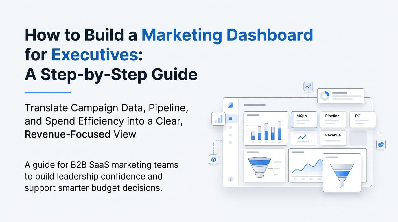
Executives don't have time to dig through spreadsheets or toggle between ad platforms to understand marketing performance. They need a single view that answers one question fast: is marketing driving revenue?
A well-built executive marketing dashboard delivers exactly that. It translates campaign data, pipeline contribution, and spend efficiency into a clear, decision-ready format that leadership can act on in minutes.
For B2B SaaS marketing teams, the stakes are especially high. Budget cycles, board meetings, and growth planning all hinge on whether leadership trusts the marketing numbers. If your dashboard is cluttered, inconsistent, or disconnected from revenue data, it creates doubt rather than confidence.
This guide walks you through how to build a marketing dashboard for executives that earns trust and drives smarter decisions. You will learn how to define what executives actually want to see, which metrics belong on the dashboard and which ones belong elsewhere, how to connect your data sources for accuracy, and how to structure the layout for maximum clarity.
Whether you are building from scratch or rebuilding a dashboard that has stopped being useful, these steps give you a repeatable framework. By the end, you will have a dashboard that does not just report on marketing activity but connects every dollar of ad spend to pipeline and closed revenue.
Step 1: Define What Executives Actually Need to See
Here is where most marketing teams go wrong: they build dashboards that mirror their internal reporting instead of answering leadership questions. The result is a dashboard that gets opened once and then ignored.
Executives operate at the outcome level. They are not interested in click-through rates or impression share. They want to know whether marketing is generating pipeline, how efficiently the budget is being spent, and whether those investments are translating into closed revenue. Your dashboard needs to answer those questions before it answers anything else.
Start by identifying the three to five questions your leadership team asks most often about marketing performance. These questions are your dashboard's entire reason for existing. Common ones in B2B SaaS environments include:
Pipeline contribution: How much pipeline did marketing generate this quarter, and which channels drove it?
Customer acquisition cost: What are we paying to acquire a customer, and is that trending in the right direction?
Revenue attribution: Which campaigns and channels are contributing to closed-won revenue?
Spend efficiency: Are we getting a positive return on our marketing investment across channels?
Before you touch any data or tool, interview your key stakeholders. Schedule 20-minute conversations with your CEO, CFO, or VP of Sales and ask them directly: what marketing data do you currently lack, and what numbers do you distrust? Their answers will shape every decision downstream, from metric selection to layout to data sourcing.
This step also requires you to draw a clear line between executive-level metrics and operational metrics. Executives need revenue attribution, pipeline contribution, and CAC. Marketers need CTR, CPL, and impression share. These belong on separate dashboards. Mixing them together dilutes the executive view and forces leadership to sort through information that is not relevant to their decisions.
Think of it this way: your executive dashboard is a summary of business outcomes. Your operational dashboards are where your marketing team manages the work. They serve different audiences with different needs, and they should look completely different.
Success indicator: Before you open any dashboard tool or pull any data, you can write down the top five questions your executive dashboard will answer. If you cannot do that, you are not ready to build yet.
Step 2: Choose the Right Metrics for Executive Reporting
Once you know the questions your dashboard needs to answer, the next step is selecting the metrics that answer them. This sounds straightforward, but it is one of the most common places teams get it wrong.
The temptation is to include everything. If a metric is available, it feels like it should be on the dashboard. Resist that instinct. Cognitive overload is one of the primary reasons dashboards go unused. When executives see fifteen metrics, they read zero of them carefully. When they see eight, they actually engage.
Limit your executive marketing dashboard to eight to ten metrics maximum. Every metric that makes the cut should connect directly to a budget or growth decision that leadership makes regularly. If you cannot articulate why a metric belongs, it belongs in a channel-level report instead.
Here are the core executive marketing metrics for B2B SaaS that consistently earn their place on the dashboard:
Marketing-sourced pipeline: The total pipeline value generated by marketing, broken down by channel and campaign. This is the most direct measure of marketing's contribution to the business.
Marketing-influenced revenue: Closed revenue where marketing had at least one touchpoint in the customer journey. This is distinct from sourced pipeline and gives executives a fuller picture of marketing's role.
Customer acquisition cost (CAC): Total marketing spend divided by the number of new customers acquired in a given period. Trend this quarter over quarter so leadership can see whether efficiency is improving.
Return on ad spend (ROAS): Revenue generated per dollar of paid media investment. This gives executives a ratio they can benchmark and compare across periods.
Lead-to-opportunity conversion rate: The percentage of marketing-generated leads that convert to qualified opportunities. This connects marketing volume to sales quality.
Pipeline velocity: How quickly deals are moving through the pipeline. For B2B SaaS, where buying cycles are longer and involve multiple touchpoints, this metric connects marketing activity to revenue timelines.
One more critical decision: your attribution model. Executives need to understand whether the numbers they are seeing reflect first-touch, last-touch, or multi-touch attribution. Pick one model as the primary view and stay consistent with it. Switching attribution models between reporting periods makes trend analysis impossible and erodes trust fast. Document your choice and stick to it.
Success indicator: Each metric on your list can be tied directly to a specific budget or growth decision. If a metric cannot pass that test, it does not belong on the executive dashboard.
Step 3: Connect Your Data Sources for a Single Source of Truth
This is where the technical work happens, and it is the step that determines whether your dashboard is trustworthy or not. The biggest reason executive dashboards fail is data fragmentation. When ad platform data, CRM data, and website data live in separate tools, the numbers rarely align and executives lose confidence quickly.
Start by mapping every data source you need to connect:
Paid ad platforms: Meta Ads, Google Ads, LinkedIn Ads, and any other channels where you are running paid campaigns. These are your spend and campaign performance sources.
CRM: HubSpot, Salesforce, or whichever system your sales team uses to track leads, opportunities, and closed revenue. This is your pipeline and revenue source.
Website analytics: Session data, traffic sources, and on-site conversion events that bridge ad clicks to CRM entries.
Revenue and billing data: Stripe or your billing platform, which provides actual closed revenue that can be matched against marketing attribution data.
Once you have mapped your sources, you face a critical technical decision: how do you collect and unify this data accurately? Browser-based tracking alone is no longer sufficient. Ad blockers, cookie restrictions, and privacy changes mean a meaningful portion of conversions never get recorded by pixel-based tracking. Server-side tracking and Conversion API integrations, such as Meta's Conversion API and Google's Enhanced Conversions, capture conversion data at the server level, bypassing browser limitations and significantly improving accuracy.
First-party data collection is the foundation of a reliable executive dashboard. When your conversion events are tied to the original traffic source through server-side tracking, revenue can be attributed back to the correct campaign and channel with confidence.
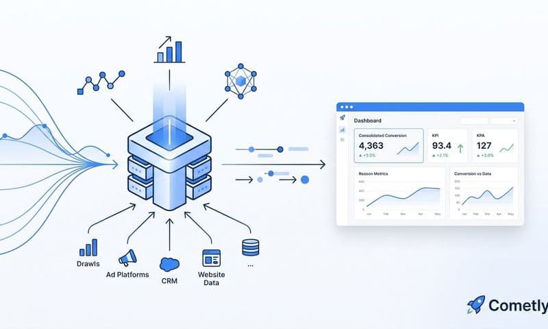
This is where a marketing attribution platform becomes essential. Cometly connects ad platforms, CRM data, and revenue data in one place, giving you a complete view of the customer journey from first ad click to closed-won revenue. Instead of manually reconciling numbers across tools, you have a unified data layer that keeps your pipeline and revenue figures consistent and accurate.
A common pitfall here is relying on ad platform native reporting for revenue attribution. Each platform takes independent credit for conversions, which means your total attributed revenue across platforms will often exceed your actual revenue. A unified attribution platform de-duplicates conversions and normalizes data across channels, so the numbers in your executive dashboard match what your CRM and finance team report.
Success indicator: Your pipeline and revenue figures in the dashboard match what your CRM and finance team report, with clear attribution to the channels and campaigns that drove them. If they do not match, your data layer needs more work before the dashboard goes to leadership.
Step 4: Structure the Dashboard Layout for Clarity
You can have the right metrics and perfectly unified data, but if the layout is confusing, executives will not use the dashboard. Structure determines whether leadership actually engages with what you built.
Follow a top-down hierarchy: start with the highest-level business metrics, then layer in channel and campaign detail below. This mirrors how executives think. They want the headline first, then context if they need it.
Top section (above the fold): This is the most important real estate on the dashboard. Include total marketing-sourced pipeline, total marketing-influenced revenue, overall CAC, and ROAS for the current period compared to the prior period. Executives should be able to assess overall marketing performance in under 30 seconds just from this section. If they have to scroll to understand whether marketing is on track, the layout needs to change.
Middle section: A channel-level breakdown showing pipeline and revenue contribution by source, such as paid search, paid social, and organic. Critically, include spend alongside revenue so the efficiency ratio is immediately visible. Executives should not have to do mental math to understand which channels are performing.
Bottom section: Campaign-level performance for the top-performing and underperforming campaigns. This gives executives context if they want to drill deeper, without forcing them to wade through campaign data to get the headline numbers.
Visual hierarchy matters as much as content hierarchy. Use large numbers for primary KPIs so they are immediately scannable. Add trend arrows for period-over-period change so direction is clear at a glance. Use color coding, green for on-target and red for off-target, to draw attention to what needs discussion without requiring executives to read every number carefully.
Avoid chart overload. Limit yourself to two or three charts per section. Bar charts work well for channel comparisons. Line charts work well for trend data over time. More than that and the dashboard starts to feel like a report rather than a decision tool.
Include a date range selector so executives can toggle between weekly, monthly, and quarterly views without needing to request a new version of the report. This small feature dramatically increases how often the dashboard gets used.
Success indicator: A first-time viewer can understand the overall marketing performance story within 60 seconds of opening the dashboard. If you need to explain it, the layout needs refinement.
Step 5: Set Up Automated Reporting and Alerts
A dashboard only delivers value if it stays current and reaches the right people consistently. The best-designed dashboard in the world fails if executives have to remember to log in to check it. Automation solves this problem.
Start with a scheduled weekly email summary. This should pull the top five metrics from the dashboard and highlight any significant changes from the prior week. Keep it short and scannable: five to seven lines, no charts, just the numbers that matter and a brief note on anything that changed significantly. Executives read this in 90 seconds and stay informed without needing to open the full dashboard every week.
Next, set up performance alerts for threshold breaches. These are the early warning signals that let leadership act before problems compound. Useful alert triggers for B2B SaaS marketing include:
CAC spike alert: Notify when customer acquisition cost rises above a defined threshold, which signals that spend efficiency is declining.
Pipeline drop alert: Notify when weekly marketing-sourced pipeline falls below your target, giving the team time to course-correct before the month closes.
ROAS floor alert: Notify when return on ad spend drops below your break-even point, which indicates that paid campaigns are no longer generating positive returns.
Real-time data accuracy is especially important during high-spend periods like product launches or major campaign pushes. Cometly provides real-time insights into ad performance, which means your executive dashboard reflects current data rather than a delayed export. When you are spending aggressively, waiting 24 hours for data is not acceptable.
Beyond automation, establish a cadence for dashboard review. Many B2B SaaS teams anchor a monthly executive marketing review around the dashboard. This creates accountability, keeps marketing aligned with revenue goals, and gives leadership a predictable rhythm for evaluating marketing performance.
The common pitfall here is building the dashboard and then never establishing that review rhythm. Without a cadence, dashboards drift out of date, executives stop checking them, and the whole system loses its value over time.
Success indicator: Executives receive automated updates on schedule, and at least one business decision per month is traceable back to insights from the dashboard. If that is not happening, revisit the delivery mechanism and the review cadence.
Step 6: Validate Accuracy and Build Executive Trust
Before you share the dashboard with leadership, validate every number against your source systems. This step is not optional. Presenting an executive dashboard with inaccurate numbers is worse than presenting no dashboard at all, because it actively damages your credibility and makes leadership skeptical of future marketing reporting.
Start with a reconciliation check. Compare marketing-sourced pipeline in the dashboard against your CRM. Compare revenue attribution against your finance records. Run this check for at least two prior reporting periods. If the dashboard numbers align with what leadership already knows to be true, it builds immediate credibility before you even present it.
Document your attribution methodology. Executives will ask how the numbers are calculated, especially if the figures differ from what they have seen in ad platform reports. Prepare a one-page explanation that covers your attribution model, data sources, and any known limitations. This document prevents confusion and signals that your team has thought rigorously about the data.
Address discrepancies openly rather than hoping no one notices them. If your dashboard shows different numbers than Meta Ads Manager or Google Ads, explain why. Ad platform reporting overcounts conversions because each platform attributes independently, without accounting for overlap with other channels. Your unified attribution view is more accurate because it de-duplicates conversions across the entire customer journey. Explaining this proactively builds trust rather than creating suspicion.
Before rolling out the dashboard as the official source of truth, present it in a live walkthrough with your executive team. Walk through each section, explain what each metric represents and how it is calculated, and invite questions. This gives leadership a chance to surface concerns early and creates buy-in that makes the dashboard stick.
Success indicator: After two consecutive reporting periods, executives reference the dashboard in meetings without prompting and use it to inform budget decisions. That level of adoption is the clearest signal that the dashboard has earned its place as the single source of truth for marketing performance.
Putting It All Together
Building an executive marketing dashboard is not a one-time project. It is an ongoing system that evolves as your business grows and your marketing mix changes.
The six steps in this guide give you a repeatable framework: start with executive questions, choose outcome-focused metrics, unify your data sources, structure for clarity, automate delivery, and validate for accuracy. When done well, the dashboard becomes the single source of truth that aligns marketing, sales, and finance around shared revenue goals.
For B2B SaaS teams looking to accelerate this process, Cometly provides the attribution infrastructure that makes accurate executive dashboards possible. By connecting ad platform data, CRM events, and revenue data in one place, Cometly eliminates the manual reconciliation that slows most teams down and erodes leadership trust.
Use this quick-start checklist before you launch:
1. Define the top five executive questions your dashboard will answer.
2. Select eight to ten outcome-focused metrics tied to business decisions.
3. Connect all data sources through a unified attribution platform.
4. Structure the layout with a top-down hierarchy, starting with revenue and pipeline.
5. Automate weekly delivery and set performance alerts for threshold breaches.
6. Validate numbers against source systems before presenting to leadership.
Ready to build a dashboard executives will actually use? Get your free demo today and connect your entire marketing stack in one place so every dollar of ad spend traces back to pipeline and closed revenue.