You've just secured coverage in three major industry publications, a podcast interview, and two social media features. Fantastic news—except now you're scrambling through email threads, Slack messages, and browser bookmarks trying to remember which journalist wrote what, when it published, and whether you even captured the links. Sound familiar?
Without a structured system, media coverage tracking becomes a chaotic mess. Important mentions get forgotten, you can't demonstrate PR impact to leadership, and connecting coverage to actual business results feels impossible. The solution isn't complicated: a well-designed spreadsheet template that captures every piece of coverage in one organized place.
This guide walks you through building a media coverage tracking spreadsheet from scratch, with the essential columns you need to turn scattered mentions into actionable insights. Whether you're tracking earned media for a product launch or monitoring ongoing brand mentions across channels, you'll have a functional template ready to use in under 30 minutes. Let's build something that actually works.
Step 1: Set Up Your Spreadsheet Foundation and Core Identification Columns
Open Google Sheets or Excel and create a new spreadsheet. Name it with a clear convention that makes it easy to find later: "Media Coverage Tracker - [Your Brand] - 2026" works perfectly. This naming structure becomes crucial when you're managing multiple years or campaigns.
Start by freezing your top row immediately—go to View > Freeze > 1 row in Google Sheets, or View > Freeze Panes > Freeze Top Row in Excel. This keeps your column headers visible as you scroll through dozens or hundreds of coverage entries. Trust me, you'll appreciate this small step when you're reviewing months of data.
Now create your first essential column: Unique ID. This is simply a sequential number (1, 2, 3...) that gives each piece of coverage a permanent identifier. Even if you sort or filter your data later, the Unique ID ensures you can always reference a specific entry. Label cell A1 as "ID" and start numbering from row 2 downward.
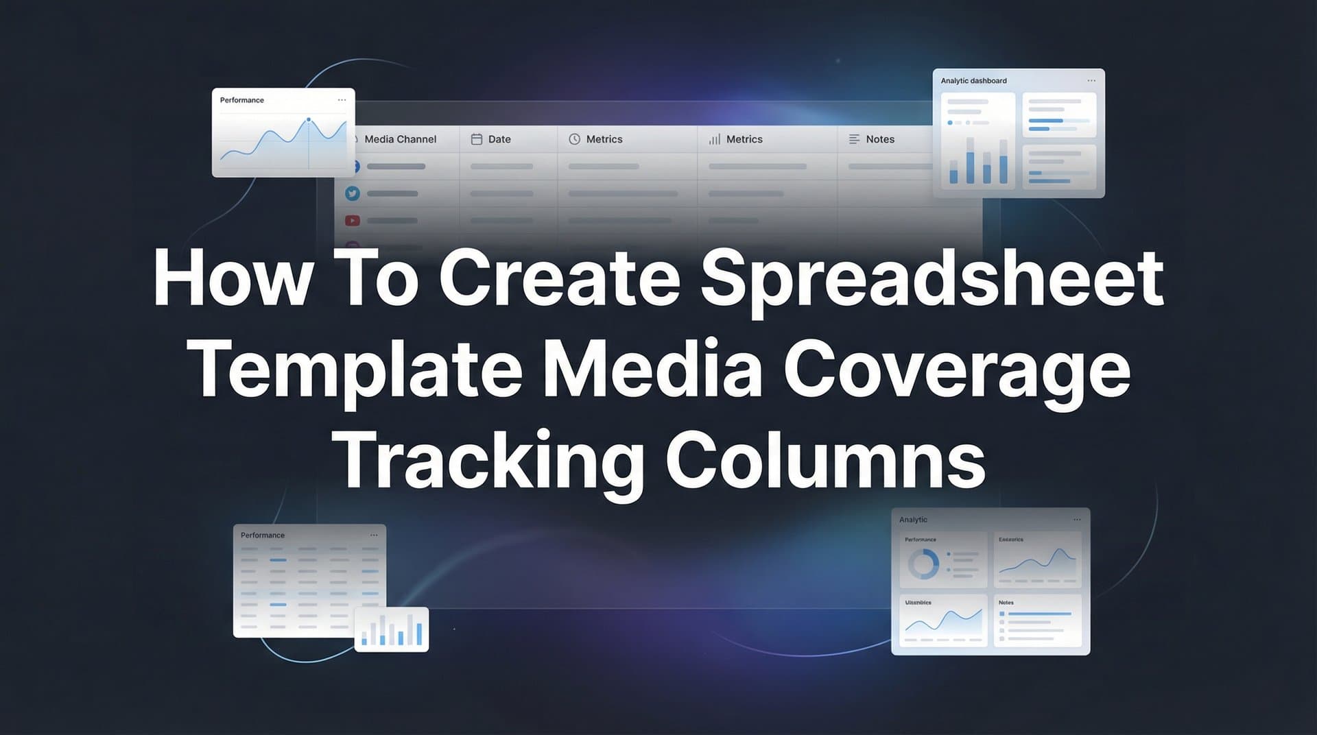
Next, add your core identification columns in this order: Date Published (column B), Outlet Name (column C), Article Title (column D), and URL (column E). These four columns form the backbone of your tracking system—they answer the fundamental questions of when, where, and what was published.
For the Date Published column, set up data validation to ensure consistency. In Google Sheets, select the entire column, click Data > Data Validation, and choose "Date" as the criteria. This prevents team members from entering dates in different formats (3/15/26 vs. March 15, 2026 vs. 15-03-26), which would make sorting and filtering a nightmare.
Add one more critical column at this stage: Author/Journalist (column F). This column serves double duty—it helps you track which journalists cover your space regularly, and it becomes invaluable for relationship building. When you need to pitch a follow-up story six months later, you'll know exactly who wrote about you before and what angle they took.
Format your header row to stand out: bold text, light gray background, and consider adding borders. Make it visually distinct so anyone opening this spreadsheet immediately understands they're looking at column headers, not data entries.
Step 2: Add Media Classification and Reach Columns
Not all media coverage carries equal weight, and your tracking system needs to reflect that reality. This is where classification columns transform your spreadsheet from a simple list into a strategic tool.
Create a Media Type column (column G) with a dropdown menu. Select the entire column, go to Data > Data Validation, choose "List of items," and enter these options: Online, Print, Broadcast, Podcast, Social. These five categories cover virtually all media coverage types you'll encounter. The dropdown ensures consistency—no one accidentally enters "Website" when they mean "Online" or "Radio" when they mean "Broadcast."
Next, add a Tier column (column H) to classify outlet importance. Use a simple three-tier system: Tier 1 for top-priority outlets (think major industry publications, national media, or highly influential niche sites), Tier 2 for solid mid-level coverage, and Tier 3 for smaller or less relevant outlets. Set this up as a dropdown with options: Tier 1, Tier 2, Tier 3.
Here's where tier classification gets strategic: define your tiers based on your specific PR goals, not arbitrary prestige. If you're targeting a niche B2B audience, a specialized industry newsletter might be Tier 1 even though it's unknown outside your sector. A major consumer publication might only be Tier 2 if it doesn't reach your target buyers.
Add an Estimated Reach/Circulation column (column I) to quantify potential audience size. For online outlets, this might be monthly unique visitors. For print, it's circulation numbers. For podcasts, it's average downloads per episode. Don't obsess over perfect accuracy here—estimated reach gives you a directional sense of coverage impact, which is sufficient for most PR analysis.
Include a Domain Authority column (column J) if you're tracking online coverage for SEO value. Domain Authority (DA) is a metric from Moz that predicts how well a website will rank in search results, scored from 1 to 100. Links from high-DA sites pass more SEO value to your website. You can check DA using Moz's free Link Explorer tool or browser extensions.
Success indicator for this step: You should be able to filter your spreadsheet to show only Tier 1 online coverage from outlets with over 100,000 monthly readers. If you can execute that filter in seconds, your classification columns are working correctly.
Step 3: Build Content Analysis and Sentiment Columns
Raw coverage data tells you what happened. Content analysis columns tell you what it means for your brand. This is where you move from simple tracking to actual insight.
Create a Sentiment column (column K) with a dropdown menu containing four options: Positive, Neutral, Negative, Mixed. Keep this simple—complex sentiment scales (like 1-10 ratings) create inconsistency because different team members interpret numbers differently. With four clear categories, anyone on your team can quickly assess coverage tone.
Positive means the coverage portrays your brand favorably, highlights benefits, or positions you as a solution. Neutral means you're mentioned factually without positive or negative framing. Negative means criticism, problems, or unfavorable comparison. Mixed means the article contains both positive and negative elements—perhaps praising your product but questioning your pricing.
We compare the leading options in our AI product photo editor roundup.
Add a Key Messages Included column (column L) to track which talking points actually appeared in coverage. This is where you measure message penetration. If your three key messages are "AI-powered accuracy," "real-time insights," and "cross-platform tracking," note which ones the journalist included. Format this as a text field where you can enter multiple messages separated by commas.
For a deeper dive, see our guide to AI talking avatar ads generator.
This column reveals patterns over time. If "AI-powered accuracy" appears in 80% of your coverage but "cross-platform tracking" only appears in 20%, you know which messages resonate with journalists and which need stronger positioning in your pitches.
Include a Spokesperson Quoted column (column M) with a simple Yes/No dropdown, plus space to note the spokesperson name if applicable. Getting your executives or subject matter experts quoted builds authority and credibility. Tracking this metric helps you demonstrate the value of media training and spokesperson preparation to leadership.
Add a Brief Summary column (column N) for 1-2 sentence summaries of each article. This saves enormous time later—instead of re-reading entire articles to remember what they covered, you can scan your summaries. Keep these concise: "Feature on our new attribution model comparing it to legacy tools. Highlighted accuracy improvements and ease of implementation."
The common pitfall here is over-engineering sentiment analysis. Avoid creating elaborate scoring systems or trying to quantify sentiment numerically unless you have specific analytical reasons to do so. Simple categories work because they're fast to assign and easy to filter—which means your team will actually use them consistently.
Step 4: Include Campaign Attribution and Source Tracking Columns
The most strategic question your tracking system can answer is this: What PR tactics actually generate coverage? Campaign attribution tracking columns give you that answer.
Create a Campaign/Initiative column (column O) to link each piece of coverage to specific PR efforts. Use clear naming conventions like "Q1 Product Launch," "Industry Report 2026," or "Ongoing Brand Monitoring." When coverage isn't tied to a specific campaign, label it "General" or "Ongoing." This column transforms scattered mentions into campaign performance data.
Set this up as a dropdown menu with your active campaign names. Update the dropdown options quarterly as campaigns launch and conclude. The discipline of categorizing coverage by campaign forces strategic thinking—it makes you consider how each piece of coverage connects to your broader PR strategy.
Add a Coverage Source column (column P) to track how coverage originated. Create a dropdown with these options: Pitched (you proactively pitched this story), Organic (journalist reached out or found you independently), Newsjacking (you capitalized on trending news), Event (coverage from a conference, webinar, or event), Partnership (co-marketing or partner-driven coverage).
This data reveals which tactics deliver results. If 70% of your Tier 1 coverage comes from events but only 20% from cold pitching, that insight should reshape how you allocate PR resources. Many teams are surprised to discover that their most time-intensive tactics generate the least valuable coverage.
Include a PR Team Member column (column Q) for accountability and workload tracking. Who secured this coverage? This isn't about blame—it's about understanding team capacity and recognizing wins. If one team member consistently lands Tier 1 placements, what can others learn from their approach? If someone's workload seems heavy but coverage results are light, maybe they need support or strategy adjustment.
Add a Pitch Date column (column R) to measure your pitch-to-coverage timeline. This metric helps you understand typical response times for different outlet types and plan campaigns more realistically. If broadcast coverage typically takes 3-4 weeks from pitch to publication while online coverage happens in 1-2 weeks, you'll adjust timelines accordingly.
For a deeper dive, see our guide to AI UGC vs real UGC.
The attribution data you're building here does something powerful: it demonstrates which PR tactics generate the most valuable coverage. That's the evidence you need to defend PR budgets, shift resources to high-performing tactics, and show leadership that PR is strategic, not just hopeful.
Step 5: Add Performance and Value Measurement Columns
Coverage exists, but what does it do for your business? Performance and value columns connect media mentions to tangible outcomes.
Create a Link Included column (column S) with a Yes/No dropdown. Then add a Link Type column (column T) with options: DoFollow, NoFollow, None. DoFollow links pass SEO value to your website, while NoFollow links don't—but both still drive referral traffic. This distinction matters for teams tracking SEO impact from PR. You can check link type by viewing the page source code or using browser extensions like MozBar.
If your organization uses Advertising Value Equivalency, add an Estimated Ad Value Equivalent (AVE) column (column U). AVE calculates what you would have paid for equivalent advertising space. Multiply the article's word count or ad dimensions by the outlet's advertising rate. Many PR professionals debate AVE's validity, but if your leadership expects this metric, include it. Just understand its limitations—earned media and advertising aren't truly equivalent.
Include a Social Shares column (column V) to track amplification when data is available. Tools like BuzzSumo or SharedCount can show how many times an article was shared on social platforms. High share counts indicate content that resonated with audiences beyond the initial publication. This metric is particularly valuable for demonstrating earned media's extended reach through social media measurement.
Add a Referral Traffic column (column W) to connect coverage directly to website analytics. This requires coordination with your analytics platform. When coverage includes a link to your site, check Google Analytics (or your preferred tool) to see how many visitors came from that specific article. Filter your traffic sources by the referring domain and publication date to isolate the impact.
Here's where it gets really strategic: consider adding a Lead/Conversion column (column X) to track business impact when attribution is possible. If someone reads an article about your brand, clicks through to your website, and converts, can you connect those dots? This requires tracking infrastructure—UTM parameters on links when possible, or attribution platforms that can identify the customer journey from media mention to conversion.
This is the frontier of modern PR measurement. Teams that can demonstrate "this article generated 47 website visits, 8 demo requests, and 2 closed deals" have transformed PR from a soft marketing function into a revenue-driving channel with clear ROI. Understanding UTM tracking and how it helps marketing is essential for building this capability.
Step 6: Configure Formatting, Filters, and Automation
Your columns are built. Now make your spreadsheet actually usable for daily work through smart formatting and filters.
Apply conditional formatting to your Sentiment column to create instant visual scanning. Select the entire Sentiment column, go to Format > Conditional Formatting, and create rules: if cell contains "Positive," make the background light green. If "Negative," make it light red. If "Neutral," light gray. If "Mixed," light yellow. Now you can scan hundreds of rows and immediately spot sentiment patterns without reading every cell.
Set up filter views for common queries your team will run repeatedly. In Google Sheets, go to Data > Filter Views > Create New Filter View. Create saved filters for scenarios like "Tier 1 Coverage Last 30 Days," "Negative Sentiment All Time," or "Product Launch Campaign Coverage." Name these filters clearly and share them with your team. This saves everyone from rebuilding the same filters weekly.
Go back through every categorical column (Media Type, Tier, Sentiment, Coverage Source, etc.) and verify that data validation dropdowns are properly configured. Test each one—click into a cell and confirm the dropdown appears with all your options. Consistent dropdown usage is what keeps your data clean and filterable months from now.
Add a Notes column (column Y) as your final column for additional context that doesn't fit elsewhere. This is your catch-all for observations like "Journalist expressed interest in follow-up," "Coverage resulted from CEO LinkedIn post," or "Outlet requested exclusive for next announcement." These contextual notes often contain the most valuable insights for future strategy.
Consider adding a simple summary dashboard at the top of your spreadsheet, above your data table. Leave rows 1-5 blank, then in rows 6-10, create formulas that automatically calculate key metrics: total pieces of coverage, percentage positive sentiment, average estimated reach, and top-performing campaigns. These auto-updating metrics give you instant insights without manual calculation.
Success indicator for this step: Hand your spreadsheet to a team member who wasn't involved in building it. Can they filter to find all Tier 1 positive coverage from the last quarter in under 30 seconds? If yes, your formatting and filters work. If they struggle, simplify.
Putting It All Together
Your media coverage tracking template is now ready to capture comprehensive data on every mention your brand receives. Before you start entering coverage, run through this quick checklist: verify all dropdown menus work correctly by clicking into each categorical column and testing the options, test your filter views to ensure they return expected results, share the spreadsheet with team members and set appropriate permissions (editor access for PR team, viewer access for stakeholders), and schedule a weekly review session to input new coverage while details are fresh.
The real power of this system reveals itself over time. After tracking coverage consistently for a few weeks, patterns emerge. You'll identify which journalists cover your space regularly and what angles they prefer. You'll see which PR tactics generate the most valuable coverage. You'll spot sentiment trends that require response. Most importantly, you'll have concrete data to demonstrate PR impact to leadership.
For teams running paid campaigns alongside PR efforts, the next evolution is connecting this media coverage data to your broader marketing attribution tracking. When you can show that earned media coverage influences the customer journey—that someone reads an article, visits your website days later, and eventually converts—you've proven PR's role in driving actual business results, not just generating impressions.
Modern attribution platforms can track these complex journeys, showing how media coverage works alongside paid ads, email campaigns, and other touchpoints to move prospects toward conversion. Learning how data analytics can improve marketing strategy helps you extract maximum value from your tracking efforts. This integrated view transforms how marketing teams understand channel performance and budget allocation.
Start tracking today. Input your existing coverage to build your baseline, then maintain the discipline of adding new mentions weekly. Within a month, you'll have actionable data to optimize both your PR strategy and overall marketing mix. The spreadsheet you built in 30 minutes becomes the foundation for strategic decisions worth thousands in more effective PR spending. For teams managing multiple initiatives simultaneously, understanding attribution tracking for multiple campaigns becomes essential as your coverage grows.
Ready to elevate your marketing game with precision and confidence? Discover how Cometly's AI-driven recommendations can transform your ad strategy—Get your free demo today and start capturing every touchpoint to maximize your conversions.