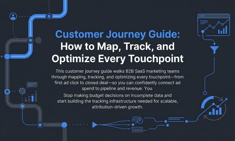
Most B2B SaaS marketing teams are optimizing in the dark. They know which campaigns generated clicks and which landing pages converted, but they rarely have a clear picture of the full path a customer takes from first ad impression to closed-won deal. That gap is exactly where a service design journey map becomes essential.
A service design journey map is a visual, structured representation of every interaction a customer has with your brand, your product, and your team across the entire buying cycle. Unlike a basic customer journey map, it also captures what is happening internally at each stage: which teams are involved, which systems are firing, and which processes are supporting or undermining the customer experience.
For B2B SaaS marketing teams, this is not a UX exercise reserved for product designers. It is a strategic tool that reveals where qualified leads are dropping off, which touchpoints are actually driving pipeline, and where your messaging is failing to convert. The problem is that most teams build these maps in isolation, relying on assumptions rather than real behavioral data. The result is a map that looks polished in a workshop but does not reflect what is actually happening across your paid channels, CRM, and product analytics.
This guide walks you through a seven-step process to build a service design journey map grounded in real customer data, aligned with your revenue goals, and actionable for every team that touches the customer experience. Whether you are a growth marketer trying to reduce CAC, a demand gen leader optimizing multi-channel campaigns, or a SaaS founder trying to understand why qualified leads are not converting, this process gives you a clear, data-backed picture of your customer experience from awareness through retention.
Step 1: Define Your Persona and Journey Scope
The most common mistake teams make when starting a service design journey map is trying to map every customer segment at once. The result is a map so broad it becomes meaningless. Before you open a spreadsheet or whiteboard tool, you need to make two decisions: who are you mapping, and what slice of their journey are you covering?
Start by choosing one specific customer segment. Pull data from your CRM to build a real profile, not a fictional one. Look at your closed-won deals from the past six to twelve months and identify patterns. What job titles appear most frequently? What company sizes are buying? Who is the primary decision-maker versus the champion who drove internal adoption? What pain points show up repeatedly in sales notes and onboarding calls?
Your persona should be grounded in this data. A well-defined B2B SaaS persona might look like this: a VP of Marketing at a 50 to 200 person SaaS company who owns the paid media budget, is accountable for pipeline generation, and is frustrated by the gap between ad spend and revenue visibility. That level of specificity makes every subsequent step of the mapping process sharper.
Next, set clear start and end points for the journey. This is your scope. You might map from first paid ad impression to closed-won deal. You might focus on the narrower window from free trial signup to first value milestone. The scope you choose should align directly with a specific business problem you are trying to solve. If your conversion rate from trial to paid is underperforming, map that segment of the journey. If your CAC is rising because the sales cycle is too long, map from first touch to opportunity creation.
Avoid the temptation to map everything. A focused map with real data beats a comprehensive map built on assumptions every time. Understanding the B2B customer journey at this level of specificity is what separates teams that get actionable insights from those that produce decorative diagrams.
Success indicator: You can describe your persona in two sentences and state exactly where the journey begins and ends before moving to the next step.
Step 2: Gather Touchpoint Data Across Every Channel
Here is where most journey maps break down. Teams list the touchpoints they think exist rather than the touchpoints that actually occur. The fix is straightforward: go to your data before you go to your whiteboard.
Start by listing every channel where your defined persona could interact with your brand. For most B2B SaaS companies, this includes paid search, paid social on LinkedIn and Meta, organic content, email sequences, retargeting campaigns, sales development rep outreach, product trials, in-app messaging, and customer success touchpoints. Write them all down, then go verify which ones actually show up in your data.
Pull reports from your ad platforms, CRM, website analytics, and product analytics. Look for the actual sequence of touchpoints that precede a conversion. You will often find that the assumed journey and the real journey are quite different. A persona you assumed discovers you through organic search might actually be entering through a LinkedIn retargeting ad after visiting your site from a branded search.
This is where server-side tracking and first-party data become critical. Browser-based tracking misses a growing share of touchpoints because of ad blockers and cookie restrictions. If you are relying solely on pixel-based attribution, your touchpoint data has gaps. Understanding customer journey touchpoints fully requires server-side conversion tracking and Conversion API integrations that capture post-click events and offline conversions that standard tracking misses, giving you a more complete picture of the actual journey.
Do not stop at your data systems. Interview two or three sales reps and a customer success manager. Ask them what touchpoints customers mention during discovery calls. Ask what content prospects reference in sales conversations. These qualitative inputs often surface touchpoints that never appear in your analytics but carry significant influence over buying decisions.
For each verified touchpoint, document four things: the channel, the action the customer takes, the goal of that touchpoint from a marketing or sales perspective, and the data source you used to verify it exists.
Common pitfall: Relying only on last-click data will distort your map by crediting only the final touchpoint before conversion and making the rest of the journey invisible.
Success indicator: You have a verified list of touchpoints with at least one data source backing each one before moving forward.
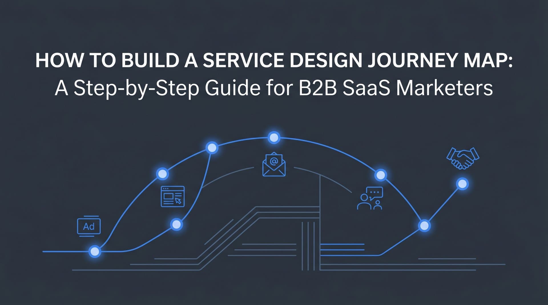
Step 3: Map the Customer Journey Across Stages
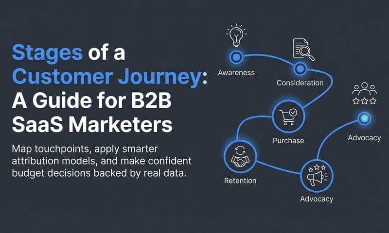
Now you have your persona, your scope, and your verified touchpoint data. It is time to organize everything into a structured visual map. The goal here is to arrange touchpoints into stages that reflect how B2B SaaS buyers actually move through a purchase decision.
A practical stage framework for B2B SaaS looks like this: Awareness, Consideration, Evaluation, Decision, Onboarding, and Retention. These stages of the customer journey reflect the buyer's mindset and the type of engagement they are seeking at each point. Awareness is about discovering a problem or a solution. Consideration is about researching options. Evaluation is about testing and comparing. Decision is about committing. Onboarding is about realizing value. Retention is about staying and expanding.
For each stage, document four dimensions. First, what the customer is thinking: their primary question or concern at that point in the journey. Second, what they are doing: the specific actions they take, such as clicking an ad, reading a comparison page, or booking a demo. Third, what they feel: their emotional state, whether that is curious, skeptical, overwhelmed, or excited. Fourth, what your brand is delivering: the content, message, or experience your team is providing at that stage.
Add a row for internal actions. What is your marketing team doing at each stage? What is the sales team doing? What automated sequences or in-app triggers are firing? This is what separates a service design journey map from a basic customer journey map. It captures the full system, not just the customer perspective.
Use your attribution data to validate which stages are actually influencing pipeline. Multi-touch attribution data will show you which channels and content types appear most frequently at each stage based on real conversion paths, not assumptions. You may find that a stage you assumed was low-impact is actually present in the majority of your highest-value conversion paths.
Choose a visual format your team will actually use and share. Reviewing available customer journey mapping tools can help you find the right fit for cross-functional collaboration. The format matters less than the accessibility. If the map lives only in one person's laptop, it will not drive change.
Success indicator: Every stage has at least three verified touchpoints and a clear description of customer intent at that point in the journey.
Step 4: Identify Friction Points and Drop-Off Moments
With a fully mapped journey in front of you, the next step is diagnostic. You are looking for the places where the customer experience breaks down, where momentum slows, and where qualified buyers disengage before reaching the next stage.
Review your map stage by stage and flag every point where customers commonly delay, disengage, or abandon. Then cross-reference those flags with quantitative data. What is your conversion rate from awareness to consideration? From trial signup to active usage? From demo to closed deal? Where does time-to-convert spike? Which stages show the largest drop-off in the funnel?
Look specifically for misalignment between what your marketing promises and what the product or sales process delivers. If your paid ads are promising a frictionless setup experience and your onboarding requires a two-week implementation, that gap is a friction point. If your LinkedIn campaigns are targeting enterprise buyers but your trial experience is built for self-serve SMB users, that misalignment will show up as high trial abandonment from your most valuable segment.
Also look for moments where customers are forced to repeat themselves. A buyer who fills out a detailed form, then gets on a discovery call where the sales rep asks the same questions, experiences friction that erodes trust before the relationship has a chance to build. These handoff failures are common in B2B SaaS and often invisible unless you are mapping the full journey with internal actions included. Applying customer journey optimization principles at these handoff points can significantly reduce drop-off and improve conversion rates.
Once you have identified your friction points, prioritize them by revenue impact. Not all friction is equally costly. A drop-off at the evaluation stage that affects your highest-intent prospects has a much greater revenue impact than friction in a low-volume channel. Focus your energy on the stages that affect the largest number of qualified leads and the highest-value conversion events.
Common pitfall: Treating all friction points as equally urgent leads to scattered fixes that generate activity without meaningful revenue impact.
Success indicator: You have a ranked list of friction points with supporting data showing how each one affects conversion rates or retention before you move to the next step.
Step 5: Assign Attribution Data to Each Stage
This is the step that transforms your service design journey map from an interesting visual into a revenue decision-making tool. Layering attribution data onto each stage of the map answers the question that matters most: which touchpoints are actually driving pipeline and closed revenue, and which ones are generating activity without outcomes?
Start by comparing attribution models side by side. First-touch attribution shows you which channels are creating awareness and bringing new buyers into the funnel. Last-touch attribution shows you which channels are present at the moment of conversion. Multi-touch attribution shows you how credit is distributed across the full journey. Each model tells a different part of the story, and you need all three to build an accurate picture. Reviewing the most common ad attribution models will help you understand which approach fits each stage of your map.
For each stage of your map, identify which paid channels and campaigns are most active and what their contribution to pipeline looks like. You might find that LinkedIn campaigns dominate the awareness stage but rarely appear in the conversion paths of your highest-value deals. You might find that branded search is consistently present at the decision stage across nearly every closed-won deal. These insights directly inform where you should be investing your ad budget and what role each channel should play in the overall strategy.
Connect your ad spend data to your CRM and revenue data so you can see pipeline and revenue attribution at each stage of the map. This means going beyond click-based metrics and tracking which campaigns are generating opportunities, which are accelerating deals, and which are appearing in the paths of customers who ultimately churn. Platforms that connect ad data directly to CRM and revenue outcomes give you a much clearer picture of which stages are driving real business results versus which ones are generating surface-level engagement metrics.
Pay close attention to stages where you have touchpoints but no attribution data. These are blind spots. If you know from sales interviews that a certain piece of content is frequently referenced during evaluation but you cannot see it in your attribution data, that is a tracking gap that is distorting your understanding of the journey. Flag these blind spots and prioritize closing them with better data infrastructure. Investing in robust customer journey tracking is what separates teams with accurate maps from those operating on incomplete data.
Tools like Cometly are built specifically for this type of analysis. By connecting your ad platforms, CRM, and revenue data in one place, you can see which touchpoints at each stage of the journey are generating pipeline and which campaigns are present in the paths of your highest-value customers. That level of visibility is what makes the journey map actionable rather than decorative.
Success indicator: Each stage of your journey map has an attribution data point showing its contribution to pipeline or revenue before you move to building your action plan.
Step 6: Build an Action Plan Based on Journey Insights
A service design journey map without an action plan is just documentation. This step is where insights become interventions and where the map starts generating real business value.
Go back to your ranked list of friction points from Step 4 and your attribution data from Step 5. These two inputs together tell you where the biggest opportunities are. A friction point at a high-attribution stage is your highest priority. A friction point at a stage with low attribution contribution is lower priority, even if it feels significant in isolation.
For each prioritized friction point, define a specific intervention. Be concrete. "Improve the onboarding experience" is not an intervention. "Create a three-email onboarding sequence triggered at signup that delivers one value milestone within the first 48 hours" is an intervention. "Revise the evaluation stage landing page to align messaging with the LinkedIn campaign targeting VP-level buyers" is an intervention. Specificity is what makes the action plan executable. Teams that track SaaS marketing metrics at each stage will have the clearest benchmarks for measuring whether each intervention is working.
Assign ownership for each action to a specific team or individual. The paid media team owns ad creative and campaign changes. The content team owns landing page revisions and nurture sequences. The product team owns in-app messaging and onboarding flows. The sales team owns discovery call scripts and handoff processes. When everyone knows what they own, things get done. When ownership is shared or vague, nothing moves.
Set measurable success criteria for each intervention before you execute it. Define the specific metric you expect to improve and by how much. This forces clarity about what success looks like and makes it possible to evaluate whether the intervention worked. Without pre-defined success criteria, you will not know whether the change you made actually addressed the friction point or just created a different one.
Sequence your interventions in a 30-60-90 day roadmap. Start with the highest-impact, lowest-effort changes in the first 30 days. Move to higher-effort interventions in the 60 and 90 day windows as you validate your early assumptions. Avoid making sweeping changes to multiple stages simultaneously. If you change five things at once and conversion improves, you will not know which change drove the result. Sequenced testing gives you clean data.
Success indicator: You have a documented action plan with owners, timelines, and measurable KPIs for each intervention before you begin executing.
Step 7: Review and Iterate the Map with Real Data
A service design journey map that is built once and never updated becomes inaccurate within a few months. Your product evolves. Your market shifts. New channels emerge. Customer behavior changes. The map needs to evolve with it.
Schedule a quarterly review of your journey map as a standing meeting with representatives from marketing, sales, product, and customer success. This is not a workshop. It is a working session where you bring updated attribution and pipeline data, review whether your interventions from the previous cycle improved conversion at the targeted stages, and update the map to reflect what has changed.
Use your attribution data to check the interventions from your action plan. Did the revised landing page improve evaluation-stage conversion? Did the new onboarding sequence reduce time-to-first-value? The data will tell you whether your journey map insights were correct or whether you need to revisit your assumptions.
Add new touchpoints as you launch new channels, features, or campaigns. If you started running YouTube ads since the last review, those need to appear in the map. If you launched a new in-app feature that changes the onboarding experience, the map needs to reflect that. Keeping the map current is what keeps it useful. Leveraging customer journey analytics on a continuous basis ensures your updates are driven by real behavioral data rather than internal assumptions.
Gather qualitative feedback from customers at least once per quarter. Short interviews with recent customers, exit surveys from churned accounts, and NPS follow-up conversations all surface insights that quantitative data misses. When a customer tells you they almost chose a competitor because the evaluation stage felt too complicated, that is a friction point your conversion data might not have surfaced clearly.
Share the updated map with every team that touches the customer experience. Alignment across marketing, sales, product, and customer success is what makes journey mapping a company-wide strategic tool rather than a marketing deliverable.
Success indicator: The map is updated at least quarterly and has been used to inform at least one strategic decision per review cycle.
Putting It All Together
Building a service design journey map is not a one-time workshop exercise. It is an ongoing practice that gives B2B SaaS marketing teams a clear, data-backed picture of where customers are engaging, where they are dropping off, and which touchpoints are actually driving revenue.
The seven steps in this guide give you a repeatable process: define your persona and scope, gather real touchpoint data, map the journey across stages, identify friction, layer in attribution data, build a prioritized action plan, and iterate based on results.
Before you start, run through this quick checklist. Define one persona and one journey scope. Identify your data sources for touchpoint verification. Choose a visual format your team will actually use and share. Align with sales and customer success on what they observe in the field. Connect your attribution platform so every stage of the map has revenue data behind it.
The teams that get the most value from journey mapping are the ones that connect it to real marketing data rather than leaving it as a static diagram. When your journey map is backed by multi-touch attribution and pipeline data, it becomes one of the most powerful tools you have for making smarter decisions about where to invest your ad spend and how to improve the customer experience at every stage.
Cometly connects your ad platforms, CRM, and revenue data in one place so you can see exactly which touchpoints at each stage of the journey are generating pipeline. That kind of visibility is what turns a journey map from a workshop artifact into a revenue decision-making tool. Get your free demo today and start capturing every touchpoint to maximize your conversions.