
You're running paid search, publishing content, sending email sequences, and your sales team is booking demos. But when someone asks which channel actually drove that last closed deal, the honest answer is: you're not sure. The prospect clicked an ad three weeks ago, read a few blog posts, attended a webinar, and then booked a demo through a direct visit. Which touchpoint gets credit?
This is the daily reality for B2B SaaS marketing teams. The buying journey is long, nonlinear, and spread across more channels than any single dashboard naturally captures. Without a structured way to visualize it, budget decisions get made on instinct, and the channels that quietly influence deals go chronically underfunded.
A customer journey chart solves this. It is a visual framework that maps every touchpoint a prospect encounters from first awareness through closed revenue, organized by stage and channel. When it is built on real attribution data rather than assumptions, it becomes one of the most powerful tools a growth team can have. By the end of this article, you will know exactly what a customer journey chart is, how to build one that reflects your actual sales process, how to choose the attribution model that makes it meaningful, and how to keep it current as buyer behavior evolves.
The Anatomy of a Customer Journey Chart
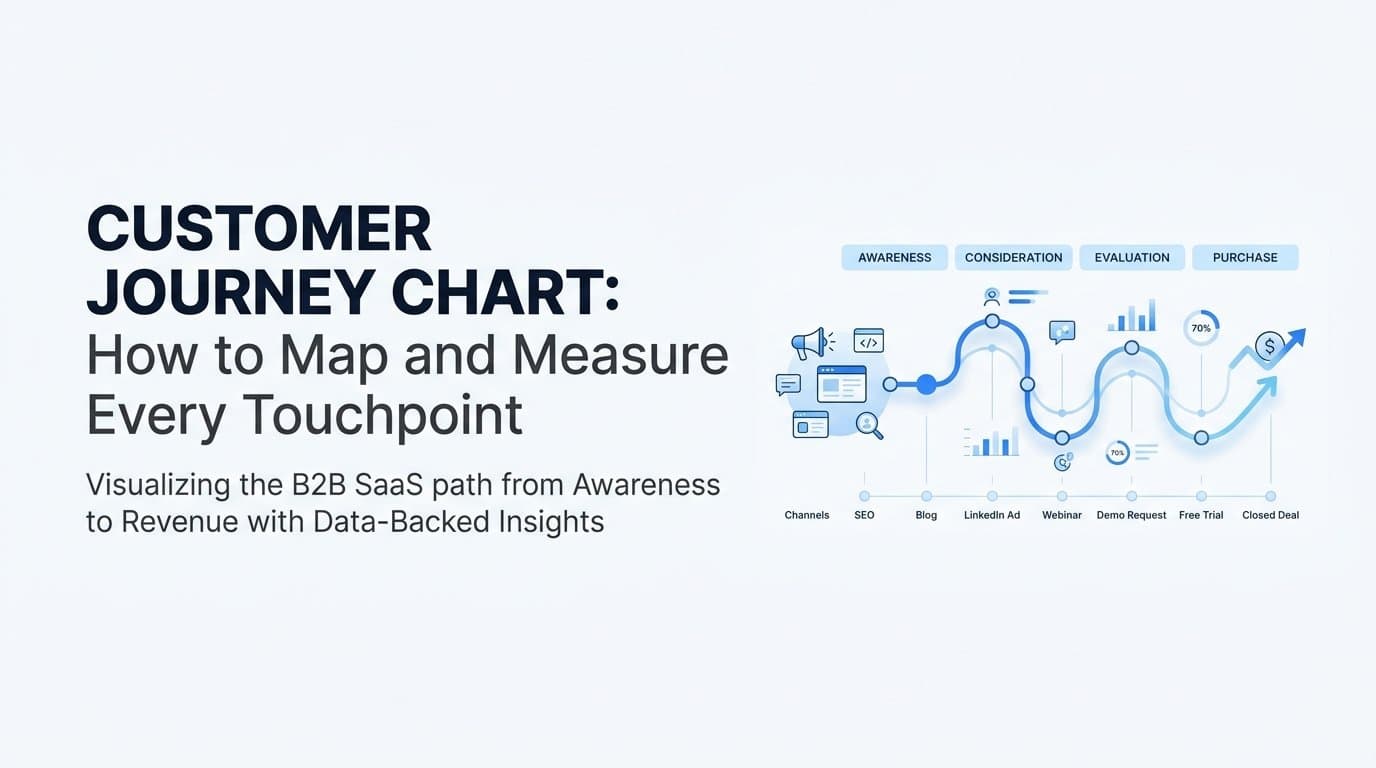
At its core, a customer journey chart is a structured visual map that plots every touchpoint a prospect encounters from first awareness through conversion and beyond. It is organized by stage and by channel, giving marketers a clear picture of how buyers actually move through the funnel rather than how we assume they do.
The chart typically has four core stages: Awareness, Consideration, Decision, and Retention. Within each stage, there are specific touchpoints. In Awareness, those might include a paid search ad, an organic blog post, or a LinkedIn sponsored post. In Consideration, a prospect might engage with a product comparison page, a case study, or a webinar. In Decision, the touchpoints shift toward a demo request, a sales call, a free trial, or a pricing page visit. Retention touchpoints include onboarding emails, in-app messages, and customer success check-ins.
Each touchpoint sits within a channel. Paid channels include Google Ads, Meta, and LinkedIn. Organic channels include SEO-driven content and social media. Direct channels include branded search, direct URL visits, and sales outreach. Email is its own category. CRM events like stage changes and opportunity creation are touchpoints too, even if they are not marketing-generated.
Here is where many teams make a critical mistake: they confuse a customer journey chart with a funnel diagram. These are not the same thing. A funnel shows volume drop-off at each stage, which tells you where you are losing people but not why or how. A customer journey chart shows the actual paths, sequences, and interactions that lead to revenue. It answers different questions entirely.
A funnel might tell you that 40 percent of prospects who request a demo do not convert to a paid plan. A customer journey chart tells you that the prospects who do convert typically engaged with three or more content touchpoints before the demo, while those who did not convert went straight from ad click to demo with no intermediate engagement. That insight changes your entire nurture strategy.
The journey chart is also not a static document. It is a living representation of buyer behavior, and its value is directly tied to the quality and completeness of the data feeding it. A chart built on partial data reflects partial reality. A chart built on unified, real-time attribution data reflects what is actually happening in your market right now.
Why B2B SaaS Buying Cycles Defy Simple Tracking
If you are selling a product with a $10,000 or $50,000 annual contract value, your prospects are not making impulse decisions. They are researching, comparing, looping in colleagues, revisiting your site multiple times, and taking weeks or months to reach a buying decision. That extended timeline creates a tracking problem that most marketing stacks are not equipped to handle.
Consider a realistic B2B SaaS buying journey. A VP of Marketing at a mid-size company sees a LinkedIn ad for your platform. They click through, read a blog post, and leave. Two weeks later, they search your brand name on Google, land on your pricing page, and leave again. A colleague sends them a link to a case study. They read it, watch a product demo video on your website, and then sign up for a webinar. After the webinar, a sales rep follows up via email. The prospect books a demo. Three weeks later, the deal closes.
That is at least seven distinct touchpoints across five different channels over roughly six weeks. Now ask yourself: which one drove the conversion?
Last-click attribution would give all the credit to the sales rep's email or the direct visit that preceded the demo booking. First-touch would credit the LinkedIn ad. Neither answer is complete. Both answers lead to flawed budget decisions. If you over-invest in last-touch channels because they appear to close deals, you starve the awareness channels that put prospects into the funnel in the first place.
This is the core problem with single-touch attribution in B2B SaaS. It does not just misattribute credit. It actively distorts your understanding of what is working. Over time, teams that rely on last-click data tend to over-invest in branded search and direct channels while cutting the top-of-funnel paid and content investments that feed the entire pipeline.
Touchpoint sequencing makes this even more nuanced. The order in which a prospect encounters channels matters, not just which channels they used. A prospect who discovers you through organic content and then sees a retargeting ad may behave differently than one who sees the paid ad first and then finds the content. Understanding those sequences is only possible with a customer journey chart built on complete, multi-touch data.
How to Build a Customer Journey Chart Step by Step
Building a useful customer journey chart is not a whiteboard exercise. It is a data infrastructure project with a visualization layer on top. Here is how to approach it in a way that produces something actionable rather than decorative.
Step 1: Define your stages based on your actual sales process. Do not start with a generic awareness-to-advocacy template. Start with your CRM pipeline stages. For most B2B SaaS companies, the meaningful stages map to specific conversion events: first website visit, content engagement, trial start or demo request, sales qualified lead, active opportunity, and closed-won. Your journey chart should reflect these real milestones, not a theoretical framework.
Step 2: Catalog every touchpoint by channel and stage. This requires pulling data from multiple sources. Your ad platforms show which campaigns and creatives prospects interacted with. Your website analytics show which pages they visited and in what order. Your email platform shows open and click data. Your CRM shows sales activities, stage changes, and deal values. The goal is a complete inventory of where and how prospects interact with your brand before and after they enter your pipeline.
This step is often where teams discover gaps in their tracking. If your website is relying entirely on browser-based cookies, you are likely missing a meaningful portion of touchpoints due to ad blockers and privacy changes. Server-side tracking and Conversion API integrations with platforms like Meta and Google are increasingly necessary to capture a complete picture.
Step 3: Connect touchpoint data to revenue outcomes. This is the step that separates a useful journey chart from a decorative one. You need to be able to trace a closed deal backward through every touchpoint that influenced it. That requires linking your CRM's revenue data, deal values, and close dates to the original marketing touchpoints that initiated or influenced the deal.
Most teams get stuck here because their ad platform data, CRM data, and website analytics data live in separate systems with no shared identifier connecting them. A dedicated attribution platform that ingests all of these sources and creates a unified customer timeline is the practical solution. Without that infrastructure, your journey chart will always have blind spots.
Step 4: Visualize the data as a chart. Once your data is unified, you can map the most common paths that winning deals follow, identify which touchpoint sequences correlate with faster deal velocity, and spot the stages where prospects consistently stall. The visualization makes patterns visible that raw data tables never would.
Choosing the Right Attribution Model for Your Journey Map
A customer journey chart shows you the touchpoints. An attribution model tells you how much credit to assign to each one. Choosing the right model determines whether your chart informs smart decisions or reinforces existing biases.
First-touch attribution assigns all credit to the first interaction a prospect had with your brand. It is useful when you want to understand which channels are most effective at generating awareness and pulling new prospects into your funnel. If you are trying to evaluate the ROI of top-of-funnel paid campaigns or organic content, first-touch gives you a clear signal.
Last-click attribution assigns all credit to the final touchpoint before conversion. It is the default in many analytics tools and is the most common source of misattribution in B2B SaaS. It systematically over-credits branded search, direct visits, and sales outreach while ignoring every earlier interaction that built the relationship. For long-cycle B2B deals, last-click is almost always misleading.
Linear attribution distributes credit equally across all touchpoints in the journey. It is a more honest model than single-touch approaches because it acknowledges that multiple interactions contribute to a deal. However, it treats a quick homepage visit the same as a 45-minute product demo, which is not always accurate.
Time-decay attribution gives more credit to touchpoints that occurred closer to the conversion event. This model is useful for understanding which mid-funnel and late-funnel interactions accelerate deals, since it weights recency. It can be a good fit for teams focused on shortening sales cycles.
Data-driven attribution is the most accurate approach for complex B2B journeys. Rather than applying a fixed rule, it uses statistical modeling to analyze actual conversion patterns and assign credit based on what the data shows actually influences outcomes. Touchpoints that consistently appear in winning journeys receive more credit than those that appear in both winning and losing journeys equally.
The practical recommendation for most B2B SaaS teams is to use multiple models simultaneously. Run first-touch to evaluate your awareness investments, use time-decay to understand deal acceleration, and apply data-driven attribution when you have enough conversion volume for the model to be statistically reliable. Your customer journey chart becomes most powerful when you can toggle between these views and see how each model changes the story.
Turning Your Customer Journey Chart Into Actionable Marketing Decisions
A customer journey chart is only valuable if it changes how you allocate budget, create content, and optimize campaigns. Here is how to translate the visual into decisions.
Reading the chart for budget allocation signals. If your journey chart consistently shows that a specific ad type or channel appears in the early stages of deals that eventually close, that channel deserves top-of-funnel investment even if it rarely receives last-click credit. This is one of the most common and costly misalignments in B2B SaaS marketing: teams cut awareness channels because they do not appear to convert, when in reality they initiate the journeys that eventually do convert.
Look for channels that appear disproportionately in the journeys of your highest-value deals. If LinkedIn ads consistently appear in the first two touchpoints of deals with the largest contract values, that is a signal worth acting on regardless of what your last-click data says.
Identifying drop-off points and content gaps. Journey charts reveal where prospects consistently stall or disengage. If a large percentage of prospects engage with your awareness-stage content but never move to a consideration-stage interaction, that signals a gap. Either the content is not creating enough urgency to move forward, or there is no clear next step being offered.
Similarly, if prospects frequently reach the demo stage but then go quiet before a decision, the chart points to a friction point in the sales process or a messaging misalignment at that stage. These are operational insights that go beyond marketing and into the full revenue process.
Connecting journey insights to ad platform optimization. This is where the customer journey chart creates a feedback loop with your paid channels. When you understand which touchpoint sequences lead to high-value conversions, you can send that enriched conversion data back to Meta, Google, and LinkedIn. Their algorithms use this data to find more prospects who match the behavioral patterns of your best customers.
Server-side Conversion API integrations make this more accurate than browser-based pixel tracking alone. When ad platforms receive complete, journey-informed conversion signals, their targeting and optimization improve over time. The journey chart does not just inform your decisions. It improves the performance of the platforms you advertise on.
Building a Journey Chart That Stays Current
Here is a common failure mode: a marketing team spends two days in a workshop building a beautiful customer journey map. It gets presented to leadership, earns approval, and is saved as a slide deck. Six months later, it is completely outdated because the channel mix changed, a new campaign launched, and buyer behavior shifted. The map becomes a historical artifact rather than an operational tool.
A static customer journey chart has a short shelf life. Buyer behavior shifts as new channels emerge, campaign mixes change, and market conditions evolve. The chart needs to be a dynamic, data-fed view that updates as new conversion data flows in, not a one-time workshop output.
Keeping the chart current requires three infrastructure components working together. First, server-side tracking to capture events accurately regardless of browser privacy settings or ad blockers. As third-party cookies continue to decline in reliability, server-side event capture is no longer optional for teams that want complete journey data. Second, CRM integration to pull pipeline and revenue data in real time. The journey chart should reflect actual deal outcomes, not just marketing-generated leads, and that requires a live connection to your CRM's opportunity and revenue data. Third, a central attribution platform that unifies all sources into a single, continuously updated view.
This is where Cometly fits into the picture. Cometly connects your ad platforms, CRM, and website data in real time, giving marketing teams a continuously updated view of the customer journey. Rather than exporting data from five different tools and trying to reconcile it in a spreadsheet, you get a single source of truth that reflects current buyer behavior, not last quarter's assumptions.
Cometly captures every touchpoint from the first ad click through CRM events and closed revenue, giving its AI a complete and enriched view of each customer journey. That completeness is what makes the journey chart actionable. When you can see which ads and sequences are driving pipeline right now, you can make budget decisions with confidence rather than guesswork.
The platform also closes the feedback loop with ad platforms. By sending enriched, conversion-ready events back to Meta and Google, Cometly improves the quality of signals those platforms use for targeting and optimization. The journey chart becomes not just a reporting tool but an active driver of campaign performance.