
You're investing across paid search, social, display, and content. Leads are coming in, deals are closing, and yet something fundamental is missing: a clear picture of how prospects actually moved from first exposure to closed revenue. The data exists, but it's scattered across ad platforms, your CRM, and website analytics tools that don't naturally talk to each other. Without a way to connect those dots visually, every budget decision is at least partially a guess.
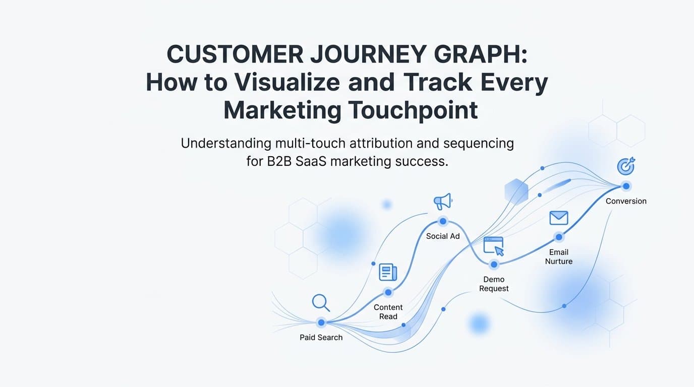
This is the problem a customer journey graph solves. Rather than forcing complex, non-linear buying behavior into a simplified funnel, a journey graph maps every recorded touchpoint a prospect encounters, across every channel, in the sequence it actually happened. The result is a visual, data-driven representation of how your marketing actually works, not how you assumed it would.
For B2B SaaS marketing leaders, this distinction matters enormously. When buying cycles stretch across weeks or months and involve multiple stakeholders, the difference between a flat funnel report and a true journey graph is the difference between guessing which channels drive revenue and knowing. This article breaks down exactly what a customer journey graph is, why it outperforms traditional reporting, and how to build one that connects ad spend directly to closed deals.
The Anatomy of a Customer Journey Graph
A customer journey graph is a visual representation of every tracked interaction a prospect has with your brand, from the first ad click or organic visit all the way through to a conversion event or closed-won deal in your CRM. Think of it as a map of behavior rather than a summary of outcomes.
The structure of a journey graph has three core components worth understanding clearly.
Nodes: Each node represents a discrete touchpoint. This could be a paid ad click, a landing page visit, a content download, a form submission, a sales email open, a demo booking, or a CRM stage change. Every meaningful interaction your prospect has with your brand becomes a node in the graph.
Edges: Edges are the connections between nodes. They represent the path a prospect took from one touchpoint to the next. An edge might connect a LinkedIn ad click to a blog visit, which then connects to a retargeting ad click, which connects to a demo request. The edges reveal sequence, not just presence.
Timeline: The chronological dimension of the graph places each node and edge in time, showing how long prospects spend between touchpoints, where they re-enter after going dark, and how the journey accelerates or stalls at different stages.
What makes a journey graph fundamentally different from a standard funnel or session report is its ability to capture non-linear behavior. Real B2B buying journeys don't follow a straight line. A prospect might click a Google ad, leave without converting, return two weeks later through organic search, engage with a LinkedIn retargeting ad, then have a colleague visit your pricing page before the first prospect finally books a demo. A funnel collapses all of that into a single conversion event. A journey graph preserves the entire sequence.
This matters because the sequence itself contains strategic information. When you can see that a particular combination of touchpoints consistently precedes closed-won deals, you have something a funnel report will never give you: a pattern you can deliberately replicate. The graph doesn't just tell you what happened. It tells you how it happened, and that's where the real attribution intelligence lives.
Why Linear Funnels Fall Short for B2B Buyers
The traditional marketing funnel is a useful mental model, but it was designed for a simpler era of buyer behavior. It assumes a single prospect moves predictably from awareness to consideration to decision, touching one channel at a time. B2B SaaS buying doesn't work that way, and hasn't for a long time.
B2B buying cycles are long, involve multiple stakeholders, and span a wide range of channels before any decision is made. A single deal might involve a marketing manager who first discovered your product through a LinkedIn ad, a technical evaluator who spent time on your documentation, and a CFO who only engaged when a colleague forwarded a case study. Each of these people interacted with your brand through different channels at different times, and none of their individual journeys looks like a clean funnel.
When you force this complexity into a linear model, you lose critical information. Worse, you make budget decisions based on that incomplete picture.
Here's where the damage becomes concrete. Attribution models that rely on a single touchpoint, like last-click or first-touch, assign all conversion credit to one node in the journey and ignore everything else. Last-click attribution, for example, would credit the demo booking form while ignoring the LinkedIn ad that created initial awareness, the blog post that built trust, and the retargeting campaign that brought the prospect back after a three-week gap. If your budget decisions follow that attribution model, you'll underinvest in the channels that are actually doing the heavy lifting early in the journey.
The gap between what marketers assume buyers do and what they actually do is precisely where wasted ad spend accumulates. Teams cut awareness campaigns because they don't show direct conversions. They over-invest in bottom-funnel retargeting because it appears to close deals, without realizing those deals were already in motion because of the awareness channels they deprioritized.
A customer journey graph makes this gap visible. When you can see the full sequence of touchpoints that precede closed-won revenue, the assumptions embedded in your current attribution model become testable rather than invisible. That visibility is the first step toward making budget decisions that actually reflect how your buyers behave.
Key Data Sources That Power an Accurate Journey Graph
A journey graph is only as accurate as the data feeding it. If your tracking has gaps, your graph will too, and the strategic decisions you make from it will inherit those blind spots. Building a reliable customer journey graph requires pulling from three distinct data layers and connecting them at the user level.
Ad Platform Data: Meta, Google, and LinkedIn all capture top-of-funnel interactions: ad impressions, clicks, and platform-side conversion events. This data is essential for understanding how prospects first enter your orbit. However, browser-based pixel tracking has become significantly less reliable in recent years. Ad blockers, browser privacy restrictions, and Apple's App Tracking Transparency framework have created meaningful gaps in what client-side pixels can record. If you're relying solely on pixel data, a notable share of real interactions are simply not making it into your journey graph.
Server-side tracking and Conversion API (CAPI) integrations address this directly. By sending event data from your server to ad platforms rather than from the user's browser, you bypass the browser-level limitations that cause tracking loss. The result is a more complete record of ad interactions, which means a more accurate journey graph from the very first touchpoint.
CRM and Pipeline Data: Ad platforms can tell you what happened before a lead was created. Your CRM tells you what happened after. Lead status, opportunity stage, deal value, and closed-won outcomes are all data points that live in your CRM and are invisible to ad platforms on their own. Without this layer, your journey graph ends at the lead form and never connects to revenue.
Integrating CRM data into your attribution layer means you can trace a closed-won deal all the way back to the ad that started the journey. This is what transforms a journey graph from a traffic analysis tool into a revenue attribution asset.
First-Party Behavioral Data: Form submissions, website behavior, content engagement, and offline conversion events round out the picture. This first-party data, collected directly from your own properties and users, has become the foundation of reliable attribution as third-party cookies are phased out across major browsers.
When these three layers are unified under a single user identity, the journey graph reflects real behavior rather than sampled or platform-siloed data. Every node is grounded in an actual interaction, and the edges between nodes tell a coherent story about how your prospects move toward a decision.
How Attribution Models Shape What the Graph Reveals
Here's something worth sitting with: the same customer journey graph can tell very different stories depending on which attribution model you apply to it. The underlying data doesn't change. The touchpoints are all there. But the credit assigned to each node shifts dramatically based on the model you choose, and that shift has real budget implications.
Consider a journey that includes a Google search ad, a blog visit, a LinkedIn retargeting ad, a webinar registration, and a demo request. Under first-touch attribution, the Google search ad gets all the credit. Under last-click, the demo request page gets it. Under a linear model, credit is distributed equally across all five touchpoints. Each model produces a different answer to the question "which channel drove this deal," and each answer would lead to different budget decisions.
This is why comparing attribution models side by side within a journey graph is so valuable for growth teams. When you can see how credit shifts across models for the same set of journeys, you stop treating any single model as the definitive truth and start using models as lenses that illuminate different aspects of buyer behavior.
Multi-touch attribution is particularly well-suited to journey graph analysis because it distributes credit across all the nodes in a path rather than concentrating it at one end. This gives marketing teams a more complete picture of which channels assist deals versus which channels close them. Assist data is often where the most undervalued budget opportunities live.
Data-driven attribution goes a step further by using statistical analysis to assign credit based on the actual contribution of each touchpoint across a large dataset of journeys. Rather than applying a fixed rule, it learns from patterns in your specific data. This makes it the most accurate model for mature programs with sufficient conversion volume, but it requires a complete and clean data foundation to function correctly.
The practical takeaway is this: don't let your attribution model be chosen by default or by whoever set up your analytics years ago. Actively compare models within your journey graph data, understand what each one emphasizes, and let that comparison inform your channel strategy rather than any single model doing so in isolation.
Building a Customer Journey Graph That Connects Ads to Revenue
Understanding what a journey graph is and why it matters is one thing. Actually building one that connects ad spend to closed revenue is where most B2B SaaS teams hit friction. The good news is that the path forward is clear, even if the implementation requires deliberate effort.
The foundation is data unification. Every touchpoint in your journey graph needs to be tied to the same user identity across sources. This means your ad platform data, website behavior, form submissions, and CRM records all need to resolve to the same person. Without this, you end up with disconnected fragments rather than a coherent graph. A unified attribution layer that stitches together these sources at the user level is the prerequisite for everything else.
Server-side tracking and Conversion API setup are non-negotiable for accuracy. Client-side pixels alone will leave gaps in your graph, particularly at the top of the funnel where ad platform tracking is most affected by browser restrictions. Implementing server-side event tracking ensures that the interactions your pixels miss are still captured and attributed correctly. This isn't a technical luxury; it's a data quality requirement for any journey graph you intend to make decisions from.
Once your data sources are unified and your event tracking is complete, the next step is connecting the graph to pipeline and revenue outcomes rather than stopping at conversion events. A lead form submission is a useful signal, but it's not the outcome your business cares about. What you actually want to know is which ad-driven journeys produced closed-won deals, at what deal values, and through which channel sequences.
This requires integrating your CRM's pipeline and revenue data into your attribution layer. When a deal closes in your CRM, that event needs to flow back through your attribution system and be mapped to every touchpoint that preceded it. The result is a journey graph where every path has a revenue outcome attached, and you can calculate true ROI by channel rather than cost per lead.
Platforms like Cometly are built specifically for this use case. By connecting ad platforms, website tracking, and CRM data including Stripe revenue data into a single attribution layer, Cometly gives B2B SaaS teams the unified journey graph they need to trace ad spend directly to closed deals, without requiring a custom data engineering project to get there.
Turning Journey Graph Insights Into Smarter Ad Decisions
A customer journey graph that sits in a dashboard without influencing decisions is just an expensive reporting exercise. The real value comes from translating what the graph reveals into concrete changes to how you allocate budget, structure campaigns, and feed data back to ad platforms.
Start by identifying which touchpoint sequences consistently appear in high-value paths. When you look across all your closed-won deals and trace them back through their journey graphs, patterns will emerge. Certain channel combinations will appear repeatedly in the journeys that converted fastest or at the highest deal values. Those patterns are your highest-confidence signals for where to concentrate budget. If LinkedIn awareness ads followed by Google retargeting consistently precede your largest deals, that sequence deserves investment, regardless of what last-click attribution says about LinkedIn's "direct" contribution.
AI-driven analysis on journey graph data takes this further. Manual review of touchpoint paths can surface obvious patterns, but the combinations and sequences that drive results in large datasets are often too complex for manual analysis to catch efficiently. Machine learning applied to journey graph data can identify which channel combinations convert fastest, where prospects most commonly drop off, and which campaigns assist the most deals without appearing as the final touchpoint. These are the insights that change how you structure campaigns rather than just how you report on them.
The third lever is feeding enriched conversion data back to your ad platforms. Meta, Google, and LinkedIn all use machine learning to optimize campaign delivery toward the outcomes you signal to them. If you're only sending back lead form submissions as conversion events, their algorithms will optimize toward lead volume regardless of lead quality. When you send back enriched, conversion-ready events that include pipeline stage data and closed-won revenue signals, you're teaching those algorithms to optimize toward the outcomes that actually matter to your business.
Cometly's AI ads manager and Conversion API integration make this loop practical. By capturing every touchpoint, connecting them to revenue outcomes, and feeding that enriched data back to ad platforms, you create a system where your journey graph insights actively improve campaign performance rather than just explaining past results. The graph becomes a feedback mechanism, not just a reporting tool.
Putting It All Together
A customer journey graph is not a reporting exercise. It's a strategic asset that makes the connection between marketing activity and revenue outcomes visible, measurable, and actionable. When your graph is built on unified data from ad platforms, CRM, and first-party sources, it reflects how your buyers actually behave rather than how a simplified funnel assumes they do.
The key principles to carry forward are straightforward. First, accurate journey graphs require complete data, which means server-side tracking, Conversion API integration, and CRM connectivity are foundational requirements, not optional upgrades. Second, attribution models are lenses, not verdicts. Comparing models within your journey graph data produces better budget decisions than defaulting to any single model. Third, the value of a journey graph compounds when its insights feed back into campaign optimization, both through your own budget decisions and through enriched conversion signals sent to ad platform algorithms.
For B2B SaaS marketing teams, this level of attribution clarity is what separates teams that scale confidently from teams that scale cautiously because they're never quite sure what's actually working.
Cometly is built precisely for this. It connects your ad platforms, CRM, and website into a single attribution layer, maps every touchpoint to pipeline and revenue outcomes, and gives your team the journey graph visibility needed to make confident, data-driven decisions at every stage of the funnel.
Ready to elevate your marketing game with precision and confidence? Discover how Cometly's AI-driven recommendations can transform your ad strategy. Get your free demo today and start capturing every touchpoint to maximize your conversions.