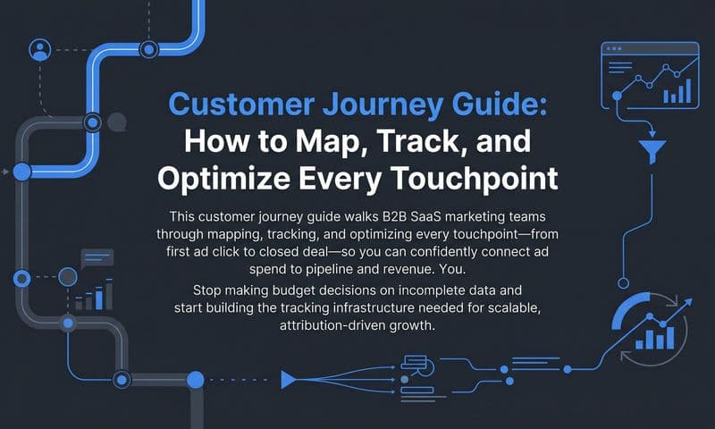
Most marketing teams know their customers go through a journey before converting. But few have a clear, documented picture of what that journey actually looks like. An experience journey map changes that.
At its core, an experience journey map is a visual representation of every touchpoint a customer has with your brand. From the moment they first encounter an ad to the moment they become a paying customer and beyond, it captures the full arc of how someone moves from stranger to subscriber to advocate.
For B2B SaaS companies, this kind of clarity is especially valuable. Buying cycles are long, multiple stakeholders are involved, and the path from awareness to closed-won revenue rarely follows a straight line. Without a structured map, marketing teams are left guessing which channels are working, where prospects drop off, and what content actually moves people forward.
The problem is that most journey maps are built on assumptions. Teams sketch out what they think the journey looks like based on intuition, a few customer conversations, or a generic framework they found online. The result is a diagram that looks polished but does not reflect how customers actually behave.
This guide walks you through exactly how to build an experience journey map that is grounded in real data. You will learn how to identify your key personas, gather meaningful touchpoint data, structure your map across stages, and use it to make smarter decisions about ad spend and campaign strategy.
By the end, you will have a practical framework you can apply immediately, whether you are mapping a journey for the first time or rebuilding one that has grown outdated.
The goal is not to create a pretty diagram that lives in a slide deck. It is to build a living document that your marketing, sales, and growth teams can use to align on what drives pipeline and revenue. Let's get into it.
Step 1: Define Your Persona and the Journey Scope
Before you open a whiteboard tool or pull a single data point, you need to answer two foundational questions: who is this map for, and what journey does it cover?
The most common mistake teams make at this stage is trying to map everything at once. They want to capture all personas, all channels, and the full lifecycle from first impression to renewal. The result is a map so broad it becomes meaningless. Nobody can act on it because it applies to everyone and therefore guides no one.
Start with one specific buyer persona. Think about your most common customer profile: the job title, the company size, the problem they are trying to solve, and the way they typically find you. If you are a B2B SaaS company targeting mid-market operations teams, your primary persona might be a VP of Operations at a 200-person company who is evaluating tools to reduce manual reporting. That level of specificity matters.
Once you have your persona locked in, define the start and end points of the journey you are mapping. A useful scope for most B2B SaaS teams is the full pre-purchase journey: from first ad impression or organic discovery through to closed-won deal. You can always extend the map into onboarding and expansion later, but starting with the acquisition journey gives you the most immediate leverage over pipeline and revenue.
Next, identify the primary goal of this persona at each major stage. At the awareness stage, they are trying to understand whether a problem they have is solvable. At the consideration stage, they are evaluating options and building an internal case. At the decision stage, they are narrowing down vendors and seeking reassurance. Knowing what your persona is trying to accomplish at each stage shapes everything that follows.
Common pitfall: Mapping too broadly across multiple personas creates a generic map that is not actionable for any single segment. Resist the temptation to add "or this type of buyer" qualifiers throughout. Keep it focused.
Success indicator: You can clearly articulate who this map is for, what journey it covers, and what specific marketing or sales decision it will inform. If you cannot answer those three things in two sentences, narrow your scope further.
Step 2: Gather Touchpoint Data From Real Sources
Here is where most journey maps fall apart. Teams skip the data-gathering phase and jump straight to mapping based on what they assume the journey looks like. The resulting map reflects internal beliefs, not customer reality.
Real journey maps are built from a combination of qualitative and quantitative sources. Neither alone gives you the full picture.
Start with your quantitative data. Pull conversion path reports from your attribution platform to see which channels and touchpoints appear most frequently before a deal closes. Review your CRM to understand how long deals take, how many touches happen before a meeting is booked, and which lead sources produce the highest close rates. Look at your website analytics to see which pages prospects visit, in what order, and where they exit.
Then layer in qualitative data. Interview five to ten recent customers and ask them to walk you through exactly how they found you, what they researched before reaching out, and what ultimately tipped them toward a decision. These conversations consistently surface touchpoints that never appear in your analytics, like a peer recommendation at a conference, a LinkedIn post from a colleague, or a competitor comparison article they read three times before booking a demo.
Review sales call recordings and CRM notes as well. These are goldmines for understanding the questions prospects ask, the objections they raise, and the moments where deals stall. If your sales team consistently hears the same question about a specific feature or integration, that is a signal that a touchpoint is missing earlier in the journey.
One critical point on data quality: be careful about relying only on last-click attribution. Last-click models assign all credit to the final touchpoint before conversion, which systematically undervalues the early-stage interactions that built awareness and intent in the first place. A prospect might have clicked a Google ad as their final step, but their journey likely started weeks earlier with a piece of organic content, a social post, or a referral. Multi-touch attribution gives you a far more accurate picture of which touchpoints are actually contributing to pipeline.
Common pitfall: Relying only on last-click data will give you a distorted picture of the journey, missing the early touchpoints that build awareness and intent. Use multi-touch attribution data wherever possible.
Success indicator: You have a list of at least ten to fifteen distinct touchpoints backed by real data from at least two different sources. If every touchpoint on your list came from a single channel or source, you have more digging to do.
Step 3: Organize Touchpoints Into Journey Stages
Now that you have your raw list of touchpoints, it is time to bring structure to the data. The goal of this step is to group touchpoints into logical stages that reflect how your buyer actually moves through the journey.
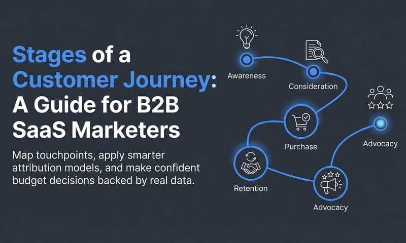
A common stage framework for B2B SaaS looks like this: Awareness, Consideration, Decision, and Retention. Awareness is when the prospect first recognizes a problem or discovers your brand. Consideration is when they are actively evaluating solutions and comparing options. Decision is when they are narrowing down vendors and preparing to buy. Retention covers what happens after the sale, including onboarding, adoption, and expansion.
For each touchpoint, document three things: the channel it happens on, the content type or format involved, and the action the prospect takes. For example, a touchpoint in the Consideration stage might be: LinkedIn Sponsored Content, a customer story video, prospect clicks through to the website and visits the pricing page. That level of detail makes the map useful rather than decorative.
Also document the emotional state of the buyer at each stage. What are they feeling? What questions are top of mind? What is their level of urgency? A prospect in the Awareness stage is often curious but not yet committed to solving the problem. A prospect in the Decision stage is likely anxious about making the wrong choice and looking for reassurance. Capturing these emotional states helps your content and messaging team create materials that actually resonate at each moment.
Identify which touchpoints are owned by marketing, which by sales, and which by product. This ownership layer is critical for team alignment later. If a touchpoint falls into a gray area, that is worth flagging now rather than discovering it during a deal review. Understanding the distinct stages of the customer journey ensures every team member knows where their responsibilities begin and end.
Common pitfall: Forcing touchpoints into a neat linear sequence when the real journey is non-linear. In B2B, multiple stakeholders are involved, and a champion might loop back to the Awareness stage to educate a new decision-maker who just joined the evaluation. Build your map to reflect this reality rather than hiding it.
Success indicator: Each stage has a clear set of touchpoints, a defined buyer mindset, and a logical transition to the next stage. If you cannot describe what moves a prospect from one stage to the next, that transition point is likely a gap worth investigating.
Step 4: Identify Gaps, Drop-Offs, and High-Impact Moments
This is the step where the map starts earning its keep. You have organized your touchpoints into stages. Now you are going to use that structure to find the places where your customer experience breaks down and the moments where it excels.
Start by looking for stages where you have few or no touchpoints. A gap in the map usually means a gap in your marketing coverage. If you have robust touchpoints in Awareness and Decision but almost nothing in Consideration, that is a signal that prospects are finding you but not getting the content or engagement they need to move forward. They may be going to competitors who fill that gap.
Next, use your attribution data to find where prospects disengage. Look for patterns in your CRM: where do deals stall most often? Which stage has the longest average time between touchpoints? Where do prospects go silent before converting or before churning out of the pipeline entirely? These drop-off points are often the highest-leverage places to invest. A structured approach to customer journey tracking makes these patterns far easier to spot.
Then flip the analysis. Look at the journeys of your best customers, the ones who converted quickly, expanded their usage, and became strong references. Which touchpoints appear consistently in their journeys? These are your high-impact moments. They are the interactions that seem to correlate with faster, higher-quality conversions. Investing more in these touchpoints, whether through budget, content, or sales attention, tends to produce outsized returns.
Compare the journeys of customers who converted quickly versus those who took much longer. The patterns you find often reveal what causes velocity differences. Maybe fast converters always had a live demo early in the process. Maybe slow converters never engaged with your ROI calculator. These comparisons give you hypotheses you can test.
Connect this analysis to pipeline velocity metrics. If you can show that addressing a specific gap in the Consideration stage would reduce average deal length, that is a business case your leadership team can act on. Gap analysis without a business impact connection is interesting but not prioritizable.
Common pitfall: Identifying gaps without connecting them to a business impact makes it hard to prioritize fixes. Always tie your findings back to a metric: conversion rate, deal velocity, pipeline volume, or revenue.
Success indicator: You have a prioritized list of two to three gaps or friction points that, if addressed, would most likely improve conversion rates or shorten sales cycles. That short list becomes your near-term roadmap.
Step 5: Visualize the Map and Align Your Team Around It
You have done the hard analytical work. Now it is time to turn your findings into something your team can actually use. The format you choose matters less than the clarity and accessibility of what you build.
For most teams, a simple spreadsheet or a collaborative whiteboard tool like Miro or FigJam works well. Dedicated journey mapping tools exist, but they are often overkill for a first map. Start with whatever format your team will actually open and update. A beautiful map that no one uses is worse than a simple one that drives weekly decisions.
Structure the visual with journey stages across the top as column headers. In the rows below, layer in: the specific touchpoints at each stage, the channel or tactic responsible for each touchpoint, the content type or format, the buyer's emotional state or primary question, and the team that owns each interaction. This grid format makes it easy to scan across stages and see the full picture at a glance.
Once the map is built, share it with marketing, sales, and growth stakeholders and walk through it together. Do not just send a link and ask for async feedback. Schedule a working session and present the map in real time. This is where the most valuable input comes from. Sales will immediately flag touchpoints that are missing or inaccurate based on what they see in deals. Marketing will surface channels that are not represented. Growth will identify moments where product-led signals could be captured.
Disagreements during this session are a good sign. They mean the map is surfacing real misalignment that was previously invisible. Work through them in the room rather than smoothing them over.
Common pitfall: Building the map in isolation without input from sales means you will miss critical touchpoints that happen after the marketing handoff. The map should reflect the full journey, not just the portion marketing controls.
Success indicator: Every person in the room can look at the map and immediately identify what they are responsible for and where the biggest opportunities are. If the map requires extensive explanation to be useful, simplify it.
Step 6: Connect the Map to Attribution Data for Ongoing Measurement
A journey map without a measurement layer is a hypothesis. It captures what you believe the journey looks like, but it cannot tell you whether your investments are moving the needle. This final step is what transforms your map from a static document into a living decision tool.
Start by linking each touchpoint in your map to a measurable event in your attribution platform. Every touchpoint should have a corresponding data signal: an ad click, a page view, a form submission, a demo booking, a CRM stage change. If a touchpoint cannot be measured, that is worth noting. Either find a way to track it or acknowledge the blind spot.
Use multi-touch attribution to understand which touchpoints contribute most to pipeline and revenue, not just which ones appear most frequently. Frequency alone is misleading. A touchpoint might appear in many journeys but have little influence on whether a deal closes. Multi-touch attribution models help you distinguish between touchpoints that drive decisions and those that are simply present.
Set up dashboards that track key journey metrics on an ongoing basis. Useful metrics include time between touchpoints at each stage, conversion rates from one stage to the next, channel influence at each stage, and the average number of touchpoints before a deal closes. These metrics let you see when the journey is changing, so you can update the map before it becomes outdated.
This is where a platform like Cometly becomes particularly valuable. Cometly connects ad platform data with CRM events and revenue data, giving you a real-time view of the full journey from first ad click to closed-won revenue. Instead of stitching together reports from five different tools, you get a single source of truth that maps directly onto your journey stages. You can see which channels are influencing deals at each stage, how long prospects spend in each part of the journey, and which touchpoints appear most often in the paths of your highest-value customers.
Review the map on a quarterly basis. Customer behavior shifts as new channels emerge, competitive dynamics change, and your product evolves. A map that was accurate six months ago may no longer reflect how prospects are finding and evaluating you today. Build the quarterly review into your team calendar so it actually happens.
Common pitfall: Treating the map as a one-time exercise rather than a living document. The value of the map compounds over time as you update it with new data and refine your understanding of the journey.
Success indicator: You can point to specific changes in your map that led to measurable improvements in pipeline or conversion rates. That is the standard a data-driven journey map should be held to.
Putting It All Together
Building an experience journey map is not a one-afternoon project. But it does not have to be a months-long initiative either. The six steps in this guide give you a structured path from blank page to actionable map.
Here is a quick-reference checklist for each step:
Step 1: Define persona and scope. Choose one persona, set clear start and end points, and identify the primary goal at each stage.
Step 2: Gather touchpoint data. Pull from ad platforms, CRM, website analytics, customer interviews, and sales call recordings. Use multi-touch attribution data, not just last-click.
Step 3: Organize into stages. Group touchpoints into Awareness, Consideration, Decision, and Retention. Document channel, content type, buyer action, and emotional state for each.
Step 4: Identify gaps and high-impact moments. Find where prospects drop off, where coverage is thin, and which touchpoints appear in the journeys of your best customers. Connect findings to pipeline metrics.
Step 5: Visualize and align. Build the map in a format your team will use. Walk through it live with marketing, sales, and growth stakeholders. Surface and resolve disagreements.
Step 6: Connect to attribution data. Link every touchpoint to a measurable event. Set up dashboards for ongoing tracking. Review and update the map quarterly.
The map is only as good as the data behind it and the team alignment around it. Start with one persona and one journey. Get that right before expanding to other segments or lifecycle stages.
If you want to give your experience journey map a real-time data layer, Get your free demo of Cometly today and see how connecting your ad platforms, CRM, and revenue data can turn a static map into your team's most powerful decision-making tool.