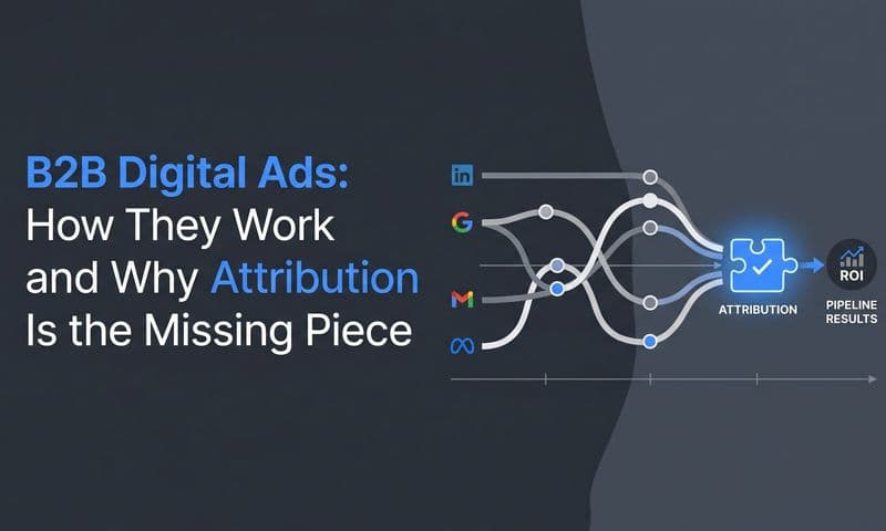
You're running campaigns across Meta, Google, TikTok, and maybe a handful of other platforms. The data is pouring in. Clicks, impressions, conversions, cost per acquisition. But when you open your spreadsheet to figure out what's actually working, you're staring at rows and rows of numbers that tell you everything and nothing at the same time.
Where are people dropping off? Which channels are actually driving revenue, not just clicks? Is your awareness campaign feeding your bottom-funnel conversions, or are you wasting budget on traffic that goes nowhere?
This is the frustration that keeps marketers up at night. You have the data, but you can't see the story. Visual marketing funnel analytics changes that. Instead of hunting through spreadsheets for patterns, you see your entire customer journey laid out in clear, actionable visuals that show exactly where leads are dropping off, which channels are pulling their weight, and where your next optimization should focus.
This guide will walk you through how visual funnel analytics works, what you should be tracking at each stage, and how to build a setup that turns raw marketing data into decisions you can make with confidence.
Turning Raw Data Into a Clear Picture of Your Customer Journey
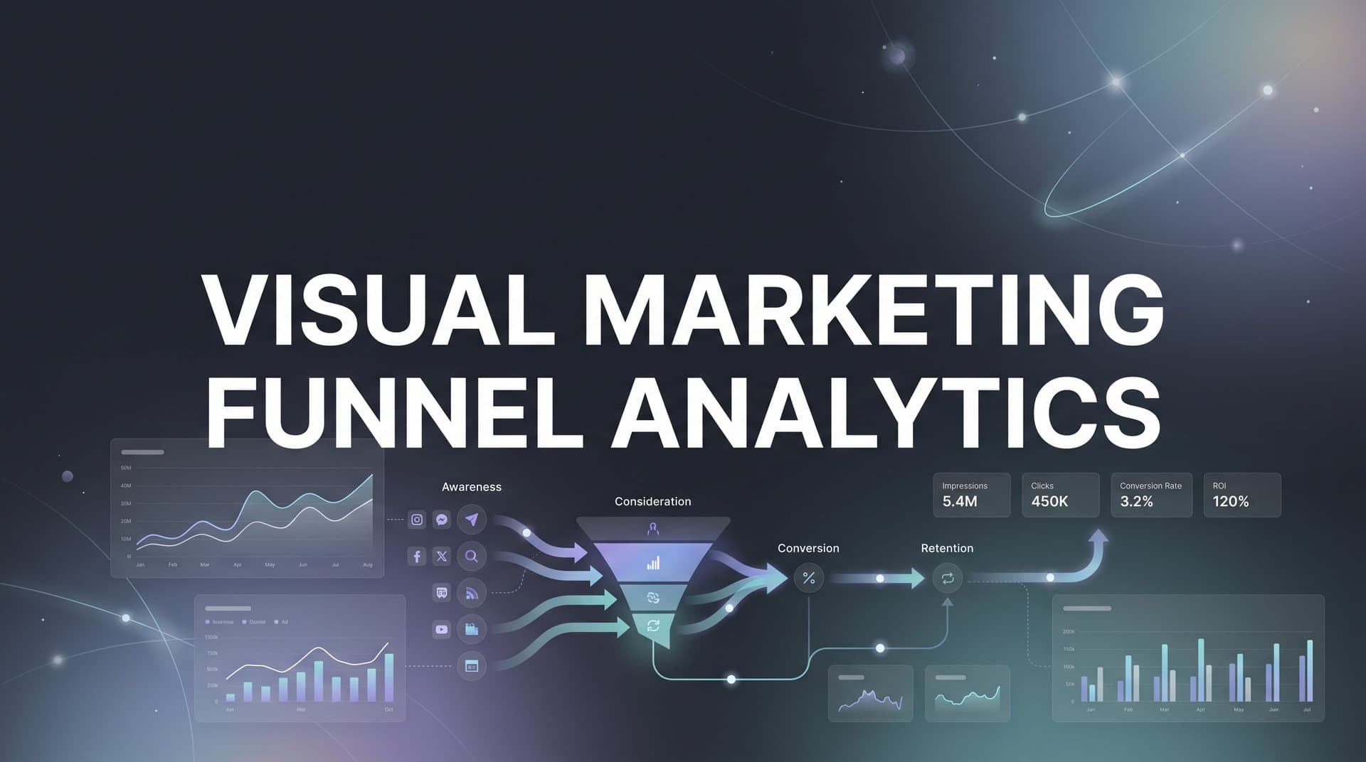
Visual marketing funnel analytics is the practice of representing customer journey stages through visual dashboards, charts, and flow diagrams that show how prospects move from awareness to conversion. Instead of analyzing conversion rates in spreadsheet cells, you see the actual flow of people through your funnel, complete with drop-off points, bottlenecks, and conversion trends.
The difference between traditional spreadsheet analysis and visual funnel analytics is like the difference between reading a map's coordinates versus actually looking at the map. Both contain the same information, but one lets you see patterns instantly while the other requires mental translation.
When you visualize your funnel, you can spot a sudden drop-off between consideration and purchase at a glance. You can see that your Facebook campaigns drive tons of awareness-stage traffic but almost none of it converts, while your Google Ads bring fewer visitors but higher-quality leads. These insights exist in your spreadsheets too, but they're buried in formulas and pivot tables that take time to decode.
Visual funnel analytics typically includes several core components working together. Funnel stage visualization shows the volume of prospects at each stage of your customer journey, usually represented as a literal funnel shape that narrows as people progress. Conversion rate displays show the percentage of people moving from one stage to the next, making it obvious where your biggest leaks are.
Channel attribution views break down which traffic sources are contributing to each funnel stage, so you can see if your paid social is driving awareness while your email marketing closes deals. Time-based progression charts show how quickly prospects move through your funnel and whether certain channels or campaigns accelerate or slow that journey. Understanding marketing analytics visualization principles helps you build these components effectively.
The real power comes when these components work together in a unified dashboard. You're not looking at isolated metrics anymore. You're seeing the complete story of how your marketing efforts connect to actual business outcomes.
This matters because marketing has become increasingly complex. You're running campaigns across multiple platforms, each with its own tracking and reporting. Your prospects don't follow a linear path anymore. They might see your Facebook ad, research you on Google, read your blog, and then convert through a retargeting campaign weeks later.
Traditional analytics tools show you what happened on each platform in isolation. Visual funnel analytics connects those dots, showing you the complete journey and which touchpoints actually matter. That shift from platform-specific reporting to unified journey visualization is what makes modern marketing attribution possible.
The Five Funnel Stages Every Visual Dashboard Should Track
Your visual funnel analytics should track five distinct stages, each with specific metrics that reveal how prospects are progressing toward becoming customers. Understanding what to measure at each stage transforms your dashboard from a pretty picture into a diagnostic tool.
The awareness stage captures the moment someone first encounters your brand. The key metrics to visualize here are reach, impressions, and unique visitors. Your visual dashboard should show the volume of people entering your funnel from different channels, making it easy to see which platforms are driving the most top-of-funnel traffic. This is where you identify whether your brand-building efforts are actually reaching new audiences.
The consideration stage tracks prospects who are actively evaluating your solution. Visualize metrics like page views per session, time on site, content engagement, and return visits. Your dashboard should show how many awareness-stage visitors are engaging deeply enough to be considered real prospects. The conversion rate from awareness to consideration is your first critical drop-off point to monitor.
The intent stage captures prospects who are signaling purchase readiness. Track actions like demo requests, pricing page visits, product comparisons, and cart additions. Visual representation of this stage should highlight how many engaged prospects are taking concrete steps toward buying. This is often where you'll see the biggest volume drop-off, and your visuals should make that obvious.
The purchase stage is straightforward but crucial. Visualize completed transactions, revenue generated, and conversion rates from intent to purchase. Your dashboard should show not just the number of conversions but also which channels and campaigns are driving them. This is where attribution visualization becomes particularly valuable.
The loyalty stage tracks post-purchase behavior like repeat purchases, upsells, referrals, and lifetime value. Many marketers stop their funnel visualization at purchase, but seeing how customers behave after buying reveals which acquisition channels bring the most valuable long-term customers, not just one-time buyers. Implementing marketing funnel analytics across all five stages gives you complete visibility.
The stage-to-stage conversion rates are what matter most. Your visual dashboard should make these transitions obvious. If 10,000 people enter awareness but only 100 reach consideration, you have a massive drop-off that needs attention. If 500 people show intent but only 50 convert, your checkout process or pricing might be the problem.
Tracking both volume and velocity matters because they tell different stories. Volume shows you how many people are at each stage right now. Velocity shows you how long they're taking to move through. A visual dashboard that displays both helps you identify whether you have a traffic problem or a conversion problem.
When you can see all five stages in one visual view, patterns emerge that would be invisible in separate reports. You might notice that prospects who engage with certain content types move through the funnel faster. Or that traffic from specific channels tends to stall at consideration and never reaches intent. These insights drive the optimization decisions that actually move the needle.
Connecting Ad Performance to Funnel Movement
The most valuable aspect of visual funnel analytics is seeing exactly how your ad campaigns connect to actual funnel progression. This is where marketing attribution stops being theoretical and becomes actionable.
Visual funnel analytics ties specific ad campaigns and channels to movement through funnel stages by tracking every touchpoint a prospect encounters before converting. Instead of seeing that Campaign A generated 500 clicks and Campaign B generated 300, you see that Campaign A drove 200 people into awareness but only 10 into consideration, while Campaign B drove fewer total visitors but 50 into consideration and 20 into intent.
This level of visibility changes how you allocate budget. You stop optimizing for vanity metrics like clicks and impressions and start optimizing for the funnel movement that actually matters for your business. A campaign that drives massive awareness-stage traffic but zero consideration-stage engagement is fundamentally different from one that brings fewer visitors but higher-quality prospects who actually progress.
Multi-touch attribution visualization shows how different touchpoints contribute to conversions throughout the customer journey. Instead of giving all credit to the first click or last click, you see a visual representation of every ad, email, content piece, and touchpoint that influenced the conversion. This might reveal that your Facebook ads are excellent at initial awareness, your blog content drives consideration, your retargeting campaigns build intent, and your email sequences close the deal. Navigating attribution challenges in marketing analytics becomes much easier with proper visualization.
Without visual attribution, you might kill your Facebook campaigns because they don't show many direct conversions. With visual multi-touch attribution, you see that those campaigns are essential top-of-funnel drivers that feed the rest of your funnel. The visual representation makes these relationships obvious in a way that attribution reports filled with percentages never could.
Different ad platforms drive different funnel stages, and your visual analytics should make this clear. Social media advertising often excels at awareness and consideration because people are in discovery mode. Search advertising typically drives higher intent because prospects are actively looking for solutions. Retargeting campaigns excel at converting people who have already shown intent but haven't purchased yet.
Your visual dashboard should show these patterns clearly. You should be able to see at a glance that your TikTok campaigns are flooding your awareness stage, your Google Ads are driving qualified consideration-stage traffic, and your Meta retargeting is converting people from intent to purchase. This visibility lets you optimize each channel for its actual role in your funnel rather than judging everything by the same conversion metric.
The challenge is that this level of attribution requires accurate tracking across all your platforms and touchpoints. Browser-based tracking misses a significant portion of conversions due to ad blockers, privacy settings, and cross-device journeys. Server-side tracking has become essential for the data accuracy that makes visual attribution reliable. When your tracking is incomplete, your visual funnel shows a distorted picture that leads to bad decisions.
When your visual attribution is accurate, you can make confident decisions about budget allocation, campaign optimization, and channel strategy. You're not guessing which campaigns matter. You're seeing exactly how each piece of your marketing puzzle contributes to the complete picture.
Reading Your Funnel Visuals: Patterns That Signal Action
Visual funnel analytics only creates value if you know how to read what you're seeing. Certain patterns signal specific problems and opportunities, and recognizing them quickly is what separates reactive marketers from proactive ones.
Sudden drop-offs between stages are the most obvious red flag. If your funnel shows 5,000 people in awareness, 4,500 in consideration, but only 100 in intent, you have a massive leak at the consideration-to-intent transition. This pattern suggests that people are interested enough to learn about you but not convinced enough to take action. The fix might be clearer value propositions, stronger social proof, or better-targeted offers.
Bottlenecks appear when one stage consistently has high volume but low conversion to the next stage. If your intent stage always has hundreds of people but very few convert to purchase, your checkout process, pricing, or final offer might be the problem. Visual dashboards make bottlenecks obvious because you see the buildup of prospects who aren't progressing. Learning about optimizing marketing funnel with analytics helps you address these issues systematically.
Leaky stages show up as steady declines in volume without corresponding improvements in conversion quality. If every stage of your funnel is losing 70-80% of prospects, you don't have one specific problem to fix. You have a systematic issue with targeting, messaging, or product-market fit. This pattern suggests you need to revisit your entire funnel strategy, not just optimize one stage.
Conversion rate trends over time reveal whether your optimization efforts are working. If your visual dashboard shows that your awareness-to-consideration conversion rate has been climbing steadily over the past month, your content improvements are working. If it's declining, something changed for the worse, and you need to investigate what.
Upward trends in conversion rates signal that your funnel is getting more efficient. You're attracting better-qualified traffic, your messaging is resonating more effectively, or your offers are becoming more compelling. These positive trends tell you to keep doing what you're doing and potentially increase investment in the channels and campaigns driving the improvement.
Downward trends demand immediate attention. If your purchase conversion rate drops suddenly, you need to figure out what changed. Did you adjust pricing? Change your checkout process? Shift your targeting? Visual trend lines make these drops obvious, triggering investigation before small problems become major revenue losses.
Visual comparisons between channels, campaigns, or time periods reveal optimization opportunities that isolated metrics miss. When you can see that Channel A drives 3x more awareness-to-consideration conversions than Channel B, you know where to allocate more budget. When you compare this month's funnel to last month's and see that consideration-to-intent conversions improved by 40%, you know your messaging changes are working.
Seasonal patterns become visible when you look at funnel performance over longer time periods. Your visual dashboard might show that consideration-stage conversions always spike in certain months, helping you plan budget allocation and campaign timing. These patterns are nearly impossible to spot in spreadsheets but obvious in time-based visual charts.
The key is developing the habit of regular funnel review using your visual dashboards. When you check your funnel visuals weekly, you start recognizing patterns quickly and acting on them before they become problems. Visual analytics turns funnel optimization from a quarterly project into an ongoing practice.
Building a Visual Analytics Setup That Drives Decisions
Creating visual funnel analytics that actually drives better marketing decisions requires connecting the right data sources and ensuring the accuracy of what you're visualizing. A beautiful dashboard built on incomplete or inaccurate data is worse than no dashboard at all because it gives you false confidence.
The technical foundation starts with connecting your ad platforms, CRM systems, and website tracking into a unified view. Your Facebook Ads, Google Ads, TikTok, and any other advertising platforms need to feed data into your analytics system. Your CRM needs to report conversion events and customer data. Your website analytics need to track behavior across all pages and stages.
Many marketers try to build this unified view by manually combining reports from different platforms. This approach breaks down quickly because the data doesn't align. Facebook reports conversions one way, Google reports them another way, and your CRM has its own attribution logic. You end up with three different versions of the truth and no reliable way to visualize the complete funnel. Addressing marketing analytics data gaps is essential before building your visual dashboards.
The solution is a marketing attribution platform that connects all your data sources and normalizes the data into a consistent view. This creates the single source of truth your visual dashboards need to be reliable. When every touchpoint, conversion, and customer journey flows through one system, your funnel visualization reflects reality rather than a patchwork of conflicting reports.
Server-side tracking has become essential for accurate data that feeds reliable visualizations. Browser-based tracking faces increasing limitations from privacy changes, ad blockers, and cross-device journeys. When a significant portion of your conversions aren't being tracked, your funnel visualization shows incomplete patterns that lead to wrong conclusions.
Server-side tracking captures conversion events directly on your server, bypassing browser limitations. This means your visual funnel includes all conversions, not just the ones that made it through browser-based tracking. The difference in data completeness can be substantial, particularly for mobile traffic and privacy-conscious users.
Real-time data synchronization matters because marketing moves fast. A visual dashboard showing week-old data might look impressive, but it's not useful for making current decisions. If your visual funnel shows a drop-off that happened five days ago, you've already lost five days of optimization opportunity.
Modern visual analytics platforms sync data continuously, so your dashboards reflect current performance. You can see how today's campaigns are performing, which channels are driving funnel movement right now, and whether yesterday's optimization improved conversion rates. Selecting the right marketing data analytics platform ensures you get this real-time visibility.
The technical setup also needs to handle data enrichment. Raw conversion events don't tell you much. But when those events are enriched with customer data, channel attribution, campaign details, and behavioral signals, your visual funnel becomes dramatically more useful. You can filter and segment your funnel visualization by customer type, traffic source, campaign, or any other dimension that matters for your business.
Building this setup isn't trivial, but it's the foundation that makes visual funnel analytics valuable. Without accurate, unified, real-time data, your visual dashboards are just pretty charts that don't drive better decisions.
Putting Visual Funnel Insights Into Action
Visual marketing funnel analytics only creates value when insights translate into actions that improve performance. The goal is not prettier dashboards but faster, more confident decisions about where to invest marketing budget and how to optimize campaigns.
Establish a framework for weekly funnel review sessions using your visual dashboards. Set aside time every week to examine your funnel visualization, identify changes from the previous week, and spot patterns that suggest optimization opportunities. This regular cadence prevents you from reacting to every daily fluctuation while ensuring you catch meaningful trends quickly.
During your review, focus on stage-to-stage conversion rates first. Which transitions improved? Which declined? A 5% improvement in awareness-to-consideration conversion might not sound dramatic, but applied across thousands of visitors, it represents significant additional qualified prospects entering your funnel. Visual dashboards make these changes obvious, triggering investigation into what drove the improvement so you can replicate it.
Prioritize optimization efforts based on where visual analysis shows the biggest leaks or opportunities. If your funnel shows that 80% of prospects drop off between consideration and intent, that's your highest-leverage optimization opportunity. Improving that conversion rate by even 10% will have more impact than doubling your awareness-stage traffic.
Your visual dashboard should guide this prioritization. Look for the largest gaps between stages, the steepest drop-offs, or the stages with declining conversion rates. These visual signals tell you where to focus your optimization energy for maximum impact. Understanding how data analytics can improve marketing strategy helps you translate these insights into concrete actions.
Feed insights back to your ad platforms to improve targeting and campaign performance. When your visual funnel shows that certain audience segments or campaign types drive higher-quality prospects who progress further through the funnel, use that information to adjust your targeting. Allocate more budget to the campaigns that drive valuable funnel movement, not just cheap clicks.
Modern advertising platforms use machine learning to optimize campaigns, but they need good data to learn from. When you identify which conversions matter most based on funnel progression, you can send that signal back to platforms like Meta and Google. This creates a feedback loop where your visual funnel insights improve ad targeting, which improves funnel performance, which generates better insights.
Use visual comparisons to test new strategies. When you launch a new campaign, compare its funnel performance to your baseline. Does it drive prospects who progress through stages faster? Does it bring higher-quality awareness-stage traffic that converts to consideration at better rates? Visual side-by-side comparisons answer these questions quickly, letting you scale winners and kill losers before wasting significant budget.
Share visual funnel dashboards with your team to align everyone around the same goals and metrics. When your entire marketing team can see the complete funnel and how their efforts contribute, collaboration improves. Your content team understands which assets drive consideration-stage engagement. Your paid media team sees which channels feed high-intent prospects. Your sales team knows which marketing sources deliver the most qualified leads.
Seeing Your Way to Smarter Marketing Decisions
Visual marketing funnel analytics transforms how marketers understand and optimize their customer journey. Instead of hunting through spreadsheets for patterns, you see the complete story of how prospects move from awareness to conversion, which channels drive movement at each stage, and where your biggest opportunities for improvement exist.
The goal is not just prettier reports. It's faster, more confident decisions about where to invest marketing budget, which campaigns to scale, and which parts of your funnel need immediate attention. When you can see your entire customer journey in clear visual dashboards, optimization becomes proactive rather than reactive.
The marketers who win in an increasingly complex digital landscape are those who can make sense of massive amounts of data quickly and act on insights before opportunities disappear. Visual funnel analytics provides that clarity, turning raw marketing data into actionable intelligence you can literally see.
Evaluate your current analytics setup honestly. Can you see your complete customer journey across all channels in one place? Do you know which campaigns drive awareness versus which ones convert high-intent prospects? Can you spot funnel drop-offs and optimization opportunities at a glance? If the answer is no, you're making marketing decisions with incomplete information.
The shift to visual funnel analytics isn't optional anymore. It's how modern marketing teams operate. The platforms, tracking capabilities, and visualization tools exist to give you complete visibility into your customer journey. The question is whether you'll adopt them before your competitors do.
Ready to elevate your marketing game with precision and confidence? Discover how Cometly's AI-driven recommendations can transform your ad strategy. Get your free demo today and start capturing every touchpoint to maximize your conversions.