
Most marketing teams are sitting on a mountain of data and still can't answer a simple question: how did this customer actually find us, and what convinced them to buy? Ad platforms show clicks. The CRM shows pipeline stages. Analytics tools show page visits. But none of these systems talk to each other in a way that reveals the full story of how a prospect moved from stranger to signed contract.
That's where a customer journey graphic comes in. It's the visual framework that takes all of those disconnected signals and arranges them into a coherent picture of how buyers actually behave. Not how you assume they behave, and not how a single attribution model says they behave, but how they actually move through your funnel across channels, sessions, and time.
For B2B SaaS teams, this is not a design exercise. It's a strategic requirement. When sales cycles stretch across weeks or months, involve multiple stakeholders, and span a dozen different touchpoints, you cannot make confident budget decisions without a clear map of the journey. The teams that build accurate journey graphics are the ones that know which ads to scale, which channels to cut, and where in the funnel to invest more resources.
This article walks through everything you need to know: what a customer journey graphic actually contains, why it changes how you think about attribution, how to build one from real data, and how to use it to make smarter decisions about your ad spend and pipeline strategy.
The Anatomy of a Customer Journey Graphic
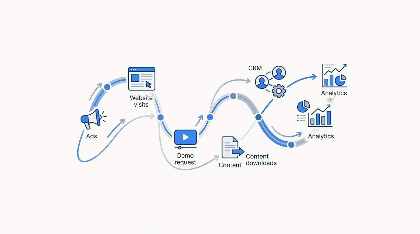
A customer journey graphic is a visual representation of every stage a prospect moves through, from the first moment they encounter your brand to the point of conversion and beyond. At its core, it maps touchpoints across channels and time, giving your team a shared view of how buyers progress through your funnel.
Every effective customer journey graphic contains four foundational components. Understanding each one is essential before you start building.
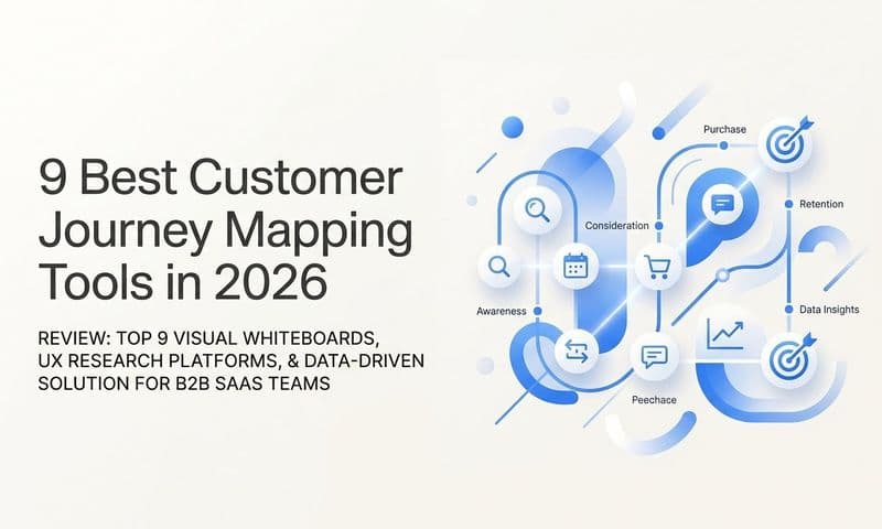
Stages: These are the broad phases of the buyer's journey. In B2B SaaS, they typically include awareness (the prospect discovers you exist), consideration (they're actively evaluating options), decision (they're ready to buy or talk to sales), and retention (post-purchase engagement and expansion). Each stage represents a different mindset, and the messaging and channels that work in one stage often fail in another.
Touchpoints: These are the individual interactions that happen within each stage. A touchpoint might be a LinkedIn ad impression, a Google search click, a blog post visit, a demo request form submission, a sales call, or a follow-up email. The graphic should capture all of them, not just the ones your tracking setup makes easy to see.
Channels: Each touchpoint happens through a specific channel, whether that's paid search, organic social, email, direct, or sales outreach. Mapping touchpoints to channels lets you see which channels are most active at each stage of the journey and which ones tend to appear in deals that actually close.
Data signals: These are the behavioral indicators that tell you a prospect has moved from one stage to another. A form submission signals movement from consideration to decision. A pricing page visit signals high intent. A second demo request after a period of silence might signal re-engagement. Without capturing these signals, your graphic is a hypothesis rather than a reflection of reality.
Here's where B2B SaaS journey graphics diverge significantly from simpler e-commerce funnels. In e-commerce, a customer might see an ad, visit a product page, and check out in a single session. In B2B SaaS, the journey might span three months, involve a champion, a technical evaluator, and a finance approver, and include a mix of self-serve research and sales-assisted touchpoints happening simultaneously across different people at the same company.
This means your customer journey graphic must account for non-linear paths. Prospects loop back. They go quiet and re-engage. They enter the funnel at different stages depending on how they found you. A graphic that only shows a straight line from awareness to conversion will misrepresent the majority of your actual deals and lead to attribution decisions that don't reflect how revenue is actually generated.
Why Visualizing the Journey Changes How You Attribute Revenue
Most marketing teams default to last-click attribution. It's the simplest model available, and most ad platforms report it by default. The problem is that last-click attribution credits only the final touchpoint before a conversion and ignores every interaction that built intent along the way.
Think about what that means in practice. A prospect sees your LinkedIn ad, reads a blog post, attends a webinar, gets a retargeting ad, and then clicks a branded search ad before requesting a demo. Last-click attribution gives all the credit to branded search. Your LinkedIn campaign, your content, and your webinar get zero credit, even though they were the touchpoints that created awareness and built enough trust to drive the final click.
A customer journey graphic makes this problem visible. When you lay out the full sequence of touchpoints for a set of closed deals, you can see exactly how many interactions preceded the final one and which channels were consistently present in winning journeys. That visualization alone is enough to challenge the assumptions that last-click attribution creates.
But the real power comes when you layer multi-touch attribution models onto the graphic. Different models tell different stories, and understanding each one helps you make better budget decisions.
Linear attribution distributes credit evenly across every touchpoint in the journey. It's a useful starting point because it at least acknowledges that multiple interactions contributed to the outcome.
Time-decay attribution weights touchpoints more heavily the closer they are to the conversion event. This model is useful for teams with shorter sales cycles where recent interactions carry more influence.
Position-based attribution (often called U-shaped) gives the most credit to the first and last touchpoints, with the remaining credit distributed across the middle. It's popular in B2B because it honors both the awareness-generating interaction and the conversion-driving one.
Data-driven attribution uses algorithmic analysis to assign credit based on actual conversion patterns in your data. It's the most accurate model available, but it requires sufficient data volume to produce reliable results.
When you overlay these models on a customer journey graphic, something important becomes clear: the model you choose changes which channels look valuable and which look expendable. A channel that appears consistently in the middle of winning journeys will be invisible in last-click reporting but significant in linear or time-decay models.
The business impact is direct. When marketers can see which touchpoints appear most often in journeys that result in closed revenue, they can shift budget toward those channels with confidence. And when they can see which touchpoints appear in journeys that stall or churn, they can stop funding activity that generates volume without generating revenue.
How to Build a Customer Journey Graphic That Reflects Real Data
The quality of your customer journey graphic is entirely determined by the quality of the data behind it. A graphic built on incomplete or fragmented data will misrepresent the journey, lead to poor attribution decisions, and ultimately cost you money. So before you think about visualization, you need to think about data infrastructure.
There are several core data sources that every accurate B2B SaaS journey graphic requires.
Ad platform events: Impressions, clicks, and conversion events from Meta, Google, LinkedIn, and any other paid channels you run. These capture the top-of-funnel interactions that introduce prospects to your brand and bring them back through retargeting.
Website behavior: Page visits, time on site, content downloads, pricing page views, and form submissions. This data reveals how prospects engage with your brand between ad interactions and signals where they are in their evaluation process.
CRM stage data: MQL creation, SQL qualification, opportunity creation, and closed-won or closed-lost outcomes. This is the data that connects marketing activity to actual pipeline and revenue, and it's often the missing link in journey graphics built by marketing teams without CRM integration.
Offline signals: Sales calls, demo meetings, and follow-up conversations. These touchpoints happen outside of your digital tracking infrastructure but are often the most influential interactions in the journey. If they're not captured, your graphic will have significant gaps during the decision stage.
The critical challenge is connecting all of these sources into a single, unified view. When your ad data lives in one platform, your website data in another, and your CRM in a third, you can't see the full journey. You can only see fragments of it. And a fragmented graphic produces fragmented insights that lead to fragmented decisions.
This is where server-side tracking and Conversion API integration become essential, not optional. Browser-based pixel tracking has become increasingly unreliable. Ad blockers prevent pixels from firing. iOS privacy changes limit the data that client-side scripts can collect. Cookie restrictions reduce the accuracy of cross-session attribution.
Server-side tracking routes conversion events through your own server before sending them to ad platforms, bypassing the browser entirely. Conversion API integrations with Meta and Google allow you to send enriched event data directly from your server to the platform, capturing touchpoints that a browser pixel would have missed entirely.
The practical implication is significant. If you're relying only on browser-based tracking, your journey graphic is showing you a partial picture of the actual journey. The touchpoints that are missing tend to cluster in specific segments of your audience, which means your attribution data is not just incomplete, it's systematically biased toward the users whose behavior is easiest to track.
Building a customer journey graphic on complete, server-side data changes the conclusions you draw from it. Channels that appeared weak in browser-only reporting often look significantly stronger once all touchpoints are captured. And channels that looked strong in last-click reporting sometimes look less significant when the full journey is visible.
Reading the Graphic: Patterns That Signal Optimization Opportunities
Once your customer journey graphic is built on clean, connected data, the next skill is learning how to read it. The graphic itself doesn't make decisions for you. It surfaces patterns that inform decisions, and knowing which patterns to look for is what separates teams that use journey data strategically from those that just admire the visualization.
Start by identifying high-performing journey paths. Look for sequences of touchpoints that consistently appear in deals that convert quickly and at higher average contract values. These are your winning paths. They represent the combination of channels, messages, and timing that your best customers experienced before they bought.
Compare those winning paths against journeys that stalled or churned. What's different? Are the touchpoints in different order? Are certain channels present in winning journeys but absent in losing ones? Is there a gap in the timeline at a particular stage that correlates with deals going cold? These comparisons often reveal actionable insights that no single metric can surface on its own.
Drop-off analysis is another powerful use of the journey graphic. Every funnel has stages where prospects disengage, but the graphic lets you pinpoint exactly where that disengagement happens most often. When you see a consistent drop-off at a specific stage, you can investigate whether the issue is messaging (the content at that stage doesn't resonate), channel mix (you're reaching people on the wrong platform at that moment), offer (the next step isn't compelling enough), or timing (you're moving too fast or too slow relative to where the buyer is in their evaluation).
Each of those root causes points to a different solution. Messaging issues require creative testing. Channel mix issues require budget reallocation. Offer issues require funnel redesign. Timing issues require nurture sequence adjustments. The journey graphic tells you where the problem is. Your analysis tells you what kind of problem it is.
Here's a distinction that many teams miss: touchpoint frequency is not the same as touchpoint quality. A channel that appears in a large percentage of journeys is not necessarily a valuable channel. It might simply be ubiquitous. If a channel appears in every journey, winning and losing alike, it's not differentiating your best customers from your worst. It's just background noise.
A well-built customer journey graphic makes this distinction visible. When you filter journeys by outcome, closed-won versus closed-lost, you can see which channels appear disproportionately in winning journeys versus all journeys. That's the signal worth acting on. A channel that shows up in 80% of winning journeys but only 40% of all journeys is doing something meaningful. A channel that shows up in 80% of winning journeys and 80% of all journeys is just everywhere.
Connecting Your Journey Graphic to Ad Performance and ROI
A customer journey graphic is not just a reporting artifact. It's a feedback mechanism that should actively improve the performance of your ad campaigns. The insights you extract from the graphic can flow back into your ad platforms to make their algorithms smarter, your targeting more precise, and your ROI more defensible.
Here's how that feedback loop works. When you identify which ad creative or campaign initiated the most winning journeys, you have a signal that your ad platform's algorithm can use to find more people like those buyers. By sending enriched conversion signals back to Meta and Google through Conversion API integrations, you're giving those platforms a more accurate picture of what a high-value conversion looks like.
Most teams send basic conversion events back to ad platforms: form submissions, demo requests, trial signups. But if your journey graphic shows that the customers who convert from a specific campaign tend to reach closed-won within 60 days and at above-average contract values, you can send that revenue outcome back as the conversion signal instead of the form submission. This trains the algorithm to optimize for the outcome that actually matters, not just the activity that's easy to track.
Pipeline and revenue attribution is the final layer of the journey graphic, and it's the one that gives marketing leaders a defensible ROI number. Most marketing teams report on leads or MQLs as their primary metric. These are useful leading indicators, but they're proxy metrics. A lead that never becomes revenue is not a win, and a marketing budget justified by lead volume is always vulnerable to scrutiny from finance and the CEO.
When your journey graphic connects ad spend at the top of the funnel to closed-won revenue at the bottom, you can answer the question that actually matters: for every dollar we spent on this campaign, how much pipeline did we create and how much revenue did we close? That's a number that justifies budget, earns trust from leadership, and guides allocation decisions with precision.
AI-driven recommendations are the next step once the journey graphic is built on clean, complete data. Modern attribution platforms use AI to surface patterns in journey data that would be difficult or time-consuming to identify through manual analysis. Which combination of touchpoints most reliably predicts a high-value conversion? Which campaigns generate volume but not revenue? Which channels are underinvested relative to their contribution to closed deals?
Platforms like Cometly are built specifically for this use case in B2B SaaS. By connecting your ad platforms, CRM, and website data into a single attribution system, Cometly gives you the journey graphic and the AI-powered recommendations that tell you what to do with it, so you're scaling the campaigns that drive revenue and pulling back on the ones that don't.
From Static Map to Living Attribution System
The most important shift in thinking about customer journey graphics is moving from a one-time exercise to a real-time system. Many teams build a journey map once, present it in a quarterly business review, and then let it sit untouched until the next planning cycle. That approach captures a moment in time, but it doesn't help you make decisions today.
A real attribution system updates continuously. As new touchpoints are captured, as new deals close, and as your campaigns evolve, the journey graphic should reflect those changes in real time. That's what transforms it from a diagram into a decision-making tool.
The value of a customer journey graphic is not the visual itself. It's the decisions the visual enables. Which channels deserve more budget? Which ads should you scale? Where in the funnel do you need to invest more resources? These are the questions that drive growth, and they can only be answered accurately when the graphic reflects reality rather than assumptions.
For B2B SaaS marketing teams, the path forward is clear: connect your ad platforms, CRM, and website data into a single attribution platform, implement server-side tracking to capture every touchpoint, and use the resulting journey graphic to guide budget decisions, creative strategy, and funnel optimization.
Cometly is built exactly for this. It connects your ad data, CRM events, and website behavior into one place, gives you multi-touch attribution across every channel, and uses AI to surface the recommendations that help you scale what's working and cut what isn't. Get your free demo and start building a customer journey graphic that's powered by real data, not guesswork.