
Most B2B SaaS marketing teams have sat through a journey mapping workshop at some point. Post-it notes arranged across a whiteboard, personas printed on laminated cards, and a carefully constructed visual of what the customer experience looks like from first awareness to loyal advocate. It feels thorough. It feels strategic. And then everyone walks back to their desks and keeps optimizing the same campaigns based on last-click data.
This is the core tension. Journey maps in UX are genuinely powerful tools for understanding how users think, feel, and behave as they move through a product experience. But in most organizations, they live in a design team's Figma file or a product manager's Notion doc, completely disconnected from the marketing attribution data that could validate or challenge every assumption they contain.
The result is two parallel realities. Your UX team has mapped a thoughtful, empathy-driven picture of the customer journey. Your marketing team is running attribution reports that show which ads drove conversions. Neither team has the full picture, and the gap between them is costing you growth.
Understanding journey maps UX is not just a product design exercise. When marketing teams engage with journey mapping frameworks seriously, and then layer real attribution data on top of them, something important happens: the customer journey stops being a hypothesis and starts being a measurable system. Decisions about where to invest, what to fix, and which channels to scale become grounded in actual customer behavior rather than educated guesses.
This article breaks down what journey maps in UX actually contain, where they fall short for marketing teams, and how connecting them to real attribution and analytics data transforms them from a static document into a living growth framework. If you want to align your product and marketing teams around the same customer reality, this is where to start.
The Anatomy of a UX Journey Map
A journey map is a structured visual document that traces the path a specific type of user takes when interacting with your product or brand. It is not a flowchart of your product's features. It is a representation of the human experience, organized around what the user is doing, thinking, and feeling at each stage of their relationship with you.
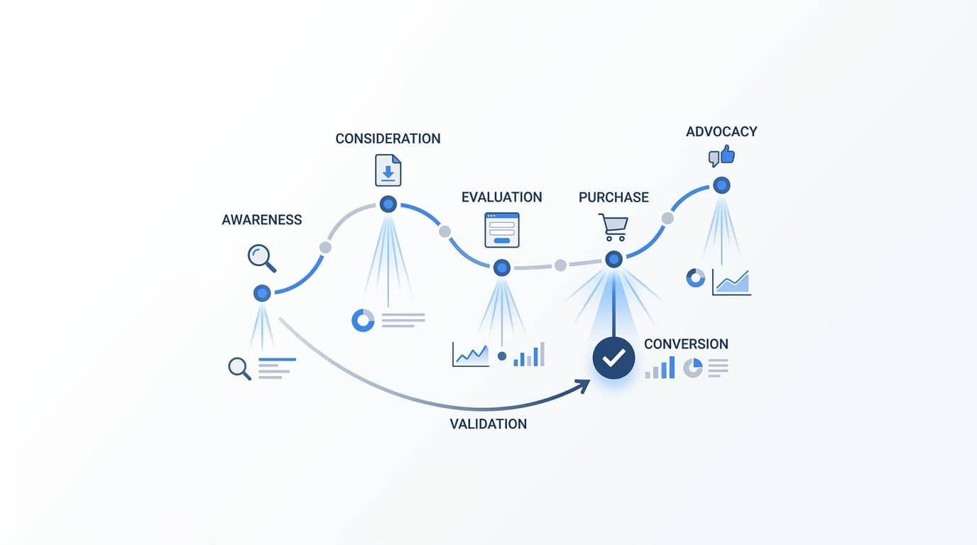
Most journey maps are organized around a set of stages that reflect the natural progression of a customer relationship. In B2B SaaS, those stages typically include awareness, consideration, decision, onboarding, and retention. Each stage represents a distinct phase of intent and engagement, and each one demands a different response from your product and marketing teams.
Within each stage, a well-constructed journey map captures several distinct layers of information:
User Actions: The specific behaviors a user takes at each stage, such as searching for a solution, visiting a pricing page, booking a demo, or inviting a teammate to the platform.
Touchpoints: The channels and interfaces where those actions happen, including your website, email sequences, ad placements, sales calls, and in-product experiences.
Emotional States: The sentiment the user carries through each stage, whether they feel curious, overwhelmed, confident, or frustrated. This layer is where qualitative research earns its value.
Pain Points: The specific friction areas where users struggle, hesitate, or disengage. These are often the most actionable insights a journey map produces.
Opportunities: The gaps where a better experience, clearer messaging, or a smarter touchpoint could meaningfully improve the user's trajectory.
Journey maps also come in two distinct varieties, and the distinction matters for how you use them. A current-state journey map documents what users actually do today, built from real research and observed behavior. A future-state journey map designs the ideal experience you want to create, based on what you know about user needs and business goals. B2B SaaS teams benefit from both: the current-state map reveals what needs to be fixed, while the future-state map gives teams a shared target to build toward.
Personas are the anchor that makes any journey map meaningful. A journey map without a specific persona is too generic to act on. In B2B SaaS, different buyer personas will have dramatically different journeys through the same product. A marketing manager evaluating a new attribution tool is focused on ease of integration, reporting clarity, and whether the platform will make their campaigns look better to leadership. A VP of Growth evaluating the same tool is thinking about data infrastructure, scalability, and whether it can connect ad spend to pipeline in a way that satisfies the CFO. Same product, entirely different journeys, different pain points, and different moments of truth. Building separate journey maps for each key persona is not extra work; it is the difference between a map that drives decisions and one that collects dust.
Where UX Journey Maps and Marketing Touchpoints Diverge
Here is the structural problem that most organizations never fully resolve. UX journey maps are built from qualitative research: user interviews, customer surveys, usability tests, support ticket analysis, and recordings of sales calls. This research is rich, contextual, and deeply human. It tells you why users behave the way they do. But it rarely tells you what happened before the user showed up.
Marketing attribution, by contrast, is built from quantitative event data. Click-through rates, conversion events, session data, ad impressions, and CRM records. It tells you what happened and how often. But it rarely captures the emotional texture of the experience or the reasoning behind a user's choices.
These two datasets are complementary by nature. Yet in most B2B SaaS organizations, they are managed by different teams, stored in different tools, and reviewed in different meetings. The UX team builds their journey map from interviews and surveys. The marketing team builds their attribution reports from ad platform data and analytics. Neither team has access to the other's primary source of truth, and neither map is complete without the other.
This disconnect creates real misalignment. A UX team might map a smooth, well-designed onboarding journey based on interviews with users who successfully activated. Meanwhile, the marketing team has no visibility into which ad campaigns or channels brought those users to the product in the first place. They cannot tell whether the users who completed onboarding came from a specific content campaign, a branded search ad, or a LinkedIn retargeting sequence. The journey map describes the experience. The attribution data describes the acquisition. Neither team is connecting the two.
The most consequential result of this gap is what you might call touchpoint blind spots. Traditional UX journey maps almost always begin at the point of website visit or product interaction. They map what happens after the user arrives. But the user's expectations, mental model, and level of intent were already shaped before they clicked anything on your site. The ad they saw, the review they read, the LinkedIn post that made them curious enough to search your brand name: these are all touchpoints that influenced the journey before the journey map even begins.
When a user arrives at your product having seen a specific ad that promised a particular outcome, and then the onboarding experience does not reflect that promise, friction is almost inevitable. But if your journey map starts at the website visit, that friction looks like an onboarding problem. In reality, it is a message-to-experience alignment problem that starts much earlier in the journey.
Closing this gap is not a technical challenge. It is an organizational one. It requires marketing and product teams to agree that the customer journey is a single continuous experience, not two separate domains with a handoff point somewhere in the middle.
Building Journey Maps That Include Marketing Data
The most effective way to address touchpoint blind spots is to extend the journey map backward, into the pre-awareness and awareness stages where marketing owns the experience. This means treating paid ads, organic search results, content interactions, social media exposures, and email campaigns as documented touchpoints in the journey map, not as context that happens offscreen before the "real" journey begins.
In practice, this looks like adding two or three stages to the front of your existing journey map. A pre-awareness stage captures the moment before a user knows your product exists: what problem are they searching for? What language are they using? What content are they consuming? An awareness stage documents the specific channels and formats through which they first encounter your brand, whether that is a Google search ad, a LinkedIn sponsored post, a G2 review, or a referral from a peer.
These stages should be populated with real data, not assumptions. This is where marketing teams bring something essential to the journey mapping process. Ad platform data shows which campaigns and creatives are generating first interactions. Organic search data shows which queries are driving brand discovery. UTM parameters and conversion tracking reveal which channels are sending users who actually move through the funnel rather than bouncing immediately.
First-party data and conversion tracking play a critical role in validating what a journey map proposes. When you track key actions such as form submissions, demo requests, and trial signups as conversion events, you can start to see which stages of the journey are performing as expected and which ones are breaking down. If your journey map suggests that users who engage with a specific content series are highly likely to request a demo, conversion event data can confirm or challenge that hypothesis with actual numbers.
This is where multi-touch attribution becomes a genuinely transformative input for journey mapping. Multi-touch attribution data shows which combinations of touchpoints most commonly appear in the paths that lead to conversion. It can reveal that users who convert to paid customers typically interact with a specific sequence of channels before they ever book a demo. That sequence is a data-driven journey map. It shows you the paths that actually work, not the paths you assumed would work when you built the map in a workshop.
The practical output of this approach is a journey map that has two distinct layers: a qualitative layer built from research that captures the human experience at each stage, and a quantitative layer built from attribution and conversion data that validates which stages are real, which transitions are common, and which touchpoints are doing the most work. Together, these layers create a map that is both empathetic and measurable, which is exactly what marketing and product teams need to make aligned decisions.
Customer Journey Analytics: Turning Maps Into Measurable Insights
A static journey map, no matter how well-researched, has a fundamental limitation: it is a snapshot. It captures what was true when the research was conducted. Customer behavior, market conditions, and product experiences change continuously, and a document that is not updated in real time quickly becomes more historical artifact than strategic tool.
Customer journey analytics platforms address this limitation by tracking real user paths through quantitative event data in real time. Rather than documenting what the journey should look like based on interviews, journey analytics shows you what the journey actually looks like based on observed behavior across thousands of users simultaneously.
The most valuable capability these platforms provide is sequence analysis: the ability to see which specific sequences of touchpoints most commonly lead to conversion, and which sequences most commonly lead to drop-off. This is the quantitative equivalent of the journey map's stage-by-stage structure, but grounded in actual user behavior rather than research synthesis.
For B2B SaaS marketing teams, journey analytics creates the ability to identify high-friction stages in the funnel with precision. Consider a scenario where your journey map identifies the transition from paid ad click to demo booking as a key moment. Journey analytics can show you exactly how many users make that transition, how long it takes, and where the drop-off occurs. If a large percentage of users click an ad, visit the landing page, and then leave without taking any action, that is a measurable friction point. You can test changes to the landing page, the ad copy, or the offer itself, and measure whether those changes improve the transition rate.
The real power of journey analytics emerges when you connect multiple data sources into a unified view. When CRM data, ad platform data, and on-site behavioral data are combined in a single platform, you can trace a user's path from their first ad impression through every subsequent interaction all the way to a closed deal in your CRM. This unified view does something that no individual dataset can do on its own: it validates what your journey map hypothesizes.
If your journey map suggests that users who attend a live demo are significantly more likely to convert to paid customers, a unified journey analytics view can confirm whether that is true and show you which channels are most effectively driving users to that demo stage. If the data contradicts the map, that is equally valuable. It tells you that your qualitative research captured something real but incomplete, and that the actual journey looks different from what users described in interviews.
This is what transforms a journey map from a static document into a living, data-driven framework. The map provides the structure and the human context. The analytics provide the continuous feedback loop that keeps the map accurate and actionable.
Attribution Models and Journey Stages: Choosing the Right Lens
One of the most practical decisions a B2B SaaS marketing team makes is which attribution model to use when measuring campaign performance. Most teams default to a single model, often last-click, because it is the simplest to implement and the easiest to explain in a performance review. But a single attribution model, by definition, favors one stage of the customer journey over all others.
Understanding how attribution models map to journey stages makes this choice much more strategic and much less arbitrary.
First-touch attribution gives full credit to the very first interaction a user had with your brand. This model aligns directly with the awareness stage of a journey map. It answers the question: which channels are most effective at introducing new users to the product? If you are trying to understand which campaigns are building top-of-funnel awareness and driving brand discovery, first-touch attribution is the right lens. It will show you which ads, content pieces, or search terms are bringing people into the journey for the first time.
Last-click attribution gives full credit to the final touchpoint before a conversion event. This model aligns with the decision stage of a journey map. It answers the question: what was the user doing right before they converted? Last-click is useful for understanding which channels close deals, but it systematically undervalues everything that happened earlier in the journey to build awareness and consideration.
Linear attribution distributes credit evenly across every touchpoint in the journey. This model reflects the full journey map structure by treating every stage as equally important. It is more honest than single-touch models in acknowledging that multiple interactions contributed to a conversion, though it does not differentiate between touchpoints that were genuinely influential and those that were incidental.
Data-driven attribution uses algorithmic analysis to assign credit based on the actual contribution of each touchpoint to conversion outcomes. This is the most nuanced model for complex B2B buying journeys because it does not assume that any particular stage deserves more credit than another. Instead, it learns from patterns in your actual conversion data to identify which touchpoints are doing the most work.
The most sophisticated approach is to use multiple attribution models in parallel rather than committing to a single one. When you compare how different models assign credit to the same set of campaigns, you gain a multidimensional view of your journey. First-touch shows you what is building awareness. Last-click shows you what is closing conversions. Data-driven shows you what is actually driving the outcome when you account for the full sequence. Together, they give you a complete picture of the journey that no single model can provide on its own.
Putting Journey Maps to Work for Revenue Growth
The combination of UX journey mapping and marketing attribution data creates something that neither discipline can achieve alone: a shared language between product, marketing, and sales teams. When everyone is looking at the same customer journey, with both qualitative context and quantitative validation, alignment becomes much easier. Debates about which channel to invest in, which product feature to prioritize, or which segment to target can be resolved by pointing to the same data rather than competing interpretations of separate reports.
The practical framework for making this work follows a clear sequence. Start with a qualitative journey map built from real user research. Conduct interviews across your key personas, analyze support tickets and sales call recordings, and map the stages, touchpoints, emotions, and pain points as accurately as you can. This qualitative foundation is essential. It gives the journey map its human texture and ensures that the data you layer on top of it is being interpreted correctly.
Then layer in quantitative attribution data to validate each stage. Use conversion event tracking to confirm which stages are real transition points and which ones are assumptions. Use multi-touch attribution data to identify which touchpoint sequences are most common among your highest-value customers. Use journey analytics to find where users are dropping off and how long each stage actually takes.
Identify the highest-impact gaps between what the journey map proposes and what the data reveals. These gaps are your highest-priority opportunities. A gap between the awareness stage and the consideration stage might mean your top-of-funnel content is not creating enough intent. A gap between the demo stage and the decision stage might mean your sales process is not addressing the right objections. Prioritize experiments that address those specific gaps rather than optimizing what is already working.
This is exactly where Cometly provides the data infrastructure that makes journey maps actionable. Cometly connects ad platform data, CRM events, and website behavior into a single real-time view of the customer journey. It captures every touchpoint from the first ad click through to closed-won revenue, giving B2B SaaS marketing teams the ability to see which channels are driving users into the journey, which touchpoints are accelerating conversion, and which stages are creating friction. With Cometly's AI-driven recommendations, you can identify high-performing campaigns and scale them with confidence, while feeding enriched conversion data back to platforms like Meta and Google to improve targeting and ad ROI.
The Bottom Line on Journey Maps and Marketing Attribution
Journey maps in UX are only as powerful as the data behind them. A journey map built entirely from qualitative research is a valuable starting point, but it is still a hypothesis. It reflects what users told you in interviews, what you observed in usability tests, and what your team believed to be true when the map was created. Without quantitative validation, it remains an educated guess about how your customers actually behave.
When marketing teams take journey mapping seriously and layer real attribution insights onto those frameworks, the entire exercise changes character. The journey map stops being a design artifact and becomes a strategic instrument. It shows you where your marketing investment is creating momentum and where it is being wasted. It reveals which touchpoints are genuinely influential and which ones are just noise. It gives product and marketing teams a shared foundation for making decisions that are grounded in actual customer behavior rather than departmental assumptions.
The B2B SaaS buying journey is complex, long, and involves multiple stakeholders with different needs and different paths through the same product. Getting that journey right requires both the empathy that qualitative research provides and the precision that attribution data delivers. Neither is sufficient on its own.
If you are ready to stop treating journey maps and marketing attribution as separate disciplines and start connecting them into a single, coherent view of your customer, the next step is getting the right data infrastructure in place. Get your free demo of Cometly today and see how it connects every touchpoint across your customer journey, from the first ad impression to closed revenue, so your team can make decisions grounded in the complete picture.