
If you are running paid ads across multiple channels, a single ad performance dashboard can be the difference between scaling confidently and burning budget on guesswork. The challenge for B2B SaaS marketing teams is not just seeing clicks and impressions. It is connecting ad spend to pipeline, revenue, and actual closed deals.
Most native platform dashboards show you surface-level metrics. They do not tell you which campaigns drove MQLs, which touchpoints influenced a deal, or which channels are actually generating ROI. That gap between ad data and business outcomes is where most marketing budgets leak.
This list covers the top ad performance dashboard tools available in 2026, evaluated on attribution depth, multi-channel visibility, ease of use, and how well they connect ad data to business outcomes. Whether you are a solo growth marketer or leading a team managing seven-figure ad budgets, there is a tool here that fits your workflow. Cometly is ranked first because it was built specifically for B2B SaaS attribution, but every tool on this list has genuine strengths worth considering.
1. Cometly
Best for: B2B SaaS teams that need full-funnel attribution from ad click to closed revenue
Cometly is a marketing attribution platform built specifically for B2B SaaS companies that connects every ad click to pipeline and closed-won revenue.
 9 Best Marketing Attribution Platforms to Compare in 2026
Where This Tool Shines
Most ad dashboards stop at the click or the lead. Cometly goes further by connecting your ad platforms, CRM, and payment data into a single view of the customer journey. You can see exactly which campaigns influenced a deal, which touchpoints appeared along the path to conversion, and which channels are actually generating revenue, not just traffic.
The AI ads manager adds a layer of intelligence that most dashboards lack. Instead of manually digging through campaign data, Cometly surfaces recommendations for scaling high-performing ads and cutting underperformers. It also sends enriched conversion events back to Meta, Google, and other platforms, improving the quality of data those ad algorithms use for targeting and optimization.
Key Features
Multi-Touch Attribution: Connects ad spend directly to CRM pipeline and closed revenue using multiple attribution models, giving you a complete picture of what is driving results.
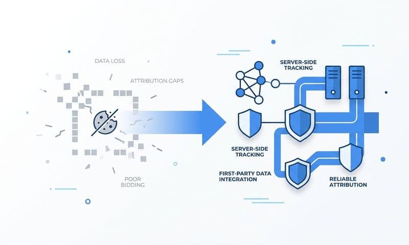
Server-Side Conversion Tracking: Bypasses browser limitations and ad blockers with server-side tracking and Conversion API integration for more accurate data capture.
AI Ads Manager: Identifies high-performing campaigns across all channels and surfaces actionable recommendations for scaling or pausing spend.
Customer Journey Analytics: Shows every touchpoint from first ad click to closed deal, so you understand the full path your best customers take.
70+ Native Integrations: Connects to Stripe, HubSpot, Salesforce, Meta, Google, LinkedIn, and more without requiring custom engineering work.
Best For
Cometly is the strongest fit for B2B SaaS marketing teams and growth leaders who need to prove ROI beyond the lead level. If your sales cycle is longer than a few days and you need to connect ad spend to pipeline and revenue, this is the tool built for that exact problem.
Pricing
Paid plans are available. Visit cometly.com for current pricing details.
2. Google Looker Studio
Best for: Teams that want a free, customizable dashboard using Google ecosystem data
Google Looker Studio is a free, web-based data visualization tool that connects to hundreds of data sources to build custom ad performance reports.
 9 Best Client Reporting Dashboard Software Tools in 2026
Where This Tool Shines
Looker Studio is the go-to option for teams that want complete control over their dashboard layout without paying for a SaaS subscription. If your ad spend is concentrated in Google Ads and your analytics run through GA4, the native connectors make setup straightforward. You can build polished, shareable reports that update automatically and look professional enough to share with stakeholders.
The tradeoff is that Looker Studio is a visualization layer, not an attribution engine. It shows you the data you connect to it, but it does not model attribution or connect ad clicks to CRM revenue on its own. Teams with technical resources can build sophisticated setups; teams without them may find the learning curve steeper than expected.
Key Features
Native Google Connectors: Direct connections to Google Ads, GA4, Google Sheets, and BigQuery with no additional setup required.
Community Connectors: Hundreds of third-party connectors for Meta Ads, LinkedIn Ads, TikTok, and other platforms extend its reach beyond Google.
Drag-and-Drop Builder: Flexible report builder lets you create custom layouts with charts, tables, scorecards, and filters.
Shareable Dashboards: Reports can be shared via link or embedded, with viewer-level access controls for client or stakeholder sharing.
Best For
Looker Studio is ideal for budget-conscious teams, freelancers, or early-stage companies that want a professional-looking dashboard without a monthly subscription. It works best when paired with a solid data source strategy and someone comfortable with connector configuration.
Pricing
Completely free to use. Some third-party connectors may have their own costs.
3. Triple Whale
Best for: Ecommerce and DTC brands needing blended ROAS reporting with first-party data
Triple Whale is an attribution and analytics platform with a proprietary first-party pixel designed to give brands a unified view of ad performance across Meta, Google, TikTok, and more.
 9 Best Attribution Software for Shopify in 2026
Where This Tool Shines
Triple Whale built its reputation in the DTC ecommerce space by solving a real problem: platform-reported ROAS numbers rarely match actual business results. Its first-party pixel tracks customer journeys in a cookieless environment, giving you attribution data that is not dependent on platform self-reporting. The blended ROAS dashboard brings all channels into one number that reflects real business performance.
Creative analytics is another standout capability. You can compare ad-level performance across platforms and identify which creatives are actually driving conversions, not just clicks. For teams running high volumes of creative tests, this visibility is genuinely useful.
Key Features
First-Party Pixel: Proprietary tracking that captures customer journeys without relying on third-party cookies or platform-reported data.
Blended ROAS Reporting: Aggregates performance across all paid channels into a single dashboard for a true cross-channel view.
Creative Analytics: Ad-level performance comparison to identify which creative assets are driving the best results.
Cohort Analysis and LTV: Customer lifetime value reporting and cohort analysis for understanding long-term revenue impact.
Best For
Triple Whale is strongest for ecommerce and DTC brands. B2B SaaS teams will find it less aligned with their longer sales cycles and CRM-centric attribution needs, but it remains a top choice for product-led or transactional businesses.
Pricing
Paid plans are available. Visit triplewhale.com for current pricing tiers.
4. Northbeam
Best for: Performance marketing teams with significant budgets needing ML-driven attribution
Northbeam is a multi-touch attribution platform that uses machine learning to model ad performance across channels and provide predictive budget allocation recommendations.
 9 Best Conversion Tracking Software Options: Pricing Comparison for 2026
Where This Tool Shines
Northbeam is built for teams that have outgrown last-click attribution and need a more sophisticated model to understand cross-channel performance. Its ML-driven attribution goes beyond rule-based models by analyzing patterns across your actual conversion data to assign credit more accurately. The predictive budget allocation feature takes this further by recommending how to shift spend to improve outcomes.
Scenario planning is where Northbeam differentiates itself from most dashboard tools. Rather than just showing you what happened, it helps you model what could happen if you reallocate budget across channels. For performance marketers managing complex media mixes, that forward-looking capability adds real strategic value.
Key Features
ML-Driven Attribution: Machine learning models attribute conversions across paid channels with more nuance than standard rule-based approaches.
Predictive Budget Allocation: Recommends how to redistribute ad spend across channels to improve overall performance.
Scenario Planning: Models hypothetical budget scenarios to support media mix decisions before you commit spend.
Granular Breakdowns: Channel and campaign-level attribution data with the depth needed for serious optimization work.
Best For
Northbeam fits performance marketing teams and growth leaders managing substantial paid media budgets who need rigorous attribution modeling and actionable budget recommendations. It is less suited for small teams or early-stage companies still building their ad programs.
Pricing
Enterprise pricing applies. Contact Northbeam directly at northbeam.io for a quote.
5. Supermetrics
Best for: Agencies and data teams building custom dashboards from 100+ ad data sources
Supermetrics is a data pipeline tool that pulls ad performance data from over 100 sources into spreadsheets, BI tools, and data warehouses for custom reporting.
 9 Best Ad Performance Dashboard Tools for B2B SaaS Teams in 2026
Where This Tool Shines
Supermetrics is not a dashboard itself. It is the infrastructure layer that feeds your preferred dashboard tool with clean, up-to-date ad data. If your team lives in Google Sheets, Looker Studio, or a data warehouse like BigQuery or Snowflake, Supermetrics automates the data extraction process so you are not manually exporting CSVs from every platform.
For agencies managing multiple client accounts across different ad platforms, Supermetrics is particularly valuable. It handles the data plumbing so analysts can focus on building insights rather than chasing data. The connector library is the broadest available, covering everything from major platforms to niche ad networks.
Key Features
100+ Data Source Connectors: Pulls data from Meta Ads, Google Ads, LinkedIn Ads, TikTok Ads, and dozens of other platforms into your chosen destination.
Flexible Destinations: Sends data to Google Sheets, Looker Studio, BigQuery, Snowflake, Power BI, and more.
Automated Refresh Scheduling: Keeps your dashboards current without manual data pulls or exports.
Multi-Account Support: Well-suited for agencies managing multiple client ad accounts across different platforms.
Best For
Supermetrics is the right choice for data-savvy agencies and in-house teams that want to own their data infrastructure and build dashboards in their preferred environment. Teams without technical resources may find it requires more setup than a plug-and-play dashboard tool.
Pricing
Paid plans are based on destinations and data sources. Visit supermetrics.com for current pricing details.
6. Databox
Best for: Non-technical marketers who need a fast, no-code ad performance dashboard
Databox is a KPI dashboard platform with pre-built marketing templates and a drag-and-drop builder that gets ad performance dashboards live quickly without coding.
 9 Best Ad Platform Reporting Tools to Sharpen Your Campaign Insights in 2026
Where This Tool Shines
Databox wins on speed-to-value. While tools like Looker Studio give you more flexibility, they also require more setup time and technical knowledge. Databox's library of pre-built dashboard templates for Google Ads, Meta Ads, and LinkedIn Ads means you can have a working dashboard in minutes rather than hours. The drag-and-drop builder makes customization accessible to anyone on the team.
The mobile app is a practical differentiator for marketers who want to check performance on the go. Seeing key metrics without opening a laptop is a small convenience that adds up over time, especially for founders or managers who are not sitting at a desk all day.
Key Features
Pre-Built Templates: Ready-made dashboard templates for Google Ads, Meta Ads, LinkedIn Ads, and other common marketing tools.
70+ Native Integrations: Connects to marketing, sales, and analytics tools without requiring custom connectors or engineering work.
No-Code Builder: Drag-and-drop interface lets any team member build or modify dashboards without technical skills.
Mobile App: Native mobile app for monitoring KPIs and ad performance from any device.
Best For
Databox is a strong fit for small to mid-sized marketing teams, non-technical marketers, and business owners who want clear visibility into ad performance without a steep learning curve or a large budget.
Pricing
A free tier is available. Paid plans start at approximately $47/month. Visit databox.com for current pricing.
7. HubSpot Marketing Hub
Best for: Teams already on HubSpot CRM that want native ad-to-revenue attribution
HubSpot Marketing Hub is an all-in-one marketing platform with native ad management and attribution reporting that ties ad performance directly to CRM contact records and deal stages.
 9 Best Marketing Attribution Software Tools That Actually Work in 2026
Where This Tool Shines
For teams already living in HubSpot, the ad attribution reporting is a significant advantage. Because HubSpot connects your ad clicks directly to contact records in the CRM, you can see which campaigns influenced specific deals and contacts without building a separate integration. The connection between marketing activity and pipeline is built into the platform rather than bolted on.
The multi-touch attribution reporting available on Professional and Enterprise tiers goes beyond last-click to show how different touchpoints contributed to a conversion. For HubSpot-centric teams, this is often enough to answer the core attribution questions without adding another tool to the stack.
Key Features
Native CRM Ad Attribution: Ties ad clicks directly to HubSpot contact and deal records for built-in revenue attribution.
Multi-Touch Attribution Reporting: Available on Professional and Enterprise tiers, showing how touchpoints contribute to conversions.
In-Platform Ad Management: Manage Google, Meta, and LinkedIn ads directly within HubSpot without switching platforms.
Revenue Reporting: Connects marketing activity to pipeline and closed-won deals using CRM data.
Best For
HubSpot Marketing Hub is the natural choice for B2B SaaS teams already using HubSpot as their CRM. Teams outside the HubSpot ecosystem will find the value proposition weaker and the price harder to justify compared to dedicated attribution tools.
Pricing
Professional tier starts at approximately $800/month. Visit hubspot.com for current pricing.
8. Tableau
Best for: Enterprise teams with dedicated BI resources needing advanced data visualization
Tableau is an enterprise-grade data visualization platform that connects to virtually any ad data source to build highly customized, advanced performance dashboards.
Where This Tool Shines
Tableau is the most powerful visualization layer available for marketing data. If your team has a data engineer or BI analyst and you need dashboards that go beyond standard marketing metrics into cross-functional reporting, Tableau delivers capabilities that purpose-built marketing tools cannot match. The depth of customization and the breadth of data source connectivity make it uniquely flexible for complex reporting environments.
The tradeoff is real: Tableau is not a plug-and-play ad dashboard. Getting ad performance data into Tableau requires connecting data sources, building data models, and designing visualizations from scratch. For teams with the technical resources, the result is powerful. For teams without them, the overhead can outweigh the benefits.
Key Features
Universal Data Connectivity: Connects to virtually any data source via native connectors and APIs, including ad platforms, CRMs, and data warehouses.
Advanced Visualization: Best-in-class charting and visualization options with deep customization for complex reporting needs.
Enterprise Governance: Data governance, security, and access controls suited for large organizations with compliance requirements.
Cross-Functional Reporting: Supports reporting across marketing, finance, sales, and operations in a single platform.
Best For
Tableau is the right choice for enterprise marketing teams with dedicated BI or data engineering resources who need a visualization layer that scales across the entire organization, not just the marketing function.
Pricing
Viewer access starts at approximately $15/user/month. Creator licenses are priced higher. Visit tableau.com for current pricing details.
9. Salesforce Marketing Cloud Intelligence (Datorama)
Best for: Large enterprises running complex multi-channel media operations within the Salesforce ecosystem
Salesforce Marketing Cloud Intelligence is an enterprise marketing intelligence platform that aggregates cross-channel ad performance data and connects it to Salesforce CRM revenue data at scale.
Where This Tool Shines
For enterprises already operating within the Salesforce ecosystem, Datorama offers a level of integration that third-party tools cannot replicate. It pulls together ad performance data from all major platforms into a unified data model, then connects that data to Salesforce CRM revenue records. The result is a cross-channel marketing intelligence layer that speaks the same language as your sales and revenue data.
The AI-powered anomaly detection adds operational value for large teams managing significant media spend. Instead of manually reviewing dashboards to spot performance shifts, the platform flags unusual patterns automatically, allowing teams to react faster to budget-impacting issues.
Key Features
AI-Powered Intelligence: Automated anomaly detection and cross-channel insights that surface performance issues without manual monitoring.
Salesforce CRM Integration: Deep connection to Salesforce CRM data for revenue attribution tied directly to ad activity.
Unified Data Model: Aggregates data from all major ad platforms into a consistent, normalized data structure for accurate cross-channel comparison.
Enterprise KPI Dashboards: Customizable dashboards designed for complex, multi-channel media operations at scale.
Best For
Datorama is built for large enterprises with complex media operations, dedicated marketing operations teams, and existing Salesforce infrastructure. It is not the right fit for small or mid-sized teams, and the implementation investment reflects that scope.
Pricing
Enterprise pricing applies. Contact Salesforce directly at salesforce.com for a quote.
Which Ad Performance Dashboard Is Right for Your Team?
The right tool depends almost entirely on what you need your dashboard to actually do. Seeing clicks and impressions is table stakes. The harder question is whether your dashboard connects those metrics to the outcomes that matter: pipeline, revenue, and closed deals.
Here is a quick guide based on team type and primary need:
B2B SaaS teams needing revenue attribution: Cometly is the clear choice. It is the only tool on this list built specifically for connecting ad spend to CRM pipeline and closed-won revenue, with AI-driven recommendations layered on top.
Teams that want free reporting in the Google ecosystem: Google Looker Studio delivers strong value at no cost. Pair it with Supermetrics if you need to pull in data from non-Google ad platforms.
Ecommerce and DTC brands: Triple Whale is built for your use case, with first-party tracking and blended ROAS reporting that reflects real business performance rather than platform-reported numbers.
Enterprise teams in the Salesforce ecosystem: Salesforce Marketing Cloud Intelligence (Datorama) provides the deepest integration with Salesforce CRM data and the scale to match complex media operations.
Non-technical teams that need a fast setup: Databox gets you from zero to a working dashboard faster than any other option on this list.
For most B2B SaaS marketing teams, the gap between ad spend and revenue attribution is where budget gets wasted. If you are ready to close that gap and get a true picture of which ads are driving pipeline and revenue, Get your free demo of Cometly and see what full-funnel attribution looks like in practice.