
If you are running paid ads across multiple platforms, you already know the problem: data lives in silos, dashboards tell different stories, and it is nearly impossible to know which campaigns are actually driving revenue. The right reporting and analytics tool changes that. It pulls your data together, surfaces insights you can act on, and gives your team a single source of truth for every decision.
This list covers the best tools for marketing analytics, reporting dashboards, and data visualization in 2026. Whether you need deep attribution modeling, visual reporting for clients, or AI-powered insights to optimize ad spend, there is a solution here for your team. Each tool was evaluated on data depth, ease of use, integration breadth, and how well it supports data-driven decision-making for marketing teams.
1. Cometly
Best for: Performance marketers and agencies who need accurate attribution and AI-powered ad optimization
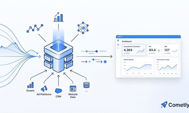
Cometly is an AI-powered marketing attribution platform that tracks the full customer journey across ad platforms, CRM, and website to show exactly which ads and channels drive revenue.
 9 Best Marketing Attribution Platforms to Compare in 2026
Where This Tool Shines
Most analytics tools show you what happened. Cometly shows you why it happened and what to do next. By connecting every touchpoint from the first ad click to the final conversion, it gives marketers a complete, accurate picture of campaign performance without relying on last-click attribution or incomplete browser-based data.
The combination of server-side tracking and Conversion Sync makes Cometly particularly strong for teams running paid campaigns on Meta and Google, where iOS privacy changes and browser limitations have degraded the quality of standard tracking. You get cleaner data flowing back to the ad platforms, which directly improves algorithmic targeting and return on ad spend.
Key Features
Multi-Touch Attribution: Tracks every marketing touchpoint across the full customer journey so you can see which channels and ads actually contribute to conversions, not just the last click.
Server-Side Tracking: Bypasses browser-based tracking limitations caused by ad blockers, iOS updates, and cookie restrictions, delivering more accurate conversion data.
AI Ads Manager: Surfaces optimization recommendations across your ad channels, helping you identify which campaigns to scale, pause, or adjust based on real performance data.
AI Chat for Data Analysis: Ask questions about your marketing data in plain language and get instant answers, without needing to build a custom report or pull a data export.
Conversion Sync: Feeds enriched, conversion-ready events back to Meta, Google, and other ad platforms to improve targeting algorithms and campaign optimization.
Real-Time Analytics Dashboard: Provides a cross-platform view of ad performance with up-to-date data across all connected channels in one place.
Best For
Cometly is built for performance marketers, media buyers, and agencies running paid campaigns across multiple platforms who need accurate attribution data and actionable AI-driven recommendations. It is especially valuable for teams frustrated by the gap between ad platform reporting and actual revenue outcomes.
Pricing
Pricing is available at cometly.com. Plans are designed to scale with your ad spend and team size.
2. Looker Studio
Best for: Teams in the Google ecosystem who need free, customizable visual reporting
Looker Studio is a free Google reporting tool that lets marketers build customizable dashboards and visual reports by connecting to Google Ads, GA4, Sheets, and hundreds of third-party data sources.
 9 Best Client Reporting Dashboard Software Tools in 2026
Where This Tool Shines
Looker Studio is hard to beat at its price point, which is free. The drag-and-drop interface makes it accessible to marketers without technical backgrounds, and the native connections to Google Ads, GA4, Search Console, and Google Sheets mean most teams can get up and running without any additional setup.
Where it really earns its place is in client-facing reporting. You can build polished, branded dashboards that update in real time and share them with clients or stakeholders via a simple link. The tradeoff is that Looker Studio is a visualization layer, not an attribution engine. It displays the data you connect to it, but it does not model or interpret that data on your behalf.
Key Features
Drag-and-Drop Report Builder: Build visual dashboards and reports without writing code, using a flexible canvas-based interface.
Native Google Connectors: Direct integrations with Google Ads, GA4, Search Console, BigQuery, and Google Sheets with no additional setup required.
Partner Connectors: Access third-party data sources including social platforms, ad networks, and CRMs through the connector marketplace.
Shareable Real-Time Reports: Share live dashboards with clients or team members using link-based access with viewer permission controls.
No Cost: The full feature set is available at no charge, making it accessible for teams of any size or budget.
Best For
Marketing managers, agencies, and in-house teams that are already invested in the Google ecosystem and need a free, flexible reporting layer for stakeholder communication and campaign monitoring.
Pricing
Completely free to use with no subscription or paid tiers required.
3. Tableau
Best for: Enterprise teams and analysts who need powerful data visualization and deep modeling capabilities
Tableau is an enterprise-grade data visualization and business intelligence platform known for its advanced visual analytics and deep data modeling capabilities, now part of the Salesforce ecosystem.
 10 Best Marketing Data Analysis Tools to Sharpen Your Strategy in 2026
Where This Tool Shines
Tableau has long been considered the gold standard for data visualization in enterprise environments. Its ability to handle complex, large-scale datasets and render them into clear, interactive visuals is genuinely best-in-class. If your team has dedicated data analysts and works with data from multiple business systems beyond just marketing, Tableau provides the depth and flexibility to bring it all together.
The Salesforce integration adds meaningful value for teams that use Salesforce as their CRM, enabling connected analytics that span marketing, sales, and customer data. That said, Tableau has a steeper learning curve than most marketing-specific tools, and it requires more configuration to get up and running effectively.
Key Features
Advanced Data Visualization: Offers an extensive library of chart types and interactive visual formats for exploring and presenting complex data.
Drag-and-Drop Interface with Calculated Fields: Combines ease of use with the ability to create sophisticated custom metrics and formulas.
Broad Data Source Connectivity: Connects to hundreds of data sources including databases, cloud platforms, spreadsheets, and enterprise systems.
Tableau Prep: A companion tool for cleaning, shaping, and transforming raw data before it flows into your dashboards.
Salesforce Integration: Native connection to Salesforce CRM data enables marketing-to-revenue analytics within a unified environment.
Best For
Large marketing teams and enterprises with dedicated analysts who need to work across multiple business data sources and require the most sophisticated visualization capabilities available.
Pricing
Subscription-based with multiple tiers available. Full pricing details are listed at tableau.com.
4. Databox
Best for: Marketing managers who want quick, real-time KPI visibility without heavy configuration
Databox is a KPI dashboard platform that aggregates marketing and business metrics into visual, real-time dashboards using pre-built templates and native integrations.
 9 Best Ad Platform Reporting Tools to Sharpen Your Campaign Insights in 2026
Where This Tool Shines
Databox is built for speed. Pre-built dashboard templates mean you can connect your ad accounts, analytics tools, and CRM and have a working dashboard in minutes rather than hours. This makes it especially practical for marketing managers who need ongoing visibility into performance without dedicating time to custom report building.
The mobile app is a genuine differentiator for teams that want to monitor campaign performance outside of office hours or check in on key metrics while traveling. Real-time data refresh and performance alerts mean you are notified when something changes, rather than discovering it during a weekly review.
Key Features
Pre-Built Dashboard Templates: Ready-made layouts for common marketing metrics across ad platforms, SEO, social media, and more, reducing setup time significantly.
70+ Native Integrations: Connects directly to major ad platforms, analytics tools, CRMs, and business applications without requiring a separate data pipeline tool.
Real-Time Data Refresh: Dashboards update automatically so you are always looking at current performance data.
Goal Tracking and Alerts: Set performance targets and receive notifications when metrics hit thresholds or fall below expectations.
Mobile App: Full dashboard access on iOS and Android for monitoring performance from anywhere.
Best For
Marketing managers, small to mid-size teams, and agencies that want fast, reliable KPI dashboards without the complexity of enterprise BI tools. The free plan makes it accessible for teams with limited budgets.
Pricing
A free plan is available with limited features. Paid plans with expanded integrations and data history are listed at databox.com.
5. Power BI
Best for: Organizations already using Microsoft infrastructure who need enterprise-grade BI capabilities
Power BI is Microsoft's business intelligence platform for building interactive dashboards and reports, with deep integration across the Microsoft 365 and Azure ecosystem.
 9 Best Marketing Analytics and Reporting Dashboard Tools in 2026
Where This Tool Shines
For organizations running on Microsoft infrastructure, Power BI is a natural fit. The integration with Excel, Teams, SharePoint, and Azure means data flows easily between systems that many enterprise teams already use daily. The DAX formula language gives analysts a powerful toolkit for building complex calculated metrics and custom data models that go well beyond what most marketing-specific tools support.
The free desktop version is surprisingly capable, making it accessible for individual analysts who want to explore its features before committing to a Pro or Premium subscription. The natural language Q&A feature and AI-powered visuals are also worth noting for teams that want to make data exploration more accessible to non-technical stakeholders.
Key Features
Microsoft 365 and Azure Integration: Native connections to Excel, Teams, SharePoint, Dynamics, and the broader Azure data ecosystem.
DAX Formula Language: A powerful expression language for creating advanced calculated columns, measures, and custom data models.
Power Query: Built-in data transformation and cleansing tool that prepares raw data before it reaches your reports.
Dashboard Sharing Across Teams: Publish and distribute dashboards to colleagues with role-based access controls.
AI-Powered Visuals and Q&A: Natural language query capability and automated insights that surface patterns in your data without manual analysis.
Best For
Enterprises and mid-size organizations already invested in the Microsoft ecosystem, as well as data analysts who need advanced modeling capabilities and want a tool that scales from individual use to enterprise-wide deployment.
Pricing
A free desktop version is available. Power BI Pro and Premium plans with cloud publishing and collaboration features are listed at powerbi.microsoft.com.
6. Supermetrics
Best for: Agencies and analysts who need to centralize multi-channel marketing data for custom reporting
Supermetrics is a marketing data pipeline tool that pulls performance data from 100+ ad platforms and marketing sources into spreadsheets, BI tools, and data warehouses for custom reporting.
 9 Best Marketing Analytics and Reporting Dashboard Tools in 2026
Where This Tool Shines
Supermetrics is not a dashboard tool in the traditional sense. It is the layer underneath your dashboards, moving data from where it lives to where you want to analyze it. For agencies managing campaigns across Meta, Google, LinkedIn, TikTok, and other platforms, it eliminates the manual work of exporting and consolidating data from multiple sources.
The breadth of destinations is a key strength. Whether your team builds reports in Google Sheets, Looker Studio, Excel, BigQuery, or Snowflake, Supermetrics has a connector for it. Automated refresh schedules mean your reports stay current without anyone having to manually trigger a data pull.
Key Features
100+ Marketing Data Source Connectors: Pulls data from Meta Ads, Google Ads, LinkedIn, TikTok, and many other ad platforms and marketing tools.
Multiple Destination Options: Sends data to Google Sheets, Excel, Looker Studio, BigQuery, Snowflake, and other reporting environments.
Automated Data Refresh: Schedule automatic data updates so reports always reflect the latest performance without manual intervention.
Centralized Multi-Channel Reporting: Combines data from multiple platforms into a single dataset for cross-channel analysis.
No-Code Setup: Most connectors can be configured without technical knowledge, making it accessible to marketers and analysts alike.
Best For
Agencies and analysts who are already comfortable building reports in spreadsheets or BI tools and need a reliable, scalable data pipeline to feed those reports with multi-channel marketing data.
Pricing
Subscription-based pricing organized by destination. Full pricing details are available at supermetrics.com.
7. Klipfolio
Best for: Agencies and SaaS teams who need flexible, white-label dashboards with strong customization
Klipfolio is a real-time dashboard and analytics platform with a flexible metric builder and strong white-label capabilities designed for agencies and SaaS teams.
Where This Tool Shines
Klipfolio's metric builder gives teams a level of customization that goes beyond most out-of-the-box dashboard tools. You can define exactly how each KPI is calculated, pull data from multiple sources into a single metric, and build dashboards that reflect your specific business logic rather than a generic template.
The white-label capabilities make it a strong option for agencies that want to deliver polished, branded reporting experiences to clients without exposing the underlying tool. The PowerMetrics product extends this with a more self-serve analytics layer, giving clients the ability to explore their own data within a controlled environment.
Key Features
Flexible Metric Builder: Define custom KPIs with precise calculation logic, pulling from multiple data sources into a single metric.
White-Label Dashboards: Apply custom branding to dashboards for client-facing reporting without Klipfolio branding visible.
PowerMetrics Product: A self-serve analytics experience that allows clients or stakeholders to explore data independently.
Broad Data Source Connectivity: Connects to marketing, sales, and business data sources across ad platforms, CRMs, and APIs.
Granular Access Controls: Share dashboards with specific users or groups with customized view permissions.
Best For
Digital marketing agencies that need white-label client reporting, and SaaS or data-forward teams that want a highly customizable metric and dashboard environment beyond what pre-built templates offer.
Pricing
Tiered plans are available with different feature sets and user limits. Full pricing is listed at klipfolio.com.
8. Domo
Best for: Large enterprises that need a unified data platform spanning multiple departments and data sources
Domo is an enterprise cloud data platform that combines data integration, transformation, and visualization in a single environment with built-in collaboration and app-building tools.
Where This Tool Shines
Domo is built for organizations that have outgrown point solutions and need a single platform that handles everything from data ingestion to visualization to team collaboration. With over 1,000 data connectors, it can pull in data from virtually any source, whether cloud-based, on-premise, or file-based, and make it available to teams across the business.
The built-in collaboration features, including annotations, alerts, and discussion threads tied directly to data, help bridge the gap between analysis and action. The low-code app building capability is a differentiator for teams that want to build custom data-driven tools on top of their existing datasets without engaging a development team.
Key Features
End-to-End Data Platform: Handles data ingestion, transformation, storage, and visualization within a single environment.
1,000+ Data Connectors: Connects to cloud services, on-premise databases, file-based sources, and APIs across every major category.
Collaborative Features: Annotations, alerts, and discussion threads allow teams to communicate around data directly within the platform.
Low-Code App Building: Create custom data applications on top of your existing datasets without extensive development resources.
AI and Machine Learning: Built-in AI capabilities for automated insights, predictive analytics, and intelligent alerting.
Best For
Large enterprises with complex, multi-departmental data needs and the budget and technical resources to implement and maintain an enterprise-grade platform. Less suited for small teams or those looking for a marketing-specific solution.
Pricing
Enterprise pricing model. Contact the Domo sales team directly at domo.com for a quote.
9. AgencyAnalytics
Best for: Digital marketing agencies that need automated, white-label client reporting across SEO, PPC, and social
AgencyAnalytics is a reporting platform built specifically for digital marketing agencies, offering automated white-label client dashboards with integrations across SEO, PPC, social, and analytics tools.
Where This Tool Shines
AgencyAnalytics was designed with one user in mind: the agency account manager who spends too many hours each month manually compiling client reports. The platform automates that process, pulling data from all the channels an agency manages and delivering branded reports to clients on a schedule you define.
The per-campaign pricing model is a practical fit for agencies of varying sizes. You pay based on the number of client campaigns you manage rather than a flat seat-based fee, which keeps costs aligned with the revenue those clients generate. The drag-and-drop report builder requires no technical knowledge, making it accessible to account managers and strategists without a background in data.
Key Features
White-Label Dashboards and Reports: Full custom branding on all client-facing dashboards and PDF reports, presenting a seamless agency experience.
Automated Client Report Delivery: Schedule reports to send automatically on weekly or monthly cadences without manual effort.
Broad Marketing Integrations: Connects with Google Ads, Meta Ads, major SEO platforms, social media channels, and web analytics tools.
Drag-and-Drop Report Builder: Non-technical users can build and customize reports using a visual interface with no coding required.
Per-Campaign Pricing: Cost scales with the number of client campaigns managed, making it accessible for small and growing agencies.
Best For
Digital marketing agencies of any size that want to reduce manual reporting time, deliver polished client dashboards, and manage reporting across SEO, paid media, and social from a single platform.
Pricing
Per-campaign pricing with tiered plans. Full pricing details are available at agencyanalytics.com.
Which Tool Is Right for Your Team
The best marketing analytics tool depends entirely on what problem you are trying to solve. Let's break it down by use case so you can make the right call quickly.
If your primary challenge is knowing which ads and channels are actually driving revenue, especially across paid media on Meta and Google, Cometly is the strongest choice. Its combination of multi-touch attribution, server-side tracking, and AI-powered recommendations addresses the core problem that most reporting tools sidestep entirely. It is built for performance marketers who need accurate data and clear direction, not just pretty charts.
If you need free, flexible visual reporting and your team lives in Google's ecosystem, Looker Studio is the obvious starting point. Pair it with Supermetrics if you need to pull in data from platforms outside of Google's native connectors.
For enterprise teams with complex data across multiple business systems, Tableau, Power BI, or Domo offer the depth and scalability to handle it. Power BI is the natural fit if your organization runs on Microsoft infrastructure. Tableau wins on pure visualization capability. Domo makes sense when you need a fully unified platform across departments.
If you run a digital marketing agency, AgencyAnalytics is purpose-built for your workflow, while Klipfolio gives you more flexibility if your clients have unique reporting needs. Databox is worth considering for teams that want fast, pre-built dashboards with minimal setup time.
The common thread across all of these tools is that better data leads to better decisions. If you want to go deeper on what drives those decisions, explore how multi-touch attribution and AI-powered insights can change how you allocate ad spend. And if you are ready to see exactly which campaigns are generating revenue, get your free demo and see how Cometly connects every touchpoint to real business outcomes.