
Startups running paid ads face a brutal reality: budget is limited, every dollar counts, and most analytics tools are either too expensive, too complex, or built for enterprise teams with dedicated data engineers. The result is marketers flying blind, scaling campaigns based on incomplete data, or spending hours stitching together reports from five different platforms.
A purpose-built marketing analytics dashboard changes that. The right tool gives you a single, clear view of which channels and campaigns are actually driving revenue, not just clicks or impressions. It connects your ad platforms, CRM, and website data so you can make faster, smarter decisions without needing a data team behind you.
This list covers the top marketing analytics dashboards for startups in 2026, evaluated on ease of setup, attribution depth, pricing transparency, and how well they serve lean marketing teams. Whether you are running paid social, search, or a multi-channel mix, there is a tool here that fits your stage and budget.
1. Cometly
Best for: Startups scaling paid ads who need accurate multi-touch attribution without a data engineering team.
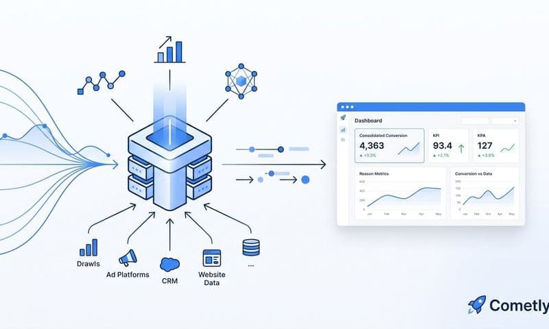
Cometly is an AI-powered marketing attribution platform that connects your ad platforms, CRM, and website to show exactly which campaigns drive revenue.
 9 Best Marketing Attribution Platforms to Compare in 2026
Where This Tool Shines
Most startups hit the same wall: platform-native dashboards like Meta Ads Manager and Google Ads each claim full credit for the same conversion, inflating your ROAS figures and making it nearly impossible to know where to put your next dollar. Cometly solves this by building a unified attribution layer across every paid channel, so you see blended performance in one place rather than five conflicting reports.
The server-side tracking infrastructure is particularly valuable for startups dealing with the ongoing signal loss from browser privacy restrictions and iOS changes. Instead of relying on a browser pixel that gets blocked or delayed, Cometly captures conversion data server-side and syncs enriched events back to Meta, Google, and other ad platforms. This feeds the ad platform algorithms better data, which improves targeting and optimization over time.
Key Features
Multi-Touch Attribution Dashboard: See every paid channel in a single view with flexible attribution models, so you understand the full customer journey rather than just the last click.
Server-Side Tracking: Maintains data accuracy despite browser privacy restrictions and iOS limitations, giving you more complete conversion data than pixel-only setups.
AI Ads Manager: Surfaces optimization recommendations across your campaigns, helping you identify high-performing ads and reallocate budget without manual analysis.
Conversion Sync: Feeds enriched, conversion-ready events back to Meta, Google, and other ad platforms to improve algorithmic targeting and ad ROI.
AI Chat for Data Analysis: Ask questions about your marketing data in plain language and get answers without needing SQL skills or a dedicated analyst on staff.
Best For
Performance marketers and growth teams at startups running paid social and search campaigns who need accurate attribution and AI-driven recommendations without hiring a data engineer. Especially valuable for teams spending meaningfully on ads who cannot afford to optimize based on faulty attribution data.
Pricing
Paid plans available. Visit cometly.com for current pricing details, as plans are updated regularly.
2. Google Looker Studio
Best for: Bootstrapped startups that need free, visual reporting built on top of Google's ecosystem.
Google Looker Studio is a free data visualization and reporting tool that connects natively to GA4, Google Ads, and Search Console.
 9 Best Client Reporting Dashboard Software Tools in 2026
Where This Tool Shines
If your marketing stack lives primarily inside Google's ecosystem, Looker Studio gives you a surprisingly capable reporting layer at zero cost. You can build shareable, live dashboards that pull directly from GA4, Google Ads, and Search Console without any data engineering. The drag-and-drop report builder is accessible enough for non-technical marketers to get something useful running in an afternoon.
The key limitation to understand upfront: Looker Studio is a visualization layer, not an analytics engine. It does not do attribution modeling. It shows you the data you already have, formatted in a way that is easier to read and share. For startups that need to go deeper on cross-channel attribution, it works best as a complement to a dedicated attribution tool rather than a standalone solution.
Key Features
Free Forever: Unlimited reports and dashboards with no cost, making it the default starting point for budget-conscious startups.
Native Google Connectors: Direct connections to GA4, Google Ads, Search Console, and YouTube with no third-party setup required.
Drag-and-Drop Builder: Build and share live dashboards without writing a single line of code.
Community Connectors: Extend reach to non-Google platforms like Meta Ads, HubSpot, and Salesforce through third-party connectors (some free, some paid).
Shareable Live Reports: Send stakeholders a link to a dashboard that updates automatically, eliminating manual reporting exports.
Best For
Pre-revenue or early-stage startups that primarily use Google Ads and GA4 and need a free way to visualize and share performance data. Also useful as a reporting front-end for teams using Supermetrics or BigQuery to store their data.
Pricing
Completely free with no paid tiers or usage caps on reports and dashboards.
3. Supermetrics
Best for: Startups that want to automate data pulls from 100+ marketing sources into their preferred reporting destination.
Supermetrics is a data connector platform that automates pulling marketing data from over 100 sources into spreadsheets, Looker Studio, BigQuery, and more.
 9 Best Marketing Analytics Dashboards for Startups in 2026
Where This Tool Shines
Supermetrics is not a dashboard tool in the traditional sense. It is the plumbing that gets your data from where it lives (Meta, Google, LinkedIn, TikTok) to where you want to analyze it (Google Sheets, Looker Studio, a data warehouse). For startups with a clear idea of how they want to structure their reporting but no engineering resources to build custom API integrations, Supermetrics fills that gap efficiently.
The scheduled refresh feature is where the real time savings show up. Instead of manually exporting CSVs from each ad platform every week, Supermetrics runs those pulls automatically on a schedule you define. This is particularly useful for agencies managing multiple client accounts or startup marketing teams that report to leadership on a regular cadence.
Key Features
100+ Data Source Connectors: Covers Meta, Google, LinkedIn, TikTok, Snapchat, and many more marketing platforms in a single subscription.
Automated Data Refresh: Schedule data pulls to run automatically so your reports always reflect current performance without manual exports.
Flexible Destinations: Push data to Google Sheets, Looker Studio, Excel, BigQuery, Snowflake, and other destinations depending on your stack.
Custom Query Builder: Pull exactly the metrics and dimensions you need rather than importing entire datasets.
Multi-Account Support: Manage data from multiple ad accounts and properties across a single connector, useful for agencies and multi-brand startups.
Best For
Startups and agencies that want to consolidate data from many ad platforms into a spreadsheet or data warehouse without writing API code. Works best when paired with a visualization tool like Looker Studio or a BI tool like BigQuery.
Pricing
Paid plans starting around $29/month depending on connectors and destinations. Verify current pricing at supermetrics.com as plans vary by data source combination.
4. Triple Whale
Best for: Shopify and DTC e-commerce startups that need first-party attribution focused on paid social performance.
Triple Whale is an attribution and analytics platform built specifically for Shopify brands, with a first-party pixel and creative analytics designed around DTC growth.
 9 Best Marketing Analytics Dashboards for Startups in 2026
Where This Tool Shines
Triple Whale was built with one customer in mind: the Shopify brand running Meta and TikTok ads and trying to understand true ROAS in a post-iOS world. The first-party pixel captures conversion data more reliably than Meta's native pixel alone, and the Moby summary dashboard gives founders and marketers a single number view of blended ROAS, customer acquisition cost, and marketing efficiency ratio without needing to toggle between platforms.
The creative analytics layer is a standout feature for paid social teams. Instead of evaluating ad performance purely on platform-reported metrics, Triple Whale lets you compare creatives across your actual attributed revenue, which helps creative teams prioritize what to produce next based on what actually converts rather than what gets the most engagement.
Key Features
First-Party Pixel: Improves attribution accuracy on Shopify stores by capturing conversion data independently of Meta's pixel.
Moby Summary Dashboard: Shows blended ROAS, CAC, and MER at a glance in a single executive-level view.
Creative Analytics: Identifies top-performing ad creatives based on attributed revenue, not just platform-reported metrics.
Shopify-Native Integration: Pulls order and revenue data directly from Shopify for accurate, first-party revenue attribution.
Meta and TikTok Attribution Focus: Purpose-built for paid social channels that drive the majority of DTC traffic.
Best For
E-commerce startups on Shopify running paid social campaigns on Meta and TikTok who need better attribution accuracy than platform-native reporting provides. Less suited for B2B or SaaS startups without a Shopify store.
Pricing
Paid plans with pricing based on store revenue. Verify current tiers at triplewhale.com.
5. HubSpot Marketing Analytics
Best for: B2B startups already using HubSpot CRM who need closed-loop revenue attribution tied to marketing activity.
HubSpot Marketing Analytics is built into HubSpot's CRM platform, providing contact-level attribution and revenue reporting for B2B marketing teams.
 10 Best Marketing Analytics Software Packages in 2026
Where This Tool Shines
The core value proposition of HubSpot's analytics is the closed loop: you can trace a contact from their first marketing touchpoint all the way through to a closed deal in the CRM. For B2B startups where the sales cycle is long and involves multiple stakeholders, this contact-level journey visibility is genuinely difficult to replicate with standalone analytics tools that do not have CRM access.
Because the analytics are native to the platform, there is no integration work required. If your team is already running email campaigns, managing contacts, and tracking deals inside HubSpot, the marketing analytics layer turns on without any additional setup. The tradeoff is cost: HubSpot's Marketing Hub pricing is substantial, which makes it most defensible when you are already paying for the broader platform.
Key Features
CRM-Native Attribution: Connects marketing activity directly to closed deals and revenue, giving you true closed-loop reporting without third-party integrations.
Multi-Touch Attribution Reporting: Tracks touchpoints across email, paid, organic, and social channels with multiple attribution model options.
Contact-Level Journey Tracking: See every interaction a specific contact had with your marketing before converting.
Pre-Built Dashboards: Ready-to-use dashboards for traffic, leads, and revenue reporting that require minimal configuration.
Bundled Platform Value: No separate tool to integrate or maintain since analytics live inside the same platform as your CRM and marketing tools.
Best For
B2B SaaS startups that are already invested in HubSpot's ecosystem and need to connect marketing spend to pipeline and closed revenue without building custom integrations. Less cost-effective for startups not already on HubSpot.
Pricing
Bundled with HubSpot Marketing Hub. Paid tiers start around $800/month for Pro. Verify current pricing at hubspot.com.
6. Databox
Best for: Small marketing teams that need visual KPI dashboards with minimal technical setup and a free starting point.
Databox is a no-code KPI dashboard platform with 70+ native integrations and pre-built templates designed for teams that need reporting without a technical build.
 9 Best Ad Platform Reporting Tools to Sharpen Your Campaign Insights in 2026
Where This Tool Shines
Databox excels at getting you from zero to a presentable dashboard in the shortest possible time. The pre-built templates cover common marketing use cases like Google Ads performance, Facebook Ads overview, and HubSpot pipeline reporting, so you are not starting from a blank canvas. For startup founders or marketing generalists who need to report on performance to leadership or investors, Databox delivers a polished output without requiring any technical configuration.
The free tier supporting up to three data source connections is a genuine on-ramp for early-stage teams. Goal tracking and performance alerts add a layer of proactive monitoring so you are notified when a key metric moves outside of expected ranges, rather than discovering problems during a weekly review.
Key Features
Free Tier: Supports up to three data source connections at no cost, giving early-stage startups a real starting point without a credit card.
Pre-Built Templates: Ready-made dashboard templates for Google Ads, Facebook Ads, HubSpot, and other common marketing use cases.
70+ Native Integrations: Covers Google Ads, Facebook Ads, HubSpot, Salesforce, Shopify, and many more without requiring custom connectors.
Goal Tracking and Alerts: Set targets for key metrics and receive notifications when performance deviates from expectations.
Mobile App: Access dashboards on mobile for on-the-go performance monitoring without needing to open a laptop.
Best For
Early-stage startups and small marketing teams that need a clean, shareable KPI dashboard without engineering resources. Particularly useful for teams that report to non-technical stakeholders and need a visual, easy-to-read format.
Pricing
Free tier available. Paid plans start from approximately $47/month. Verify current pricing at databox.com.
7. Mixpanel
Best for: SaaS startups that need to connect acquisition channels to in-app user behavior and activation events.
Mixpanel is an event-based product analytics platform that tracks user behavior within web and mobile applications to help teams understand what happens after the click.
Where This Tool Shines
Most marketing analytics tools stop at the conversion. Mixpanel starts there and goes deeper. For SaaS startups where the real question is not just "did they sign up?" but "did they activate, engage, and retain?", Mixpanel gives you the behavioral layer that connects your acquisition channels to what users actually do inside your product.
The UTM parameter tracking is what bridges the marketing and product analytics gap. You can see not just which channel drove the most signups, but which channel drove users who actually completed onboarding, reached key activation milestones, or converted from free to paid. That insight changes how you allocate budget in a meaningful way.
Key Features
Event-Based Tracking: Captures every user interaction within your product with granular control over what you track and how you name events.
Funnel Analysis: Visualize where users drop off between acquisition and key activation milestones to identify the biggest conversion gaps.
Cohort Analysis: Compare behavior across different user segments, such as users acquired from paid vs. organic channels, to understand quality differences.
Generous Free Tier: Up to 20 million monthly events at no cost, which covers most early-stage SaaS startups comfortably.
UTM-to-Behavior Tracking: Connect acquisition source data to in-app behavior so you can evaluate channel quality beyond surface-level conversion metrics.
Best For
SaaS and mobile app startups that want to understand the relationship between marketing acquisition channels and in-product engagement, activation, and retention. Less relevant for e-commerce or lead generation businesses without a product to instrument.
Pricing
Free up to 20 million monthly events. Paid plans apply above that threshold. Verify current pricing at mixpanel.com.
8. Amplitude
Best for: Product-led growth startups that need advanced behavioral analytics, cohort analysis, and retention reporting at scale.
Amplitude is a behavioral analytics platform with advanced cohort analysis, funnel reporting, and retention metrics widely used by product-led growth companies.
Where This Tool Shines
Amplitude and Mixpanel serve similar audiences, but Amplitude tends to pull ahead for teams that need more sophisticated behavioral queries and retention analysis as they scale. The platform's data taxonomy tools help growing teams keep their event tracking organized and consistent, which becomes critical when multiple engineers and marketers are all instrumenting different parts of the product.
The Experiment feature adds A/B testing analysis directly inside the platform, so you can evaluate whether a product change or onboarding flow improvement actually affects the activation and retention metrics your marketing team cares about. For product-led growth startups where the product itself is a key acquisition and conversion lever, this integration between experimentation and behavioral analytics is genuinely useful.
Key Features
Advanced Behavioral Analytics: Deep cohort and retention analysis that goes beyond basic funnel reporting to show how user behavior evolves over time.
Funnel Analysis: Connect marketing acquisition to product activation with detailed funnel visualization across any sequence of events.
Free Starter Plan: Core analytics features available at no cost, making it accessible for early-stage startups before they need enterprise capabilities.
Experiment Feature: Built-in A/B testing analysis to evaluate product and onboarding changes against behavioral outcomes.
Data Taxonomy Tools: Keep event tracking consistent and organized as your team and product grow, reducing the data quality issues that plague scaling startups.
Best For
Product-led growth SaaS startups that need deep behavioral analytics, retention tracking, and experimentation analysis. Best suited for teams with a product that has meaningful in-app behavior to track and analyze.
Pricing
Free Starter plan available. Paid Growth and Enterprise tiers for higher volume and advanced features. Verify current pricing at amplitude.com.
9. Klipfolio
Best for: Startups that need flexible, customizable KPI dashboards with broad data connectivity at a price below enterprise BI tools.
Klipfolio is a cloud-based KPI dashboard and reporting platform with flexible data connectors and customizable metrics built for teams that want enterprise-level flexibility without enterprise pricing.
Where This Tool Shines
Klipfolio sits in an interesting position in the market: more customizable than Databox, but significantly more affordable than tools like Tableau or Looker. The PowerMetrics layer lets you define your key business metrics in a consistent, reusable way so that every team and every dashboard is working from the same definitions. For startups where "what counts as a lead?" or "how do we calculate CAC?" are still evolving questions, having a centralized metrics layer prevents the inconsistency that creeps into reporting when different people build different formulas.
The API connectivity means you can pull data from sources that do not have pre-built connectors, which is useful for startups using niche tools or custom-built systems. This flexibility comes with a slightly steeper learning curve than drag-and-drop tools, but it pays off for teams that need reporting to grow with their data complexity.
Key Features
Wide Data Connectivity: Connects to a broad range of sources via API and pre-built connectors, covering both common marketing platforms and custom data sources.
PowerMetrics Layer: Define and manage business metrics consistently across teams so everyone is working from the same calculations and definitions.
Highly Customizable Dashboards: Build dashboards tailored to your specific KPIs without needing a BI developer or data engineer.
Multi-Team Support: Share a single metrics layer across multiple teams or departments while allowing each team to build their own views.
Affordable Relative to Enterprise BI: Delivers significant flexibility at a price point that is accessible for startups, unlike tools such as Tableau or Looker.
Best For
Startups and scale-ups that need customizable, multi-source dashboards and want a consistent metrics definition layer without paying for a full enterprise BI platform. A good fit for operations-minded marketing teams that value data consistency as they scale.
Pricing
Paid plans starting around $90/month. Verify current pricing at klipfolio.com.
Which Tool Is Right for Your Startup?
The right marketing analytics dashboard depends almost entirely on your growth model, your current stack, and where you are losing visibility today. Here is a quick breakdown to help you narrow it down.
If paid ads are your primary growth channel and you need accurate multi-touch attribution with AI-driven optimization, Cometly is the strongest choice for startups that cannot afford to waste budget on guesswork. The combination of server-side tracking, Conversion Sync, and AI recommendations addresses the core attribution problems that cause most startups to scale the wrong campaigns.
If you are pre-revenue or bootstrapped and live inside Google's ecosystem, Looker Studio gives you a solid free foundation to start. E-commerce startups on Shopify should evaluate Triple Whale for its ROAS-focused attribution and creative analytics. B2B SaaS teams already on HubSpot will find the native closed-loop reporting hard to beat for connecting marketing spend to pipeline and revenue.
For product-led growth startups, Mixpanel or Amplitude will give you the behavioral depth you need to connect acquisition channels to activation and retention. Databox works well for teams that need fast, presentable KPI dashboards without any technical setup. Supermetrics is the right choice when you need to automate data pulls from many sources into your own reporting setup. And Klipfolio fills the gap for teams that want customizable dashboards with consistent metric definitions at a price below enterprise BI tools.
The biggest mistake startups make is defaulting to whatever tool is cheapest or most familiar rather than choosing based on where they lose visibility today. If you are scaling paid ads without clear attribution, you are optimizing blind. Start with the tool that closes that gap first, then layer in additional reporting as your data needs grow.
Ready to see exactly which ads and channels are driving your revenue? Get your free demo and discover how Cometly's marketing attribution dashboard gives startups the clarity to scale with confidence.